What Is Universal Design? Everything You Need to Know
Universal Design is not new, but the conversations around it are reinvigorated in an effort to create more accessible and equitable design projects.
The concept isn’t specific to websites or printed creative work, it extends to every field of design.
Universal design is rooted in a set of core principles that – when used as a foundation for creative work – can help you design in a way that helps minimize the need for assistive technology and makes products more usable by everyone, not just people with disabilities.
What is Universal Design?

Universal Design may be the earliest rules of design accessibility that we use online today.
The University of Washington DO-IT program defines it like this:
“Universal design is the process of creating products that are accessible to people with a wide range of abilities, disabilities, and other characteristics. Universally designed products accommodate individual preferences and abilities; communicate necessary information effectively (regardless of ambient conditions or the user’s sensory abilities); and can be approached, reached, manipulated, and used regardless of the individual’s body size, posture, or mobility. Application of universal design principles minimizes the need for assistive technology, results in products compatible with assistive technology, and makes products more usable by everyone, not just people with disabilities.”
Simply stated: Universal design is something that works for everyone. It takes some of the targeting out of the design process and simplifies it down to the most common standard of use, comprehension, and creation.
Universal design is similar to, but not like, accessibility guidelines or standards in that it goes a little further than tackling special needs. Something that is designed universally provides a fair chance and level playing field for use among all types of people regardless of ability, age, culture, or geography.
Some people refer to Universal Design as being ethical design and the practice has been reenergized in conversations about social and design equity and inclusion.
Where Did Universal Design Originate?
Universal Design was coined around 1997 by a group of academics at North Carolina State University at the now-defunct Center for Universal Design. They developed a set of principles that can be applied to academics, communications, products, and environments as a whole as a method to create more equitable and accessible design.
Universal Design concepts can be physical – such as building an access ramp in place of a staircase – or virtual to ensure that function and usability are more at the core of online experiences.
The longevity of these concepts has shaped a lot of how we design for usability and common experiences and all of the seven principles of universal design remain applicable today for almost anything that you might create.
7 Principles of Universal Design

Everything you need to know about universal design starts with the seven principles that were drafted by the original writers of the concept in 1997. (Definitions with help from the University of Washington.)
1. Equitable Use
The design is useful and marketable to people with diverse abilities.
Application for your design projects: Responsive design is one example because it works on different devices; another would be adding the ability to translate languages (if necessary), and offering dark/light modes for different users. Consider the people and image you show and how they may or may not look like your users; part of equitability infers a lack of direct targeting.
2. Flexibility in Use
The design accommodates a wide range of individual preferences and abilities.
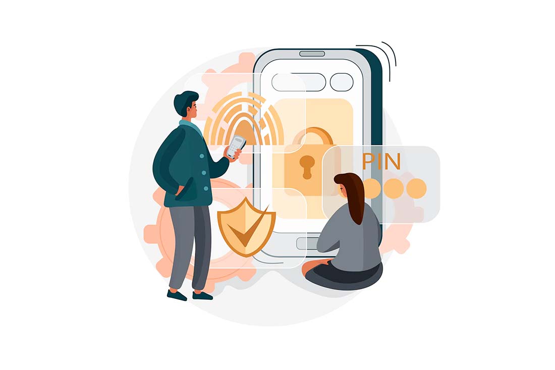
Application for your design projects: Websites that are built with solid alt text and descriptions so that they work with screen readers. The ability to use or navigate a design with text/reading or voice is an emerging flexibility option. Think about access: Provide users with multiple options for access accounts or information (fingerprint, face ID, password, PIN, etc.).
3. Simple and Intuitive Use
The design is easy to understand and use, regardless of experience, knowledge, language skills, or concentration level.
Application for your design projects: Designing buttons that look and act like buttons based on current user behavior patterns and graphical elements and icons that are universally known. Forms that let you know how to fill them out correctly and note an actual error when filled incorrectly create more intuitive use.
4. Perceptible Information
The design communicates necessary information effectively, regardless of ambient conditions or the user’s sensory abilities.
Application for your design projects: Provide controls for elements such as sound, speed of playback (or pausing of scrollers, sliders, or video) and allow users to change settings such as contrast or text size.
5. Tolerance for Error
The design minimizes hazards and the adverse consequences of accidental or unintended actions.
Application for your design projects: This one is simple – stay away from dark patterns. Secondly, offer an explanation and potential solution for accidental interactions; users should always have a way out. Offer a “back” or “undo” option.
6. Low Physical Effort
The design can be used efficiently and comfortably and with a minimum of fatigue.
Application for your design projects: When it comes to text and typography, eyestrain is a consideration; remember that lines of text that are too long or too short in comparison to screen width and size create physical effort. (For the most part, 45-65 characters per line is ideal.) Websites should also be operable with click, tap, or keyboard actions, and elements that require interaction should be no more than a thumb’s reach away on mobile devices.
7. Size and Space for Approach and Use
The design has an appropriate size and space for approach, reach, manipulation, and use regardless of the user’s body size, posture, or mobility.
Application for your design projects: Some of the same approaches for low physical effort also apply. The other key consideration is space and padding of elements so that every element in a design is easy to keep separate from other elements. (That helps with tolerance for error also.)
Benefits of Universal Design
The Centre for Excellence in Universal Design in Ireland segments Universal Design benefits into four groups:
- Individual: Respectful of user dignity, rights, and privacy while being user-friendly and accessible
- Societal: Creates inclusive solutions for the range of human ability for greater participation in society
- Business: Greater financial impact, market reach, customer satisfaction, public image, and acceptance
- Legislative: Promotes compliance with local, regional, and global standards and rules
Conclusion
One of the major reasons for thinking about and using Universal Design is simply to do your part as a good and ethical designer. But the reach of the concept has greater implications: Some regulations and best practices are derived from Universal Design. (Now that you know the principles, you might see some of these connections more directly.)
The other commonality is that Universal Design helps create greater access and accessibility to your creative work for others. It’s functional, usable, and applicable for most people. Chances are that you already have a lot of these things in mind as part of your design process; now you have a better understanding of how those concepts came to be.