7 Best Web Design Ideas For Beginners
A web designer’s task is to create compelling and accessible websites using their artistic intuition. And, thanks to the brilliance of today’s technology, we have all of the resources we need to make even the most spectacular concepts a reality.
But, building a business website may be a difficult task; there is a lot of weight to create the finest digital representation of your brand. Consider it a “virtual showroom,” with the homepage serving as the front entrance. You wish your website to be enticing enough to draw them in, and a good web design may help you do just that. We’ve gathered some excellent site design ideas to get you started.
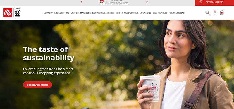
1. Use Pictures of People
Faces are one of the most potent forms of images. In web design, the stimulating effect of people’s pictures is quite valuable.
Faces not only grab viewers, but they also correspond with conversion. Basecamp’s research demonstrated a substantial boost in results when faces and experiences were combined on a sales page.
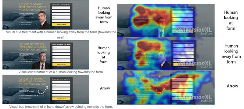
Detecting any human aspects on the Internet is something we enjoy. It gives us the impression that we are interacting with other people rather than a computer. Faces of other people, in particular, capture our eye, and we even follow their line of sight. If you’re going to use imagery with faces in your design, make sure that they’ll draw attention to where you want.
Also, instead of using stock images, utilize high-quality photographs of people that genuinely reflect the personality of your website.
2. Take Advantage of Pinterest Mood Boards
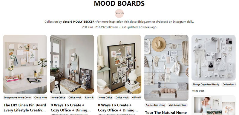
Mood boards reflect a designer’s vision at the early stages of a project. They should be visually attractive compilations of ideas, with textures and visuals that convey a narrative that words alone cannot. A mood board is the next best thing to bringing someone inside your vivid imagination.
Pinterest is an excellent resource for creating mood boards. You can gather multimedia elements that you think will help you with your project or give you pointers. These can be illustrations, color palettes, layouts, existing sites, etc.
The mood board will serve as a basis for your design ideas. You may also share it with clients or partners so that they can add their own content.
3. Experiment With One-Page Design
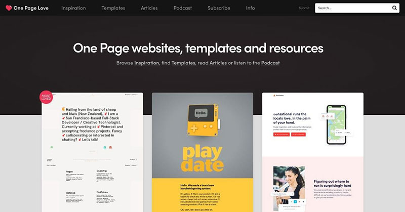
These days, one-page website templates are very popular in the world of website design. It’s generally implemented by companies that seek to advertise a particular item, service, or portfolio in a straightforward manner. Most websites have several pages, including a home page, a contact page, an about page, and a deals page. Nevertheless, it’s often preferable to have a single-page website. If people do not have to hunt for information on other pages, they will notice more details about your product, and they can get everything in a single place.
Crazy Egg put this to the test by replacing their initial sales page with one 20 times longer. The outcome was a 30% higher conversion rate!
The team at classic gaming site Solitaired saw similar results moving to a one-page design. Instead of showcasing their library of games on their homepage, they replaced it with a solitaire game users could play immediately, and found engagement increased 22%.
If your existing customer’s journey stretches over numerous pages, consider bringing it all together in one spot. This may be one of those web design concepts that closes the gap.
Source: One Page Love
4. Build Everything Around a Large Picture
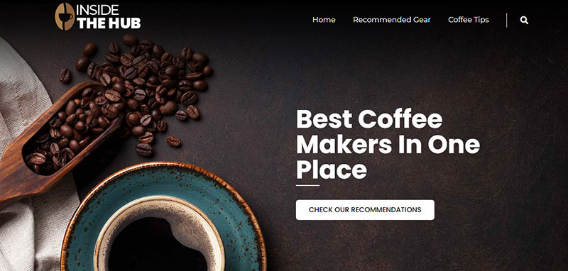
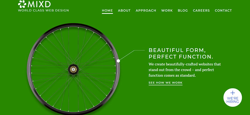
When it comes to large photography backgrounds in custom web design, there used to be an assumption that they’re usually made for a basic photographer portfolio website. Surprisingly, there appear to be no boundaries to this style of full-size image design trend. It works well for e-commerce sites, restaurant websites, web design businesses, and pretty much any other form of a website.
All of these websites have something in common: they all feature artistic and professional imagery. The site’s spotlight is the image itself, with each having a stack of information to make it efficient.
It’s a subtle trick. Once someone sees a large image on your board, it will raise questions in their minds, and they will quickly inspect the entire board to seek answers. Smaller assisting images or dosed text content placed around the larger picture should clear this up by explaining the communication provided in the larger one.
5. Go Abstract
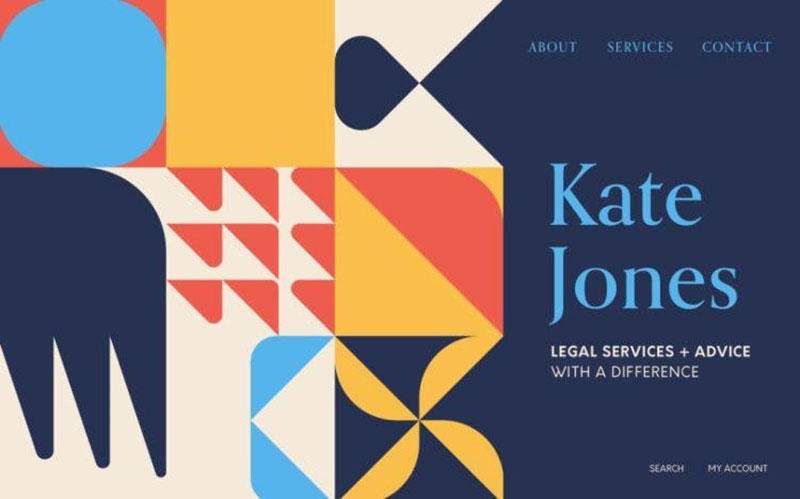
When it comes to digital design, trying a different approach with geometric patterns and forms and abstract motifs is a terrific alternative to using photographs. Depending on the industry, it has the capacity to deflect attention away from rivals and avoid predictable layouts and stock pictures.
Abstract patterns – exhibited in different forms throughout the site – are used to create a holistic vibe for your website and brand. These visuals put your main product or call-to-action buttons under a spotlight, provide consistency in multi-product showcase, and develop a genuine corporate identity that is ready to engage with your audience.
Startups should consider this website concept since it is an excellent approach to draw attention to the product, its usefulness, and the brand’s reliable, insightful, and progressive identity. Simple forms such as squares and circles can expand into vast, sweeping designs, giving your website an intriguing, inventive appearance.
Source: Shutterstock
6. Concentrate on Minimalism and Call-to-Action Buttons
Having a clear understanding of the mission of your site and pages empowers you to eliminate everything that doesn’t match that aim. This neatens up your elements of designs and makes it more appealing to the eye. According to Google, visual sophistication is negatively connected with website appeal. In a nutshell, no one wants to feel swamped. Simplifying your design also benefits other aspects, such as website speed.
Some items you can safely get rid of are:
- Menu items:You obviously want people to visit your site and learn more about it. A cluttered menu, on the other hand, might be highly confusing and have harmful consequences. Stick with the fundamentals.
- Sidebars:The sidebar is being phased out of an increasing number of websites. What are the elements of your sidebar? Is it really so crucial?
- Muddy vocabulary:The same issue applies to language. People tune out repetitive cliches and empty words. Quit using them, add individuality to your content, learn strong words, and brush up on your copywriting skills.
Another significant part of minimalist design is font size, which is particularly important when there aren’t many other elements on the page. You can deliver information more effectively by using small fonts. On the other hand, a small text might easily be buried on the page, making the design appear messy and confusing, so you have to find the golden mean.
7. Use Arrows as Visual Cues
The arrow has become the standard symbol signifying “if you click here, you’ll go somewhere.” The right-facing triangle was generally established as the sign featured on every VHS controller long before people extensively adopted the internet; thus, it only felt right to continue using it for an online video play button.
Once a user learns something, his mind will automatically know what to do. That’s why using arrows as visual cues is a safe bet. A CXL eye-tracking study reported that a simple arrow was more effective at getting visitors to focus on a particular website element than anything else.
The implementation of arrow signs has clearly simplified interaction for consumers while also giving web designers an eye-catching tool to work with. It lets a developer replace words like ‘previous’ and ‘next’ with visually appealing, easy-to-understand symbols, which is a part of the previously mentioned minimalistic concept. Based on the assumption that most cultures read from left to right, these symbols help navigate a list.
Source: CXL
How to Determine What Works and What Doesn’t on Your Website
The art of web design is highly subjective. But, you can satisfy most of your visitors; all you have to do is discover what works and what doesn’t, depending on what most of your site guests like.
For example, Crazy Egg collects user behavior data for your website. You’ll observe how people interact with design elements by clicking, scrolling, and reacting to them.
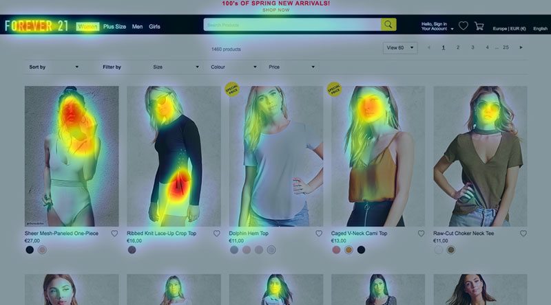
Another great option is a heatmap, which shows visitors’ interests and what they don’t care about (despite what you might think they should). A conventional heatmap illustrates regions of “hot” activity and “cold” passivity. Designing your homepage items to match eye tracking can improve its effectiveness.
If you have a good product design you can improve a better customer experience consider creating chatbots for your website for example if you create an attractive chatbot design you can boost your engagement and create a powerful brand identity.
Source: Eyequant
Furthermore, a confetti summary provides detailed information about referral sources and how visitors from various locations interact with your site.
After you’ve gathered this data, make two versions of your website. Half of your visitors will see one version, while the rest will see the other. This method of A/B testing specific elements will assist you in fine-tuning your site to make it optimal for your core demographic.
Conclusion
Establishing an online presence is a significant leap, but the finest websites result from many small steps. Finding the suitable CMS and web host, creating a template, fine-tuning your content, and choosing the optimal layouts to present your goods and services are just a few of the aspects that go into building your company’s online identity.
The beauty of building a website is that the possibilities are nearly limitless. It’s time to put your ideas into action and develop your professional website.
Author:
 Andrej is the creator and the one-person owner of the InterCoolStudio. As an experienced marketer, he is driven by turning leads into customers. His goals always include White Hat SEO. Except for being a boss, he is a real team player with a great sense of equality.