Web Design Done Well: The Ordinary Made Extraordinary (Part 1)
Great ideas in web design come so thick and fast that it can be easy to miss them if you’re not careful. This series is a small antidote to that, piecing together splashes of inspiration that caught our eye. Whether it’s a mind-bending new feature or simply an old trick delivered with new elegance, they share the quality of making us think a little differently.
I recently wrote a piece lauding the work of Saul Bass in the world of web design. One of his great gifts was making even the tiniest details beautiful. It is in that same spirit we kick off this series by honing in on website trends and features we’ve grown accustomed to being dull. As you’ll see, they needn’t be. The trick is often in the execution. Just about anything can be beautiful. Why aim for anything less?
Glasgow International’s Pages Within Pages
We’re used to plenty of scrolling these days, but the Glasgow International festival website has found a simple, clever way to scratch that itch while keeping pages short:

On mobile, the same three sections form one big column. It’s a savvy solution to the mobile/desktop relationship, and a pretty stylish one too. (Shout out to the ‘Support’ button, which starts spinning when you hover on it.)
The CSS behind this is suitably simple. The three sections sit inside a flex container, with all three sharing the values of overflow-y: auto; and height: 100vh; so that they always fit the desktop viewport. The really nice touch here is using scrollbar-width: auto; to remove the sidebar. Because the columns take up the whole screen you intuitively work out the way the page works as soon as you move your mouse.
Kenta Toshikura’s Dimension-Bending Portfolio
A recent site of the week on Awwwards, this portfolio website by Japanese frontend developer Kenta Toshikura is simply breathtaking:

If in doubt, the tendency is to lean towards flat, modular arrangements, but maybe we should be thinking in three dimensions a little more often. This is a fantastic example of lateral thinking transforming what could easily have been a column of boxes into something truly memorable.
We may not all be equipped to do something quite this fancy (I’m certainly not) but it’s well worth remembering that web pages aren’t blank canvases so much as they are windows into alternate dimensions.
Stripe Documentation Is The Teacher We All Want
Documentation is all too often one of the first casualties of the Web’s mile-a-minute pace. It needn’t be. I have no qualms calling Stripe’s documentation beautiful:

I’m sure most of us have ground through enough bad documentation to appreciate the effort put into this approach. Clear, hierarchical navigation for the content, bite-sized step-by-step-copy, and of course the code snippets. Dynamic previews of code across multiple platforms and languages is above and beyond, but then why shouldn’t it be?
There are few things more valuable — and more elusive — than quality learning resources. Stripe shows there is a world of possibilities online beyond the standard words on a page. I’ve shared this before (and I’ll share it again) but Write the Doc’s documentation guide is a smashing resource for presenting informative content in useful, dynamic ways.
Max Böck’s Technicolor Dream
There is an awful lot to like about Max Böck’s personal website, but for the purposes of this piece, I’m honing in on color schemes. Most websites have one color scheme.

Light and dark is the new normal, but as Böck himself writes in his blog post about the theme switcher, only Siths deal in absolutes. Through the magic CSS custom properties the site switches between color schemes seamlessly. For a full breakdown of how it works I heartily recommend reading the full post linked above. And for further reading on custom properties Smashing has plenty too:
- “How To Configure Application Color Schemes With CSS Custom Properties” by Artur Basak
- “A Strategy Guide To CSS Custom Properties” by Michael Riethmuller
The themes are named after Mario Kart 64 tracks, if you were wondering. Except Hacker News. That’s named after Hacker News, with the marvellous touch of adding ‘considered harmful’ to the end of every single Böck blog post title.
It’s a fun twist on the traditional light/dark dichotomy, and also speaks to just how fluid sites can be nowadays. The same groundwork could allow you to adjust color schemes depending on where people are visiting the site from, for example.
Overpass Sells Sales
Sales isn’t exactly a sector that screams innovation, but credit where credit is due. Overpass’s carousels bounce and shrink and expand so smoothly that it almost feels like you’re interacting with something tactile, like a rubber band.

Here, both the touch-action and translate3d()) CSS functions are used to great effect, making the cards container something that can be effectively dragged around the screen. In the event of the container being grabbed, all cards use scale(0.95)) to recede ever so slightly until the user lets go. It gives the carousel a lovely sense of depth and lightness.
The audio clips are a nice touch. Multimedia integration has been a running theme in these examples. Always lay the accessibility groundwork, but be bold. At this stage the only real limits are those of our imaginations.
E-Commerce Meets Long Form Storytelling On Mammut
From Steve Jobs to Seth Godin, it is often said marketing is a storytelling game. This is something that a lot of e-commerce websites seem to have forgotten, each serving up page after page of glossy products floating in front of perfect white backgrounds. You can almost hear the sucking sound of conversion funnels trying to draw you in.
It’s refreshing then to see a company like Mammut going all in on storytelling to sell its hiking products. Their long-form expedition articles are as immersive as the finest New York Times feature, with audio clips, maps, and, naturally, stunning photography. Mammut gear features heavily, of course, but it’s done in a way that’s tasteful. More importantly than that, it’s authentic.
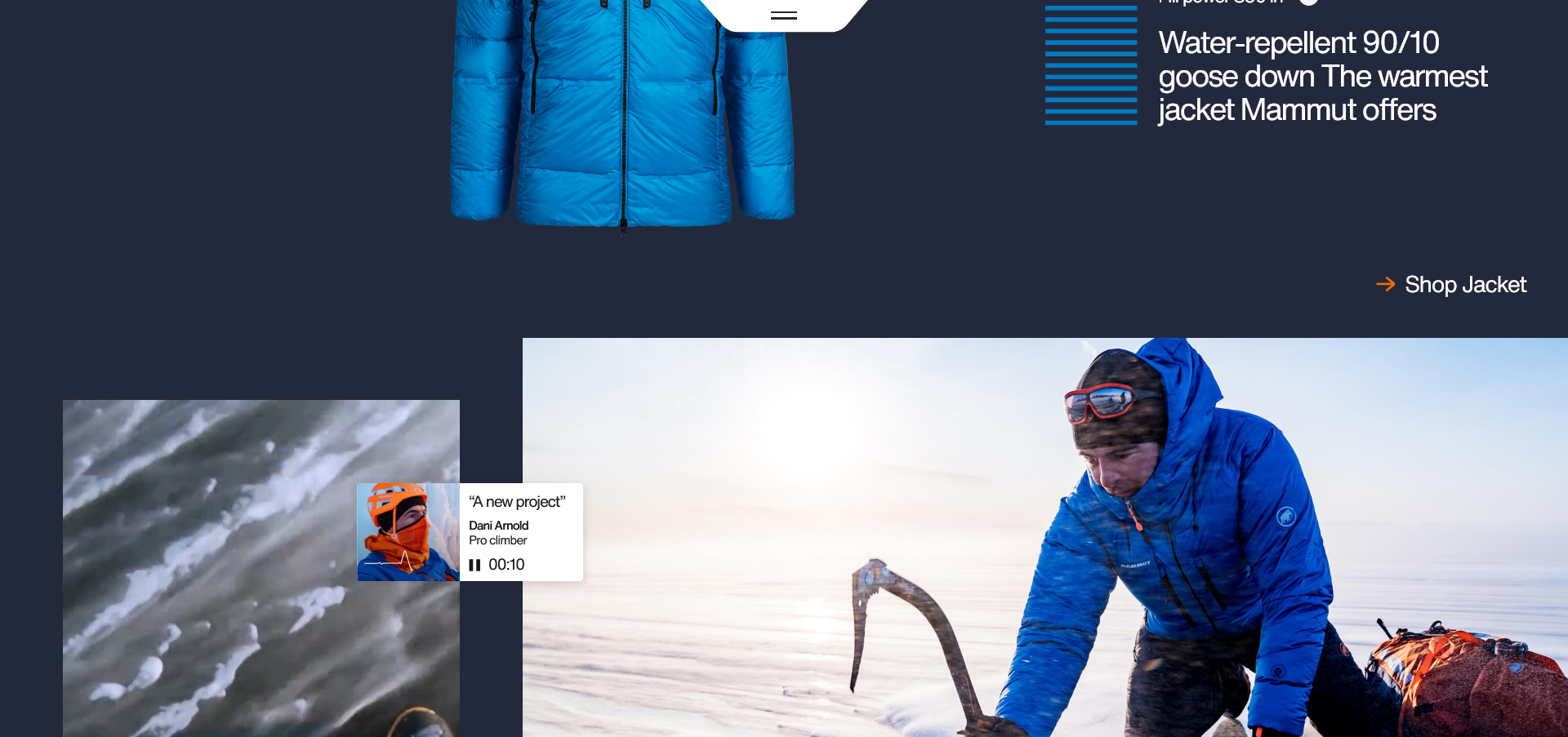
Although there is some super slick styling going on here that’s not why I’ve included it. In a way it’s incredible just how impersonal much of the Web feels these days, with e-commerce being a particularly egregious offender.
This is the kind of thing people would share even if they had no interest in buying mountaineering gear. It’s superb content. Instagram influencer posts look like child’s play compared to this. Do those prompts to shop take you to the aforementioned squeaky clean e-commerce checkout? Naturally. But, by God do they earn it. Not everyone has the resources for something this cutting edge, but it shows that e-commerce doesn’t have to be sterile and lifeless.
Axeptio Makes Its Cookies Palatable
You can’t swing a cat without hitting a disclaimer pop-up these days. It’s bizarre, then, that so many of them are so ugly. More often than not, they feel tacked on and graceless. Now, to be fair, that’s because they are tacked on and graceless, but some genuinely are just there to Improve Your Browsing Experience™.
Instead of treating its cookie pop-up like a bad odour, web consent solution provider Axeptio walks the walk by making them look stylish, and even rather charming. With GDPR (and basic decency) to think about, it’s essential to weave ethical design into a website’s fabric.

A lovely touch is that it doesn’t actually pop up until users start moving around the site. Why bother people if they’re not even interested in the content? Notice as well that they’ve dropped the boilerplate cookie lingo in favor of something more conversational.
Granted, this may not make the mundane ‘extraordinary’ exactly, but it does make it a whole lot classier. It’s a small touch, but one which makes an excellent first impression. Without even looking at the typeface yet, I already have a sense of Axeptio’s attention to detail and commitment to quality. A blocky ‘We care about your privacy’ pop-up would have given a very different impression.
As far as cookies and pop-ups are necessary, we may as well own them. The same applies to other unsexy staples of the modern web. Do legal consent forms, email signups, and privacy pages have to be ugly and evasive, or do we just need to think a little differently? Share your thoughts below!