10 Tips for Working With Bold Colors in Web Design
Designing with bold color is a lot of fun.
It’s also a little dangerous.
Bold color choices can evoke emotion, draw attention, and create just the right vibe for a design. On the other hand, bold color can feel frenzied or off balance. Users are instantly drawn into color or turned off by it.
Here’s a look at a few ways to use bold color in web design. We’ll walk through how to bring personality and vivid style into your projects, while keeping a sense of balance and accessibility that makes the site easy to use.
1. Create the Right Feel
Color can create an immediate feel and connect your website or brand with users in a way that many other design elements can’t. Bright and bold color choices tell users whether the mood is dark, light, or vibrant.
Bold color also makes an in-your-face statement that should bring attention to the design and help users engage.
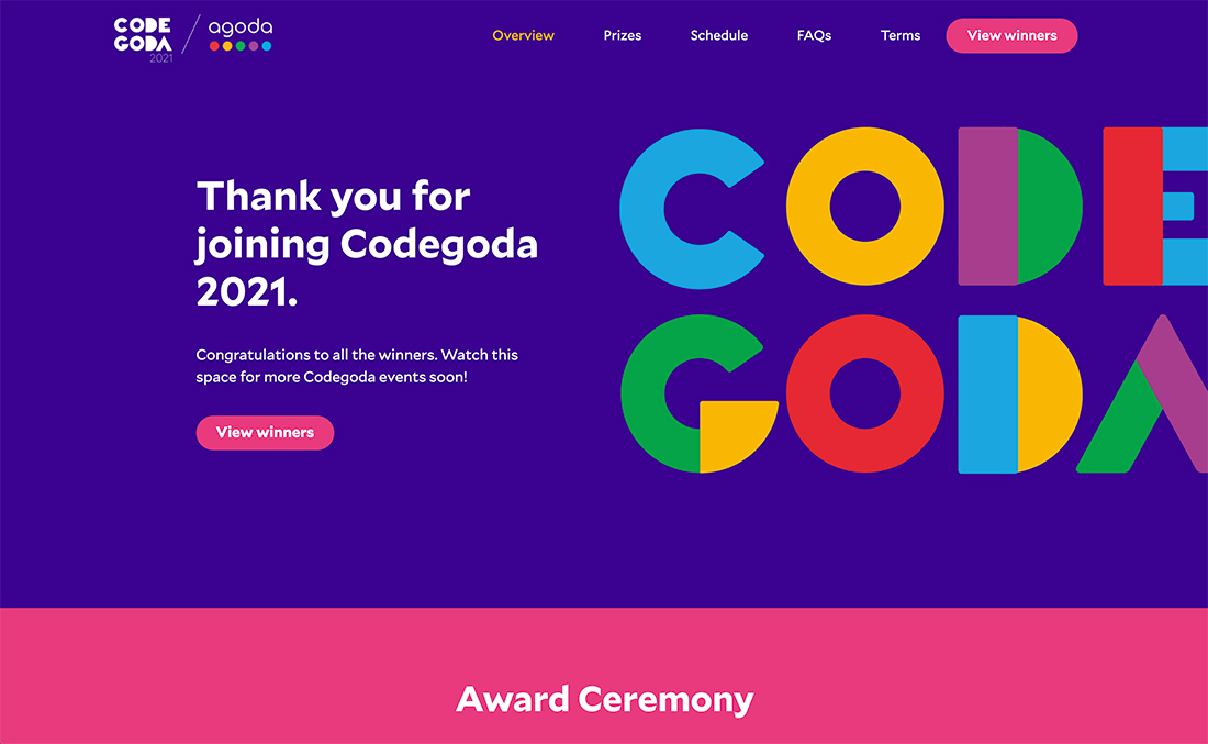
Colors derived from the Material Design palette have been the go-to in terms of bright, trendy choices for a while. The hues are vibrant and work in ways that you might not expect.
You can see this in part with the example above that uses a wide color palette of colors you might not expect, but they work harmoniously together.
2. Highlight a Nontraditional Element
A bold color choice can direct focus to a certain aspect of the website design. This technique works exceptionally well when you can use it to bring better understanding to a nontraditional design element.
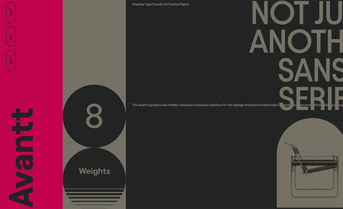
The website for the Avantt typeface, above, uses a side navigation element that would be rather hidden if not for the magenta background on that part of the screen. Bold color drives the eye toward the font name and navigation elements.
Bold color actually serves as a usability tool.
3. Highlight Who You Are

Bold color can work as a banding element in website design.
The neon color choice above is a strong example because it serves as a visual disruptor – with an interesting and unusual color choice – that ties the logo in the top corner to the name of the company.
Bold color choices for brand elements tend to work best when the rest of the design is less colorful, often with a mostly dark or light background.
4. Create Text Elements the Wow
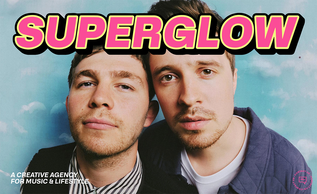
In another example of using bold color with text, Superglow is the dominant element on the website design above, even with the use of full-screen images.
The pink and yellow color pair with a drank drop shadow is daring. Plus, the oversized lettering is hard to miss.
With color and typography pairs such as this, the design needs to be heavy enough to support the weight of the typography. Experiment with different types of backgrounds so that text elements have room to wow with color, but don’t feel like they completely overpower the design.
5. Counter Stark Aesthetics
Whether it is a simple splash of color as an accent or a larger color block, bold hues can provide just the right balance to keep a stark aesthetic from feeling too minimal.
The balance with color works because it gives you something interesting to look at and focus on when the rest of the design isn’t as bold.
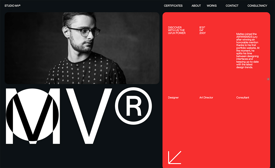
Studio MV, above, takes an interesting approach with an almost half-screen red box for small text elements. While the color counters the rest of the black and white design, it isn’t overcrowded and has a balanced starkness of its own.
The horizontal split on the left side of the screen helps the red block feel appropriately weighted.
6. Make a Statement
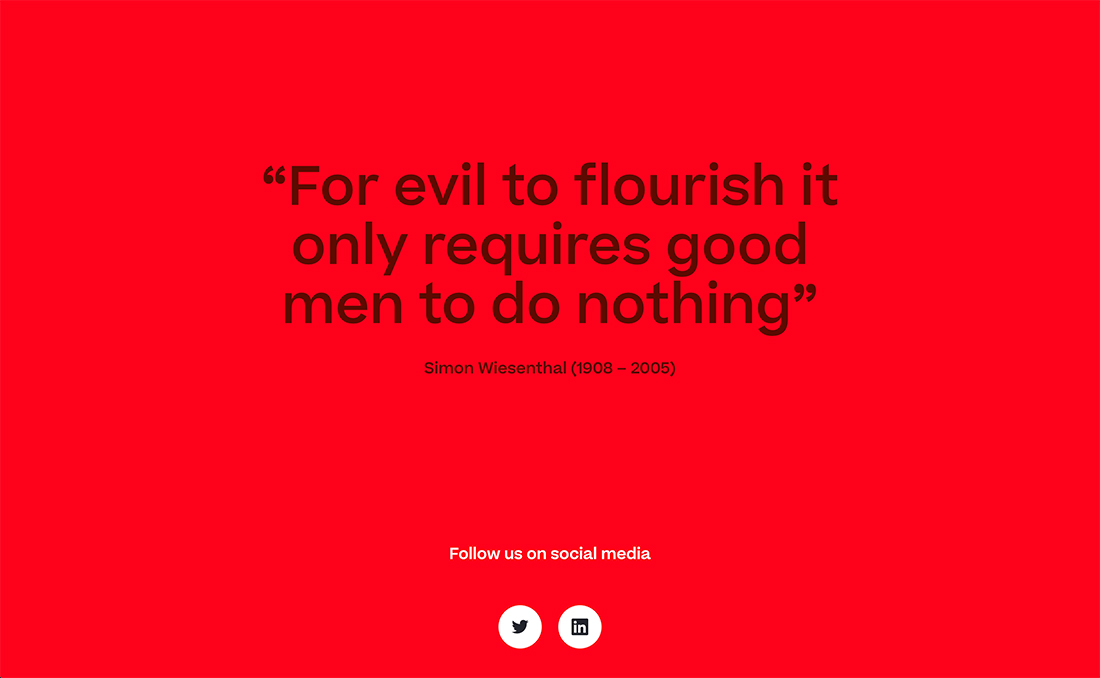
Sometimes a bold color is all you need to make a statement.
Think of all the underlying associations in the example above and the impression it leaves behind.
7. Snag Attention
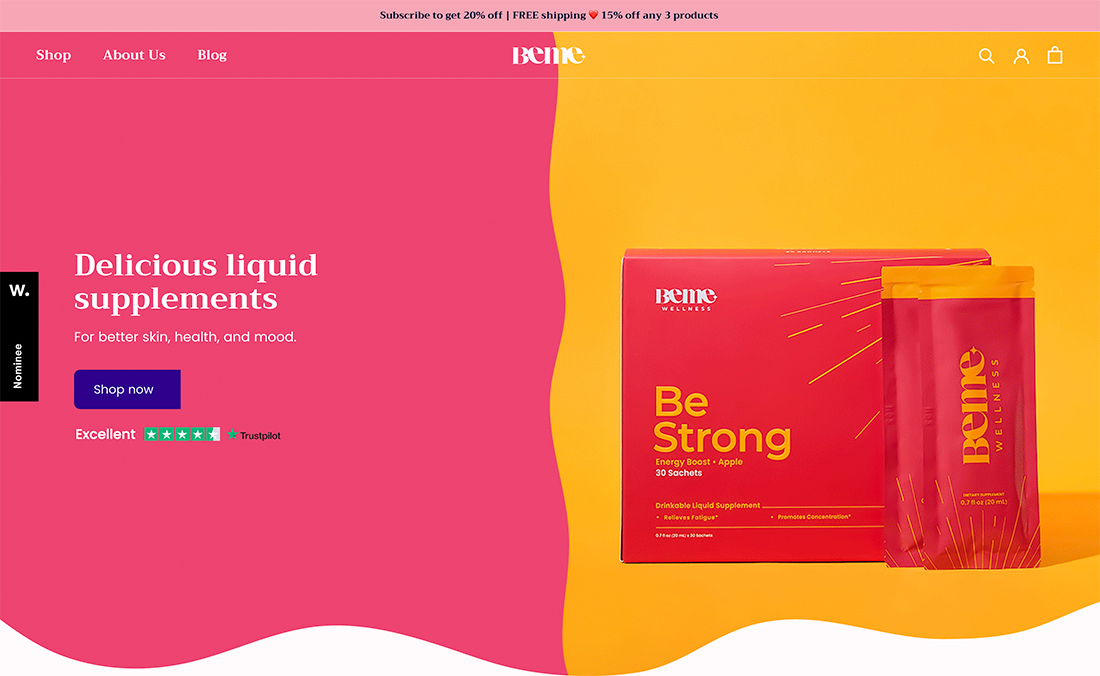
Bold color often has a direct purpose – to grab the attention of website visitors.
Sometimes bold color works in concert with the products on the website, such as the example above, and other times color simply sets the scene.
Here’s what’s exceptionally nice about color as an attention-getting tool on websites – you can change it at almost any time. A bright blue background today could be yellow next month or lime green after that.
In most cases, you can change background, image, or hero text colors without a lot of effort. This can also help bring extra attention to the design because it will be somewhat different for return visitors.
This little element of color surprise can be delightful and contribute to a positive user experience in the long run.
8. Make It Fun
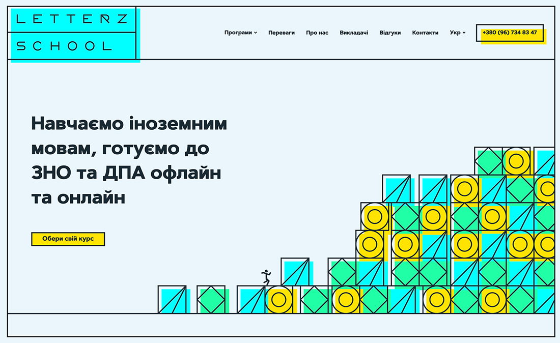
Bold color is sometimes a mash-up of hues in a palette that shouldn’t work well together, but then turn into something interesting.
This can be anything from using too many colors to “mismatched” colors.
In the example above from Letterz School, the highlighter-style color choices are a lot to digest. But they are not overwhelming, rather the lightness of the rest of the design and fun stick figure running up the blocks creates the right amount of fun. (So much fun that you don’t even notice how the colors don’t really match.)
This proves that when you are experimenting with bold color options, it is ok to try things that might break rules. You never know when it will work perfectly.
9. Establish a Bright Background

One of the tried and tried uses of bold color is as a background website design element when you don’t have a lot of other visuals to work with. Pair color with a block of text that uses an interesting typeface and you’ve almost always got a winning combination.
In addition to color, this design pattern is trendy when the typography is rooted in an experimental typeface or includes a few animated elements.
10. Show Your Trendy Side
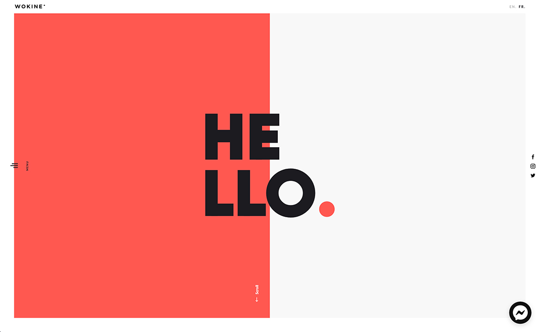
Speaking of trends, color choice is a website design trend in itself and can work nicely in concert with other fashionable elements.
Wokine, above, combines a few trending elements into one uber-modern design: Bold color, split-screen aesthetic, and a unique type choice.
Color helps balance other design elements, helps direct users to the side menu, and turns the whole screen into a piece of artwork.