Fonts that popular social media brands use for inspiration
Everyday on the internet can be a lesson in branding and marketing. For designers and social media marketers, surfing the web is not just about entertainment but an incredible opportunity to create a swipe file of all the greatest creatives of all time.
Speaking of branding, we usually think about colors, fonts, or mascots while scrutinizing the design. But what truly changes the vibe and personality of a brand’s visual identity is undoubtedly the font.
People love everything about typefaces. The minute a logo revamp goes public, the world descends on it discussing the font style, type, its design and how it suits or does not suit the brand.
If you are going to launch a brand on the internet, or find yourself looking for inspiration, a deep dive on Font Psychology is important to get your fonts in order.
We know theory can be a little boring, so we bring you a breakdown of font choices that the popular brands on social media are making today.
Take inspiration from these favorites of the world and understand what your audience expects from you before going to the drawing board.
Top Social Media brands and the Fonts they use – An overview
A cheat-sheet makes everyone happy. But before we break down the font choices by the popular social media brands, we have a word of caution for you. Originality is a highly valued virtue in the world of branding. Use this guide as a cue to understand what the greats are doing for inspiration.
When it comes to your brand’s visual identity, work with a graphic design service provider to create something unique or modify an existing font to suit your needs.
With that, let’s dive into the world of branding and popular fonts in use.
Spotify
Who doesn’t love Spotify, right? The music streaming platform has not just revolutionized the world of entertainment but also offers up lessons in branding and brand experience. Their presence on social media and the active campaign model that they follow is an inspiration to anyone.
But for the inquisitive mind, the logo poses an intriguing combination of elements too. It is distinctive, unique, but familiar, making the customers bond with the brand quite easily.
The font chosen by the design team plays a vital role in building this connection too. And that font is from the Gotham Font Family. Specifically, Spotify logo uses a Gotham Medium font from the broad family of 66 font styles. It is familiar but still unique in the industry allowing it to leave a mark.

Spotify has shown a great example of using a popular font but still being offbeat – and eye catching – in an industry.
Wayfair
When you are a decor company, your customers and the industry itself has high expectations from your branding efforts. And if you are an ecommerce brand too, then the need to be memorable is paramount.
The brand in focus, Wayfair, has managed to deliver on those expectations and how.
Wayfair chose a pretty unconventional brand color for a decor or ecommerce company. They chose a color from the purple family, known for its high allegiance to luxury and premier personalities. Even today, the brand uses a color with highly luxurious connections – a bright lilac.
For their font choice too, Wayfair followed the unconventional route by choosing an all lowercase style of fonts. While they began their branding journey with flat serif fonts, the brand currently employs a more rounded and softer approach to its typeface. While we can point similarities to many fonts, Wayfair’s logo actually uses a custom font that is true to the brand itself.

Pop Tarts
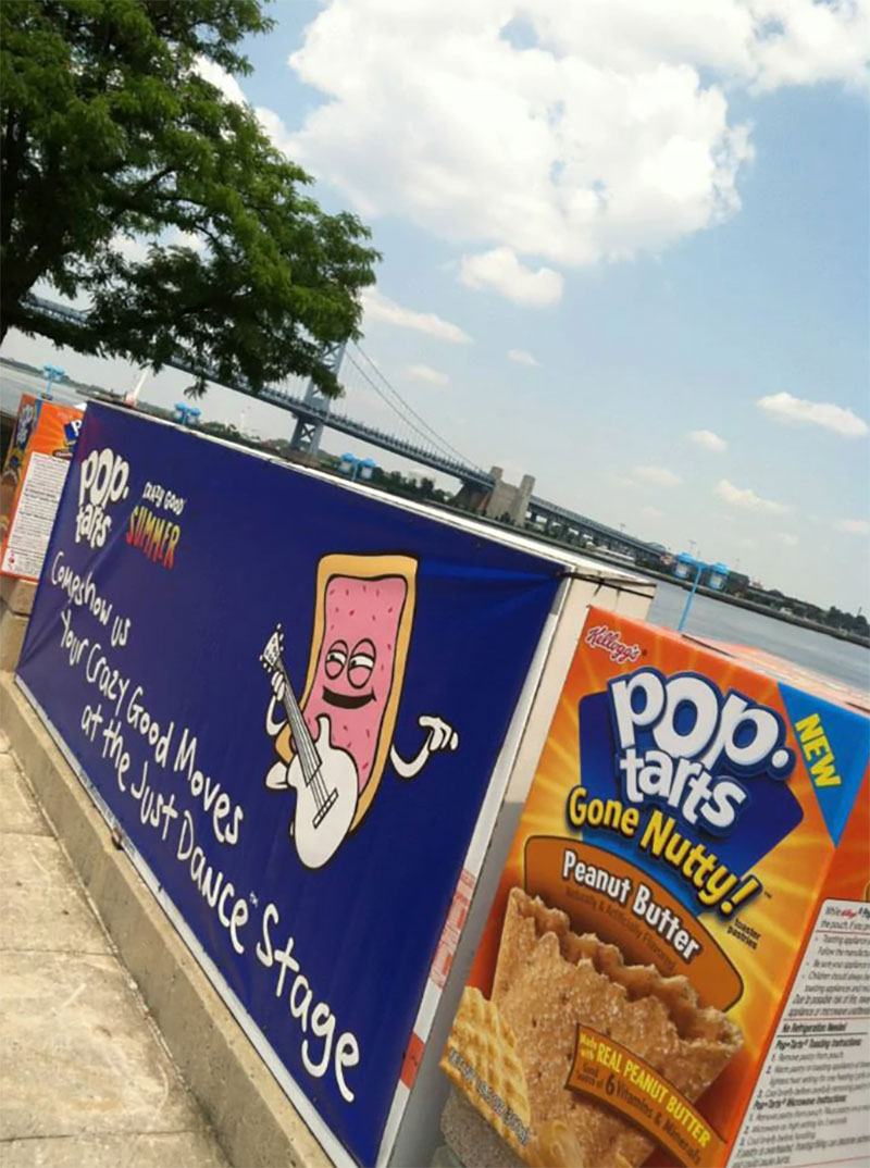
We know that Pop Tarts is an old brand but the brand runs one of the most aesthetic Instagram feeds amongst legacy brands. While Kellogg’s is always known for their custom logo fonts and spectacular branding, we feel that Pop Tarts has not gotten its due.
This brand was probably the earliest in the cereal industry to embrace the logo design as a tool for expressing a brand’s personality. What else can justify the use of an incredible custom logo font inspired from the Doodle Font family?
While many logos in use today come close, the Pop Tarts logo is unique and recognizable instantly worldwide.
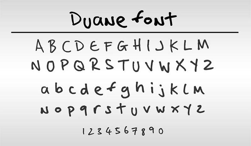
On another inspiring note, Kellogg’s took special care with the font that would go on the packaging and communications from the Pop Tarts family. In 2013, Kellog’s formally purchased the original ‘Duane Font’ for the Pop-Tarts Crazy Good promotional campaign. The brand, till date, uses unique and quirky fonts for its marketing efforts.
National Geographic
Are you wondering why the logo design of your brand does not look so striking and unforgettable like that of big brands? We will let you in on a secret – it’s because they design their fonts too.
Yes, it is true. And case in point would be the media giant – National Geographic. In 2016, the brand decided to revamp its visual identity and change its functionalities too. This obviously meant that the company needed a logo change. They roped in the best graphic designers and developed a custom font that would be unique to the brand in itself.
They developed a font family, Geograph, that has 24 styles, and is an important component of the brand’s new look and identity. The font family has two subdivisions – Geograph and Geograph Edit. The typeface is the main display set and carries sharp detailing, and is built with round dots and smooth joints. The designer felt it was more similar to Futura and preferred this version.
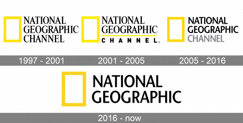
Playing around with various fonts helped the graphic design service team deliver this unique style. You too can replicate this result for your brand by working with unlimited design companies and designers to understand the workings of typeface design.
Starbucks
Next comes in a crowd favorite and an inspiration in the world of branding and marketing too. Yes, Starbucks. Your local coffee shop has nothing on Starbucks and everyone knows that. This is mainly because the company has spent decades building a solid brand that people recognize just by the coffee sleeves.
While the Starbucks logo has undergone a lot of edits and variations, the font in itself is as striking today as it was a few decades ago. The brand uses a custom font but the closest match is a font called the Freight Sans for its logo.
Freight Sans which is the closest match to Starbucks logo font makes it ideal to use in text and display creatives, and has an extensive style set including but not limited to roman, italic, old style, tabular figures, and more.
The brand has been able to maintain branding consistency across mediums mainly because of its extensive brand style guide.
Wendy’s
If you are a Twitter user, you know that fast food joints have been acing the customer interaction facet of social media marketing. In fact, they have become more popular for their memes and punchlines than their food on many occasions.
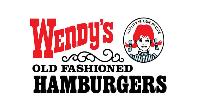
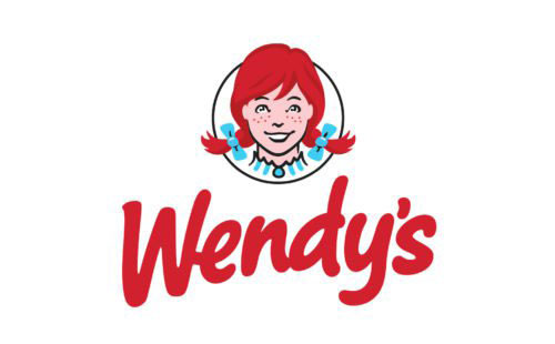
A brand with both impeccable brand recall and a strong social media presence is Wendy’s. We all have seen the tweets and the always recognizable logo with the smiling face. While the mascot has been a constant, the font used by the company in their logo has undergone quite a few iterations.
It started off with a serif typeface in 1969 but has since been upgraded to a custom font that has a modern script that resembles handwriting. Since the brand targets a younger audience and wants to build a personalized connection, the change was a good choice.
Chipotle
Speaking of fast-food joints and strong social media presence, how can we not talk about an American favorite – Chipotle. The brand is a household name and so is its logo design. We can spot it a mile away from the package, especially the trademark colors. But have you ever noticed the unique way in how the brand name showcases on the wrappers? Let us see what makes them so special.
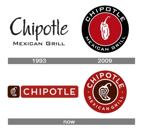
The latest logo that Chipotle uses is also a custom font but it is a font that you can see is slightly modified from the Gotham Bold typeface. The original version did not have the customization on the letter “E” to bring in the retro feel. The type is currently more rounded and gives a very friendly feel to the whole logo revamp.
You can adopt this for your brand too if you are going for a similar display of personality.
Gymshark
When the COVID-19 pandemic seized the world, it also opened the opportunity for a few brands to leave their mark on the world. One such brand that quickly rose to fame is Gymshark. They boosted their social media presence and reached out to thousands of customers looking for help in their fitness game. The sportswear giant is one of the most respected brands of the industry.
And to say that their logo design is interesting would be terribly underplaying it. The brand uses a unique two color combination in their logo and has a stencil to bold typeface transition too. The typeface looks close to a Bebas Neue Regular and is extremely memorable and suitable to a fitness brand. It is also minimalist which fits the top trend in the typeface industry right now.

Fenty Beauty
Social media platforms like Instagram and TikTok have become home to widely popular beauty and health brands taking the world by storm. These new age brands are not just building their business but are also extremely focused on building a brand empire.
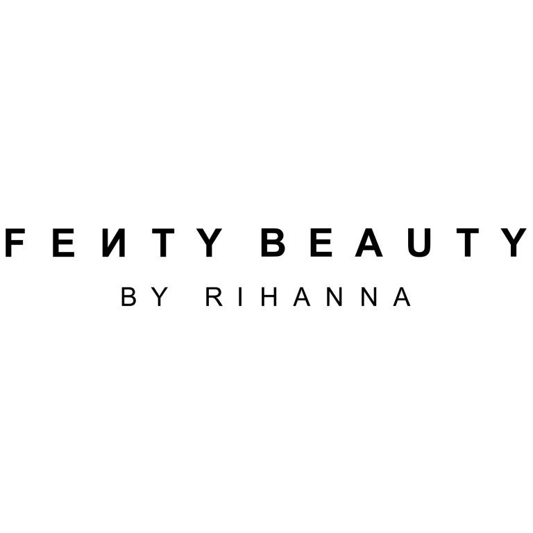
Rihanna’s Fenty Beauty is definitely on its way to becoming a brand empire. Coming from the iconic Pop Artist, Fenty Beauty needed a unique and completely trendy visual identity too, so they roped in a design team to deliver it.
As many others before them did, they developed a custom wordmark logo with distinctive letters (F and N) to help the logo stand out and own its space too. The designers used a special adaptation of Grilli Typeface GT America Compressed Light with the legacy N reversed. Clean, modern, and aesthetically pleasing designs are a central theme of this logo design.
This is an exciting time for the world of branding. So much to explore and so much acceptance from the audience for all your experimentations, if done right.
So seize the day and get inspired by these social media brands that are absolutely acing it.