Choosing the Best Font for PowerPoint: 10 Tips & Examples
There’s a fine art to creating a great PowerPont presentation that wows. With so many tricks and features in this little bit of software, it’s more likely to see a bad presentation than a good one (and you don’t want to be that person!)
While there are a lot of factors that contribute to the overall design, choosing a suitable font for PowerPoint is near the top of the list. The audience needs to be able to read the words on the screen with ease, to ensure that your presentation is as effective as possible.
So how do you do it? Where do you start when choosing a font for PowerPoint? We have 10 tips for you with a few examples of PowerPoint slides (and templates) that will impress your audience.
1. Stick to Fairly Standard Fonts
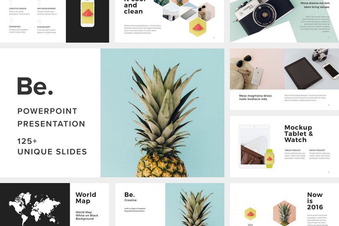
One of the most fun parts of a design project is getting to sift through fonts and make selections that fit your project. When it comes to PowerPoint, that selection should be pretty limited.
To make the most of your presentation, stick to a standard font to ensure that your presentation will look the same everywhere – and on every computer – you present. If you don’t use a standard font, chances are when you pop the presentation in a new machine, you’ll end up with a jumbled mess of lettering. PowerPoint will try to replace all the fonts it does not recognize with something else.
This can cause readability concerns and even make the presentation look like it’s error-filled (with words that are in odd locations or even missing).
10 standard fonts to try:
- Calibri
- Gill Sans
- Myriad Pro
- Cambria
- Corbel
- Constantia
- Garamond
- Caslon
- Georgia
- Tahoma
2. Incorporate Plenty of Contrast
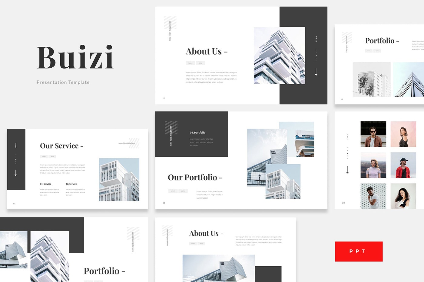
White and black text is easiest to read. But no type is readable without plenty of contrast between the background and text itself.
Regardless of what font you select, without adequate contrast, readability will be a concern. Opt for light type on a dark background or a light background with dark text.
Consider the environment here as well. Do you plan to show the presentation on a computer monitor or big presentation screen? How these conditions render can impact how much contrast your color choices actually have.
3. Use a Serif and a Sans Serif
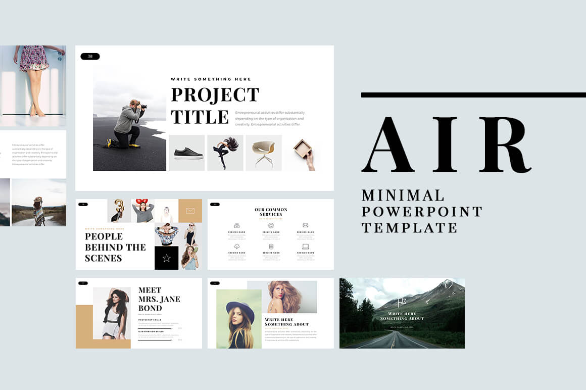
Most presentations use two fonts.
- Header font for headlines on each slide.
- Copy or bullet font for supporting text.
You don’t have to use the same font in each location. It’s actually preferred to select two different fonts for these areas of the presentation. For even more impact pair two different fonts, such as a serif and sans serif, so that the font change creates an extra level of contrast and visual interest.
4. Avoid All Caps
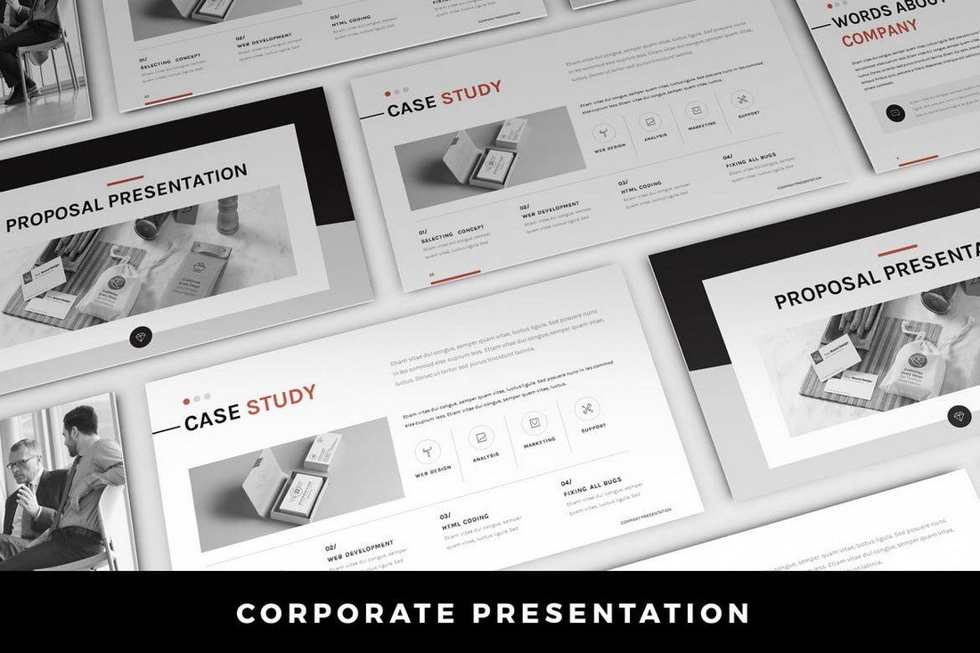
When picking a font, stay away from fonts that only include capital letter sets. All caps in presentations have the same effect as all caps in an email. It feels like you are yelling at the audience.
All caps can also be difficult to read if there are more than a couple of words on the screen. Use all caps as sparingly as possible.
5. Stay Away From Scripts and Italics
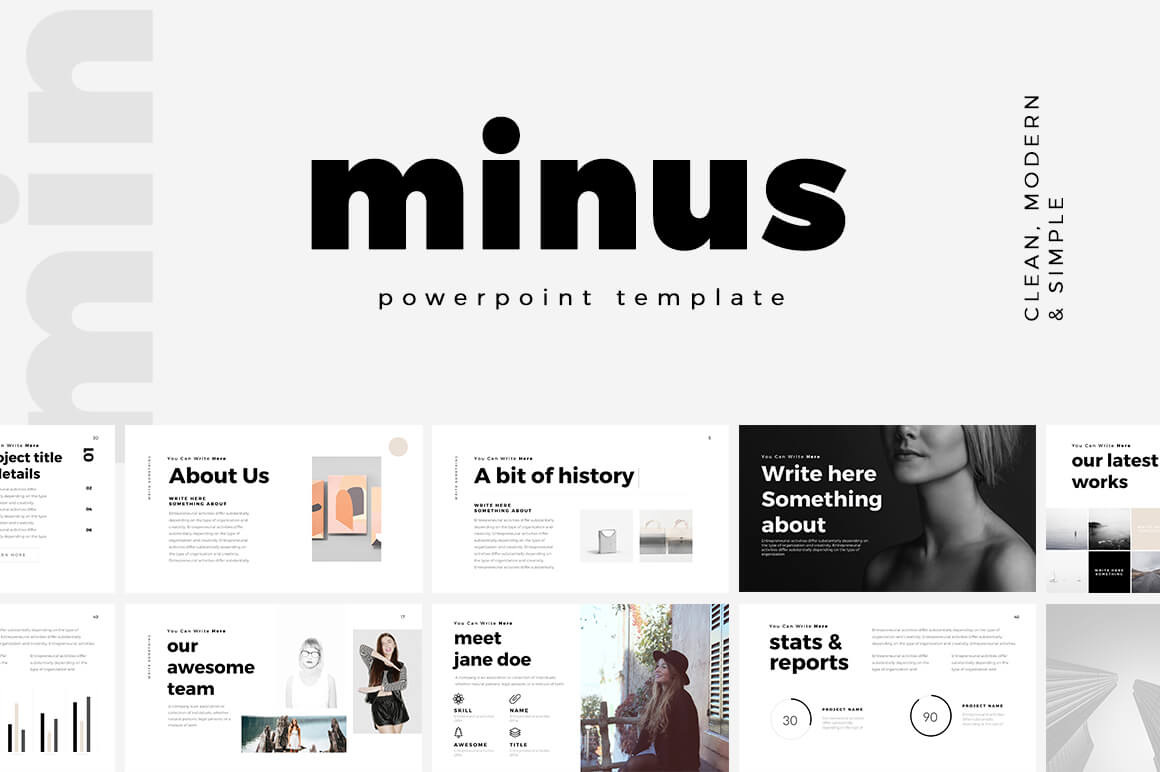
While scripts, handwriting and novelty typefaces might be pretty, they are often difficult to read. Avoid them in PowerPoint presentations. (There’s usually not enough contrast or size to help them maintain readability from a distance.)
The same is true of italics. Anything you do to a font to add emphasis should make it easier to read. While italics can be a great option online or in print applications, presentations come with a different set of rules. The biggest contributing factor is that text often has to be read from a distance – think about audience members in the back of the room – and any slanting can make that more difficult.
6. Make It Big Enough
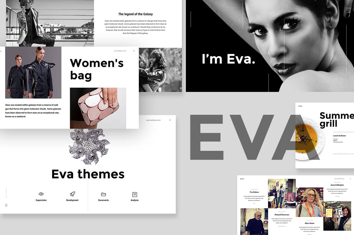
One of the biggest issues with fonts in slideshows is often size. How big should the text in a PowerPoint presentation be?
While a lot of that depends on the font you decide to use, there are some guidelines. (These sizes work wonderfully with the 10 fonts options in top No. 1. As well.)
- Minimum font size for main copy and bullets: 18 points
- Preferred font size for main copy and bullets: 24 points
- Preferred font size for headers or titles: 36 to 44 points
Make sure to think about the size of the screen and room as well when planning font sizes. With a smaller screen in a larger space, everything will look smaller than it is. The opposite is true of an oversized screen in a small room. Think Outside the Slide has a great font cheat sheets for a number of different screen sizes.
7. Turn Off Animations

Don’t let all those PowerPoint tricks suck you in. Moving text, zooming words, letters that fly in from the side of the screen – they are all difficult to read. And really distracting.
If you want to use an effect, “Appear” is acceptable. But there’s no need to dazzle the audience with crazy font tricks. All this really does is distract people from what you are really trying to say.
The same mantra that we use with all other design projects applies here as well – KISS or Keep It Simple, Stupid.
8. Plan for Sharing

While many users work with PowerPoint regularly, chances are that you’ll be asked to share your presentation slides for others. This includes posting with tools such as SlideShare, emailing the PowerPoint (or putting it in a drop folder) or sharing via Google Slides.
When it comes to fonts, Google Slides is the most complicating factor because it has a different suite of standard fonts than PC or Mac operating systems. Make sure to test the presentation in this environment if you plan to share and use a Google standard font or make sure to include the font you plan to use in the customization options.
9. Think About the Notes, Too
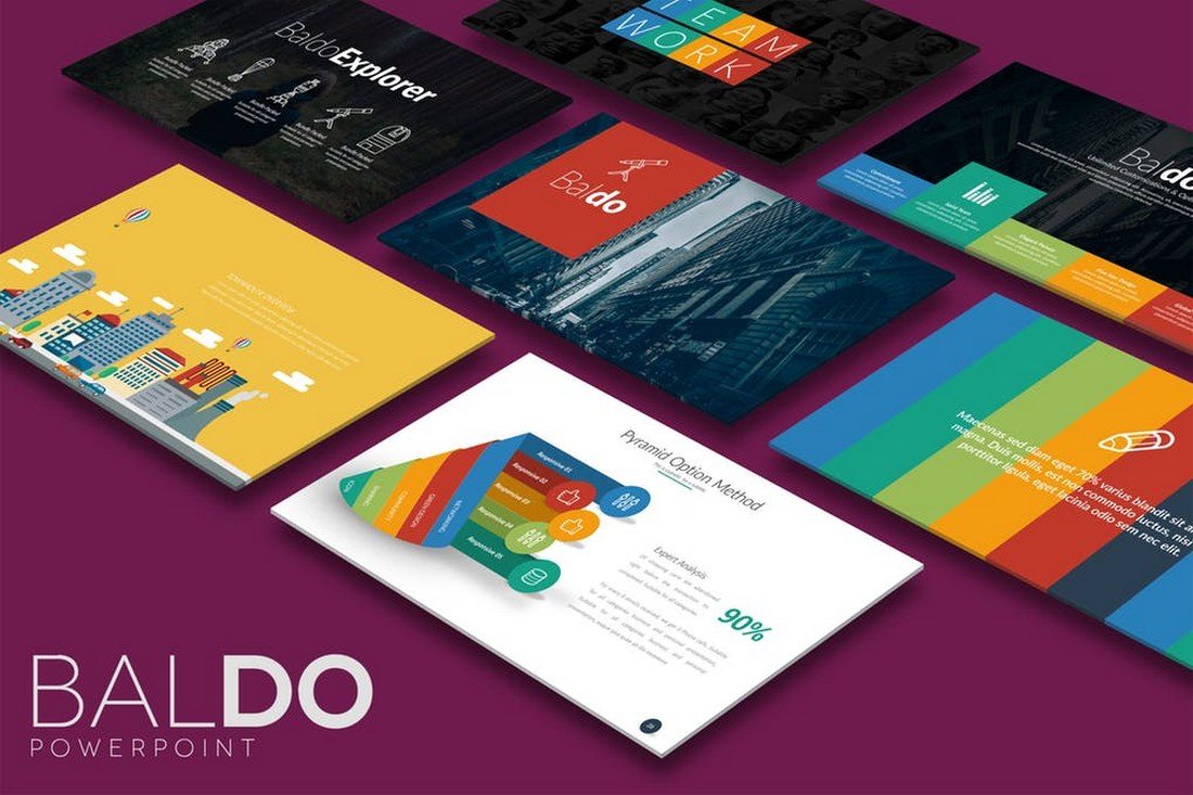
The part of PowerPoint presentations that is often neglected is the notes section. If you plan to distribute a presentation file to the audience (digitally or via printouts), the font selection for accompanying notes is important.
Use the same typeface as for the main slideshow with related corresponding headers and body and bulleted text. The big difference here is size. Body copy/bulleted information should fall in the range of 9 to 12 points and headers should be 18 to 20 points. This is a comfortable reading size for most documents. (These sizes also help ensure clear printing on standard office machines.)
10. Use Fonts Consistently

You don’t need a huge font library to create great PowerPoint presentations. Having a couple of go-to fonts that you use consistently is enough.
Make sure to use fonts consistently within a document as well. Create a PowerPoint template file so that when you use different levels of bulleting and headers, the sizes, color variations, and fonts change automatically. (Web designers, this is just like using H1 through H6 tags.)
A clear consistent use of fonts makes your presentation about how it looks and how easy (or tough) it may be to read and more about the content therein. (And that’s what it should be about.)
If you don’t feel comfortable making your own PowerPoint presentation template, you can download one to get started. These options might have a more refined look than some of the software defaults (and all of the examples in this article come from these collections).
- 25+ Minimal PowerPoint Templates
- 20+ Best PowerPoint Templates of 2018
- 60+ Beautiful, Premium PowerPoint Presentation Templates