7 Conversion Rate Optimization Techniques That CRO Pros Recommend
You’ve got the traffic. Now, you’re ready to start driving more conversions for your business.
As your organization’s conversion rate optimization (CRO) expert, it’s crucial to recognize which experiments are worth your time. Otherwise, you could waste weeks (or even months) on a test that has little-to-no impact on your conversion rates.
That’s why we’ve compiled the top seven conversion rate optimization techniques of CRO professionals:
- Check conversion rates for mobile devices, browsers, and more
- Fix the most common CRO issues
- Invest in a faster page speed across your site
- Create CTAs that anticipate user needs
- Focus experiments on content above the fold
- Reduce on-page distractions
- Complement concise headlines with bold visuals
1. Check conversion rates for mobile devices, browsers, and more
You can quickly find conversion optimization opportunities in Google Analytics. That’s because Google Analytics provides insight into how people interact with and behave on your site, which can alert you to issues invisible to you and your team.
Log into your account and look at the following reports:
- Behavior > Technology > Browser & OS
- Behavior > Mobile > Devices
- Behavior > Site Content > All Pages
- Behavior > Site Content > Landing Pages
For the “Site Content” reports, add “Device Category” or “Browser” as a “Secondary dimension.”

With these three reports, you can discover conversion-related issues by looking at the following metrics:
- Bounce rate
- Average time on page
- Goal conversion rate
If you notice that a page accessed through Safari versus Chrome, for example, posts a lower conversion rate, that could alert you to a potential issue with how that page displays in Safari. A higher bounce rate on pages accessed through mobile could also indicate a display issue.
These reports provide you access to quick wins for your business.
You could fix a conversion issue across your site, which could have a tremendous impact on your conversion rates. Even better, improving your website’s usability can also improve your rankings in search results, which can help you capture more traffic.
2. Fix the most common CRO issues
Whether your organization is just starting CRO or you’re taking the lead, it’s smart to begin with fixing existing issues on your site. Like the previous conversion rate optimization technique, this tactic can help your business improve conversions across your website.
Some of the most common CRO issues include:
- Having your calls-to-action (CTAs) below the fold:
Your above-the-fold content is what everyone sees when arriving on your page — content below-the-fold isn’t so lucky. That’s why it’s critical to include a CTA above the fold, whether it’s to encourage people to keep reading or contact your team because everyone will see it and know what to do next.
- Stuffing your title tags and meta descriptions with keywords
In most cases, your business will receive most of its traffic from search, which means you’re optimizing your website for search engine optimization (SEO). If you over-optimize your title tags and meta descriptions, though, you risk turning off users or setting the wrong expectations for them.
- Launching your conversion tracking with errors
With Google Analytics, you have a free website analytics platform for tracking your site’s conversions. If you plan to use a CRO tool like Google Optimize, it’ll even use your Google Analytics goals and events as objectives. That’s why it’s critical to confirm your Google Analytics setup works with accuracy.
Tackle these issues first, and you can set your CRO strategy up for success. You can also implement quick wins across your site, like relocating CTAs above the fold, which can increase your sitewide conversion rates.
3. Invest in a faster page speed across your site
When you investigate page performance in Google Analytics, you’ll likely discover that some pages underperform due to a slow page speed. Page speed is critical from an SEO and CRO perspective because people can’t stand slow sites — 53% will leave pages that take three seconds or more to load.
Not to mention, a one-second page speed increase can improve conversions by seven percent.
In Google Analytics, pages with a slow page speed will often post the following:
- High bounce rate
- Low conversion rate
- Low time on page
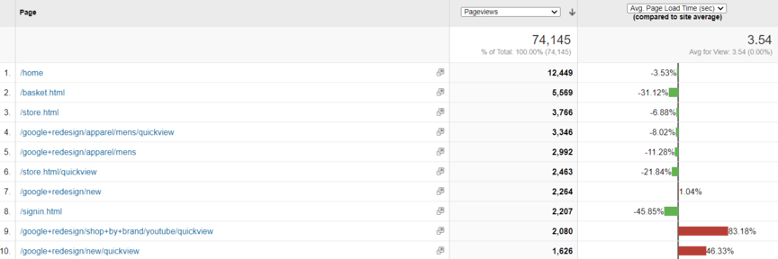
If you’re looking for another way to find slow pages, check out the Site Speed report in Google Analytics.

With this report, you can view every page’s average page load time — and compare that time to your website’s average. This report makes it easy for your business to find low-performing pages fast, as well as focus your research on your most valuable pages, like your product pages.
How do you fix page speed issues, though? In most cases, you’ll need to work with a developer.
You can get started, though, by entering your URL into Google’s PageSpeed Insights tool. This tool will provide recommendations for how your business can improve its page speed. In some cases, you can implement these recommendations right away, like by compressing page images.
Others, like condensing your HTML, JavaScript, and CSS, will require a developer’s help.
If your in-house developer doesn’t have the time or resources to help you, think about investing in page speed optimization services. These services will help your business improve its page speed, which can help your company improve its conversion rates, resulting in more sales, leads, and revenue.
Again, this conversion technique is one CRO experts love because of its sitewide impact!
4. Create CTAs that anticipate user needs
CTAs are like signal lights — they tell people what to do. Every page on your website should have one, whether it’s your product page inviting people to purchase your product or your blog post asking readers to download a related guide.
Experimenting with different CTAs is common in CRO, which is why this CRO technique focuses on how you approach CTA experiments. When you brainstorm calls-to-action, think about what your user needs or expects when arriving on your page.
For example, what does someone visiting a plumbing company’s blog post on how to fix a clogged toilet expect?
- Tips for how to unclog their toilet
- Advice on whether they need to call a plumber
The plumbing company can meet these needs in the content, but also through CTAs that offer:
- An easy-to-print, downloadable illustration that outlines the steps for how to unclog a toilet
- An invite to take the company’s diagnostic assessment on whether to call a plumber
The CTAs themselves should use clear and concise language, like “Should You Call a Plumber? Take the Assessment,” or “Save Time Next Time: Download the 1-Page Printout.” In this scenario, these CTAs can help the company attract new clients and new subscribers that could later become clients.
If you aren’t sure what users expect when arriving on a page, check out the search results for similar pages. See what companies ranking on the first page of search results offer, and then launch an experiment that incorporates that offer or CTA language into your page.
5. Focus experiments on content above the fold
Everyone sees the top of your page.
After that, though, people drop off rapidly, which is why it’s essential to focus experiments on content above the fold. If you focus too much on content below the fold, you’ll often struggle to get decisive results from your experiments.

This conversion technique fits naturally with the other recommended conversion rate optimization techniques, like including a CTA above the fold and optimizing that CTA to your user’s immediate and anticipated needs.
Above the fold experiments can include changing:
- Headlines
- Descriptions
- Visuals
- CTAs
- Navigation
- And more
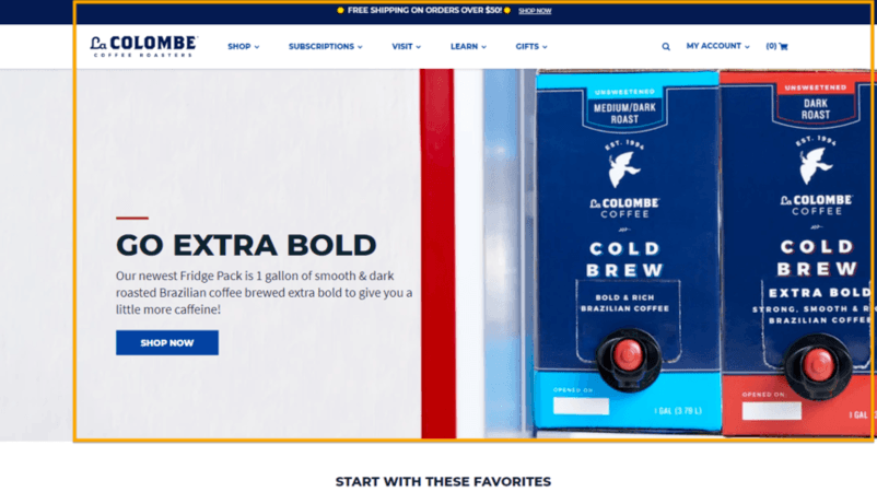
If you aren’t sure which part of your page registers as above the fold, the area is typically 1000 pixels wide and 600 pixels tall. However, keep in mind that user screen sizes will influence what someone sees when initially arriving on your page.

In Google Analytics, you can view your most common screen sizes. Just open the Audience > Mobile > Overview report, and select “Screen Resolution” as your secondary dimension. You can then see the most common resolution used to view your site.
6. Reduce on-page distractions
You can’t combat off-page distractions, like someone receiving a phone call, but you can fight on-page distractions, like pop-ups, which is why it’s one of the best conversion rate optimization techniques available.
On-page distractions typically result from multiple stakeholders wanting their message broadcasted. This issue usually happens in larger companies, especially those with numerous divisions and types of product offerings.
Apple’s website demonstrates this challenge — and offers inspiration for solving it.

The company’s website makes a clear commitment to its iPad Pro by giving that product the above-the-fold space. After that, Apple allows users to view its related products, starting with the iPhone, iMac, and other offerings.
Overall, Apple prioritizes its homepage based on product importance.
Apple TV+ isn’t the company’s primary revenue source, which is why that service appears at the bottom of the page and why the iPhone appears at the beginning of the page. While developed by separate teams, Apple got its department heads in alignment with the company’s strategy.
You need to do the same when it comes to your business and its website.
Get started with this conversion technique by taking a page and compiling a list of potential distractions — distractions pull users away from your CTA. Then, experiment with removing those distractions. You can then use the data to persuade stakeholders (if needed) to cut those elements from the page.
If you want an example of a distraction-filled page, visit Forbes’s website and try to read an article. For many users, the number of ads on the page makes reading distracting. In some ways, this approach might align with the company’s goal to get you to subscribe for unlimited access.
7. Complement concise headlines with bold visuals
Visuals can range from images to GIFs to videos. Video, however, is one of the most effective.
Like most marketers, you’re probably familiar with the statistic that one minute of video equals eight million words. However, video is extremely effective at getting someone’s attention and getting them to become clients.
One study, for example, found that video can improve conversions by 86%.
That’s why many CRO experts recommend this conversion rate optimization technique. Build concise, to-the-point headlines and then bring them to life with video. If you can’t use video, opt for high-quality images of your product, staff, or even clients.
Check out La Colombe for a non-video example. The company relies on mouth-watering visuals that show the product packaged and in use on this product page — just look at those frothy bubbles. No wonder the product sold out!

For a video example of this CRO technique, check out Rothy’s.

The company includes a video with its product listings to show the product in motion. In the example above, shoppers can use the video to see just how much the company’s bags will hold, which can help them make an informed purchase decision.
Increase your conversion rates with these conversion techniques
Congrats! You’ve now got a list of conversion techniques you can use to increase your company’s conversion rates. If you already know you’ll struggle to use these tactics in your business, though, due to a lack of time or resources, our award-winning team of 300+ professionals can help.
See how by exploring our CRO plans or contacting us online to speak with a strategist about how our custom strategies and data-driven approaches have helped our clients earn more than $2.4 billion in revenue over the past five years!
2.4 Billion
IN CLIENT REVENUE
6.3 Million
Leads for our Clients
4 Million
Client phone calls
Our digital marketing campaigns
impact the metrics that matter most!
Learn More