Full-Screen Video Backgrounds in Web Design: Pros, Cons & Tips
There’s still a debate going on in the web design community on whether video backgrounds in websites are good or bad.
However, we’ve seen a rise in websites utilizing fullscreen video backgrounds in the past few months than ever before. But is it really an effective strategy? Does it help engage with an audience? Does it affect SEO? Let’s find out.
In this guide, we aim to find answers to these questions by comparing the pros and cons of using fullscreen video backgrounds in web design. We’ll also give you a few tips on properly implementing a great video background with examples. Let’s dive in.
Benefits of Using Fullscreen Video Backgrounds

There’s a reason why fullscreen video backgrounds are so popular in web design these days. There are many benefits of using them. Even if you need to convince a client to use a video background, these points will come in handy.
Instantly Attract Attention
Video backgrounds are more effective at attracting attention than image or solid color backgrounds. The above the fold section is the first thing a visitor sees when they visit your website. And you only have 3 seconds to convince the visitor to stay on the site and keep browsing.
With a video background, you have a higher chance of grabbing their attention and keep them on your site for longer.
Simplify Complex Topics
If a picture is worth a thousand words then a video has to be worth at least a thousand pictures, right? That’s probably why 93% of marketers believe that video is an important part of their strategy.
Videos can simplify and explain even complex topics for any audience to consume. This makes the medium more effective for lesser-known brands, products, and corporations for explaining their services to an audience quite easily.
Showcase Products & Services
Video backgrounds also provide you a way to showcase your products and services in a more appealing way.
For example, adding a video background to a hotel website showing off the luxurious rooms and spas will surely give your potential customers a reason to make a booking.
The same applies to landing pages, business websites, restaurants, and even eCommerce websites. With a video background, you can showcase more products than you would have with an image carousel.
Boost Sales
If there’s one point that will get you and your clients interested in video backgrounds, it’ll be this. Using video backgrounds can actually help improve sales and conversion rates.
In one case study, adding a video background to the homepage increased the website conversion rates by 138%.
In fact, adding a simple explainer video to a landing page is enough to boost sales. With video backgrounds, you’ll have a subtle way of presenting your services without interfering with the user experience.
Make an Emotional Connection
Video backgrounds in websites also do wonders at presenting more sensitive topics to an audience. And they are very effective at making an emotional connection with the user as well.
For example, if you’re making a website for a charity or a non-profit, you can use the video background to give context or give a behind-the-scenes look at what you’ve done to help the cause.
Downsides to Using Fullscreen Video Backgrounds

There are more pros to using fullscreen video backgrounds than cons. But, these cons can make a huge impact on your website growth.
Affects Website Loading Speed
The biggest downside to using video backgrounds is the slow loading speeds. Since videos are much larger than images in size, they take up longer to load. This is especially problematic to users with slow internet connections.
According to a report, more than 50% of users said they’re willing to give up video and animations on websites for better load times.
Not Available on Mobile Devices
Auto-playing video backgrounds are still not fully supported on mobile devices. As a result, most websites that use video backgrounds are forced to use a static image version of the mobile website.
Providing completely different experiences on mobile and desktop versions of the website will only confuse the users.
Compatibility Issues on Older Browsers
Even though more people are now switching over to the latest versions of browsers and apps, a considerable amount of people still use older and outdated browsers.
Statistics show that there are people who still use highly outdated browsers like Internet Explorer 9.
HTML 5 fullscreen video backgrounds are not supported in such older browsers. While it’s easier to ask your audience to use a modern browser to explore your website, it’s not convenient for the user.
Difficult to Highlight the CTA
Unlike an image or solid color background, videos have many scenes with different colors and flashing lights. This makes it very difficult to highlight your headlines and call to action (CTA) above a fullscreen video background.
Unless you’re willing to use colors and components out of your base color palette, it won’t be easy to give attention to your website title, subheadings, and CTAs while using a video background with fast-moving scenes.
Examples + Tips For Fullscreen Video Backgrounds

You can avoid many of the downsides to using fullscreen video backgrounds by implementing the right techniques when adding a video background.
Here are just a few tips and examples of how it should be done.
Pick the Right Video

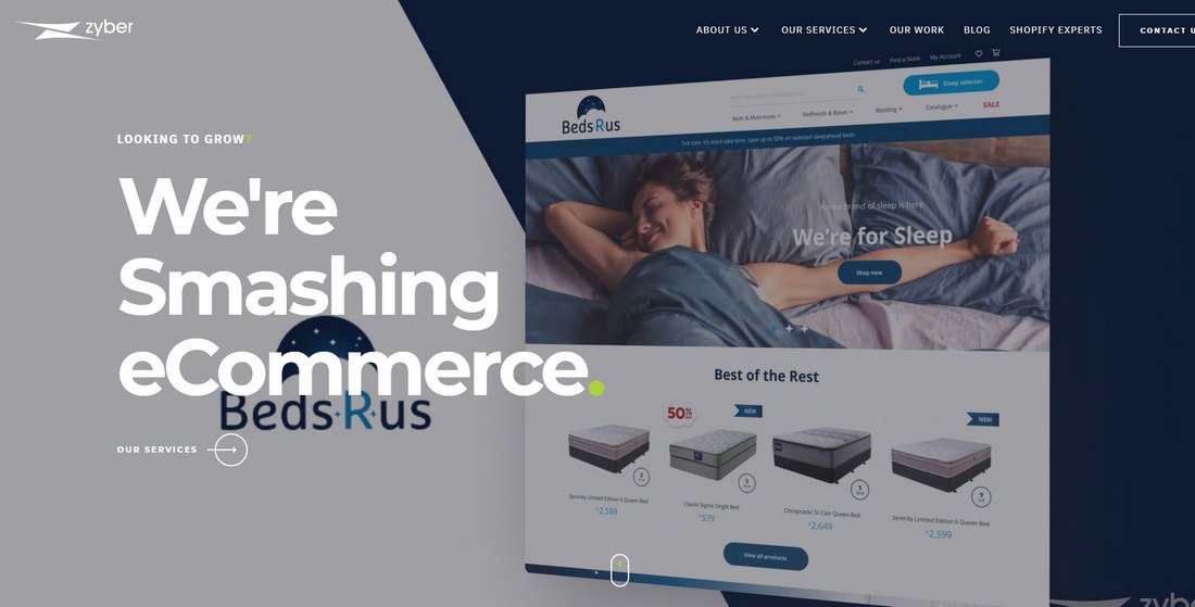
(Example: Zyber)
This is the most obvious yet more crucial part of using a fullscreen background video— Choosing the right video makes a huge difference in how big of an impact you make. As well as how it blends well with the overall user experience of the website.
For example, instead of using fast-moving videos with flashing lights, you should opt for a video with a more soothing and slower pace.
Keep It Short

(Example: Lakeside)
We’re living in a fast-moving world with very little patience. It’s safe to assume that a person wouldn’t want to stare at your background video for 3 minutes or 5 minutes. Besides, you’ll want them to rather explore the rest of the website and persuade the user to take action.
So it’s best to use a very short video for the background. A video with a length of under 30 seconds would fit in perfectly with the website. And, if you plan on adding a looping video, make sure it has a smooth loop transition.
Avoid Distracting Videos

(Example: Phantom Hire)
Videos can also be distracting at times. For example, videos that have high-contrast colors, visual effects, and flashing lights can actually take the user’s attention away from the important parts of your website.
It’ll be difficult for a person to focus on the call to action or even read the title of the website when there’s a background video taking attention away from it.
It’s best to use a video with fewer distractions or elements that steal attention.
Highlight the CTAs

(Example: Staffsolutions)
The CTA is arguably the most important component of a website or landing page. You’d want the visitors to see it clearly and persuade them to click that “buy” button.
It’ll be a challenge to highlight the CTA when using a fullscreen video background. But it’s not impossible.
You can use filters to de-saturate video colors, make the video black and white, or even use videos that have fewer colors or minimalist looks to easily highlight the CTA and titles on the website.
Don’t Include Audio

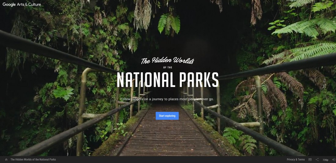
(Example: Hidden Worlds of the National Parks)
Adding background audio to a website can help create the atmosphere for the website, but auto-playing audio is not the way to do it.
You always have to consider that people visit websites from different places and devices, no one wants to suddenly have audio blasting through their phone while on the bus. Or when visiting a website at the office.
Fix this by removing the audio from your video before using it as a website background, implement an option to toggle audio only when the user chooses to, or at least give a warning to the user when loading the website.
Optimize for Speed

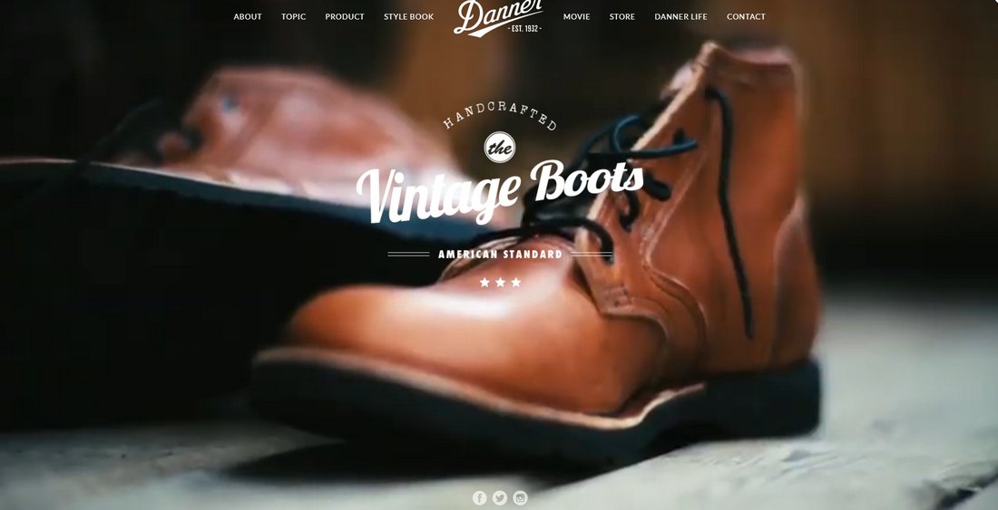
(Example: Danner)
There are a few ways you can optimize the video to make the background have less of an impact on website loading times.
Properly compressing the video is crucial. You can use tools like Handbrake to achieve that goal. Also, consider using the right resolution for the video. Getting rid of the audio will help reduce the file size as well.
YouTube vs Self-Hosted Video Backgrounds

(Example: Blacknegative)
There’s also a question of whether it’s good to host the background video on YouTube or self-host on the server. There are advantages and disadvantages to using both methods.
If you host the background video on the same server, the user will have to wait until the video is loaded before exploring the website. But, it makes sure the video is only in your control and not discoverable on YouTube.
Of course, you can avoid this by adding a loading screen to the site.
Hosting the video on YouTube will improve loading times and have less of an effect on bandwidth. But it’ll give you less control over how the video is displayed.
In Conclusion
Overall, there are more benefits to using fullscreen video backgrounds than other formats. Then again, it depends on how and why you use it. Because video backgrounds are not suitable for every website. It could make or break the website’s user experience.