Responsive vs. Adaptive Design: Everything You Need to Know
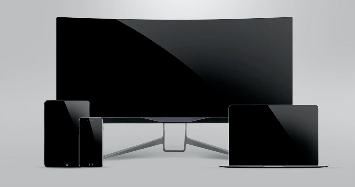
It’s a no-brainer for most website designers that your finished product needs to look and work on every type and size of device. Gone are the days of creating multiple designs to accomplish the same goal.
It all comes down to choosing a responsive or adaptive design model to achieve a consistent website design at any size.
But what’s the difference between responsive and adaptive? Are they really just the same thing? Let’s take a look and explain everything you need to know.
Two Approaches to Device-Agnostic Design

At their core, responsive and adaptive technologies probably look the same to end-users. Both design and development methods are created to make websites look and function well on all device types.
The primary difference is in how you go about the creation of websites using responsive or adaptive technologies.
Responsive Design

Responsive design is a “household” term for anyone who works with websites. Maybe almost surprisingly, it isn’t that old.
It was coined by Ethan Marcotte in 2010:
Now more than ever, we’re designing work meant to be viewed along a gradient of different experiences. Responsive web design offers us a way forward, finally allowing us to ‘design for the ebb and flow of things.’
And that’s really where our current school of thinking about responsive websites springboarded from.
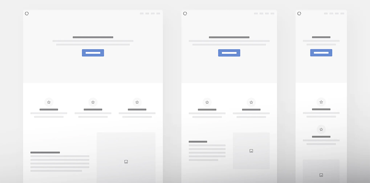
Responsive design is a technology in which websites “respond” to the size of the browser at any given size so that the design is optimized for the screen. Ideally, users should get the same experience from a single website whether they are holding it in their hands on a mobile device that just a few hundred pixels wide or looking at it on a super-wide screen monitor.
Responsive websites use a lot of elements you are likely familiar with: media queries, flexible grids, and responsive images. It is probably the most popular method of designing for multiple screen sizes. (Purists will note that responsive design has nothing to do with devices themselves, only size, as opposed to adaptive which detects device type among other things on the path to a perfect rendering.)
According to the Interaction Design Foundation, responsive design is easier and takes less work to implement. This might be why it is more widely used.
Responsive designers create a single design to be used on all screens and will generally start in the middle of the resolution and use media queries to determine what adjustments will be made for the lower and higher end of the resolution scale. This tends to make users happy, because that familiar web design seems guaranteed to translate across to any device’s screen. Uniformity and seamlessness are crucial considerations in providing a good user experience.
Further, responsive design is often the choice for large websites because of the development time involved. Responsive design is rooted in a grid system, responsive measurements (think percents or minimum and maximum values) to help the design expand, contract, and stack at different sizes.
This design technique is the norm for new development.
Pros of Responsive Design
- The design will work at any viewport size, regardless of device or browser.
- Responsive design is search-engine friendly (Google even recommends it).
- Allows for a lot of precision in the design so that designers can adject any or every detail.
- Highly mobile-friendly design option.
- Common design practice that’s compatible with plenty of themes, website builders, and tools that you might use for website projects.
- The design will have a uniform and seamless look, which is a boost for overall user experience.
Cons of Responsive Design
- It’s important to ensure that responsive elements will remain readable and accessible at different sizes, particularly smaller ones.
- Often require more coding than other websites, which can take time or lead to weight. It’s important to be aware and take care here.
- You can’t control every device size out there and you might end up with a design that’s off on older or more obscure sizes.
- Elements can move around on you and end up with odd placements from time to time, and even due to core content management system or website framework updates, so it is important to stay on top of changes.
Adaptive Design

Adaptive design is almost as old as responsive design. First used in 2011, the technique involves designing for specific device sizes and types for a more customized experience.
This is a great explanation from the MDN Web Docs archive: “Adaptive design is more like the modern definition of progressive enhancement. Instead of one flexible design, adaptive design detects the device and other features, and then provides the appropriate feature and layout based on a predefined set of viewport sizes and other characteristics.”
Designs are rooted in six fixed variations (widths):
- 320 px
- 480 px
- 760 px
- 960 px
- 1,200 px
- 1,600 px
The most common usage of adaptive design is to convert an older design into something that’s more mobile-friendly. That’s not to say it doesn’t happen with new development though.
Pros of Adaptive Design
- Mobile devices tell the design what they are so that the design is perfect for that device and browser type.
- Adaptive design provides almost exact control on the design side of things.
- Smart ads are a possibility, allowing linkages from smart devices.
- Adaptive designs tend to score higher on speed tests than responsive counterparts.
- The design can use more personalization features, connected to use of smart device options and adaptation.
- Good option for a small website that is in need to a refresh because you only have to “design” the smaller sizes.
Cons of Adaptive Design
- You can run into issues with some less common devices, such as tablets, when designing, due to configuration errors.
- Adaptive design can be labor intensive, requiring more development time and cost.
- Search engines have a more difficult time with adaptive sites, dues to content duplication.
- There’s the sneaky reality that you design the same website six times.
Conclusion
There’s no right or wrong to using responsive or adaptive design. It’s rooted in your goals and what you want to accomplish with the design.
Pick the technology that works with what the website should accomplish in terms of content, search, user experience, time, and budget.