Dealing With Your Ego as a Designer
A fundamental difference between programming intensive web-development work and graphic-focused web design is that everyone – client to business associates – has an opinion and an alternative vision for the latter.
The technically-steep learning curve of coding tends to elicit few opinions and observations, simply because only a handful of clients actually possess the technical skills or knowledge to analyze and interpret such work.
Not so with design. Design, in any medium or form, is a manifestation of individual tastes, which, again, are influenced by any number of factors ranging from natural predisposition to upbringing and education. It is particularly difficult to work for a living in any design-oriented field, as clients will often have opinions and suggestions that run contrary to your own vision as a designer.
It need not matter if these critics actually possess the training or the skill to spot good design from bad design; the mere fact that design elicits an emotional response also causes them to be opinionated.
Every designer, in due time, must learn to deal with these criticisms and tame the ego before walking into any job, for these suggestions and opinions often can prove helpful to the design process.

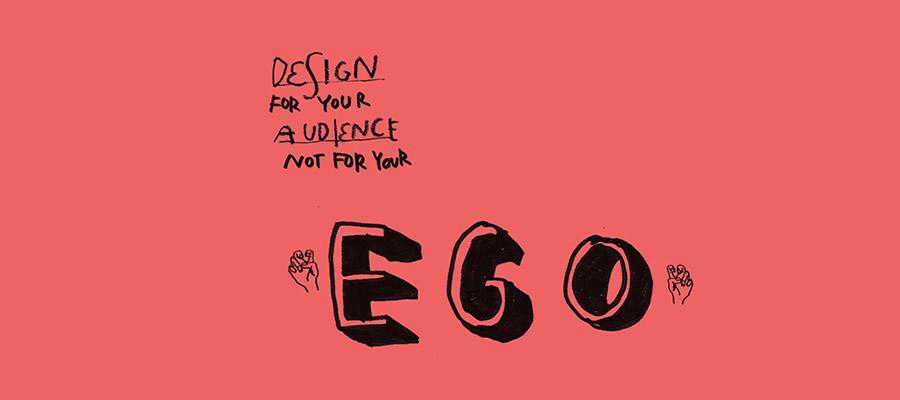
Design For Your Audience Not For Your Ego by Marcel Bachran.
The Visual Response
Designers deal with visual media. As human beings, we are primarily a visually-oriented species, sight being one of our most well-developed senses. What we absorb through our eyes often resonates at a far deeper emotional level than something that can be analyzed and interpreted (such as programming work). A picture, after all, speaks a thousand words.
Working in a visual medium allows designers to create stories sans the use of language or words.
The right tinge of blue, the precise tilt of a logo, or the round curves of a particular font can often arouse different emotional responses. The color red is often associated with power, green with vitality, and blue with calmness. The Von Restorff effect dictates that colors and elements that stand out from the rest of the design can dramatically alter recall rates of a product or a message.
While there are protocols and standards that designers can fall back on, creating a unique design for a client often comes down to the designer’s own vision – something that may not always be aligned with that of the client and can become the source of much friction and ego-bruising on either side.
Often, it comes down to a showdown between the client and the designer’s ideas. There are two ways to deal with this: a stick-to-your-guns approach, exhibited most volubly in popular culture by Mad Men’s Don Draper and his steadfast belief in the superiority of his own vision; or a show-and-grow approach that would take the best of all parts to build a better sum, but perhaps sacrifice parts of the initial vision.

Don Draper by David Cousens.
Show, Tell, and Learn
In technical tasks, there are strict protocols to follow and yardsticks to measure success against. A site that doesn’t load quickly is inefficient. A user authentication system that grants back-end access to unauthorized users is insecure. A website template that utilizes HTML tables instead of CSS is simply outdated.
The same isn’t true for design, where the difference between good and great design can be a matter of perception. Of course, usability testing can offer some statistical insight to help separate design efficiency, but on the whole, design remains a highly personal endeavor. There are often instances when it isn’t obvious as to whose ideas should prevail, or if a certain vision is worthy of pursuit.
To lead in a design-oriented setting is to be willing to accept suggestions and endeavor to change. This can include feedback from colleagues as well as clients.
A designer’s job is to fulfill a client’s requirements, which can often involve listening keenly to their ideas, and even incorporating some of their suggestions into the final design, even if it alters your own vision (but be careful: there is a thin line between alteration and compromise).
The Point
The point being: there is no place for your ego in a workplace setting. When being hired by a client, a designer’s job is to please that client and create functional, visually engaging designs.
It is not to create art to the extent that such artistry prevents the fulfillment of any of the previous goals. Art is profoundly ego-driven; design should not be.
To not consider suggestions from colleagues would be akin to workplace suicide and will impact your bottom line as well as your ability to gain referrals.
The same goes for listening to clients. Not all clients are perfect, but you must seek out clients who can share your vision and engage in a relationship where there is a mutual appreciation for one another.

The Exceptions
But what about those who have shown bald-faced defiance for the norms and the opinions of peers alike, yet have succeeded?
I certainly don’t deny – these individuals exist. But they are the rare exception, not the standard towards which a designer should stridently aim. It is like aiming to be Picasso: many have tried, most have starved.
The Bottom Line
Despite what may have been paraded around in pop design culture, ego-driven design is hardly successful – in business, or in creative zest.
Learning to manage your ego, recognizing that there are no absolutes in design and that everything is open to interpretation and change, is one of the hallmarks of a good designer.