10 Best Examples of Welcome Emails for SaaS Businesses
Hello everyone. This time I’d like to focus my attention on the vital stage of our communications with end-users. You guess right, we’ll briefly explore welcome emails and onboarding in the SaaS sector.
A welcome email is a factor that determines your further relations, no matter are you B2C or B2B oriented in your business. A lion’s share of success and conversions depend on the very first impression. If you fail, there may be no second chance. This is the essential principle of the onboarding process. What is special about SaaS brands here?
What matters, first of all, is the digital online format of our relations with users. It’s a very rare situation when we meet personally. Chats, client support service… all channels are digital here. Including emails. So we must concentrate our efforts on these ways of communication.
Secondly, we provide clients with a digital product. That’s why it’s not enough for SaaS welcome emails to say “Hello dude, welcome”. Apart from showing our good manners, these campaigns should help customers with their adaptation to our app or online service.
How to do this? Just attach the manual.PDF file to welcome email, or add the screenshot of the user interface? Not the best way, to be honest. There are much more creative solutions.
And it’s not a problem today to implement similar efficient emails. With modern HTML email template editors like this one, you’ll certainly find the predesigned template that fits your goals. So we won’t stop with the technical issues, let’s better proceed with ten examples to inspire you.
1. Gmail
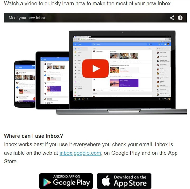
You may think that your product is the most user-friendly software worldwide. You can easily navigate its interface even with your eyes closed. But it’s a completely different situation when the users launch it the first time. They may not know how to use all the features, and even how to set it up correctly.
Gmail doesn’t write long manuals here. When it comes to email, it can’t be too long. Otherwise, subscribers simply won’t read it. Instead of many words, the Gmail team added direct links to the desired information. Their email is minimalistic yet informative and concise.
2. Mailchimp
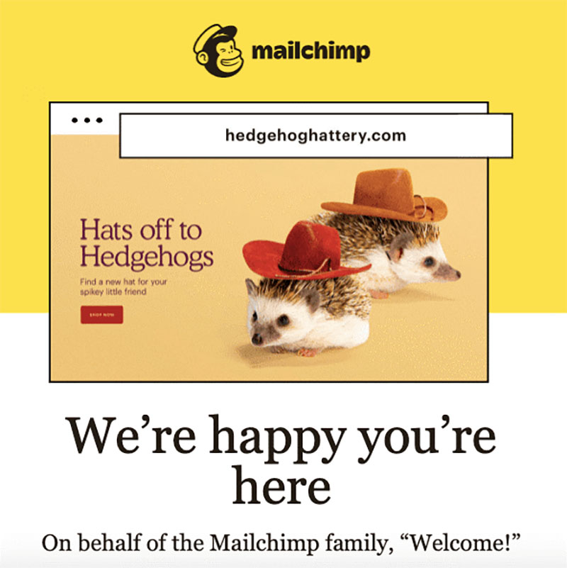
Another way to avoid the overuse of text content. This famous ESP service sends their newcomers an email with an attractive cute pic. This is much more catchy for users. Therefore, in addition to information about advantages and main features, Mailchimp provides a visually arranged component: a brief instruction and the possible result that we can reach when using their service.
3. Shopify
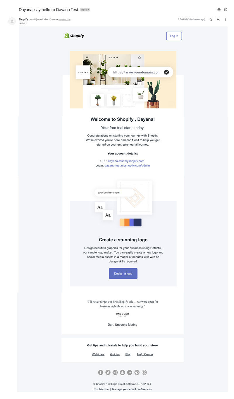
When new users sign up for Shopify, their team asks two simple questions: “why you’re creating a store”, and “what is your annual revenue”. Answers are immediately used to segment the database. Though this welcome message is generic for everyone, users understand clearly that forthcoming emails will be personalized according to the needs of each client.
4. Email on Acid
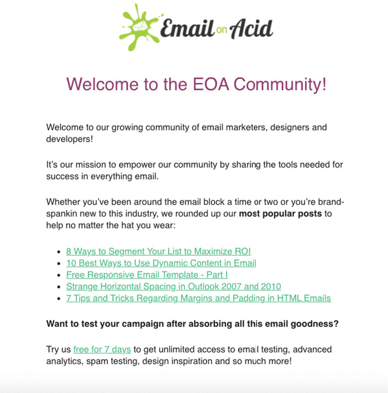
Familiar tool, isn’t it? If you use their services you’ve probably seen their welcome message. As we said above, SaaS welcome emails should contain some useful information. You can add some kind of introduction text, links to detailed instructions, and so on. Email of Acid has filled the message with maximum content for newbies and even added the link to buy the premium version. And notice, no visual overload here.
5. Netflix
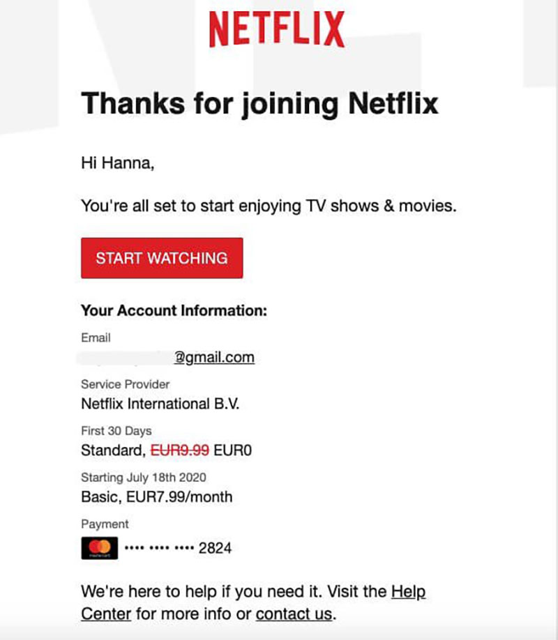
The mission of this email is not only to welcome users and tell them about the benefits of paid subscription. One of the best welcome messages for SaaS, an email from Netflix gives users the necessary information in a logical order. A price, then the duration of a subscription, and finally the billing details. All is clear.
6. Crello
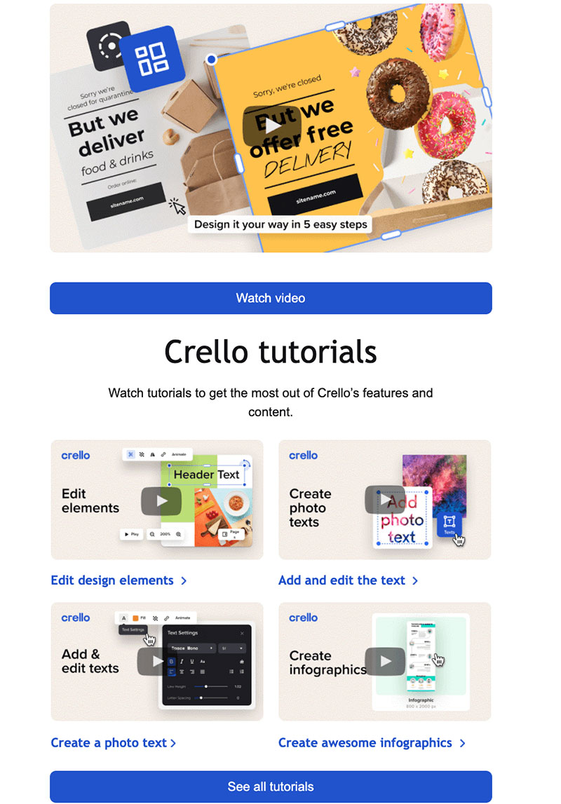
Another good example of SaaS onboarding. This brand offers user guides on how to use the helpful features of their service. Readers will find here a tutorial on how to edit texts, visual elements, and create infographics — notice that manuals are arranged as video tutorials. Do you know that embedded videos are in trend now?
7. Eventbrite
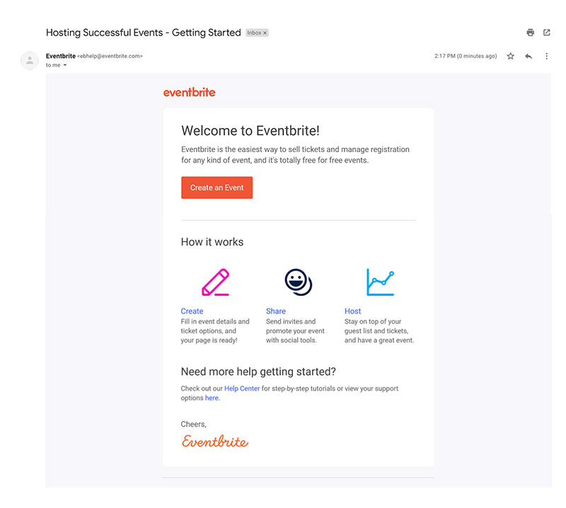
Stick to the minimalism and informativity principle just like Eventbrite do. This email is simple as SaaS welcome messages should be. Though it gives new clients the very essential information. After the brief and friendly welcoming, they briefly overview the three-step process of the service usage and add the contact of the support service. So users know what to do and where to ask for help if something goes wrong.
8. Wistia
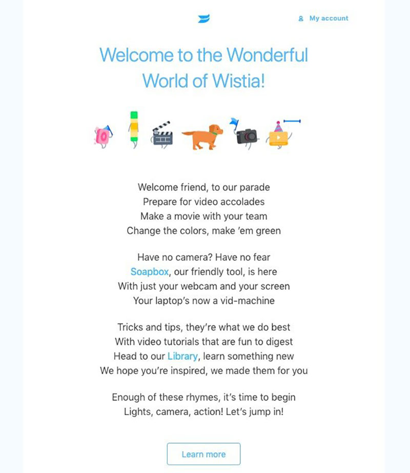
A business video hosting called Wistia comes with an amazing practice of adding memorable stuff to the onboarding email. Have you noticed that the email is viral? I look at the message and literally want to sing it :) At the same time, email is concise and informative. It answers the frequently asked questions on how to use the service.
9. Stripo
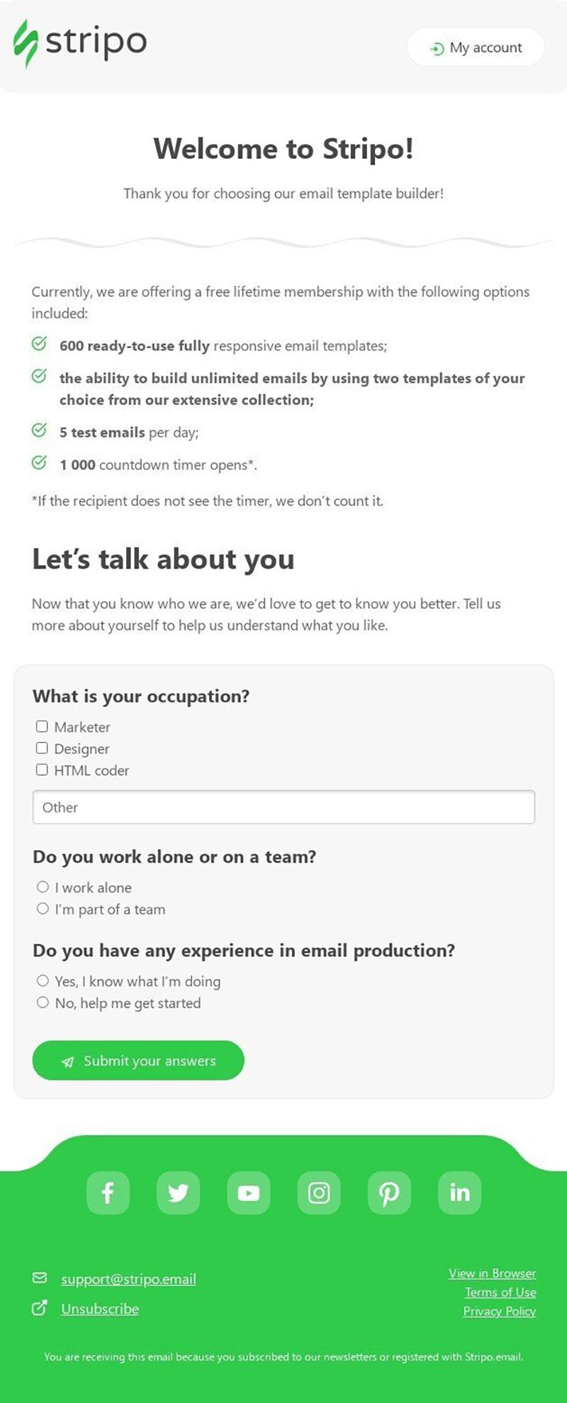
Stripo thanks people for their choice. And lists the most noticeable features of the tariff plans. It’s good when new users can immediately see the full set of options and limits: from the very start, they know about the extended set of advantages they will get for an additional payment.
10. Gusto
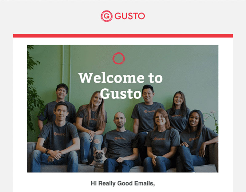
Last but not least, Gusto’s welcome newsletter focused not on technical features or billing plans but on a warm human factor. Email’s mission is to greet newcomers and get familiar. Introducing the company’s team inspires confidence and makes the brand closer to the client. Me Gusta :)
Final words
In the SaaS sphere, welcome emails are about something bigger than simply building a positive brand reputation. Their goal is to explain the value of a software or service to the end-users, teach them to use it with maximum effect, and therefore to motivate people to choose your offer among the wide variety of competitors’ products.
But first of all, a successful email has to build trust and loyalty. They will give you the respective result: conversions and incomes!