7 Principles Web Designers Should Follow in App Design
The trend of the modern web is mobile content presentation. In current practice, a designer becomes a psychologist, a researcher, and a usability specialist. In mobile applications, these skills are more important than anywhere else. Below you can see 7 application web-design principles and thoughts on each of them.
1. Make The App Fast
Many users use mobile apps outside the home and away from their convenient workplace, so they often lack the patience for apps that load very slowly. Don’t force users to wait for content to load. Do your best to make the application fast and responsive. Use quick test tools to understand where improvements can be made, how to improve performance and reduce the size of your application.
In all cases, you have to run activities in the background so that the application is fast. Actions that take place in the background have two advantages: they are invisible to the user and occur when needed. An example is uploading an image to Instagram. As soon as the user selects a picture for publication, it starts to load. This happens when a user starts writing a description and chooses hashtags.
In addition, RoR application development can help to make the applications fast. Every web app built on Rails has a standard structure, so it is easy to use it and swap between projects.
2. One Screen Should Correspond to One Task
You need to reduce user effort to reach the desired action or content. Each screen that you design for an application must support a single action. Add only one CTA button, no more. Such a mobile application is easier to use.
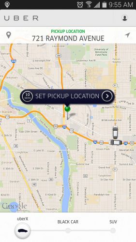
Source: Brainster
Let’s take Uber as an example. The purpose of the user who uses the app is to take a taxi. The application does not overload the visitor with too much information: it automatically detects the user based on the location of the GEO data. The only thing the user has to do is choose the place where the car will arrive.
Indeed, studying information from a mobile device is not the most interesting and ergonomic activity. You have to provide minimal content but it should be carefully selected. Try to tell the visitor not 100 words, but only 5 or 10. However, you should be able to convey the most important things in these words. If your application provides services like Uber, then you can do without words at all.
3. Invisible User Interface
The content should become the interface. Focusing on content allows you to remove unnecessary elements that do not support the user’s tasks. Users should be directed to the content they are looking for quickly after they get into the application. Google Maps is a prime example. As a result of the redesign, Google removed all unnecessary panels and buttons. The map became an interface here.
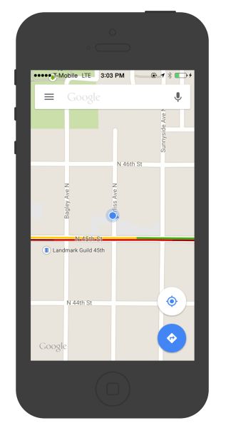
Source: Pinterest
The decorating side of design in mobile applications has become a real art. It is not an easy decision at all to decide what to remove and what to keep. It should be taken in terms of user experience and usability but not in terms of beauty or aesthetics although the latter is also important.
4. White Space
Use white space to draw attention to important content. It would seem that there is so little space, but clogging the screen with a lot of things will have no effect – the user’s attention will be scattered. Try to leave white space between and around design elements. This is often neglected. While many designers may consider it a waste of valuable screen space, white space is an essential element in mobile design.
Empty white space should be considered an active element, not a passive background. White space is responsible not only for the readability and prioritization of content but also plays an important role in a visual layout. Thus, it can simplify the UI and improve the UX.
5. Simple Navigation
Make navigation self-explanatory. Mobile navigation should be easy to follow, accessible, and take up little screen space. However, making navigation accessible is a challenge on a mobile device due to the limitations of the small screen.
Tab bars and navigation bars are well suited for applications with relatively few navigation options. They are good because they display all the main navigation links, and with one simple tap, the user can immediately go from one page to another.
Analytics will help make navigation effective. Take a look at Amplitude or Firebase yourself, or ask an analyst to download it for you. This way you can explore the most popular routes, explore empty search results and dumps of users on the way to the goal.
Your task is to make a smart navigator out of the application, and then each user, regardless of the complexity of the scenario, will be able to get to the target in clear steps through the quick access menus. Balance is important in intuitive navigation, otherwise, it can become overly intrusive.
6. Adapt Your Design to Large Screens
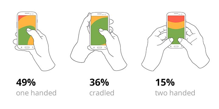
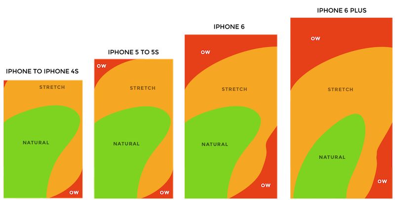
Long ago, with the release of the iPhone 6 and 6+, it became clear that screen sizes were going to continue to expand. Paradoxically, the larger the screen, the more difficult it is to reach the menu if it is located outside the range of your finger. According to research made by Steven Hoober, there are three main ways people hold their phones:
Source: Julia Deutsch – Medium
85% of monitored users use one hand for holding the phone. The heatmap shows the kinds of slider zones that have been applied to each iPhone display size since 2007. You can see that the larger the display, the less easily accessible area.
Source: Deliverr
You may find it useful to use user observation techniques. And they should not necessarily be live, since tracking screen turns can already tell you the points to improve usability.
It is necessary to adapt the app to improve the UX. Try to make sure that your app can be easily and fully used on a large screen with one hand. Place navigation options within the reach of the footer.
Source: UX Collective
The image shows that all the navigation controls are in the footer. They can be easily achieved if you hold your phone in the usual way.
7. Don’t Use Too Many Notifications
Think twice before creating notifications. Every day, users get dozens of useless notifications that distract them from their activities. Annoying notifications are the number 1 reason people uninstall mobile apps. Don’t send notifications for the sake of attraction. Use them if you are sure the user needs them.
One of the biggest mistakes developers make is useless push notifications, like “Keep playing with us.” This message is completely unnecessary for the user but needed only for the developers. Find the moments when users will return to the application. For example, “Come back for a daily bonus,” “It’s lunchtime! Order food.”
The best messaging strategy in a mobile app is to use different types of messages: push notifications, triggered emails, in-app notifications, newsletters, and news feed messaging. They need to collaborate in perfect harmony to create a good user experience.
Conclusion
Many of the principles are rooted in large-scale research. But their main goal is not to limit you but to accelerate the achievement of the desired result and open up new opportunities for creative searches and limitless customer satisfaction. The rules and tips in the article are more of a general recommendation rather than a strict classification.
The most important thing to keep in mind when developing a mobile app is to make sure it is both useful and intuitive. If an application is not useful, it has no practical meaning to the user, then no one has a reason to use it. If the app is useful but takes a lot of time and effort, people won’t bother learning how to use it. And all these issues can be solved when designing the application.