Law of Similarity in TemplateMonster Templates [Die Gestalt im Design]
Welcome to the sequel of our posts about Gestalt laws in web design. There are six major Gestalt laws: similarity, proximity, closure, symmetry, continuity, and common fate. Understanding the Law of Similarity and using it is beneficial for all graphic designers because it helps organize the space smartly and handily.

The previous topic covered the proximity principle in Gestalt laws. And today, we'd like to present similarity to create visually unified elements in graphic design.
There is one day-to-day place where you can observe similarity – it's a retail store with its rows of shelves. These repeated patterns can look impressive if you can arrange the products on displays in some attractive way. And pretty soon, you'll see them in the buyers' carts!
Software developers use similarity Gestalt law to make a kind of "computer vision" – the ability to "see" everything in the same way as users do. Generalization of separate items helps to make a clear, holistic structure of your graphic works. It's essential to arrange the objects in a smart and user-friendly way when designing software interfaces, advertising banners, or website pages.
Similarity and proximity laws might be perfect guidance for designing radio buttons, check-boxes, bullets, and form fields. The similarly styled elements are often used to ease the intuitive work with various software programs and web resources. You'll see a classic example when looking at the even row of shortcuts on your desktop - their clear-cut columns and overall appearance.
Steremono WordPress Theme

Demo | Download | Hosting
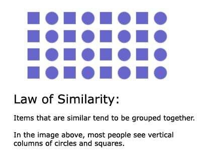
According to the law of similarity, our human mind is inclined to perceive similar-looking elements like a single entity. We strive to join them into groups and categories which are logically and visually similar. In a word, we single out totalities based on objects' forms, colors, outlines, brightness, and sizes.

What are you as graphic designers concerned most of all with? The style? The beauty? It's rather the way viewers receive and decode information. The messages encrypted in visuals need to be made correctly, and this is pure science that involves psychology and usability. That's what Gestalt is all about. The law of similarity affects its other principles and is therefore so important.

Being the author of Visual Communication, Paul Martin Lester states: "The law of similarity states that, given a choice by the brain, you will select the simplest and most stable form to concentrate on. This law stresses the importance of basic shapes in the form of squares, circles, and triangles." He means that we attribute similar shapes to the same group associating them with some special meaning. If there is a row of diamonds, we don't perceive all figures separately; we rather see them as a single row of diamonds.
It's important to emphasize the needed elements if you want the users to identify them first when looking at your graphics. Human minds immediately notice all forms and shapes, colors, and lines that look matching. It sets the whole patterns quicker than some separate pattern elements. And we find it visually pleasing to look at the pattern items playing together. That's the reason why we like website designs featuring repeating textures, shapes, brightness, and colors.
Night Club Euphoria WordPress Theme

Demo | Download | Hosting
Furnitex - furniture design and manufacturer WordPress Theme

Demo | Download | Hosting
As a graphic designer, if you use the law of similarity, you help viewers scan data quickly and effortlessly. You can manipulate their eyes and minds, focus their attention on small things you want them to consider important. For example, if it's a web store design, you group items together or emphasize the style of how they appear on a page like in the following example.
Ozzia - Multipurpose Fashion Store OpenCart Template

Demo | Download | Hosting
You can make banner ads look more fancy and memorable when making them look similar but different from the rest of the page (e.g., designed with nonstandard shape or colors):
A bunch of other great examples of similarity detection in TemplateMonster's website templates.
DreamSoft - Software Development Company Multipage Website Template

Demo | Download | Hosting
Construction - Construction Company Responsive Multipage Website Template

Demo | Download | Hosting
Magetique - AMP-Ready Multipurpose Magento 2 Theme

Demo | Download | Hosting
The conclusion is simple: make use of the similarity principle by a visual grouping of the items you want to emphasize. Overall, the understanding of Gestalt psychology in design enhances visual communication, which may save you tons of bucks on your advertising campaigns.