8 Design Trends That Are Fading Fast
Almost every year, we kick off with a list of design trends that we think will dominate projects in the coming year. While we’ve gotten pretty good at identifying hits, there are also some misses.
These trends might fade due to a lot of different factors, but commonly they are just difficult techniques that don’t apply well across different types of projects.
It looks (and works) great in one application but is flat somewhere else.
Here’s a look at some of those trends that are fading fast. (And if you want to see our full list of web design trends for 2021 you can find it here.)
Off Screen Elements
One of the design trends that seemed to be gaining traction in the early part of the year was the use of off-screen elements to help encourage interaction and horizontal scrolling.
Everything from text to images seemed to be partially off-screen.
Why we loved it: This visual composition of this technique could be quite stunning, especially on desktop devices. The visual elements were interesting and begged you to dive deeper into them.
Here’s why it faded: This is an exceptionally difficult technique to pull off. Off-screen elements look different at every screen size and that can have a rather dramatic impact on readability and comprehension.
Overlapping Design Elements

The use of overlapping design elements is another one of those trends that can be visually stunning, but difficult to make work in real situations.
This trend was easy to spot because elements had obvious overlap with other elements, creating an almost three-dimensional effect on multiple planes.
Why we loved it: The depth and dimension that came with this design style can be impressive and makes websites stand out.
Here’s why it faded: The time and effort required to make this work well are substantial. And you have to have just the right content that layers well.
Super Minimal Aesthetics
While true minimalism never really seems to get too far off-trend, the super minimal style was relatively short-lived.
These designs featured almost nothing on the home page. (So, you can probably guess why this trend didn’t make it long.)
While these designs were visually interesting in design circles, they didn’t provide enough visual or text information for the general website visitor.
Why we loved it: Streamlined designs with an open canvas can be simple, elegant, and open to imagination and interpretation.
Here’s why it faded: So much of design is counted, quantified, and turned into data about usability and conversions. There’s nothing wrong with that school of thought, but it does present a problem when there’s not much to draw users in. The shift back to a more minimal style quickly pushed back in as the dominant simple aesthetic.
Interesting Scroll Patterns
Link many of the other trends already noted here, interesting scroll patterns can be a little difficult to manage and control across devices and sizes.
The root of scroll pattern usage is to help move website visitors through designs. Some of them mix design elements from off-screen design and overlapping elements as well with an interactive motion or scroll animation.
Why we loved it: These scroll patterns were interesting and engaging and made you want to play with the design somewhat.
Here’s why it faded: Users like to know what to expect and don’t want to think about how to interact with a design. This creates a cognitive load that can be overwhelming and results in users who just leave the website rather than learn to interact with it.
Exaggerated White Space
Confession: I still love this website design trend even though it’s not being widely used. I’m not sure there’s a design with too much, well-used white space in my mind.
But I’m in the minority here, with a design that was just too start with elements that had too much space around them for the comfort of most designers and developers and users.
Why we loved it: White space creates a harmonious feeling that makes content easy to understand and digest.
Here’s why it faded: Unless you have a minimal amount of content, the counter to exaggerated white space is long scrolling. That’s not a trade many designers wanted to make.
Video Everything
Before the start of 2021, many web design trend blogs and articles pushed the idea that this would be the year of video everything. And while this trend has seemed to take a backseat, expect it to rebound quickly.
What seems to be happening with this design trend is a “COVID contraction” where there wasn’t money spent on video from marketing budgets because of social and visual restrictions. (Should there be social distancing and masking in marketing videos?) That question makes a lot of companies push pause on new photography and videography.
Why we loved it: Video is engaging and can work in several different ways.
Here’s why it faded: The lack of video seems to be due to an environmental factor. With worldwide pandemic restrictions changing, this trend is very likely to re-emerge and brands begin to create visual materials again.
Bubbles and Blob Shapes
It’s almost surprising that this website design trend faded, and that’s for many of the same reasons the video trend did fade. Since bubbles and blob shapes are a good alternative to actual imagery, this trend seemed like a natural fit in the past year,
But it didn’t seem to hold up.
Why we loved it: Paired with just the right animation, these shapes could grab your attention and keep you engaged with liquid motion and effects.
Here’s why it faded: With so many projects using this style right out of the gate, the trend may have faded due to overall design fatigue. Maybe we just didn’t want to see any more of the same thing?
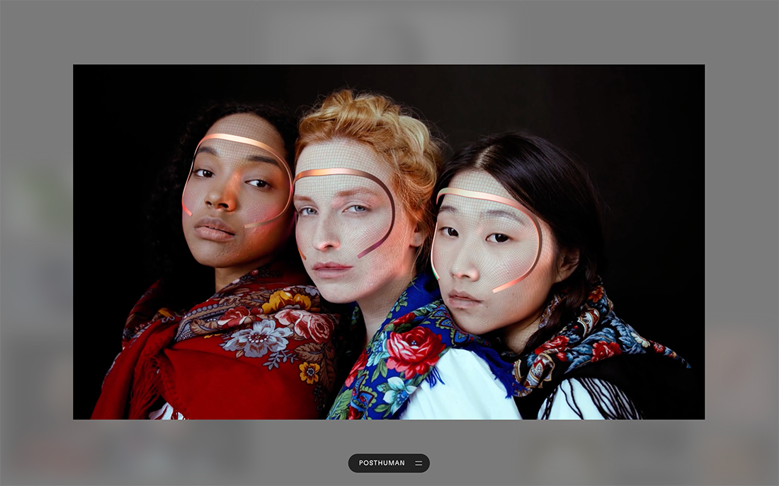
Hints of AI
We’ve been predicting the “year of AI and/or VR” for a couple of years and the technology just never seems to keep pace with the predictions.
That’s also true of this design trend.
Why we loved it: Many of these projects just felt cool.
Here’s why it faded: AI is an interesting technology that’s kind of hard to represent since a lot of what’s happening is in the background. It may just be that designers couldn’t come up with any more ways to show it visually.