Better Responsive Design With CSS clamp()
With so many mobile devices on the market, we’re flooded with viewport sizes. That makes it especially challenging to design a fully-responsive website.
CSS media queries have long been the go-to tool. But it’s getting more difficult to account for evolving screen resolutions. If a device fails to match the viewport range you’ve set, the results can be less than ideal.
That’s where CSS clamp() can make a positive impact. It doesn’t rely on predefined viewport sizes. Instead, it provides a range of values and allows the web browser to scale an element as needed.
clamp() doesn’t necessarily replace the need for media queries. But it may well reduce the number of styles we place within them.
The following are basic examples of how clamp() can be used to produce better responsive designs. Let’s get started!
What Is CSS clamp()?
The concept of clamp() can be a bit confusing. But stripped down to the basics, it provides a way to combine the min() and max() functions into a singular line.
So, before we go any further, it’s important to note that clamp() is a means of setting a minimum and maximum value for an element. That could be text, the sizing of a container, or just about anything else that needs to be responsive.
A typical line could look something like this:
font-size: clamp(1.125rem, 2vw, 1.5rem);
Note the first and last values. In this case, 1.125rem is the minimum value, while 1.5rem serves as the maximum.
Still with us? Great! Now, about that rascal in the middle…
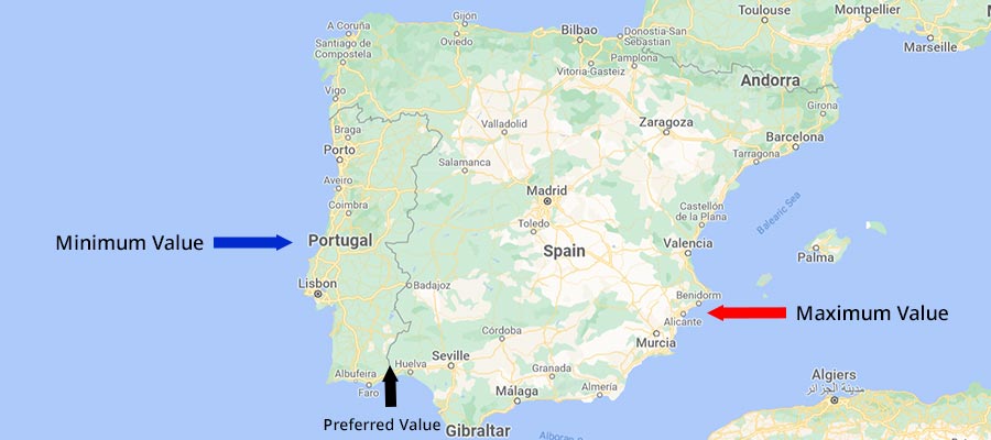
The middle number above (2vw) is our preferred value. MDN defines it as: “The preferred value is the expression whose value will be used as long as the result is between the minimum and maximum values.”
As such, we can think of it as the border between two countries. Move to the left, and you’re in Portugal, where the minimum value applies. Go to the right, and you’re in Spain, where the maximum will be used.
The preferred value can be a constant number or a mathematical expression. This allows for fine-grain control over how it’s calculated.
But back to our example. Taking a cue from MDN’s documentation, our font size will initially be set at 1.125rem.
However, once our preferred value of 2vw is greater than 1.125rem, our text will scale up to the maximum of 1.5rem.
In practice, small screens will see the minimum value, while big screens get the maximum. The preferred value merely sets the threshold.
A Few Basic Examples of clamp()
Now that we know a bit more about what clamp() does, let’s take a look at it in action. The following are examples that demonstrate the function’s basic capabilities.
Fluid Typography That Adjusts to Screen Size
Creating responsive styles for text can get complicated. Staying with the desktop sizing may look overwhelming on mobile. But applying new sizing for each CSS media query means more maintenance. And getting the scaling just right can be a pain.
Thankfully, fluid typography is an area where CSS clamp() excels. The function allows text to scale based on the parameters you’ve set. Best of all, a single line of code replaces what used to require multiple instances.
Here, we’ve set our body and h2 text to scale based on the viewport. Large viewports will see bigger fonts. Meanwhile, the text shrinks accordingly on smaller screens.
Our body text will display between the defined minimum and maximum sizes (1.125rem – 1.5rem, or 18px – 24px). The h2 text has a min/max of 2rem – 2.75rem (32px – 44px).
See the Pen CSS clamp() Demo – Heading & Body Text by Eric Karkovack
A Container That Adjusts for Large Viewports
When dealing with responsive containers, we can’t forget about large screens. 1080p (1920×1080) is now serving as something of a minimum resolution for desktop and laptop devices. Thus, it’s important to consider how layouts impact these users.
A container that stretches the full width of the viewport can be cumbersome – particularly if it includes text. Having too many characters per line makes the text harder to read on large screens. Whereas this configuration is more desirable on mobile.
This example uses clamp() to improve the user experience across viewports. Small screens, where our maximum value of 90vw is greater than our 1100px preferred value, will receive a wide container.
On large screens, the container will display at its preferred value. This should make for easier reading.
Also of note is our minimum value of 40vw. It only comes into play on exceptionally large viewports. The value could be increased if you want to see it triggered sooner.
See the Pen CSS clamp() Demo – Container Width by Eric Karkovack
clamp() Down on Your Responsive Styles
As CSS evolves, it provides us with more advanced tools. They often increase efficiency and push more of the “dirty work” to browsers. clamp() certainly fits this mold.
In this case, it means having less code to maintain. By reducing the number of styles we place into media queries, clamp() makes our job easier. In addition, it keeps our designs looking good across devices – even those with unique viewports.
Best of all, it’s supported in all modern browsers. Therefore, it’s something you can immediately add to your workflow.
To learn more, please check out the resources below!
Further CSS clamp() Resources
- clamp() by MDN
- min(), max(), and clamp() CSS Functions by Ahmad Shadeed
- min(), max(), and clamp(): three logical CSS functions to use today by Una Kravets
- Intrinsic design, theming, and rethinking how to design with WordPress by Justin Tadlock
- Modern Fluid Typography Using CSS Clamp by Adrian Bece