Frustrating Design Patterns: Mega-Dropdown Hover Menus
Complex websites often rely on complex navigation. When a website houses thousands of pages, often combined with micro-websites and hundreds of subsections, eventually the navigation will go deep and broad. And with such a complex multi-level navigation, showing the breadth of options requires quite a bit of space. Think of large eCommerce retailers and large corporate sites, catering to many audiences and having plenty of entry points.
No wonder that a common way to deal with this complexity is to expose customers to a large amount of navigation quickly. That’s exactly why mega-dropdowns have become somewhat an institution on the web — albeit mostly for complex and large projects. A mega-dropdown is essentially a large overlay that appears on a user’s action. Usually it includes a mixed bag of links, buttons, thumbnails and sometimes nested dropdowns and overlays on its own.
For decades, a common behavior for this kind of navigation is to open the menu on mouse hover. And for decades, a common user’s complaint about this pattern has been the absolute lack of certainty and control about how and when the sub-navigation opens and closes.
Sometimes the submenu appears unexpectedly, and sometimes it suddenly disappears, and sometime it stays on the screen for a while, although the mouse pointer is already in a very different part of the page, or on another page altogether.

Why Are Mega-Dropdowns Hover Menus Frustrating?
The main reason why mega-dropdowns can be cumbersome to use is because of a mismatch of intentions and expectations. With hover menus, we try to deduce and act on a particular intent by tracking mouse behavior, yet our customers might have very different objectives and very different limitations when accessing a page.
Customer’s behavior is usually unpredictable, even although our analytics might tell a slightly different story with data points gathered and normalized over a longer period of time. We just rarely can predict behavior accurately.
The common scenarios we usually explore are:
- The customer is aiming at the category link and travels there directly to explore the sub-navigation items in that category.
- The customer is moving the mouse towards a target on the screen, but the trajectory that the mouse has to travel covers a nav link that opens a mega-dropdown.

However, there are also plenty of other situations to consider. Just to name a few:
- The customer wants to look up mega-dropdown options while typing in a search autocomplete. To do that, they have to keep re-opening mega-dropdown, or use separate browse tabs, positioned side by side.
- The customer might use a trackpad (or a mouse) to operate a large secondary display, so pointer movements will be slower, abrupt and inaccurate. This would cause the mega-dropdown to open involuntarily every time the user pauses when traveling to CTAs or shopping cart at the top of the page.
- The customer wants to open the category page, so they travel to the category link, click on it, but experience flickering because a mega-dropdown appears delayed.
- With nested sub-menus within a mega-dropdown, the customer wants to explore similar items within the category in which they currently are, but because of nesting, they have to re-open the mega-dropdown over and over again, and travel the same hover tunnel over and over again.
- Imagine a situation when you want to resize the window, and just as you are about to snap to the right edge of the window, a hover menu keeps showing up — just because you’ve moved your mouse cursor too closely.
- The user starts scrolling down slowly to assess the content on a page, but the menu keeps popping up. And every time the user bumps away a cursor to read the contents of the mega-dropdown, the menu accidentally disappears.
The problem is that we need to support all these intentions and all these accidents, but at the same time we need to make sure that we don’t create an annoying and frustrating experience for any of these cases either. Of course, as designers and developers, we’ve invented a number of techniques to tackle this problem.
Hover Entry/Exit Delay
One of the first solutions, and also one of the most common ones still, is to introduce a hover entry/exit delay. We need to make sure that the enu mdoesn’t open and doesn’t close too early. To achieve that, we introduce a delay, usually around 0.5 seconds. That means that we give customers a buffer of around 0.5 seconds to:
- Cross the trajectory to a remote target if needed, or
- Indicate that they intent to explore the navigation by remaining on the mega-dropdown category link, or
- Correct a mistake if they left the boundaries of a mega-dropdown by accident.
In other words, as long as the customer stays within the mega-dropdown overlay, we keep displaying it. And we hide the overlay once the customer has moved their mouse cursor outside of the sub-navigation overlay for at least 0.5 seconds.
While it solves the problem of accidental flickering on the page, it introduces a lag in cases when a user has left the mega-dropdown for more than 0.5 seconds. As a result, it slows down every interaction with the mega-dropdown across the entire site. Unfortunately, it becomes very quickly very noticeable, especially if the navigation is used a lot.
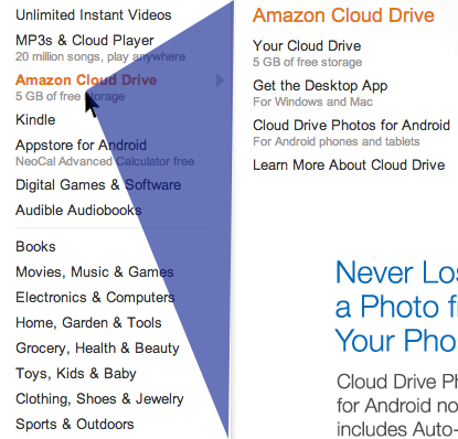
As long as the user stays within the triangle or within the entire mega-dropdown area, the overlay is still displayed. If the user chooses to travel outside of the triangle, the content of the mega-dropdown overlay will change accordingly. And of course it will disappear altogether immediately once the user has moved outside of the category list altogether.
Chris Coyier highlights some of the technical intricacies of this technique in his post on Dropdown Menus with More Forgiving Mouse Movement Paths, along with a vanilla JavaScript demo by Alexander Popov on “Aim-Aware Menus”.
With this technique we minimize the friction of sudden disappearance and re-appearance of sub-navigation. But it might become ineffective if category links are positioned too close to each other, or we display the hover menu by hovering over a larger button. We can do a bit better with SVG path exit areas.
SVG Path Exit Areas
When calculating a trajectory triangle with the previous technique, sometimes we would not only track the exact position of the mouse pointer, but also recalculate the triangle with every pointer movement — all the time. We can improve the strategy by calculating the overall SVG overlay area once and track whether the mouse pointer is inside it — without recalculating the triangle all the time. A great example of it is Hakim el Hattab’s implementation that draws the areas dynamically with SVG based on the position of the navigation item on the screen.

Hakim’s solution is actually responsive, so if the sub-navigation doesn’t fit on the screen, it will float next to the main navigation item, displayed in full width or height. The SVG path area will be recalculated accordingly, but only if the user scrolls vertically or horizontally. You can see a working demo of the technique in action on Hakim’s debug view mode of the Menu pattern.

In case you do have to deal with a complex navigation of this kind, it might be worth testing if issues disappear when only one (rather than two) hover menu is used. That menu would be slightly larger and house all options within columns. Or if possible, for every category, consider displaying all navigation options within that category as a permanent navigation bar (sidebar or a sticky top bar) — usually it should eliminate all these issues altogether.
Category titles doing too many things
As we’ve seen previously, sometimes category titles have two different functions. On the one hand, each category title could be linked to the category’s page, so customers could click on them to go straight to the page. On the other hand, they also could open a mega-dropdown overlay. So if the user is hovering over the title for a long enough time, the mega-dropdown will open, but the user might have clicked on a link already, and this will cause flickering. For customers, it’s difficult to have the right expectations when the interface doesn’t really provide any hints.
There are a few options to resolve this problem:
- To indicate that the category’s title is a link, it might be helpful to underline it,
- To make the distinction between the category title and a dropdown more obvious, add a vertical separator (e.g. vertical line) and an icon (chevron),
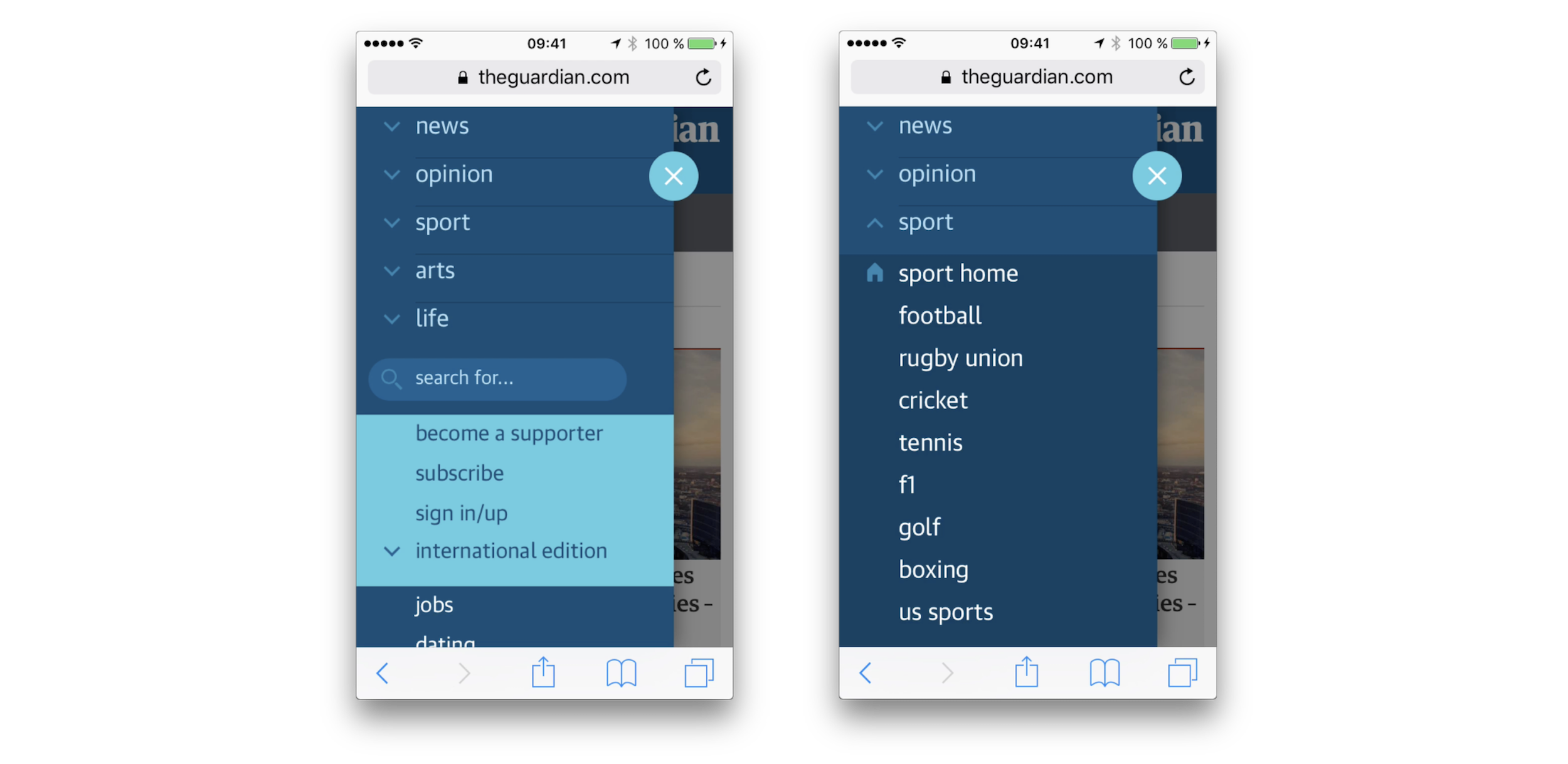
- Leave the category’s title opening only the mega-dropdown, and add a link to the category’s “Home” section within the mega-dropdown overlay. It could also be a prominent “See all options” button instead (see The Guardian example above).
As mentioned above, sometimes you can see an extra icon being used to indicate that the menu opens an overlay, while the category’s title is a link. In our usability tests, we noticed that whenever an icon is present (and it doesn’t matter which icon that is), users often make a mental distinction between the action that will be prompted by a click on an icon, and the action prompted by a click on the category title.
In the former case, they usually expect a dropdown to open, and in the latter case, the category page to appear. More importantly, they seem to expect the menu to open on tap/click, rather than hover.

If you are looking for a technical implementation, you can check In Praise of the Unambiguous Click Menu, in which Mark Root-Wiley shows how to build an accessible click menu. The idea is to start building the menu as a CSS-only hover menu that uses li:hover > ul and li:focus-within > ul to show the submenus.
Then, we use JavaScript to create the <button> elements, set the aria attributes, and add the event handlers. The final result is available as a code example on CodePen and as a GitHub repo. This should be a good starting point for your menu as well.
Accordions vs. Overlays vs. Split-Menus On Mobile
It goes without saying that not every mega-dropdown on tap/click is performing well though. Target.com is another interesting example for an accessible, large navigation that avoids multi-column layout and shows only one level of navigation on the time — all opening on tap/click.

“Our brands” leads to a separate page while each label under it opens a new navigation overlay on top of the mega-dropdown. Did you notice that “All brands” is underlined, while the rest of the navigation option isn’t? One can see the intention of designers creating the menu. Indeed, “All brands” is a link, while the other labels open an overlay:

With all of these options in place, how would we go around displaying a mega-dropdown navigation on mobile? As it turns out, grouping such mega-dropdown overlays on mobile is difficult: usually there isn’t enough space nor visual aid to highlight different levels differently and make them easy to distinguish. In the example above, it might take a while to figure out on which page we actually have landed.

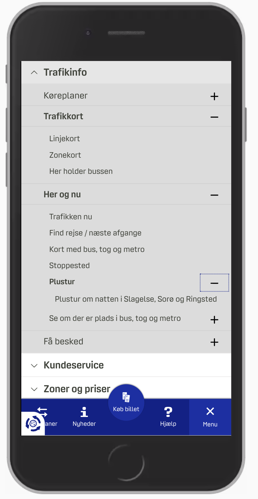
It’s a bit easier to understand at which level we currently are and what options we have with an accordion approach, as we can see on Dinoffentligetransport.dk. However, it might be a good idea to underline links within each subsection as they drive customers to the category’s page. Also, the entire category bar should probably be clickable and expand the accordion.
In the example above, most of the time we probably will be able to show a limited amount of navigation sections at a time. But if the titles of each sections are relatively short, we could split the screen horizontally and display multiple levels at the same time. LCFC.com is a good example of this pattern in action.

Which Option Works Best?
In my personal experience, when we compare the implementations of mega-dropdowns on mobile, vertical accordions appear to be faster and more predictable than overlays (be it single-column or multiple layers). And split-menus appear to be faster and more predictable than accordions.
There are a few advantages that both accordions and split-menus provide:
- There is no need to display a “Back” button to return to the parent page.
- The eye doesn’t have to jump between the top of the navigation menu and the section’s sub-navigation with every jump.
- Customers can navigate between multiple levels faster: instead of hitting “Back” multiple times, the can jump to the accordion that they find interesting.
- Customers can explore multiple sections at the same time (unless the implementation automatically closes one accordion when another one has been opened). It isn’t possible with overlays.
In general, accordions and split-menus appear to be a better option. But they don’t seem to be working well when there is a lot of navigation in place. Whenever each category has more than 6–7 items, it proved to be a good idea to either add a “Browse all” button underneath 6–7 items within another accordion (or on a separate page), or use overlays instead.
So depending on the amount of navigation, we can start out with split-menus, then if it’s not viable, move to accordions, and if the navigation is getting complex still, eventually turn accordions into overlays.
When Mega-Dropdown Might Not Be Needed After All
We’ve referenced the work of the Gov.uk team in the previous article already, but their insights are valuable in the context of mega-dropdowns as well. For large, multi-level navigation, the team has decided employed findings by form expert Caroline Jarrett’s one thing per page principle. According to Caroline, “questions that naturally ‘go together’ from the point of designers […] don’t need to be on the same page to work for users”. Caroline primarily applied it to the design of web forms, but we could apply it in the context of navigation as well.
The idea, then, is to avoid complex mega-dropdowns altogether, and provide customers with a clear, structured way to navigate through the trenches of the website, from one page to another. In the case of Gov.uk, it seems to be happening through a well-considered information architecture and guides, that lead the visitors through predictable steps towards the goal.

The Kanton Zürich is using the same pattern. Instead of layers of mega-dropdown navigation, all options are displayed in a structured way, with main topics featured on the top as “Top topics” and the navigation within each section displayed as a sticky navigation bar on the top.
An alternative approach is to use the “I-want-to” navigation pattern. In addition to the conventional navigation, we could provide a “navigation dropdown” to allow customers to construct a navigation query of their choice, and be directed straight to the page they are lookin for. Basically, it’s a series of drop-downs that appear under another to let the user select what they intend to do or find on the website.
For a while, the pattern was used on Commonbond (see the video above), and it’s also used on Corkchamber.ie. An interesting, albeit unconventional way to provide access to a deep level of navigation without having to use a mega-dropdown at all.
Mega-Dropdown Navigation Design Checklist
Every time we bring up a conversation about mega-dropdown menus, everyone seems be settling in a few groups: some colleagues prefer hover, the others prefer tap and click, some prefer both, and the others don’t mind either as long as there is both a category link and an icon that opens the menu.
It’s impossible to say that one approach is always better than the others, but both in terms of technical implementation and UX, opening the menu on tap/click usually causes way less trouble and way less frustration while allowing for a simple implementation, and thus resulting in a predictable and calm navigation. Before moving to a hover menu, we could try keeping tap/click behavior first, measure the engagement, and study if hover is needed after all.
And as always, here are some general things to keep in mind when designing and building a mega-dropdown:
- Avoid placing important, frequently used items close to the mega-dropdown navigation (e.g. search bar, CTA, shopping cart icon) (if hover),
- Avoid multiple sub-navigations within mega-dropdown appearing after each other with delays (if hover),
- Avoid overloading category titles with multiple functions.
- Underline category titles to identify them as links to the category’s page (of course if they are linked to the category page).
- If you can, add a “Home” link or a “Browse all” button within each sub-category instead of linking the category directly.
- Avoid horizontal overlays and consider replacing them with vertical accordions and split-menus,
- Add an icon to indicate that a category title triggers a mega-dropdown on click (e.g. chevron) and always make it large enough for comfortable tapping (e.g. 50×50px),
- Avoid long fade-in/fade-out transitions when a mega-dropdown appears/disappears (at most 300ms),
- Consider testing a structured guide or a navigation query (“I-want-to” navigation pattern) instead or additionally to the mega-dropdown.
- Avoid mega-dropdown hover menus if possible.
Related Articles
If you find this article useful, here’s an overview of similar articles we’ve published over the years — and a few more are coming your way.
- Perfect Accordion
- Perfect Responsive Configurator
- Perfect Birthday Picker
- Perfect Date and Time Picker
- Perfect Feature Comparison
- Perfect Slider
- Form Design Patterns Book by Adam Silver, published on SmashingMag
- Subscribe to our email newsletter to not miss the next ones.