Top 20 Smashing One-Page Website Examples 2022
After the long hard way of navigating through dozens of Google search results, your unique visitor lands on your single page website, and, as Eminem claims, you’ve got one shot to make everything right!
Most users now care about UX design, and their behavior, impression of your website, the fact of whether they stay and convert is crucial. But, at the same time, it is quite predictable – and that’s the good news!
Is your one-page website easy to navigate? Is the content carefully organized? Will users notice and hit your CTA button? Should you use single page website bootstrap for your specific purposes – or should you make it on your own? These questions, along with many others, have to be considered when choosing your one-page website design, ‘cause it definitely plays a huge role in why visitors convert.
We have got to the bottom of it in our research and now we proudly present you 20+ best one page website examples – look!
Top One-Page Website Examples
One-page website examples that follow are intended to introduce you to the notion of simplicity, succinctness, cleanliness, crispness, and genuineness as the pillars of efficacious and straightforward web design.
HoneyBee
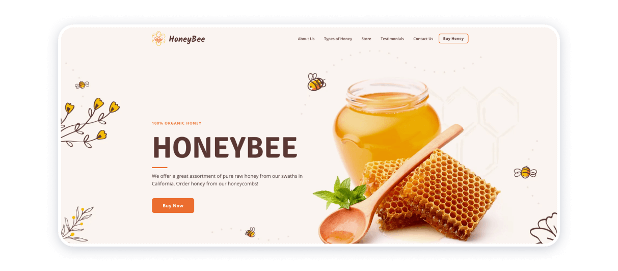
This single page website exemplifies how colors, textures, lines, shapes, fonts, and icons can complement each other to form a coherent whole. The one-pager is conclusive proof that this particular type of website is designed to capture the audience’s attention, advertise a product, and represent the brand’s identity.
Brand and product or service it caters to its target clientele are two co-dependent entities. In terms of execution, color palette can be considered a unifying element, and it has been prompted by no other thing than a visual associative array pertinent to honey. Through minimalist and endearing design, communicate a rather obvious yet vital message: human health imminently depends on the environment’s health.
Built Things
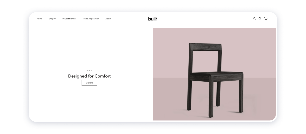
Built Things is a very well built one-pager. The menu structure is laconic and contains only a few, most important things:
- learn more about the Built firm;
- what do these guys do;
- who does these masterpieces;
- how to contact the company.
Take a look at the design and the animation on this website: you just can feel your hand touching the wooden surface. The design is just pleasant.
Jon Phillips

If somebody will ask you to define the basic – show them Jon Phillips website. Everything you will see here is the whole of it.
This website is more like laconic and polite greetings from the designer; the other stuff like portfolio and info to learn about Jon can be found on his social media pages (the buttons beautifully fit the design).
This might be one of the best of one pager website examples that can be completed in 15 minutes, using a ready-made template. Yet, it is so… great!
The Art of Texture
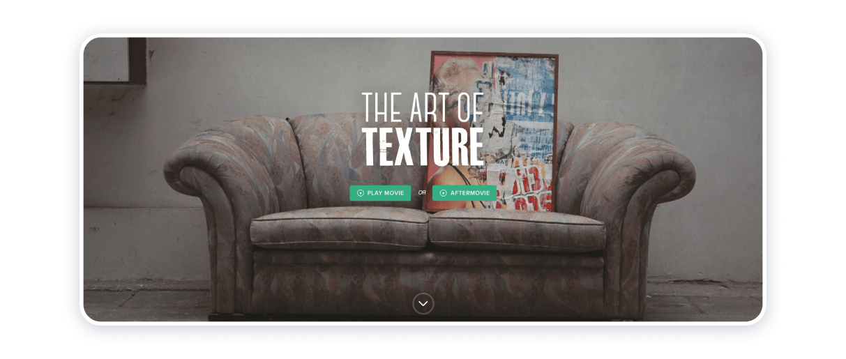
Get inspired by watching the movie about the things this designer creates – and the film will answer all your questions.
This single page scrolling website adds a feeling of art and talent to your impression; it’s a cool idea to use captions, that appear while you move the cursor over the images.
Emotion Theater in New York
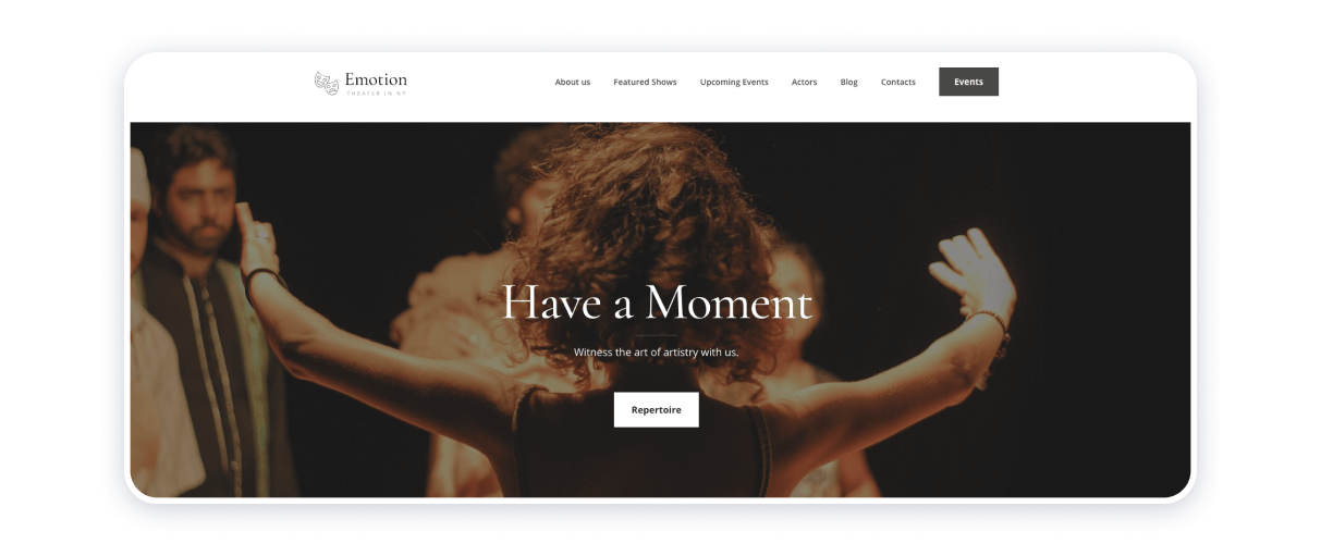
Simplicity is a friend. Any encounter with the world of arts and culture is special in its way. It seems as though one page websites design sample concerned represents this statement.
Parallax scrolling bolsters the eeriness peculiar to theatrics and performing arts in general. The web page abounds with images, accompanied by capacious texts. Both types of information help introduce the website’s visitors to Emotion theatre group’s aesthetics, which, in turn, represents their creative and philosophical bent.
This relatively simple one-page website design is also fairly intuitive: consider paying attention to how white background represents stillness or unthinkable amount of chaos out of which truly magnificent things are born.
Cryptochange
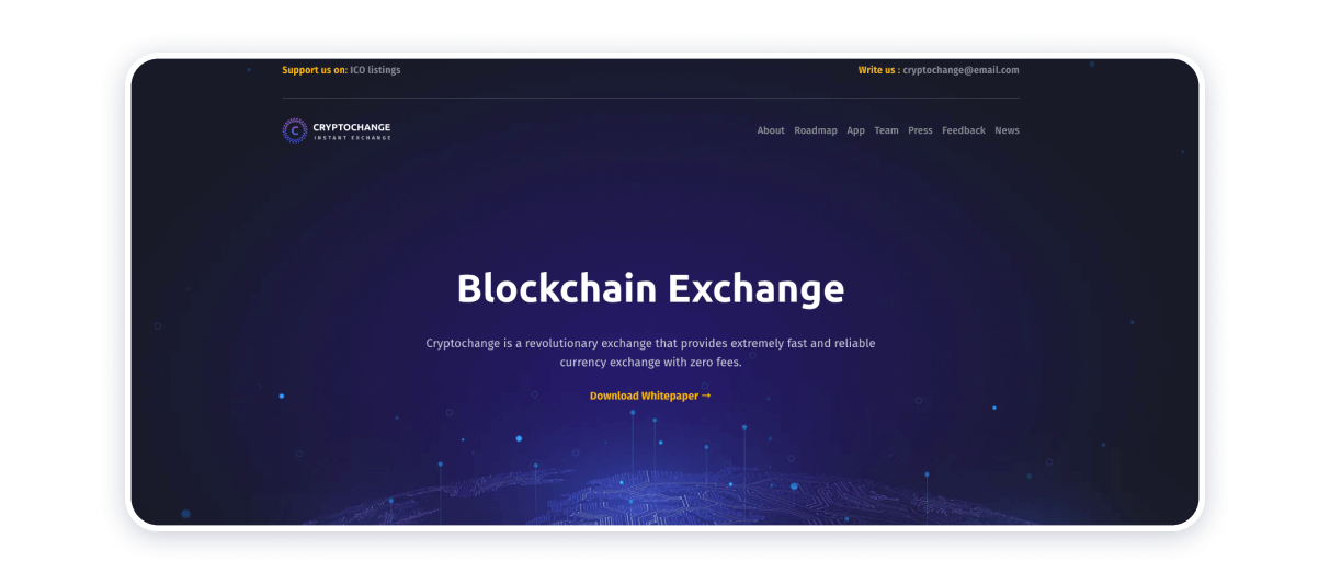
One-page website design under consideration epitomizes the importance of knowing color psychology and employing this knowledge effectively. As soon as one sees the color palette, one immediately recognizes the one-pager’s subject matter, which is finance and cryptocurrency. Light-colored font placed against cool dark-themed background helps emphasize textual content rather than the visual one. Different tones separate subheadings from blocks of text, which enhance the readability of this single-page website example.
The presence of tables and graphs on the page creates a more structured and tidier look, which is particularly important when making numerical data more discernible and easier to comprehend.
Momentum
We all know that the good website should be relevant and unique; it should answer the simple question «how does this benefit me»?
In addition to affecting the ranking of Google, the coherence in your website content also increases the chance that the visitors will come to your website naturally.
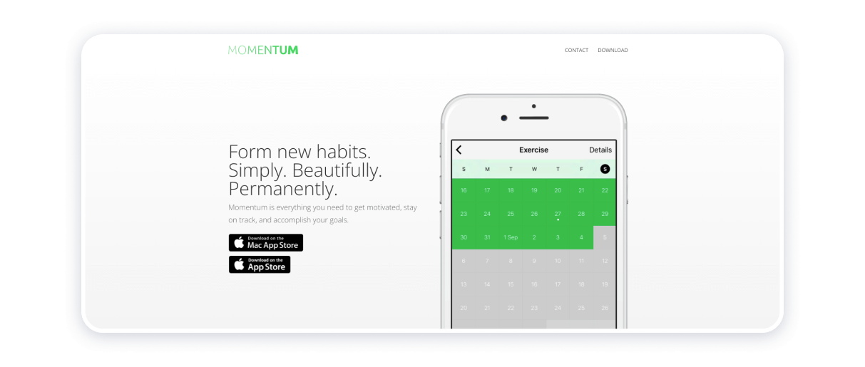
Momentum is one of the best among our one page website examples for 2022 due to several reasons: the user can easily scan through the company’s product characteristics and end up downloading the app. The whole design and every single element is laconic, coherent and relevant.
Kim Gardner

Kim Gardner’s one-pager is so clean and simple. It shares links to many projects that she is working on without overloading the visitor’s brain.
As a good tradition, there are social buttons at the bottom so you can easily learn more about Kim.
Plentific
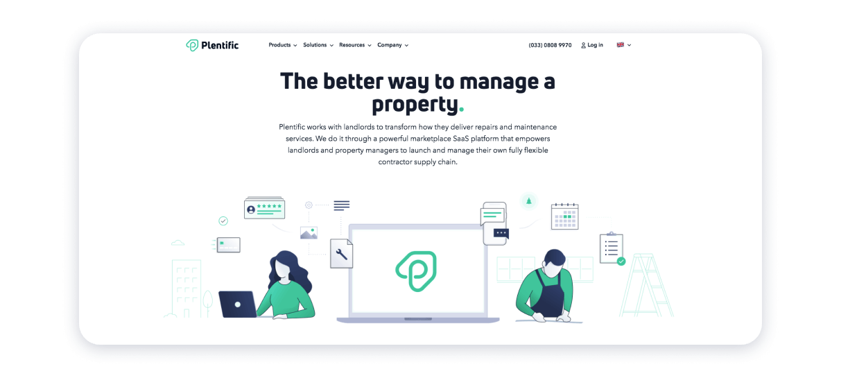
Play the «how it works» animation video – and you’ll quickly get the point about the Plentific services.
When you scroll down, you will see the testimonials section. When you put the cursor over the stories, the images magnify a bit to draw the visitors’ attention.
Make Your Money Matter
Creating a great first impression is crucial – that’s a given. Tell the visitors where they are and what they should do – and they will thank you later.
To achieve success, you should play up strong visuals but still stick to your goal. Even your website’s theme has to relate to the overall topic!
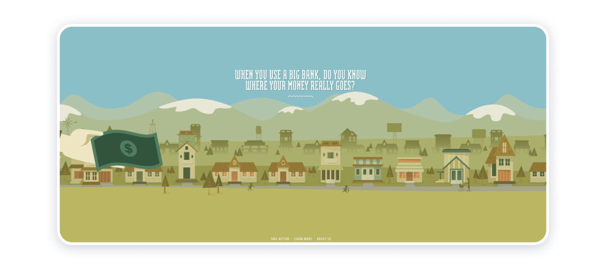
Make Your Money Matter single page website uses vivid imagery to engage the users. They successfully explain what happens to the client’s money when they put it in the bank.
As a whole, Make Your Money Matter is a beautiful & informative one-pager with a pleasant design.
Treehouse

The treehouse website has a well-balanced design. The idea is simple: they alternate the graphics and descriptions in two separate sections!
James Oconnell
James Oconnell one page website design prompts that the designer is a creative person. Nevertheless, he doesn’t show off his portfolio here to keep the website space clean.
You see only the basics and a little personality, but if you want, you can explore his works, if you click on the social buttons.
Typetalk
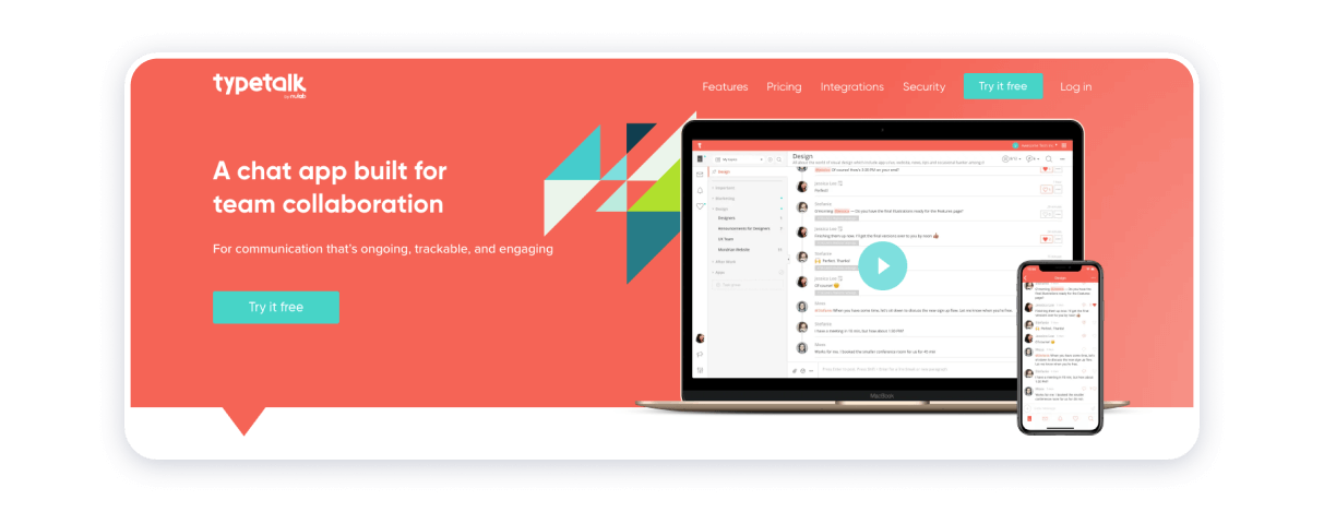
Being very simple, this one page website’s design is responsive with the bright colors, precise product description, and interesting animation effects to keep you engaged!
Hourly, time and task manager – IOS app for time tracking

This quality one page website of a startup from Russia utilizes bold typography and mild animation that won’t leave you dizzy in the end. Thanks to the consistent use of three main colors, the entire website design looks neat and well-organized.
Upstate Laundromat
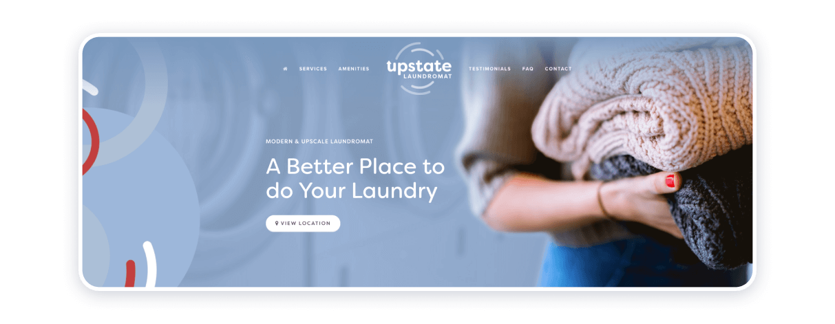
Curtailed is not necessarily a bad thing: after all, it means precision, fluent expression, and tastefulness even when it comes to such seemingly trivial things as doing laundry or advertising laundry services.
The color scheme is a bonding agent: blue, grey-blue, white, and carmine colors complement one another quite harmoniously. The photograph used as a banner, strategically placed, is a symbol of purification and gentleness: the effect is achieved through a nice bokeh of the image itself.
The positioning of blocks of text, icons, buttons, and logo considerably facilitate navigation through the web page, prompting that chores can be a meaningful and rewarding experience, too.
Coppé – MILK
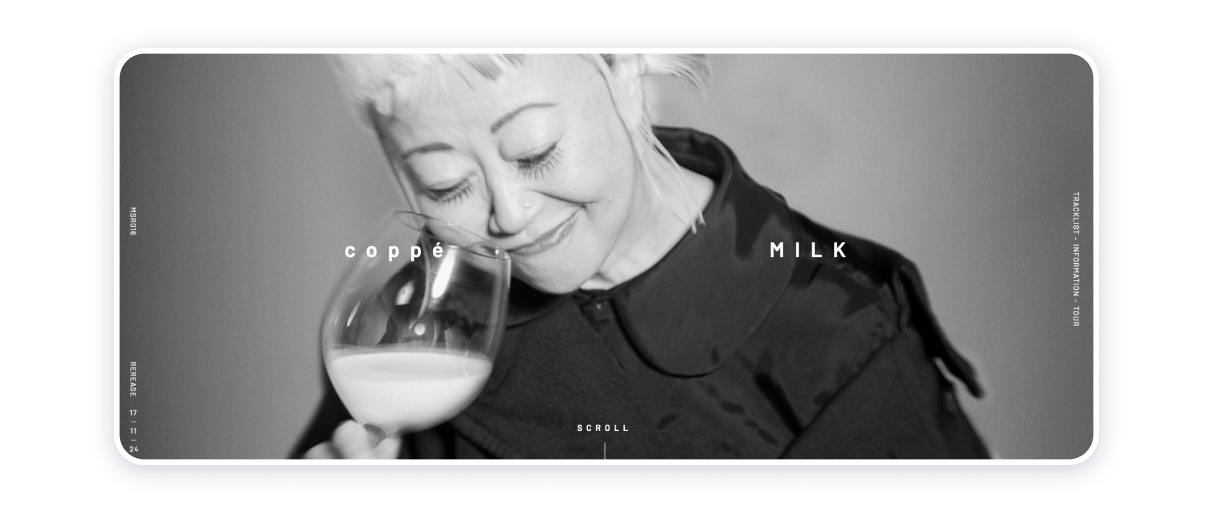
This one pager from Japan puts simplicity in the forefront. A minimalist monochrome color palette caters well to the target audience, creating an image of a modern and stylish music event organizer. Well done!
Genesis
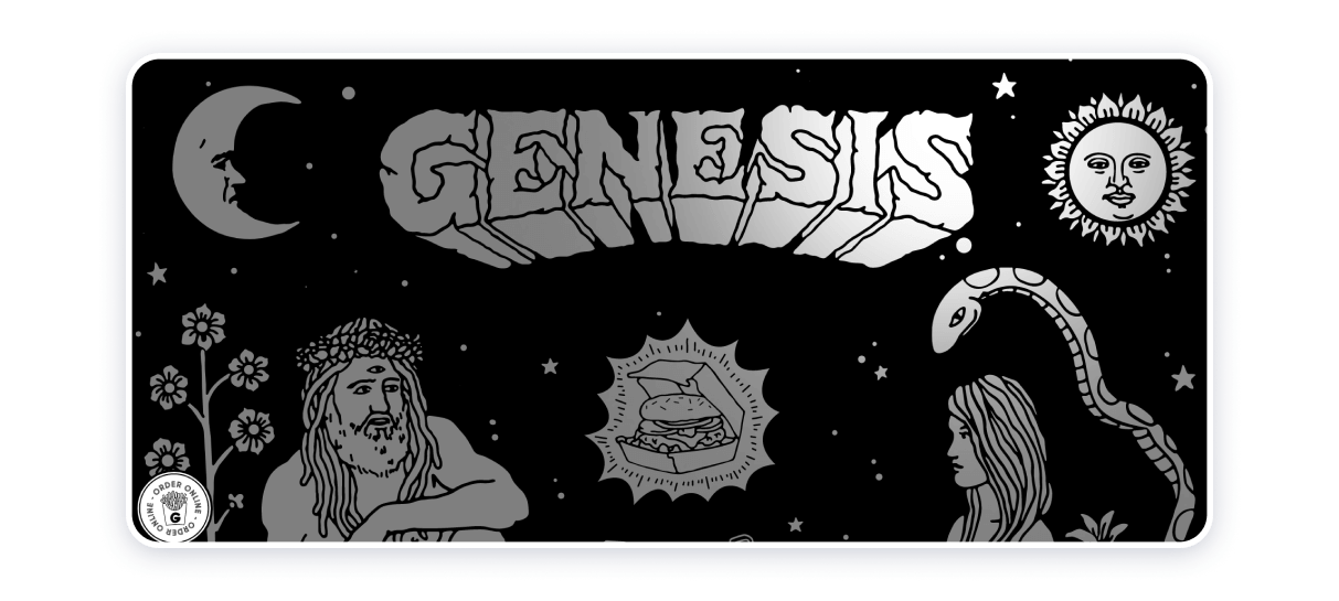
The single page website is a great example of successful use of storytelling, where a user scrolls down to read the entire story. There’s no separation into blocks which makes the content flow organically while inviting a user to continue reading.
The Rafael. The Julian
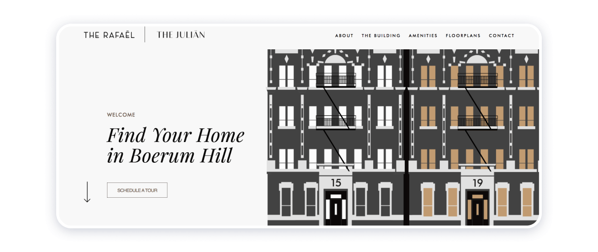
The property site at hand is an epitome of eloquence. Its purpose is to advertise modern and convenient housing in one of the most beautiful and peaceful neighborhoods in New York.
The top right corner is embellished with a delightful and engaging illustration of the building: notice how the windows light up as the cursor hovers over the picture.
The website offers the visitors a substantial amount of information, including planning, amenities, and a brief insight into the historical, cultural, and economic background of the residential area
This particular single-page website typifies how brand identity and design can coalesce to establish a fresh and appealing online presence of the brand itself.
ENJOY
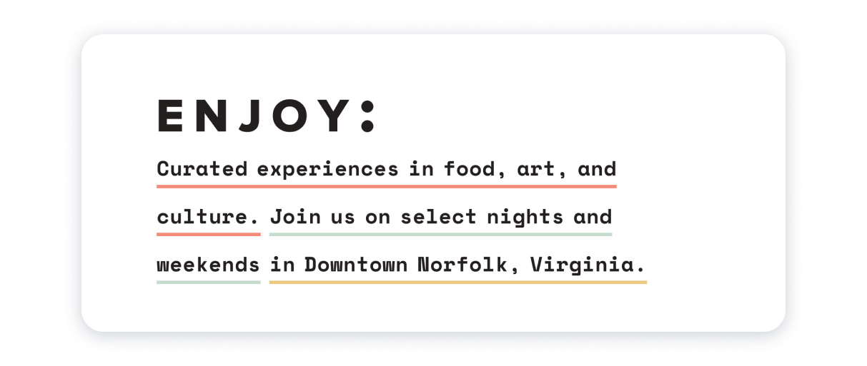
The Enjoy website design seems like a direct reference from futurist novels and films. The distinctive feature of the one pager lies in the use of graphic and motion design accompanied by the parallax effect and animation of website elements, leaving a very pleasant impression.
That’s a good example of how out of the box thinking works.
Halo
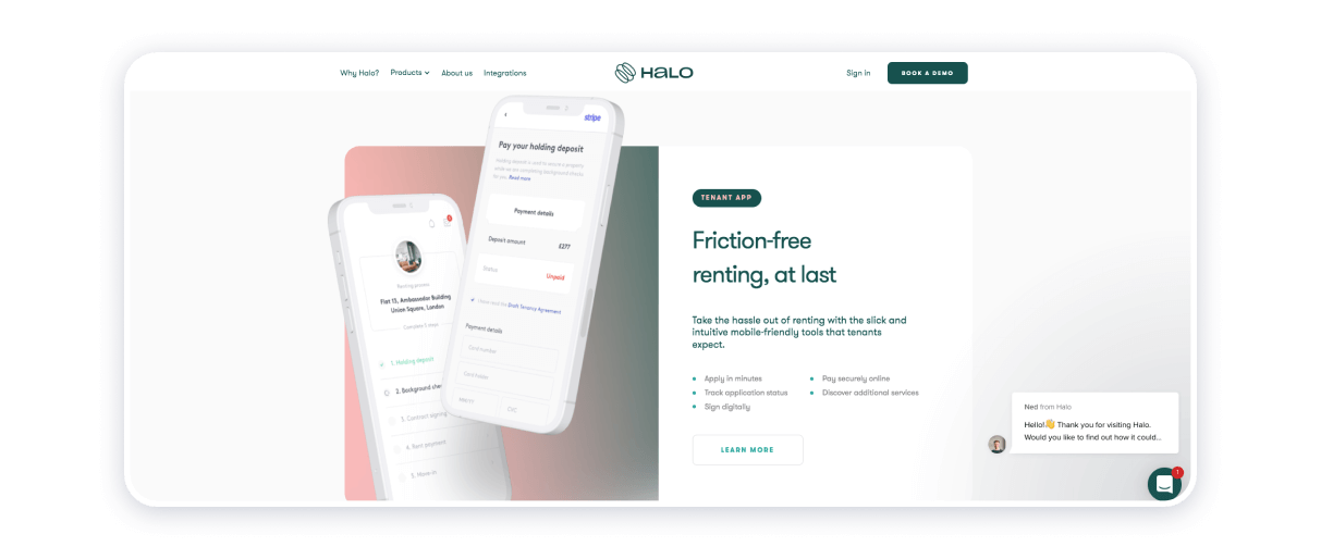
The Halo one page website design is a great representative of digital art. While making a strong use of animation and parallax effects, the website doesn’t seem overstuffed with special effects. On the contrary, the visuals direct the visitor to complete the desired action.
Dave Gamache
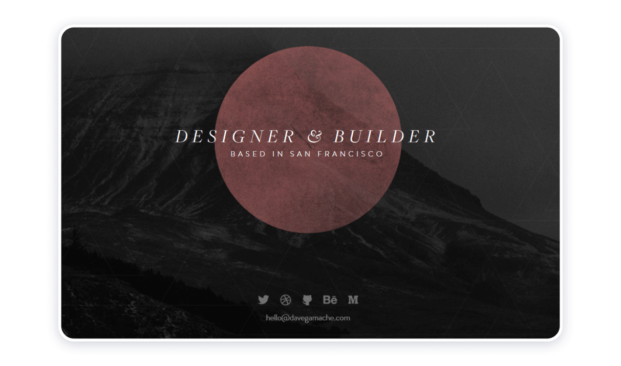
This one page website uses the idea similar to the Jon Philips’ website – a simple landing page with the specialty, location, social buttons & e-mail at the bottom – that’s all and this is enough.
The thing is that the aesthetic design of this landing page should give you a clear sense of the designer’s work.
MyLakeMap
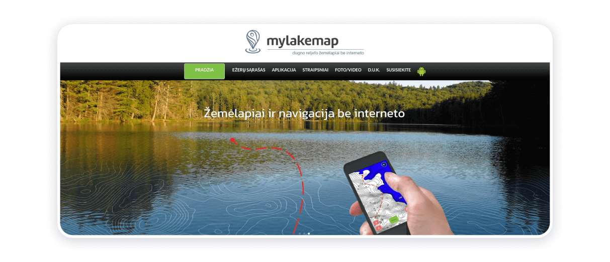
This is an example of the best one-page website because of its approachability, seamless navigation, and neatness. High-resolution images as a background, parallax horizontal scrolling, readable fonts, intelligible menu, smartly applied graphics — all of them make the page seem clean and properly organized.
The creators and owners of the website have made their design choices led by the message they wish to convey to the world. The website conclusively proves that fishing can and should be sustainable and environmentally conscious.
Top tips for one-page website success
One-page websites are the epitome of conciseness and maintenance of balance between appearance and substance. A one-page website melds top-quality content with compelling and convenient design. The best one-page website examples have some specific features in common, knowing which can help you to build an efficient, professionally-looking, and attractive one-pager, and the said characteristics are as follows:
- Reasonably and strategically designed background;
- Visually pleasing fonts and color palette;
- Logically organized and approachable User Experience design;
- Functioning and properly articulated scrolling;
- Seamless integration with mobile devices;
- Careful placement of blocks of text;
- Appropriate and non-aggressive CTA elaboration and implementation;
- Increased and rational emphasis on contact section yet;
- Effective integration of visual elements.
To ensure you can build a one-page website to the indicated specifications, you may need to seek the support of a reliable and proficient website builder. Weblium has accumulated over 300+ customizable website templates that will become available for you after the registration process.
Even a user with a limited command of technology can painlessly adjust the blueprints based on the needs of a party that pursues the intention to build a website. With Weblium, you will be able to make an authentically looking one-page website in no time.