The First Fold: A Story About Tact
The battle for user attention happens in the first fold of a website. It’s no secret anymore – user attention is getting shorter and flakier.
What was a 20-minute video earlier has become a 6 second Tik Tok today. Content is getting shorter, snappier and there is so much more content out there to fight for our time. Making the choice to where to spend our time is getting increasingly challenging, and more often than not – we choose the path of least resistance.
As a result of this, content on the internet is using all their might to make sure their resources are as easily digestible as possible.
Why the First Fold?
The phrase “first fold” comes from the newspaper days – where the most important information lies on the first page, on the top when the newspaper is folded. Those are the words that get the most eyeballs and the most prized real estate on the newspaper.

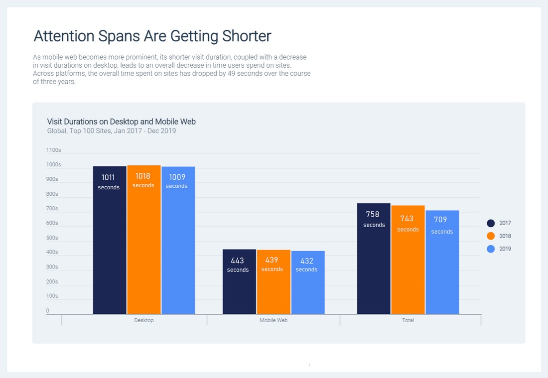
Websites are not immune to this user trend. Time spent per website has been steadily reducing for a while, and today it stands at about 15 seconds per website – after which if the content is not intriguing enough, there is a drop off.
But it’s not just that – of those 15 seconds, 80% of the time is spent on the first fold. That makes those 1440 x 900 pixels very, very important for your design.
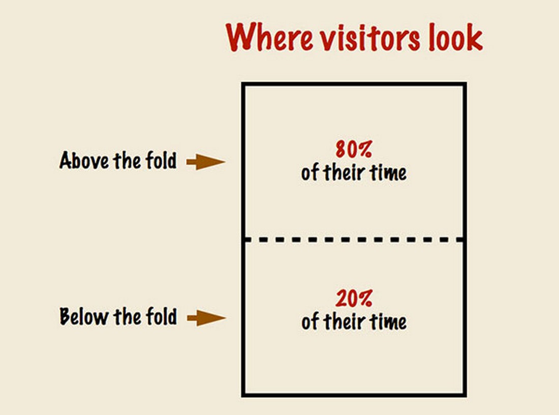
Therefore, when we design websites for conversion, it’s important that a good designer uses persuasion principles to capture user attention within the first fold and optimise for conversion.
Persuasion Design – How Do We Hook People In?
Now that we know the first fold is important, even though it has its skeptics. Either way, here are a few tips & tricks to make it the best possible version it can be.
The F Pattern
When we talk about the first fold, all areas are not made equal. The first step to using persuasion design is the placement of CTAs and other important information.
The F pattern is the way in which people typically read desktop website information. What it says is that – When at the first fold of your landing page, a visitor’s mind will start scanning it from the left. Unless you have something really appealing on the right, s/he won’t look at it until the mind is done evaluating the left side.
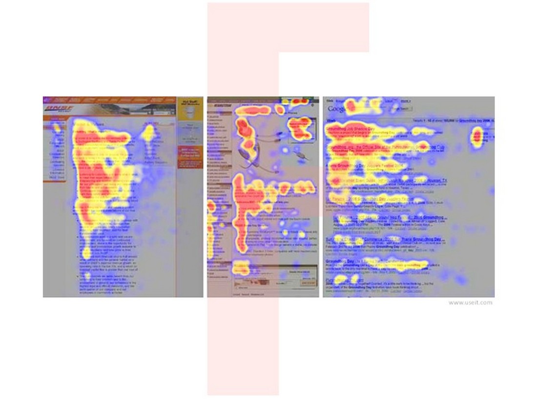
Knowing this, it would be best to place a catchy copy on the left and a CTA right after it on the right – so that users can be primed to click on the CTA.
Cutoff Affordance
Another important thing to note is that the first fold cannot be self-contained. The goal of the first fold is to encourage the user to scroll further below and learn more. So, what is important is to show the user that there is something to scroll for – by leaving some elements on the fold incomplete.
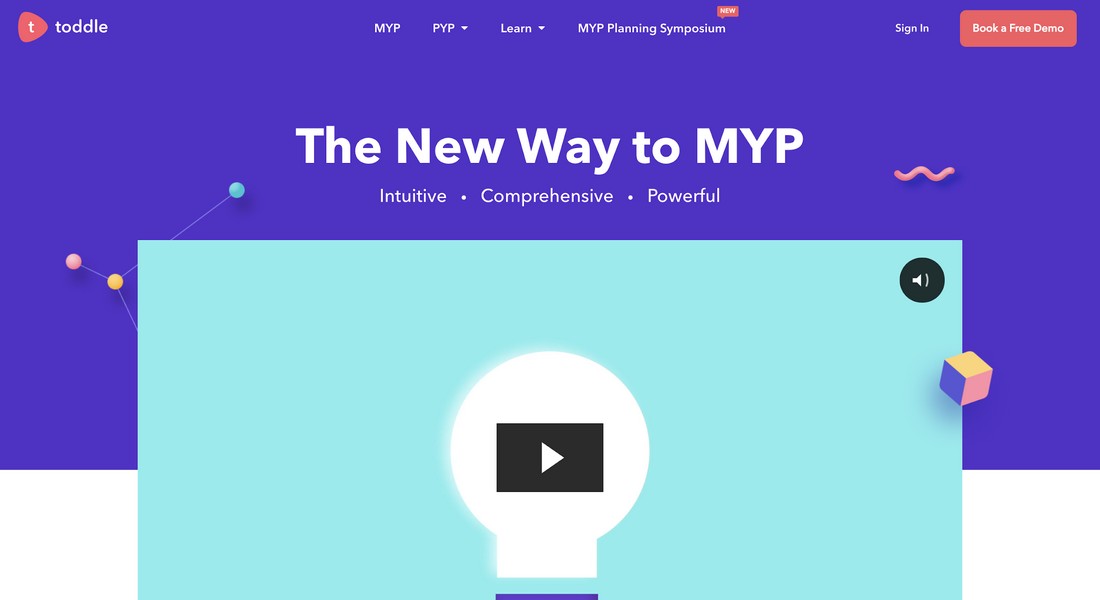
For this, we need an affordance to tell the user to scroll further. Affordance is a property or feature of an object which presents a prompt on what can be done with this object. In short, affordances are cues that give a hint how users may interact with something, no matter physical or digital. For example, when you see a door handle, it is a prompt you can use to open the door.
“When affordances are taken advantage of, the user knows what to do just by looking: no picture, label, or instruction needed.” — Don Norman, Grand Old Man of User Experience
Set expectations
When users come to visit our web page, we want them to feel safe and welcome. The role of the first fold is to be direct and set expectations for what the page is about.
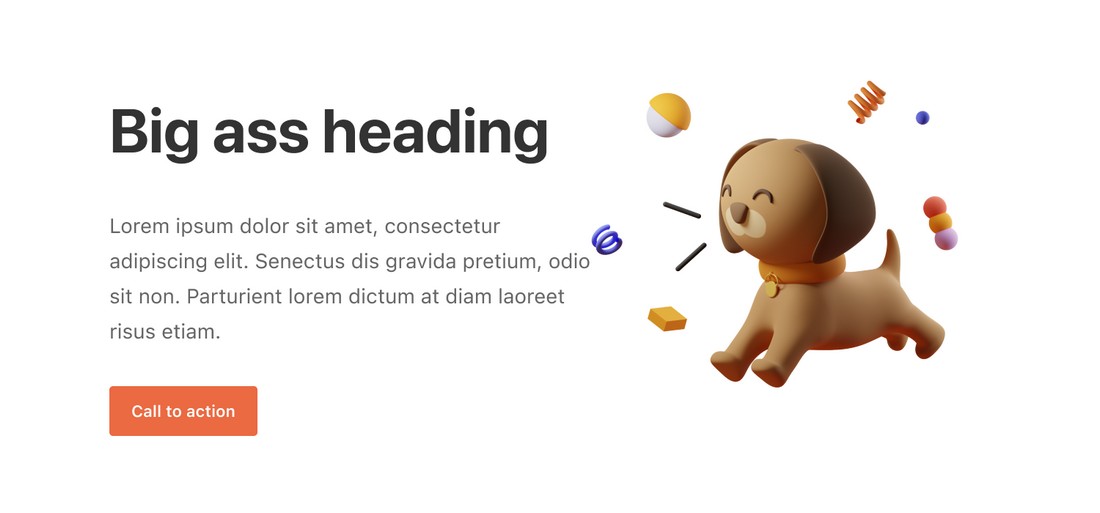
Think of it as a thesis statement of an essay – it should always include a crisp one-liner about what the website wants to convey, clearly and succinctly.
It’s like being mindful of the user’s time – making sure there is complete honesty and they don’t have to waste their time to figure out what the website is trying to accomplish.
CTA Focus
Even if a user is not looking to delve deeper into the website, we should create the first fold in a way that even just being on the first fold is beneficial to the website.
Therefore, a clear, concise and relevant CTA on the first fold is of utmost importance – to make sure that the user’s eye has somewhere to anchor to.

Most websites have already cracked this format, and every landing page you see mostly has the CTA in a nice contrasting colour with a crisp relevant line on it.

Cognitive Load
Less is more when it comes to user understanding. The first fold should always have as little clutter as possible – so that what’s important comes through to the user. The goal is always to make sure that from the first fold, one clear point goes through to the visitor.
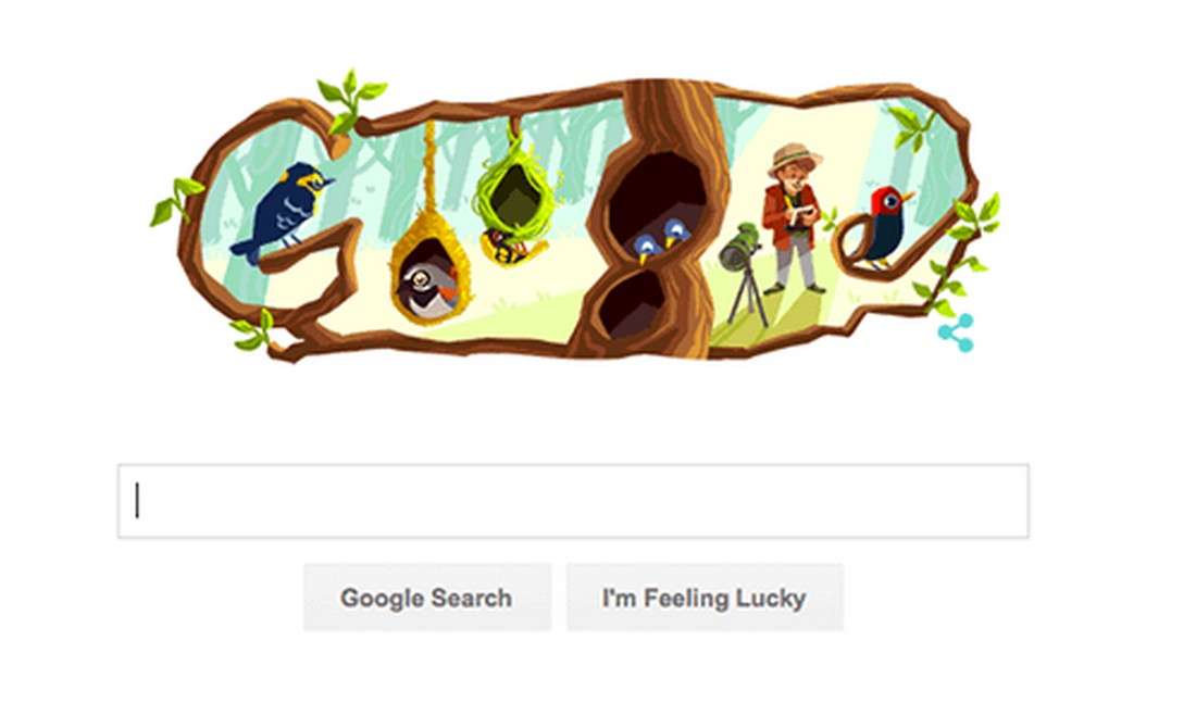
Take it from the leader of the world, Google. As little clutter as possible is what makes the important things stand out.
Last but not the least, it goes without saying, don’t put ads up there.
First Fold on Other Devices
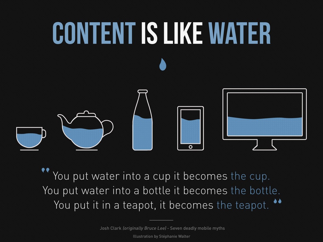
So far, we’ve only spoken about desktop websites, but every digital trend follower knows that it’s the decade of smaller devices. Mobile phones, tablets, and even watches are dominating the usage statistics.
So – does the fold matter on smaller devices? The answer is yeah. When we build for a seamless experience across devices, it’s important to think about the device-specific experiences of the user. For different devices, the same rules apply – but with smaller real estate (so basically, on hard mode)
So there you go! You are now armed with the knowledge to make sure your first fold is backed by UX science and your visitors are put to best use.