E-Commerce Design Trends To Look For In 2021
The world was shaken during 2020 and the pandemic, and most people still are. The threat hasn’t disappeared, but it has considerably subdued. Throughout this pandemic, the importance of website design increased significantly. Most brick-and-mortar stores had no choice but to turn to e-Commerce platforms for continuing their operations. However, most of them did end up liking the process much better. To have relevance on an online platform, you need to have a website that is up-to-date with security protocols and design elements.
Now that we are in 2021, we should look back and predict some of the most popular e-Commerce platforms and their design trends to see what is most likely to stay in trend and prove useful.
1. Parallax scroll animations:
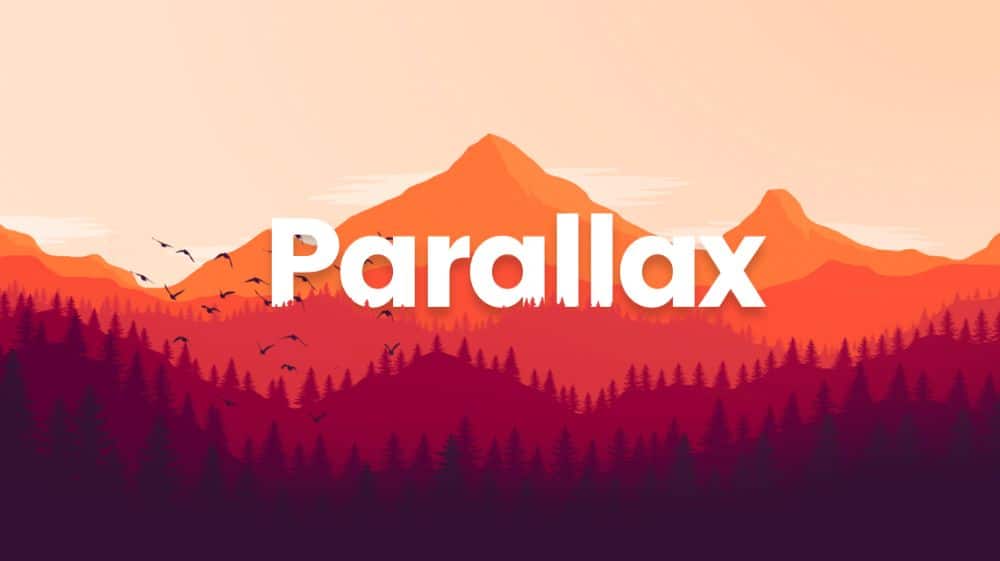
Parallax scroll animations are one of the consistent contenders that have stayed in trend for many years, which is not going to change this year. You need to be careful with using it optimally, though. Suppose you use too much movement in the parallax effect. In that case, it can not only annoy people but also harm those with vestibular disorders. The illusion of depth can cause dizziness and disorientation. You should not let parallax scrolling distract your visitors from important content places. It should not make completing a task for the visitors more difficult.
The parallax effect is best used subtly and rarely, so don’t overuse it at different places on the same website. If you want to be safe and responsible towards your visitors, keep an option to turn off parallax effects. You need to understand that every parallax animation isn’t to make grand gestures across the screen. There can be subtle applications as well.
2. 3D Visuals and Geometric Patterns:
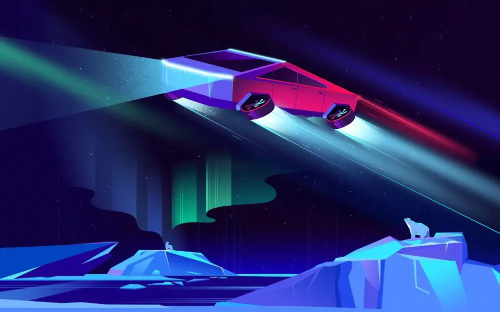
We have increased screen resolutions, which have resulted in a better 3d Design than the previous blocky edges of Geocities. Now, 3D designs are weaved into web design seamlessly. They don’t feel like unnecessary distractions; instead, they add to the overall experience.
Geometric patterns are often used in modern web design. Rectangles, polygons, triangles, and rhombus are some occasional flat shapes that we usually see. Geometric web design in 2021 seems to include more modern elements such as 3D shapes, visible gridlines, and floating objects. Doing this would blend realistic objects with surreal motion, which creates an alluring futuristic effect.
3. Illustrations:
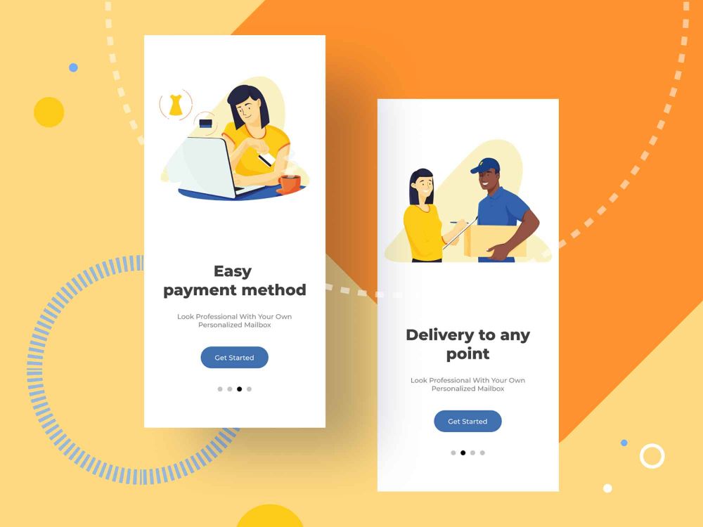
Illustrations are more or less permanent in the world of design trends. They would be important in some or the other way irrespective of which year. However, they exploded all over social media, web design, and graphic design spheres. Many brands started realizing the power and impact of illustrations and digital arts. Most of them are also making use of hand-drawn elements in their web designs. Similarly, eCommerce websites are likely to use illustrations to navigate, familiarize, and build a sense of trust with their visitors.
4. Shifting the focus to grains:
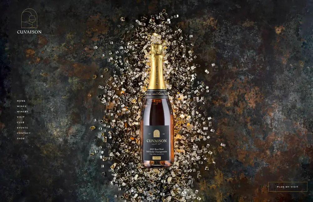
If you look at most eCommerce web designs these days, they have a flat overlay of colors. They have solid colors with no variations. Such color selection drains out the personality of any web design. Grainy textures would give them a better and natural feel. It looks more real to life and adds depth to a website design.
It is exactly how grains in images for the longest time were thought of as inefficient photography skills. Photographers did not like grainy images. These days you see Lightroom and camera applications like Huji have options to add and adjust the level of grain to a picture that never had any in the first place. Adding grains to certain images adds to their authentic feel, especially when the picture’s theme is vintage or grunge.
5. Retro fonts:
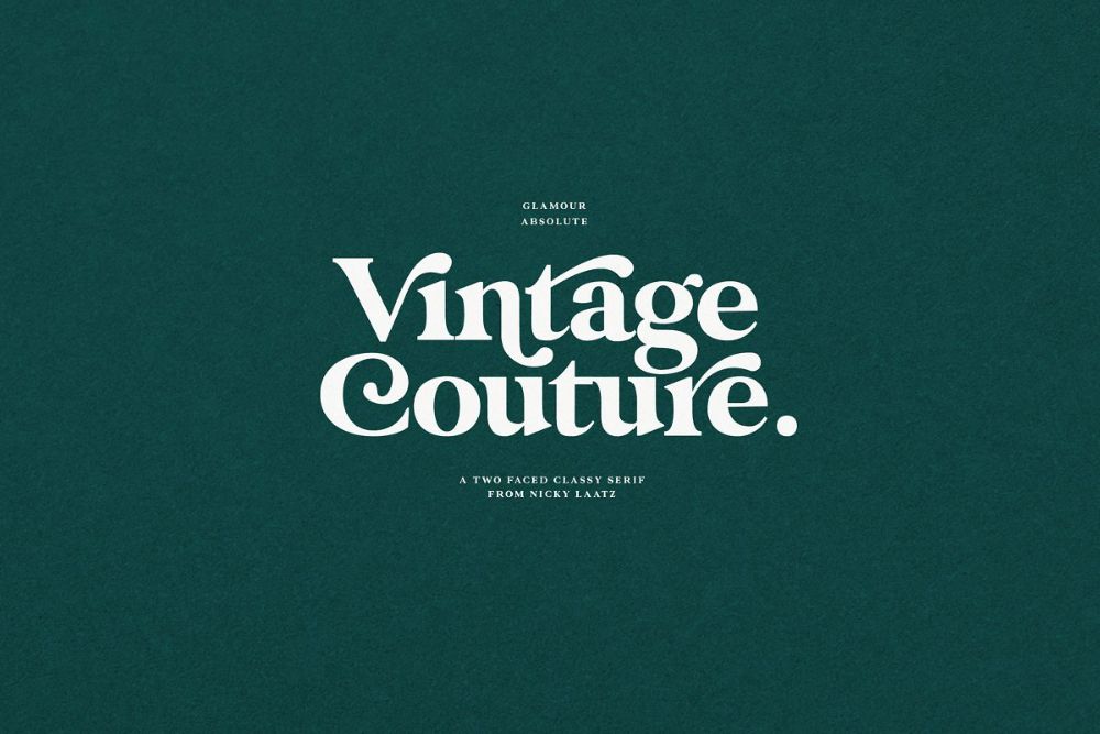 Retro fonts are such a design trend that they keep losing their popularity and gaining it back time and again. Instead of reusing the old fonts again, the approach to this design trend is found in modern artistry and designers reimagining what retro fonts can be.
It is a modern approach to retro fonts that would take modern design principles and rework retro fonts by a modern interpretation. The result of this is retro-looking fonts with more aesthetic and time relevance. This can be referred to as retro-futurism.
6. Horizontal Scrolling:

This is changing the scrolling nature of the traditional vertical scrolling. This trend is more about user experience. Changing one of the most innate psychological expectations of visitors, seeing a website slide horizontally when scrolling using your mouse, would feel oddly satisfying. As if it should not be possible. But it is! However, designers who have broken this pattern and introduced horizontal scrolling have not done it with the intention to stand out but as a practical way to disclose secondary information progressively. In no way are we expecting horizontal scrolling to replace vertical scrolling entirely. A blend of both would help create a great e-commerce website design.
A few considerations you should keep in mind with horizontal scrolling are:
- Not forcing users to navigate through horizontal content.
- Avoid it for texts that you want your visitors to read.
- Think about what content would benefit from being in a horizontal scroll.
- Make use of clear visual cues to indicate where the horizontal scroll content starts.
7. Multimedia implementation:
People have faster internet speeds, and hence they can view multimedia with ease. Designers realize this and are pushing for more multimedia experiences everywhere. They bring together video, text, audio, and visuals for enhancing user experience. By 2021, designers would focus on creating multimedia with simplicity at its core. Too much movement can be distracting and overwhelming to people who have cognitive disorders.
All media formats would be used thoroughly to increase the accessibility of content. All images would have alt text, and complicated pictures would be supported with longer descriptive text. Video autoplay would be looked down on. The visitor would be given a clear indicating button to play or pause a video.
8. Audio:
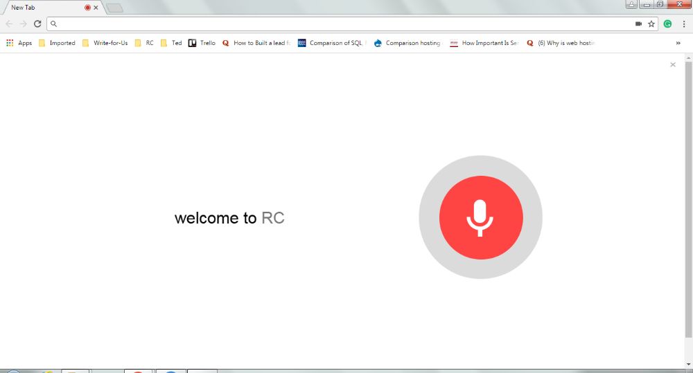
Audio is something we still haven’t seen make a big impact on website design yet. It is a design trend that some websites have used in the past, but not many or to its full potential. However, making it more integral to the website design would help increase accessibility barriers for people with visual impairments and sit well with people who’d rather hear a website’s content than read large chunks of text. More and more designers are likely to find a way of enabling audio-driven/assisted websites in 2021. eCommerce websites have a scope of integrating more VUI – Voice User Interface in their chatbots and virtual assistants.
9. Scrollytelling:
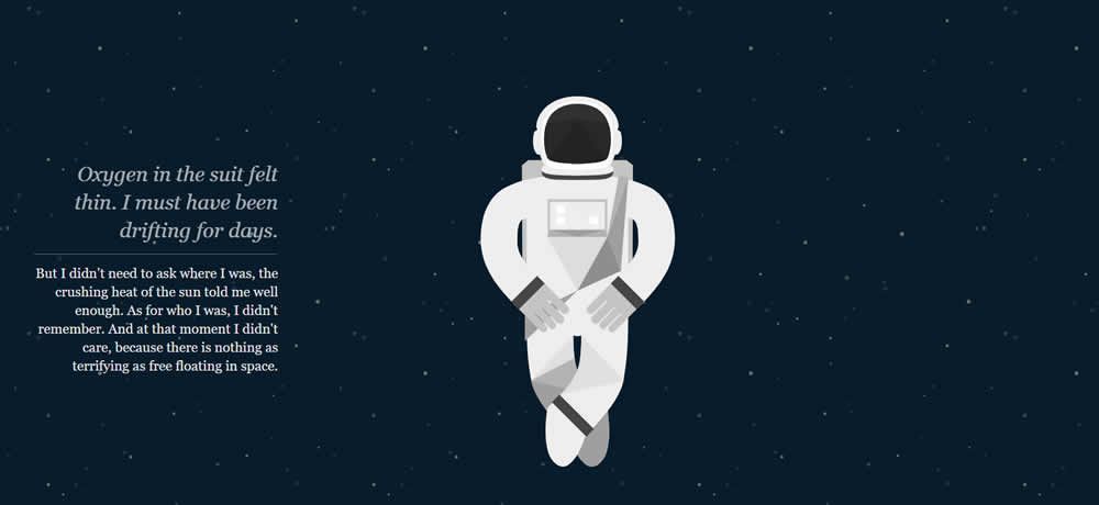
This is something that web designers have been trying to master over the years. It is what keeps people engaged with the content of a website too. Suppose the audience buys and is captivated with the story they are shown through an effective website design. In that case, they’d spend more time on the site and more likely interact with the product and services that the site has to offer. Scrolling experience affects the navigation and visual interest in a website significantly. It can make or break a website’s captivating potential.
Designers in 2021 would want to perfect and better their art of scrollytelling by keeping certain pointers in mind:
- Keeping motion in a confined small area.
- Ensuring any scrollytelling elements help emphasize the story rather than acting as a distraction.
- Give users interaction controls to play, pause, and stop interactions when they want.
10. Inspiration by print:
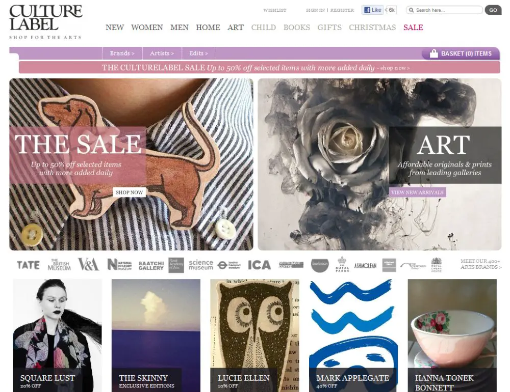
Digital technology has constantly been taking over physical objects and print media. However, amidst this, old media have been resurgent. If you think about vinyl albums and how popular they got, it is proof that people still crave things outside the binary world of 1s and 0s. Realizing this, designers who would implement print inspiration design in their layout would fulfill such people’s desire to connect with something from the real world. Online magazine layouts and traditional graphical elements are some fine examples of this.
11. Augmented Reality:
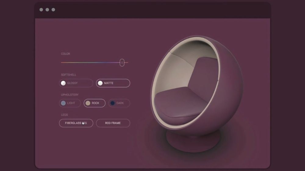
AR is one of the most immersive technologies and leads to the best experiences to discuss eCommerce design trends. This would mean allowing customers to try on a pair of spectacles using 3d camera software or having a hands-on test drive experience by visiting a website. This can work well for eCommerce websites. It removes the barriers of the product feel or use before purchasing it, which makes most people skeptical about online shopping.
12. UX writing and Microcopy:
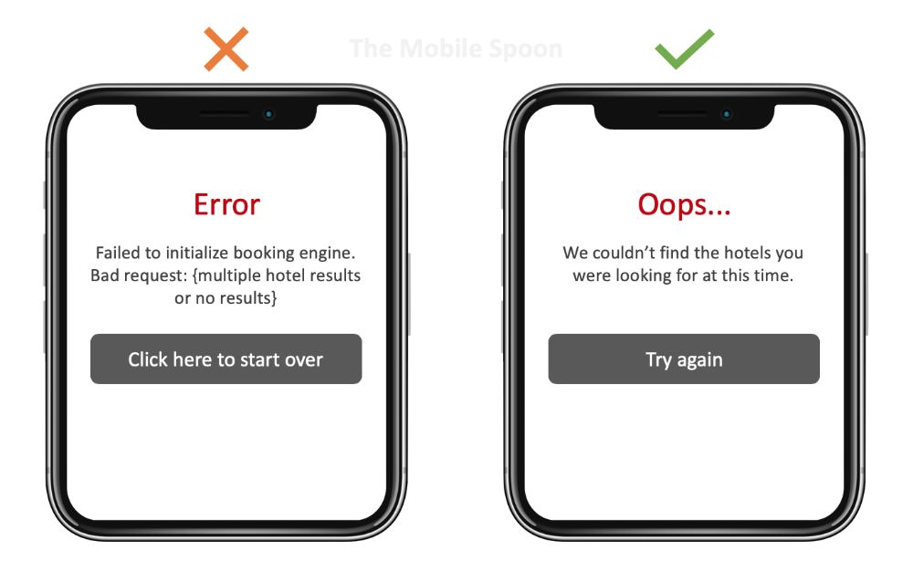
Even if you have the most stylish and user-friendly eCommerce website, you might, at times, see people visiting your site in large numbers. However, a very small percentage of them convert or buy products from your page. The general rule of design tends to indicate that people always want more. More benefits, features, visuals, and more. But nowadays, people want a story more than anything else. Hence the content that bridges them to your products and offerings should speak to them. It should resonate with them. Always make the audience the ‘hero’ of your brands’ story. Usual copywriting pieces are getting a little obsolete these days. People are bored of seeing the same content everywhere. Hence copywriters and companies should change their old approach a little to target their audience.
Overall, the dialogues can be less formal, more friendly, and more catered towards the preferences of the target audience. Having microcopies would give your website a unique tone and language, which would allow better communication with your audience. For this, you need to capture the true essence of a brand’s identity effectively.
13. Before and After Product Features Comparison:
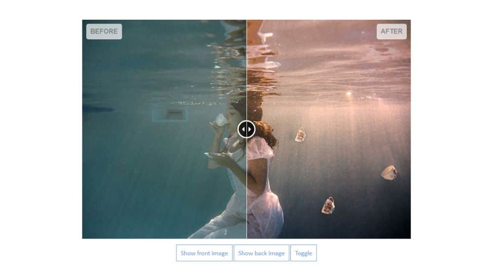
For some instances, it can be very difficult to explain how a product looks like or what effect does it have. You could stick to video tutorials to show how to apply it and the outcome of using such products. Still, you would be losing to people who would be using interactive before-after features. Such features can be activated by attractive CTA buttons like ‘See it in action,’ ‘Compare,’ ‘Transform,’ and more. Adding this feature would make your visitors participate in the UI experience by dragging the slider left or right and see the difference almost in real-time. This would make them feel more involved in the brands’ communication and make it easier for them to trust you.
14. Quicker and shorter checkout process:
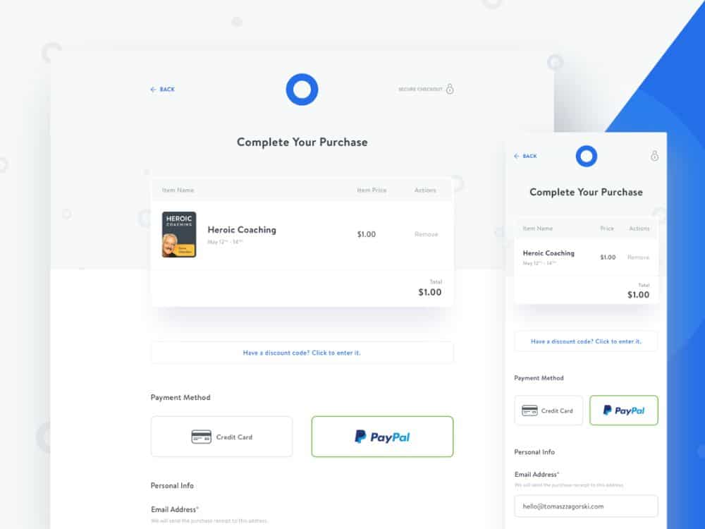
Suppose you are in a supermarket or even a mall, you find the products you want to buy and have them all in your cart. In that case, you would go and look for the checkout counter to pay for your items and purchase them finally. The problem? 100s of other people are ahead of you waiting to check out their products too. Time plays a crucial role in the final purchase decision. The same is for online stores.
Though you don’t have to stand in a queue to get to your turn to check out products you added to your cart, some websites have an extensive checkout process that can get annoying for your visitors. If they need to interact with your screen or app 5-6 times after adding items to the cart, there are good chances they would abandon the cart and cancel their purchase. Hence for successful eCommerce websites, focusing on minimalistic and concise checkout processes and fields is of utmost importance. You have to make their checkout process easier, or you’ll lose out on many assured sales.
These are the 14 eCommerce Design Trends to Look for in 2021. Making an e-commerce website for 2021 and ahead is more than providing a decent shopping experience. The website’s ease and beauty have to go hand-in-hand to truly wow your visitors and keep them coming back for more. Make sure to update your eCommerce site’s design or design a new one with these points in mind. Have your take on the overall design feel and experience with these as your guiding points.