Brochure Design Ideas & Inspiration for 2025
Almost every designer has created a brochure at some point. And there’s a strong possibility you’ll be asked to design another! Whether it’s for a client or to promote your own business, there’s an art to designing a brochure.
And then there’s an added challenge: brochure design isn’t just for print anymore. Digital brochures are just as popular as hard-copy versions. It’s quite common for clients to request a printed brochure with a digital shareable file of the same design.
Don’t sweat this design challenge though. We’ve put together some classic and modern tips so you can create a brochure design that looks great, and is easy to read.
Pastel Colors
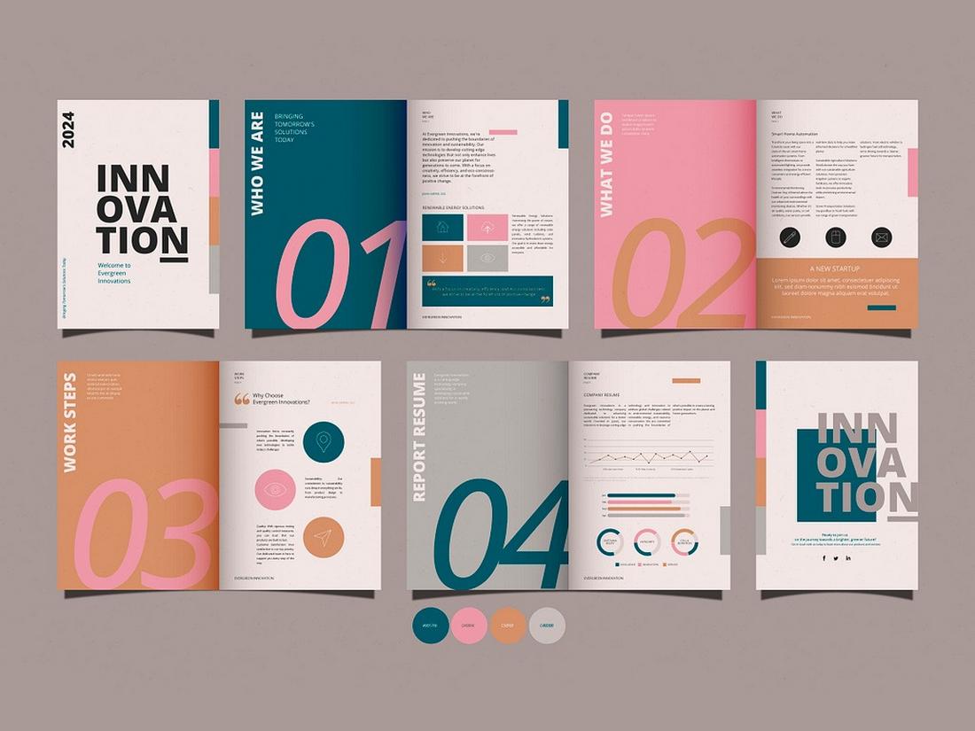
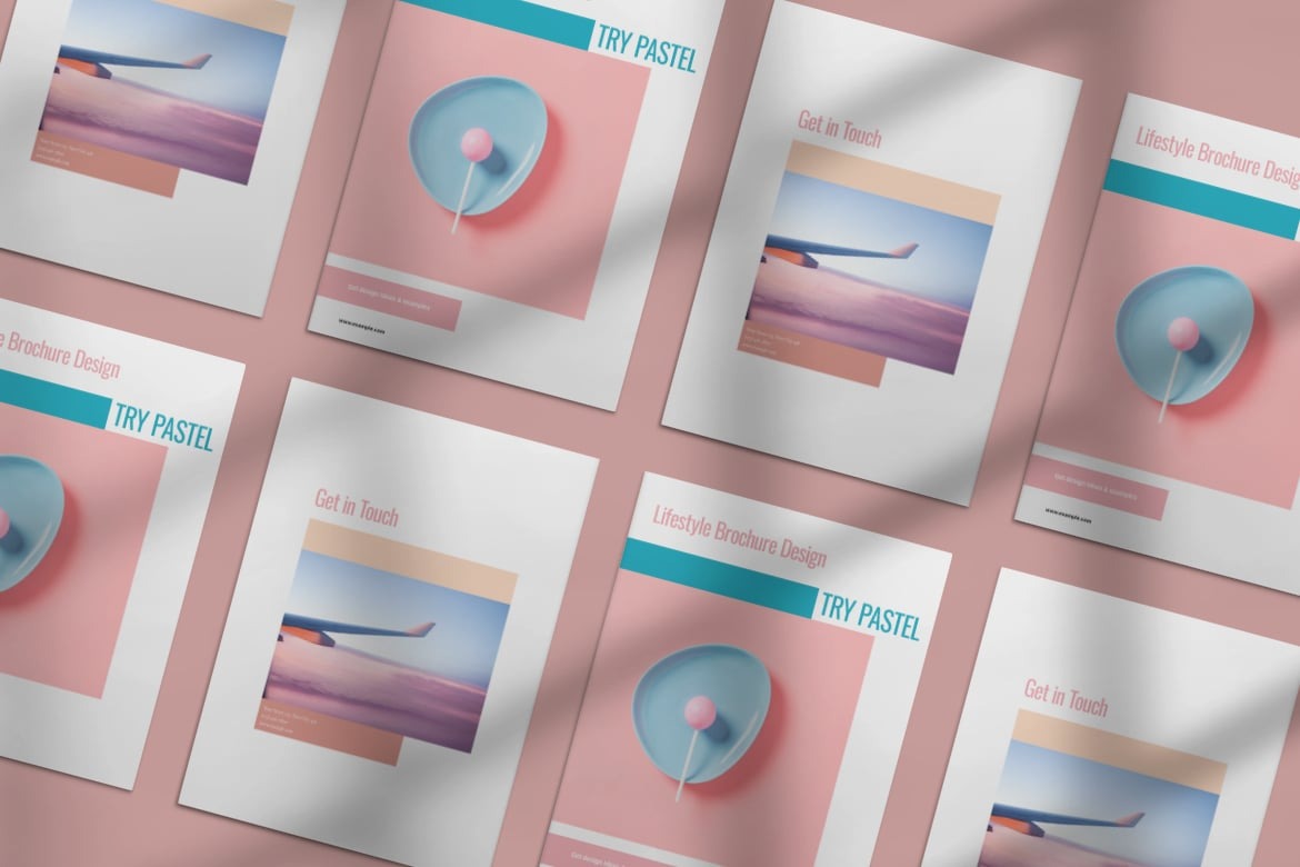
Using pastel colors in brochure design can create a soft, calming, and approachable look. Pastels, such as light pinks, baby blues, and mint greens, add a touch of elegance and sophistication to the design, making it suitable for brands aiming to evoke a gentle and welcoming feel.
These colors are often associated with a minimalistic approach, providing an airy and light atmosphere that allows content to shine without being overwhelming.
Pairing pastels with clean, white space and delicate typography can enhance the overall aesthetic, giving the brochure a refined and polished appearance. The use of pastel gradients or subtle illustrations can add depth to the design while keeping the visual impact light and refreshing.
Vibrant and Colorful
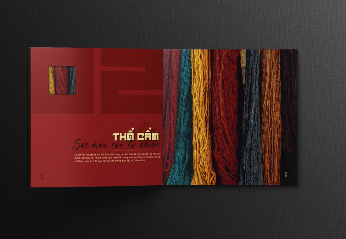
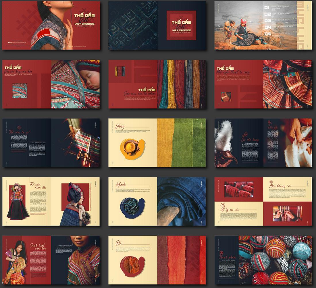
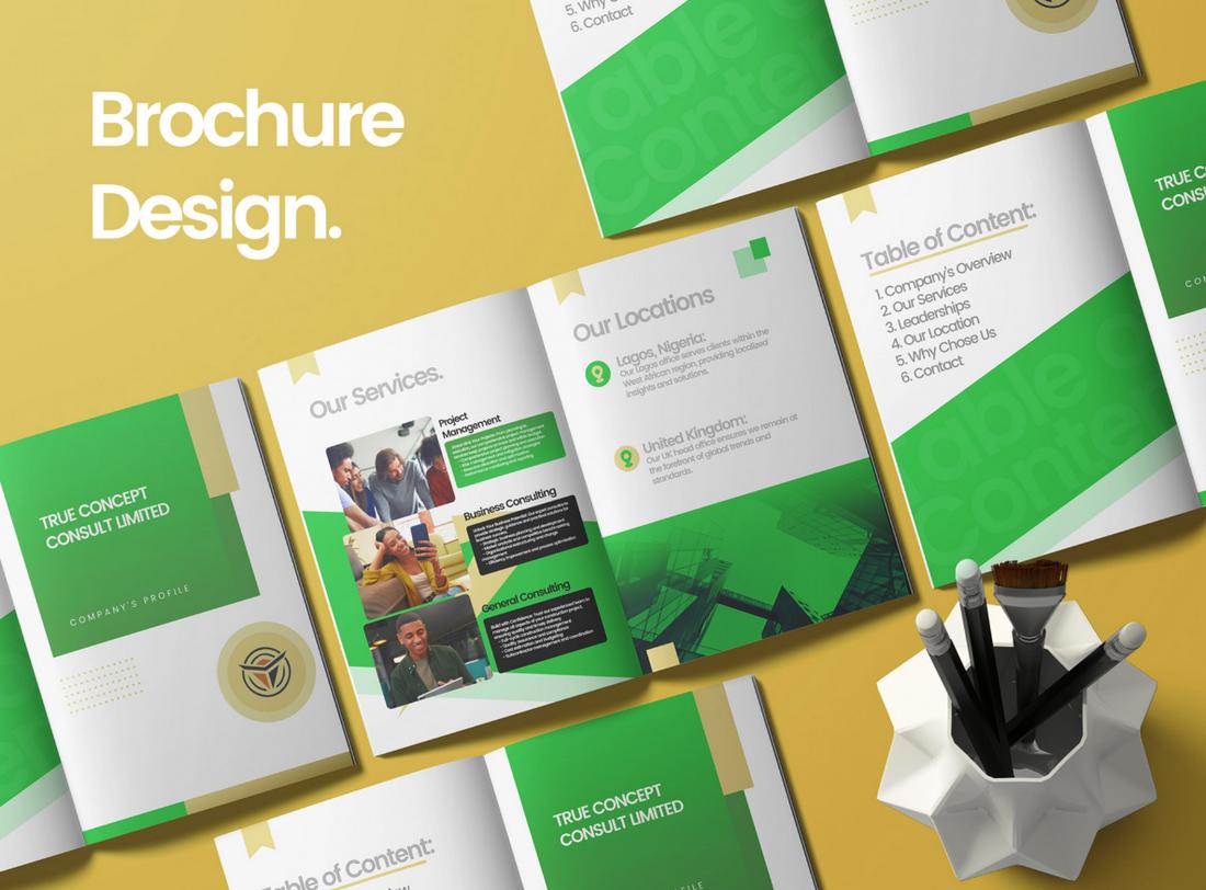
A vibrant and colorful brochure design can instantly capture attention and make a strong visual impact. By using bold hues and dynamic color combinations, this style adds energy and excitement, making it suitable for brands that want to project a lively and youthful image.
Bright colors can effectively highlight key information, draw the eye to important sections, and make the content more engaging.
To create a cohesive design, choose a color scheme that complements the brand’s identity while ensuring contrast is used effectively to maintain readability. Incorporating patterns, color-blocking, or vivid gradients can add visual interest and variety, preventing the design from feeling flat or monotonous.
High Contrast Highlights
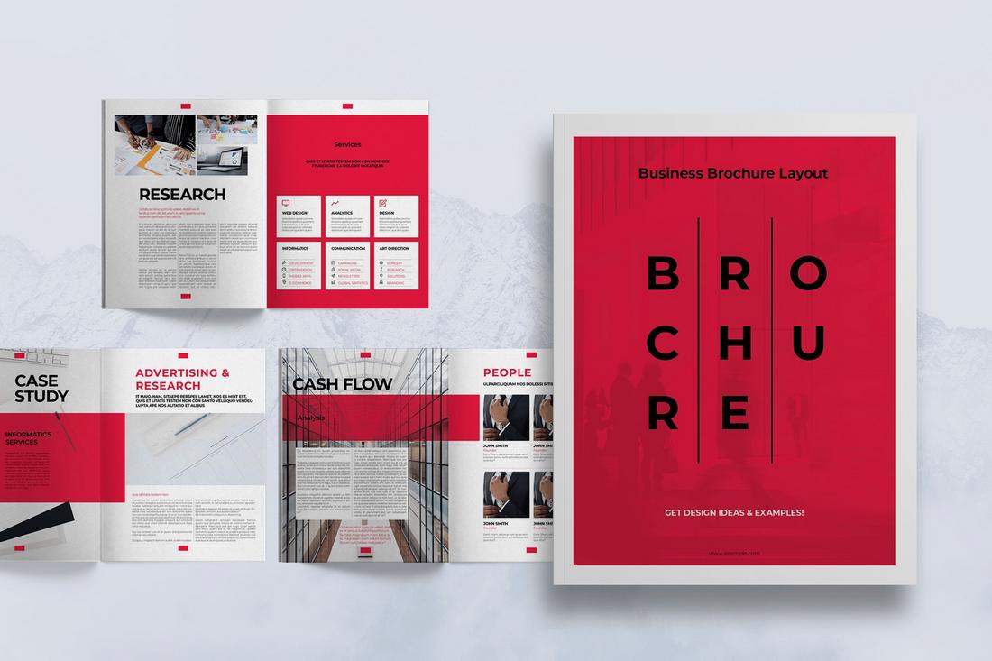
High contrast highlights in brochure design create a dramatic and eye-catching effect by matching dark and light colors. This style uses sharp contrasts, such as black and white or other opposing color pairs, to draw attention to specific elements and add a sense of boldness to the layout.
High-contrast designs are effective in emphasizing important content and making headlines or key visuals pop against the background.
Incorporating high-contrast highlights can also enhance the legibility of text and improve the overall visual hierarchy. By carefully balancing contrasting elements, designers can guide the viewer’s eye through the brochure in a deliberate and impactful way. Using textured backgrounds or geometric shapes can add depth to the design while maintaining the bold contrast effect.
Vintage Aesthetics
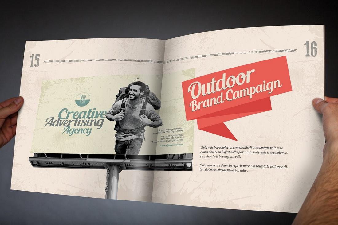
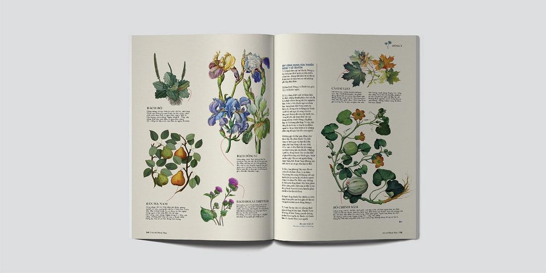
Vintage aesthetics in brochure design offer a nostalgic and timeless appeal by drawing inspiration from past eras. This style can include elements such as retro typography, faded colors, and distressed textures that give the brochure an authentic, aged look.
Vintage designs often evoke a sense of history and tradition, making them ideal for brands that want to convey authenticity, heritage, or a handcrafted quality. This approach works well for businesses in industries like antiques, craft products, specialty food and beverage, or any field where a sense of nostalgia can enhance the brand narrative.
To achieve a vintage look, use a muted color palette with tones like sepia, dusty pink, or olive green, and pair them with classic fonts reminiscent of the chosen era. Adding illustrations or vintage-inspired patterns can further enhance the aesthetic, creating a design that feels cohesive and well-thought-out.
Gradient Accents
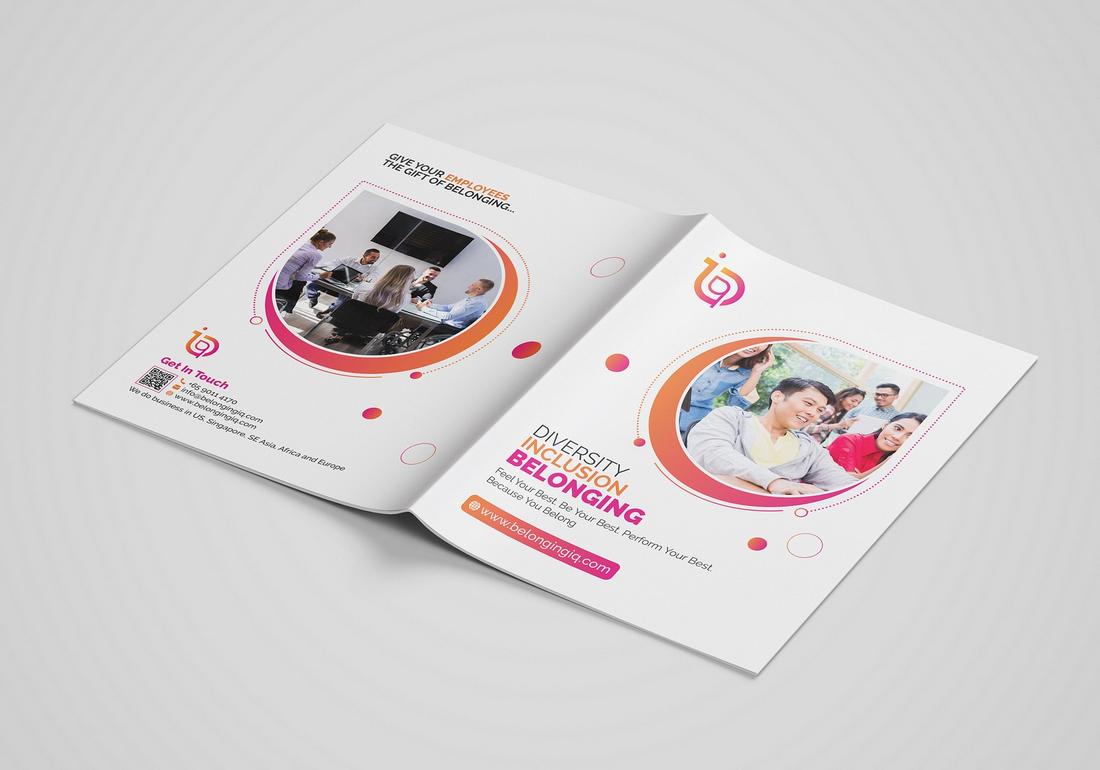
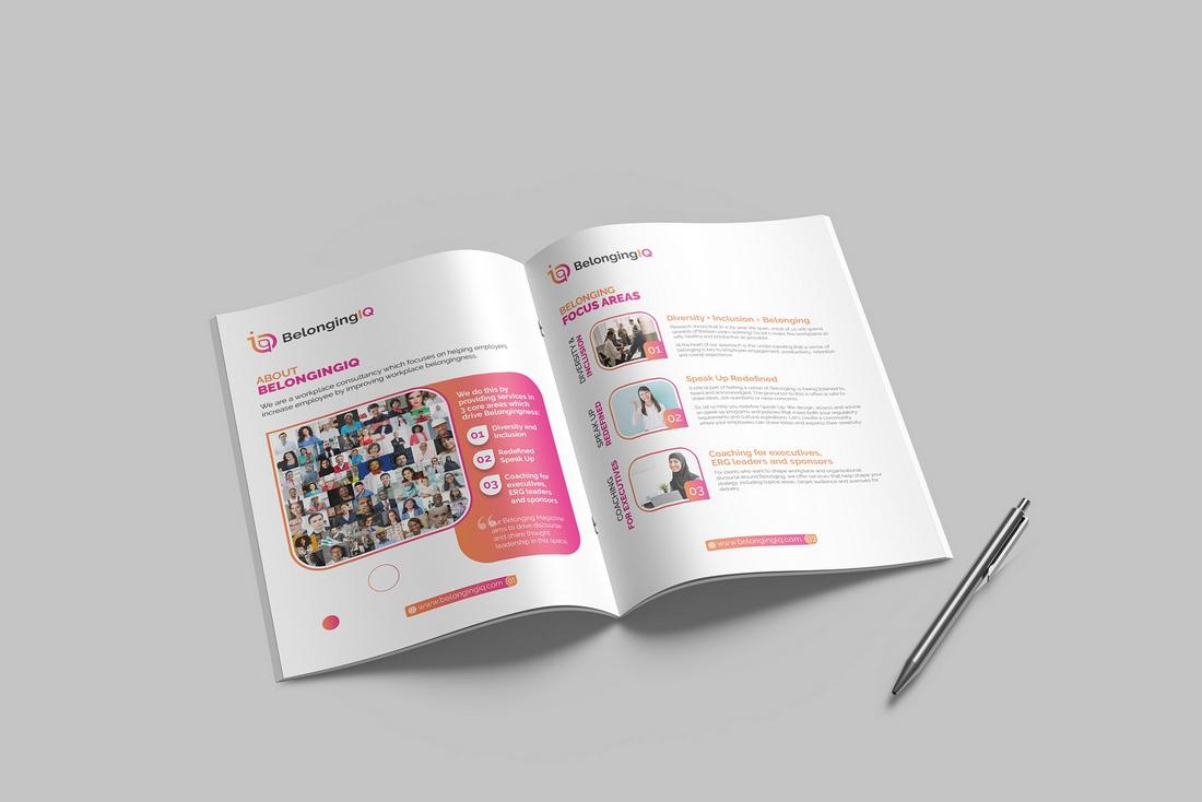
Gradient accents add a modern and dynamic touch to brochure designs by blending colors seamlessly to create a sense of depth and movement. Using gradients as background elements, overlays, or highlights can make the design feel more sophisticated and visually interesting.
Gradients work particularly well in tech, creative industries, or any brand that wants to convey a forward-thinking and innovative image. They can be used subtly to add texture or more boldly to create striking focal points that guide the viewer’s attention.
The versatility of gradient accents allows designers to experiment with different color combinations, from subtle monochromatic transitions to bold, contrasting color shifts.
Common Brochure Shapes and Sizes
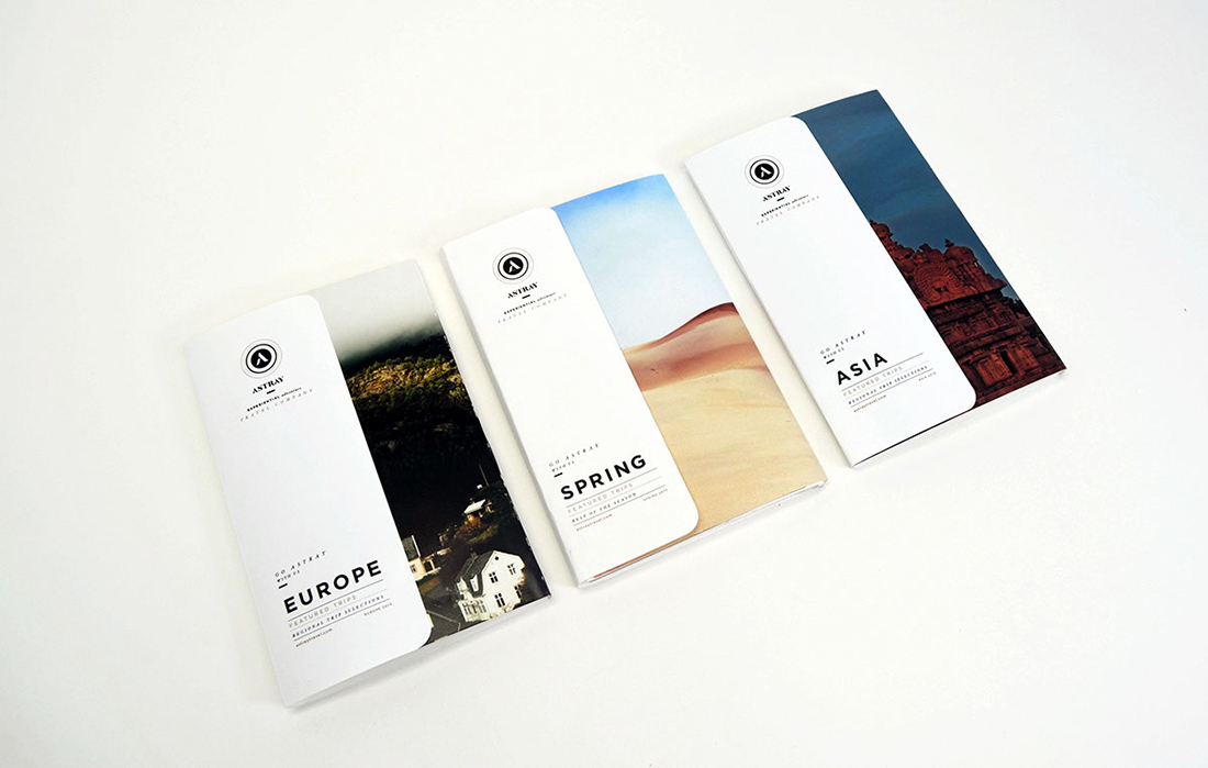
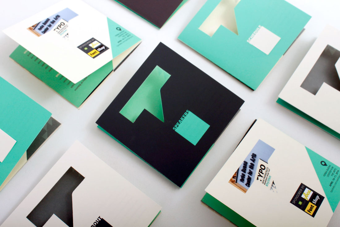
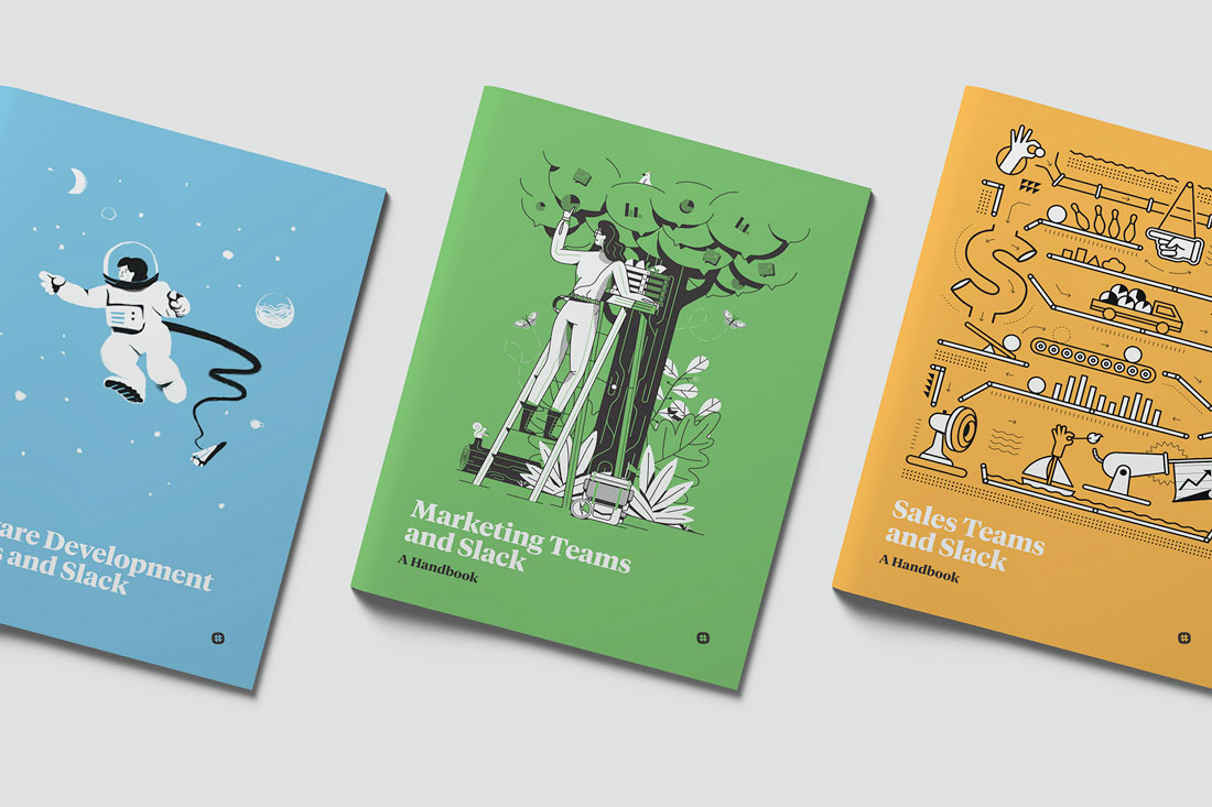
The first step in creating a brochure design is to consider shape, size, medium, and folds. All these tactile properties of brochure printing contribute to the style of design you choose and how combining text, images and other elements comes together.
When it comes to creating brochures, common options include:
- Tri-fold: Three panels on the front and back, stacked vertically or horizontally printed on common paper sizes such as 8.5 inches by 11 inches (or A4) or 11 inches by 17 inches (or A3).
- Half-fold: This style works best for a mini-booklet style with a front, back, and inside spread.
- Die-cut: Brochures with cut-out panels, shapes, and styles are often printed on thick stock and come in almost any size. They are characterized by multiple cut elements so that at least some part of the brochure isn’t rectangular.
- Multi-page: The more pages a brochure has, the more likely it is to become a booklet. These are almost always in a standard size (8.5 by 11 or A4) and include some binding.
- Square: The shape has become popular thanks to usage online and square designs often include a custom paper size. It can be a little more expensive, but quite attractive.
Make sure to take into consideration print versus digital publishing. It is common for brochures to live in both physical and online spaces. While some brochure styles don’t need adjustments other than converting a file to PDF, some print jobs don’t render well digitally. (Tri-fold brochures can look especially strange.)
When it comes to shifting a print brochure to digital, consider making each page or fold of the brochure a separate page in the digital version. Order them in the way the content should be read. This will make the brochure easier to read regardless of format.
Creative Brochure Design Inspiration
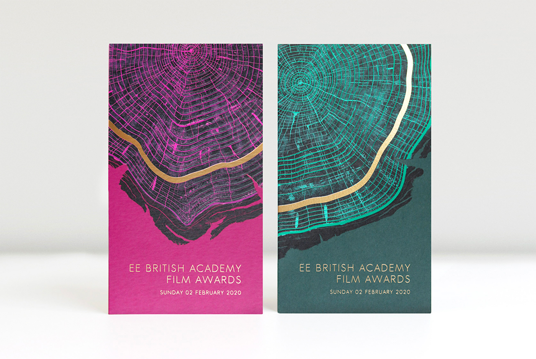
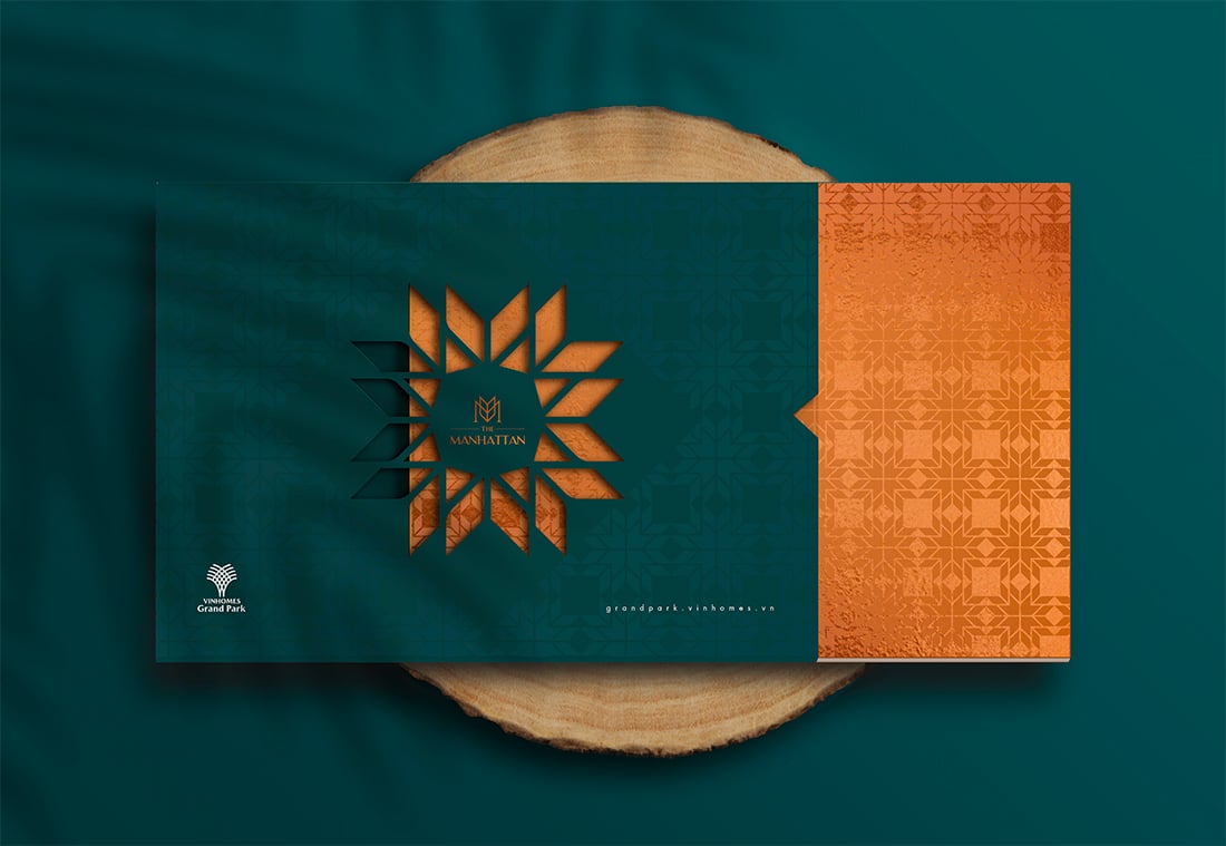
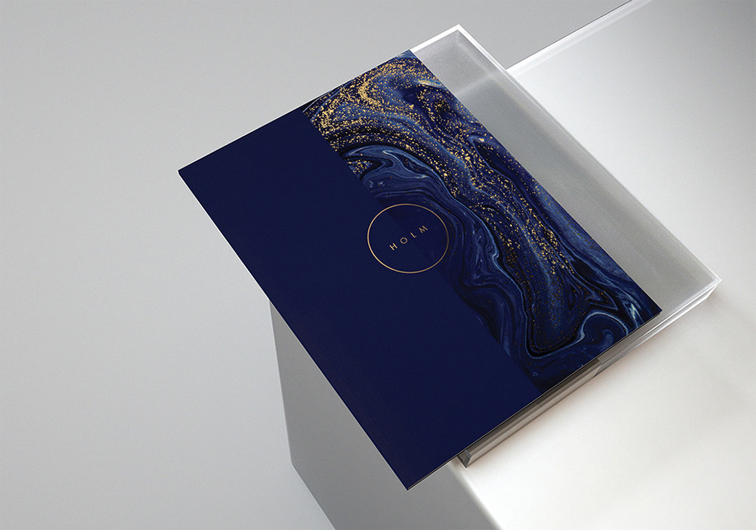
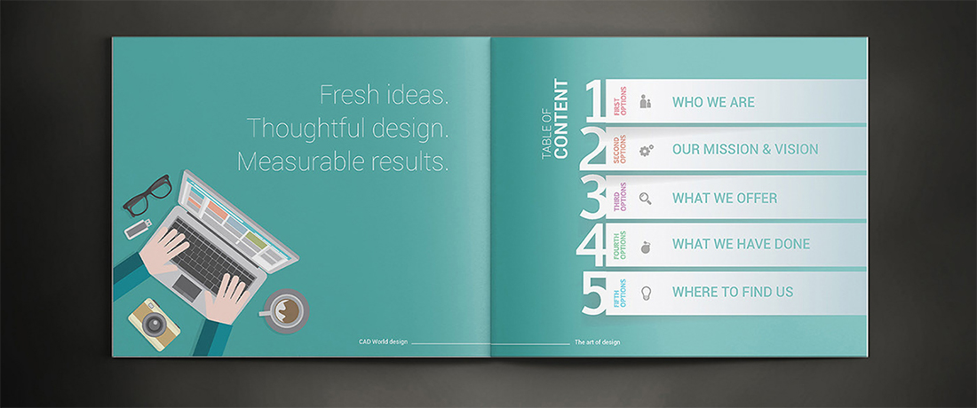
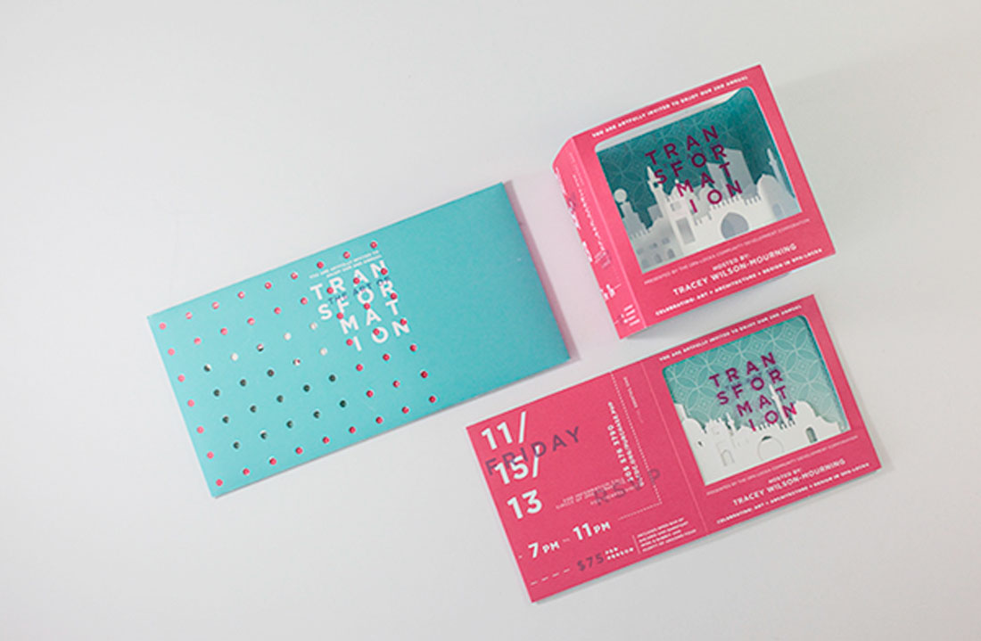
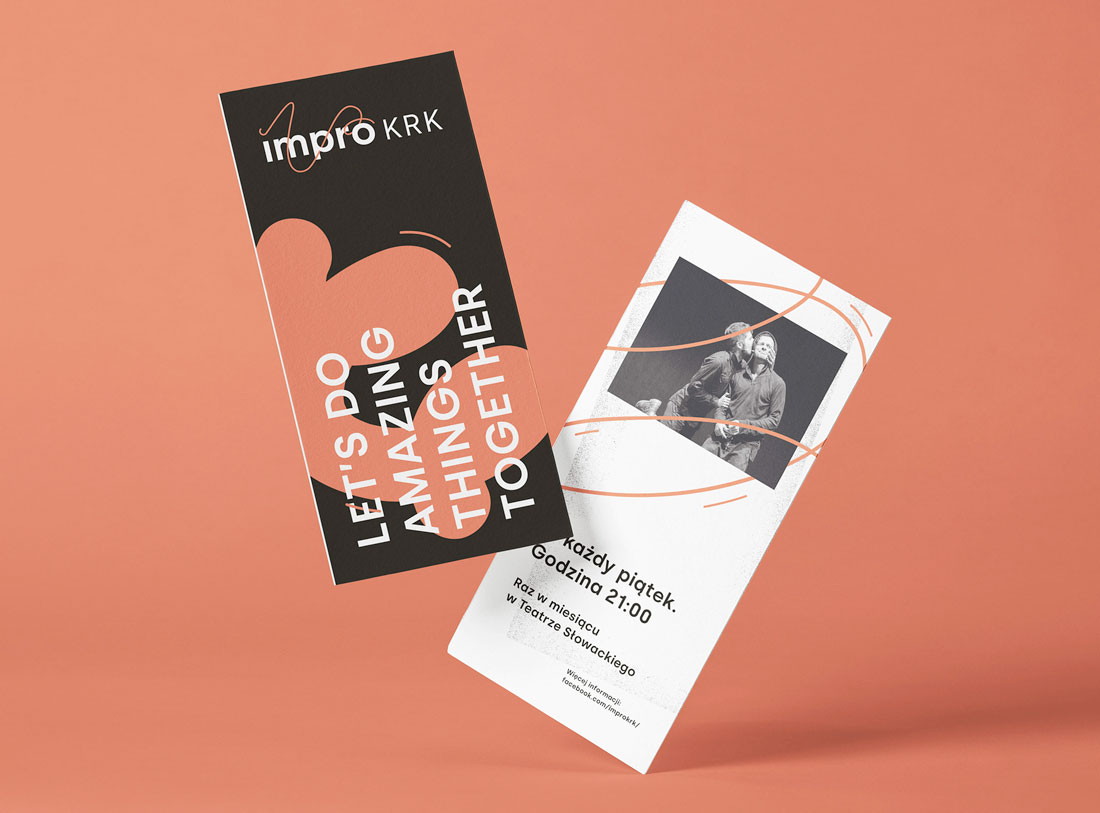
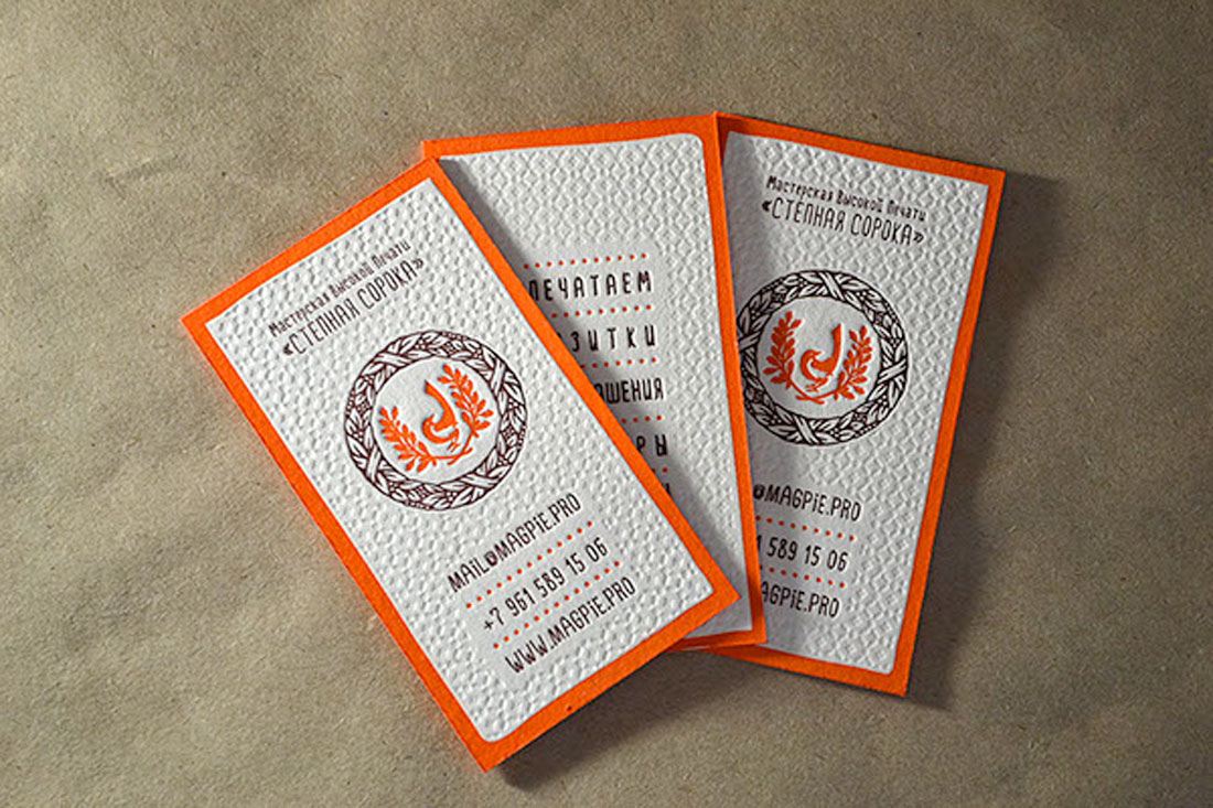
What’s great about designing a brochure is that you can get creative with effects and textures.
- Foil: Shiny lettering or feature for a certain portion of the design
- Spot UV: A special gloss or matte finish on part of the design
- Letterpress: Printing that makes an imprint on certain parts of the design, such as the brochure above)
- Folds: Bi- and tri-folds aren’t the only option, interesting fold patterns can encourage user engagement
- Paper: Paper types with different textures can set the tone of a project
- Die Cuts: Cutting out parts of the design so something else shows through creates a send of mystery
Modern, Trendy Styles
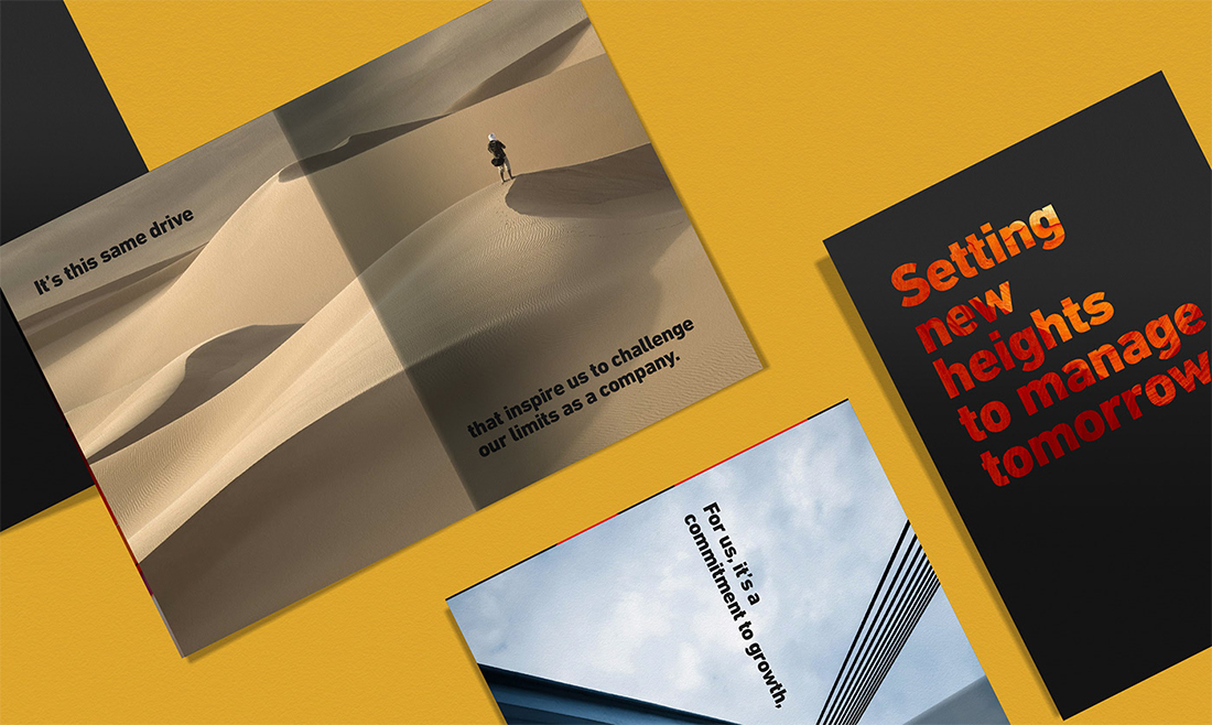
Some trends in brochure design include using high-color options, plenty of sleek typography, and simple images. Many of the same things that are popular in other areas of design apply to brochures as well.
Modern, trendy brochure design techniques that always look great include:
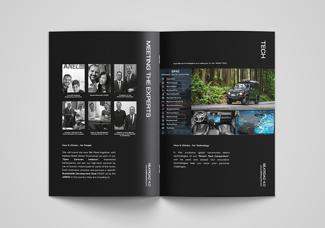
- Creative use of whitespace, that’s not actually white, such as the Silkroad brochure (above) that’s printed on black
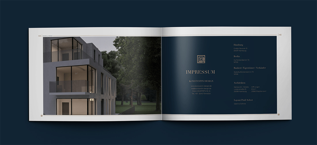
- Elegant design themes that mix simple typography and great imagery with a few stunning effects, such as the Real Estate brochure (above)
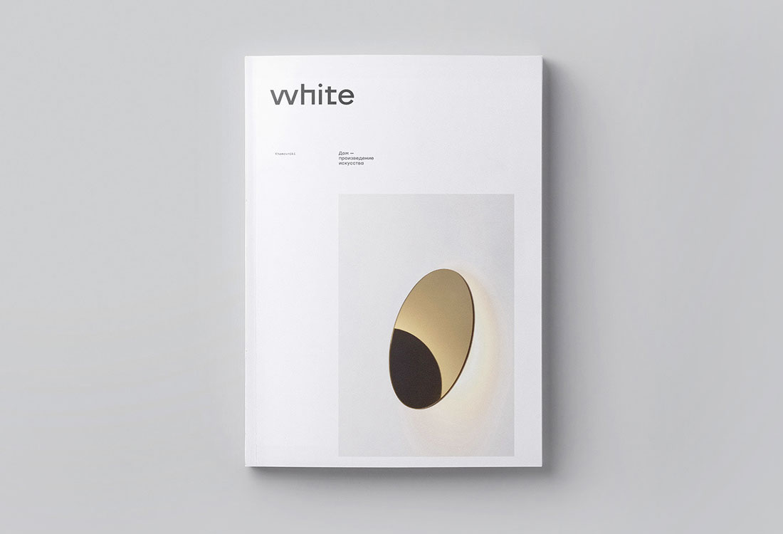
- Minimal aesthetics with plenty of white space, such as White (above)
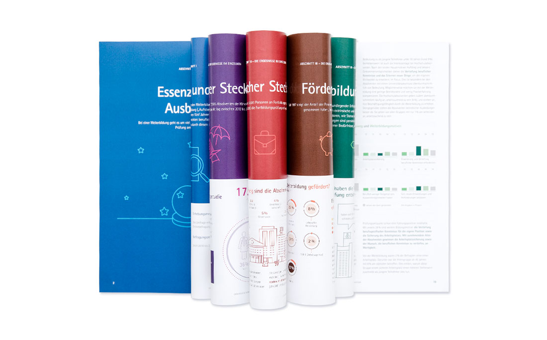
- High-color designs, including color blocking on alternating folds, pages, or panels, like DIHK (above)
- Use of oversized typography, that makes lettering a key element of the design, such as Hamat Property Company (above)
Blocky Design Elements

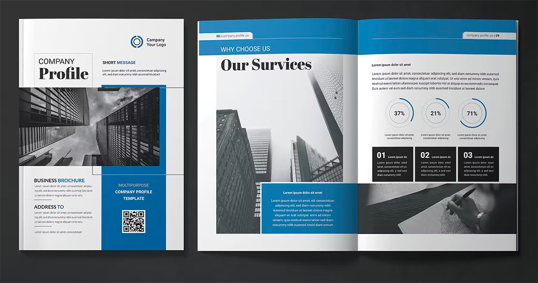
Blocky design styles are back and trending in a major way with brochure designs. A big contributor to this might be some carryover from card styles in web design or a movement to use more color.
Block options can make it easy to use color in interesting ways while maintaining readable text elements. Blocks can also be used to create groups of content for weight or single blocks with high-impact color or size.
The other nice thing about using blocky design elements is they work in almost any color with any type of content, making this a universally appealing option.
Designs That Translate to Digital Well
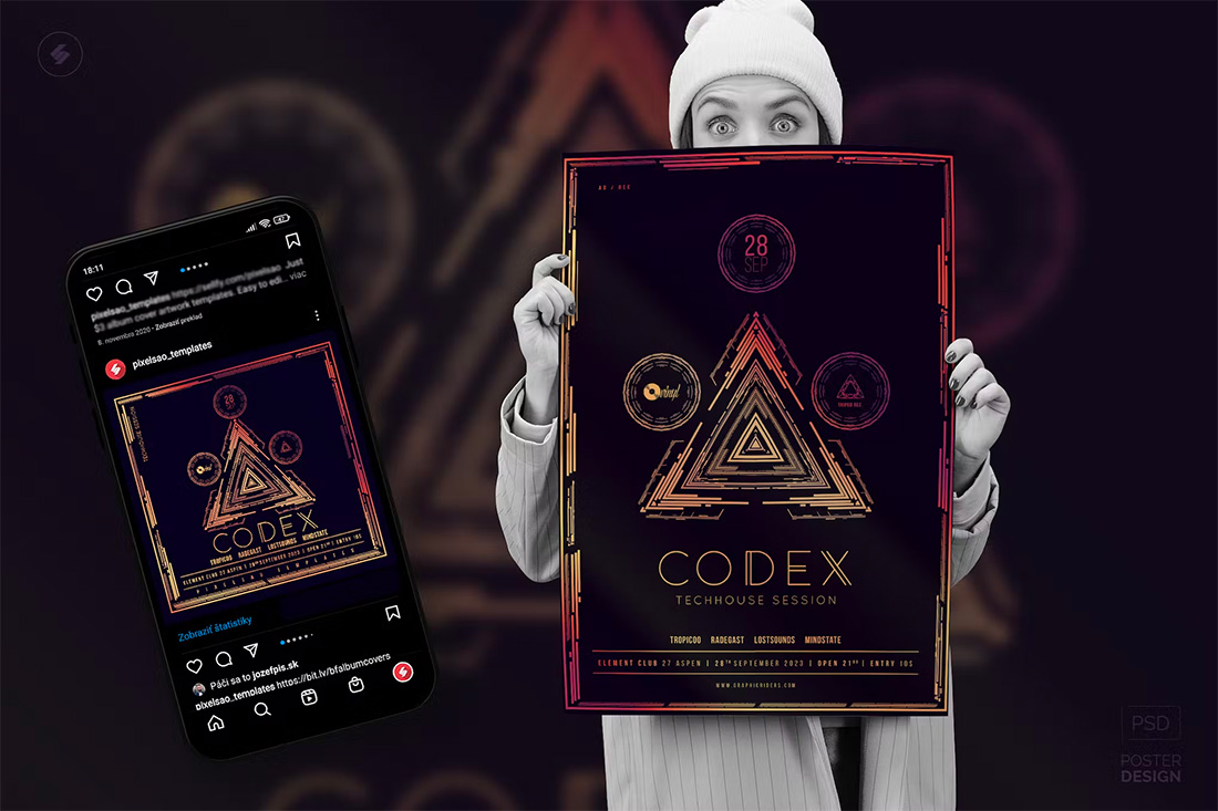

While print design elements and website design elements have always crossed over somewhat, there’s a big push to create brochure designs that are easy to use online as well. This usage might include websites or social media images or elements.
When it comes to brochure design trends, the usability of elements across platforms is a must-have skill and technique that you should take into consideration.
Some things to note when thinking about design crossover include shape, color options, and size and placement of words. When done right, the branding and images carry across print and digital platforms for consistent branding and a one-stop design solution for projects.
Geometric Shapes
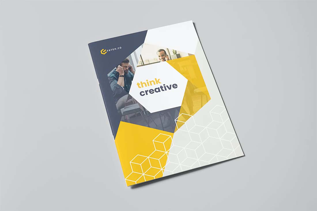
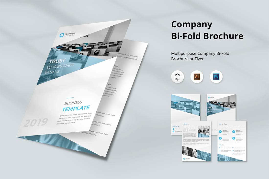
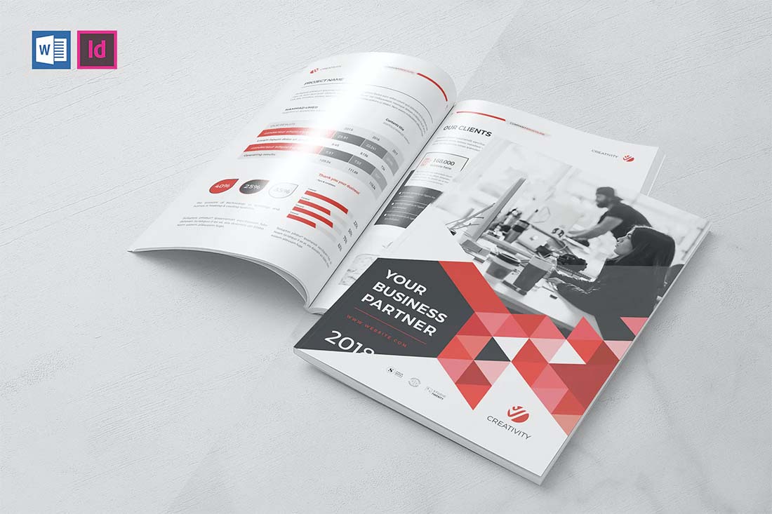
Geometric shapes can add a lot of pop to a brochure design, including the cover. The right combination of shapes can serve to lead the eye through the design, help create focus on key content, or serve as a primary visual device.
In some of the most trendy uses, geometric shapes are paired with a monotone color palette for a unified look and feel.
These brochure designs may or may not contain other image elements, and this style can be a preferred technique when you don’t have a lot of other images to work with. You can also opt for smaller or black-and-white images with geo shapes because they can help create enough visual interest to carry the design.
When working with geometric shapes in a brochure design, try to pick a consistent shape and use it throughout. Consider different variations such as filled shapes or outlines to add a little extra pizazz.
Landscape Orientation
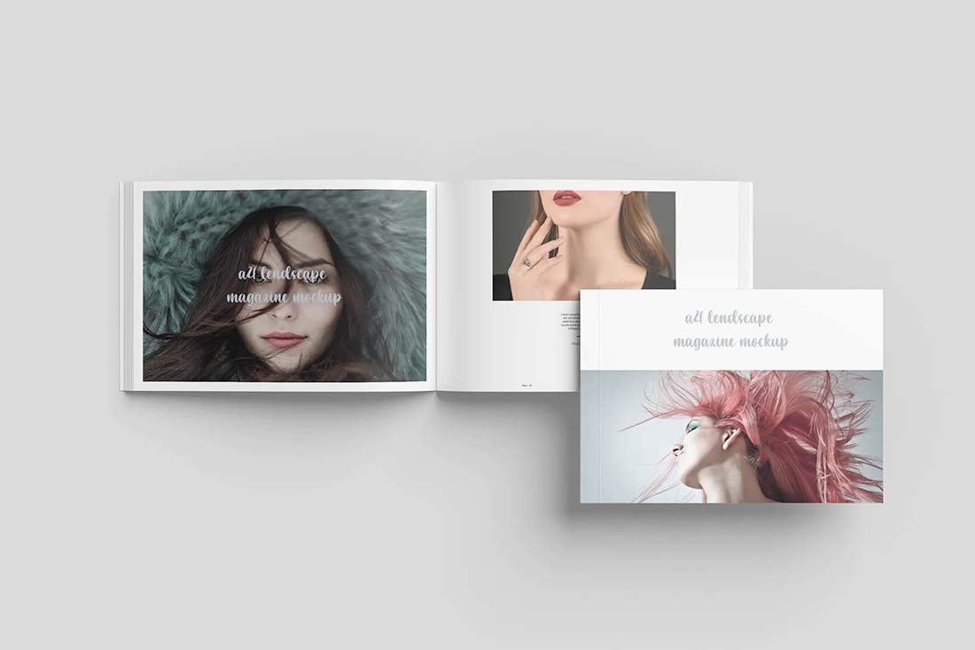
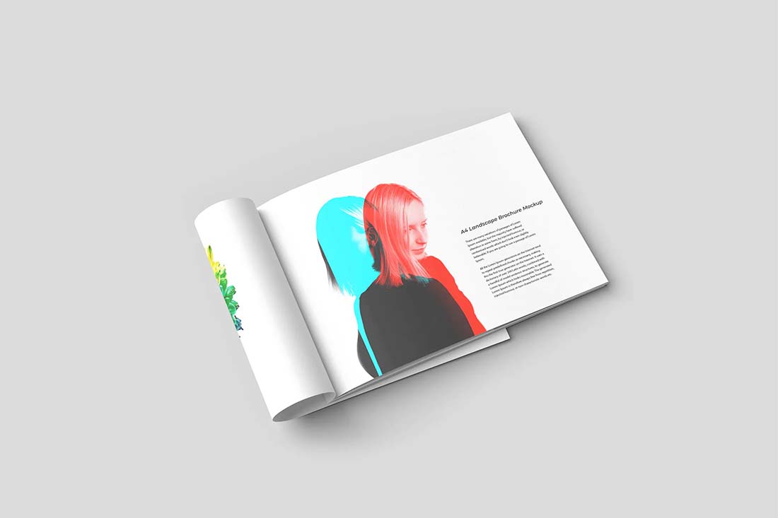
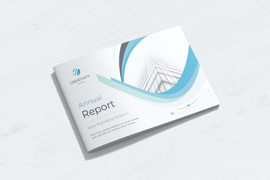
Sometimes the most modern and trendy part of a print design is the paper, publishing techniques used or orientation. While portrait-style brochures are the norm, using a landscape orientation can make your design stand out a little more.
It can also provide a totally different tactile experience for the person who gets the brochure.
Choose a landscape orientation for the design if it works with your content and images. While these brochures can look amazing, they get tricky if you force the concept with the wrong type of content.
Another bonus: Landscape orientations for print brochures can work exceptionally well as viewable PDF brochures in a digital format as well since each page mimics a desktop screen orientation.
Bold Color Choices
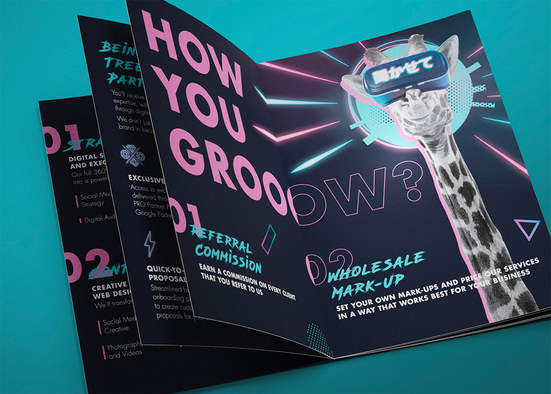
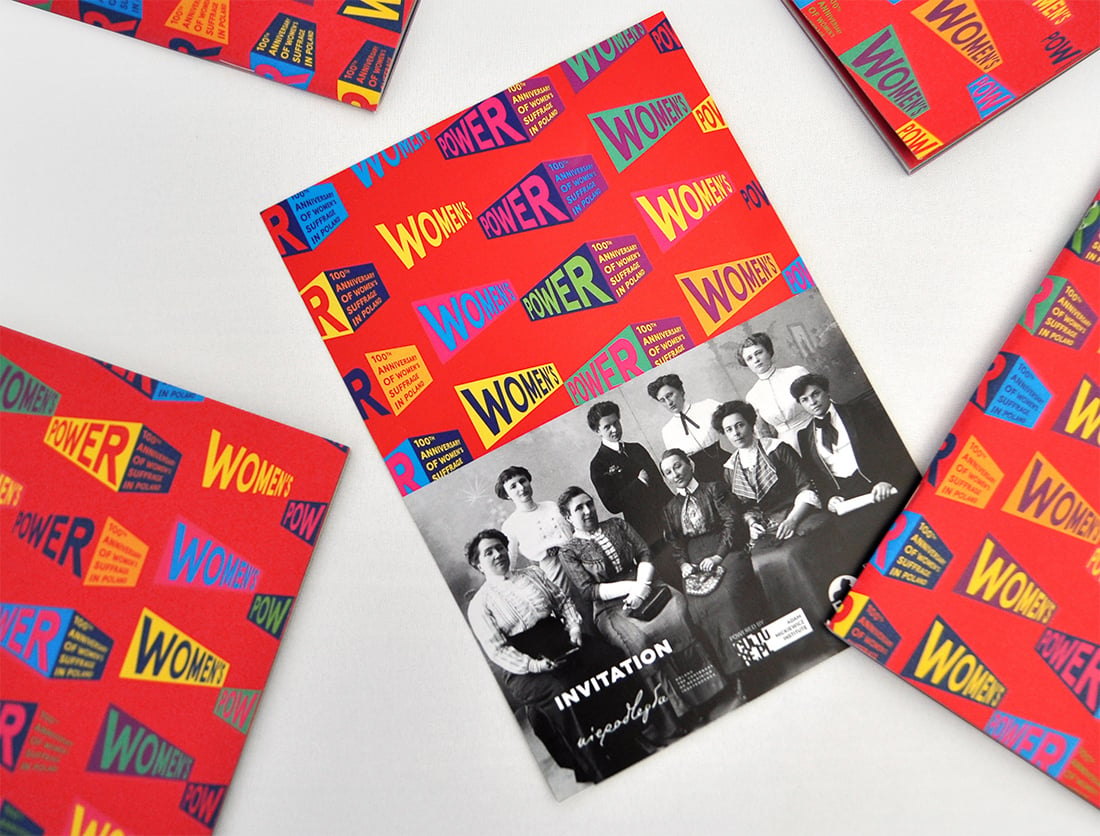
Color can play an important role in brochure design. It can also be complicated.
When it comes to bold colors and bleeds, it takes just the right mix and printing to get a stellar outcome. Take particular care with folds and mixes to ensure that your design comes out right every time.
When it comes to actual color, neons and bright hues are popular styles. They can be fun, engaging, and stand out. The goal of bold color choices in brochure design is to draw an audience to the printed product and keep them looking at it once it is picked up.
Portfolio as a Brochure
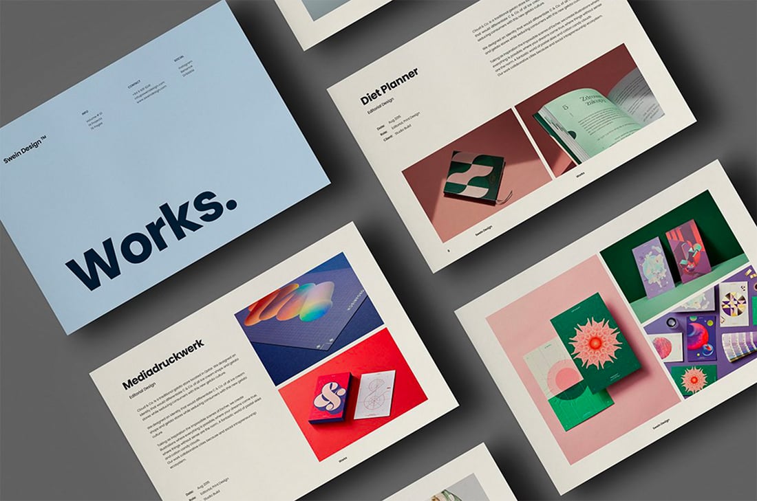
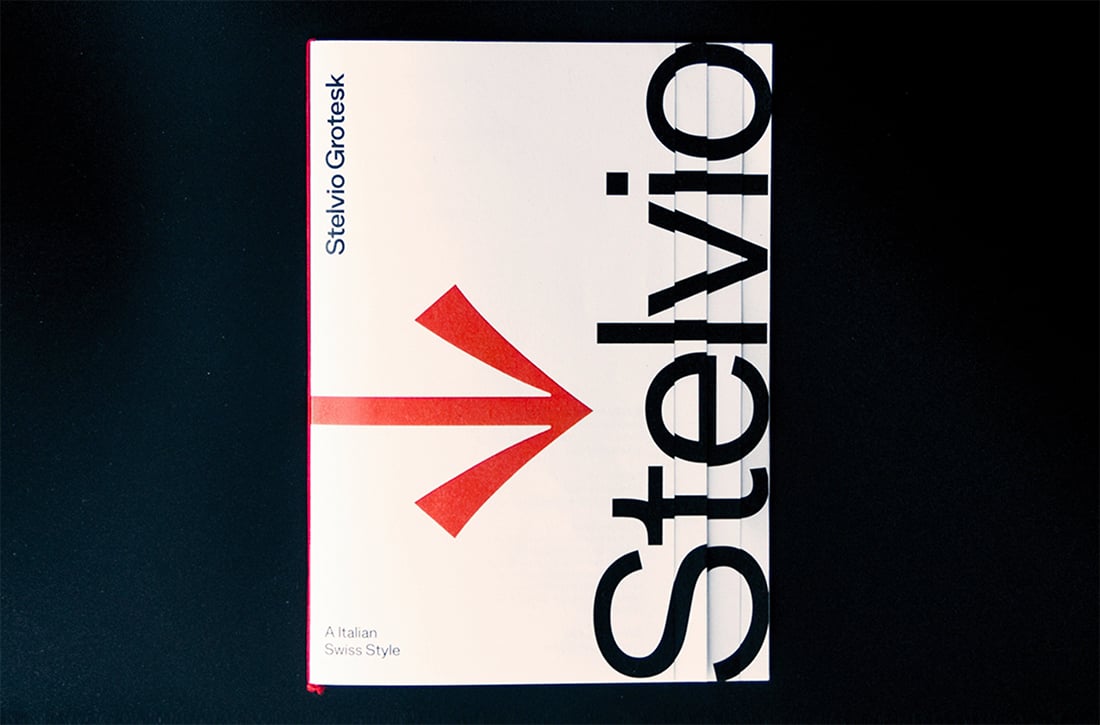
If you want to make an impact, consider turning your portfolio or website into a printed brochure.
There are different ways to do it – type foundries have been doing it for decades – but your main goal should be to create just the right impression. Showcase work and pieces that look great in a printed format. This tangible item can be a great leave-behind for networking events or job interviews.
Infographics with Flow
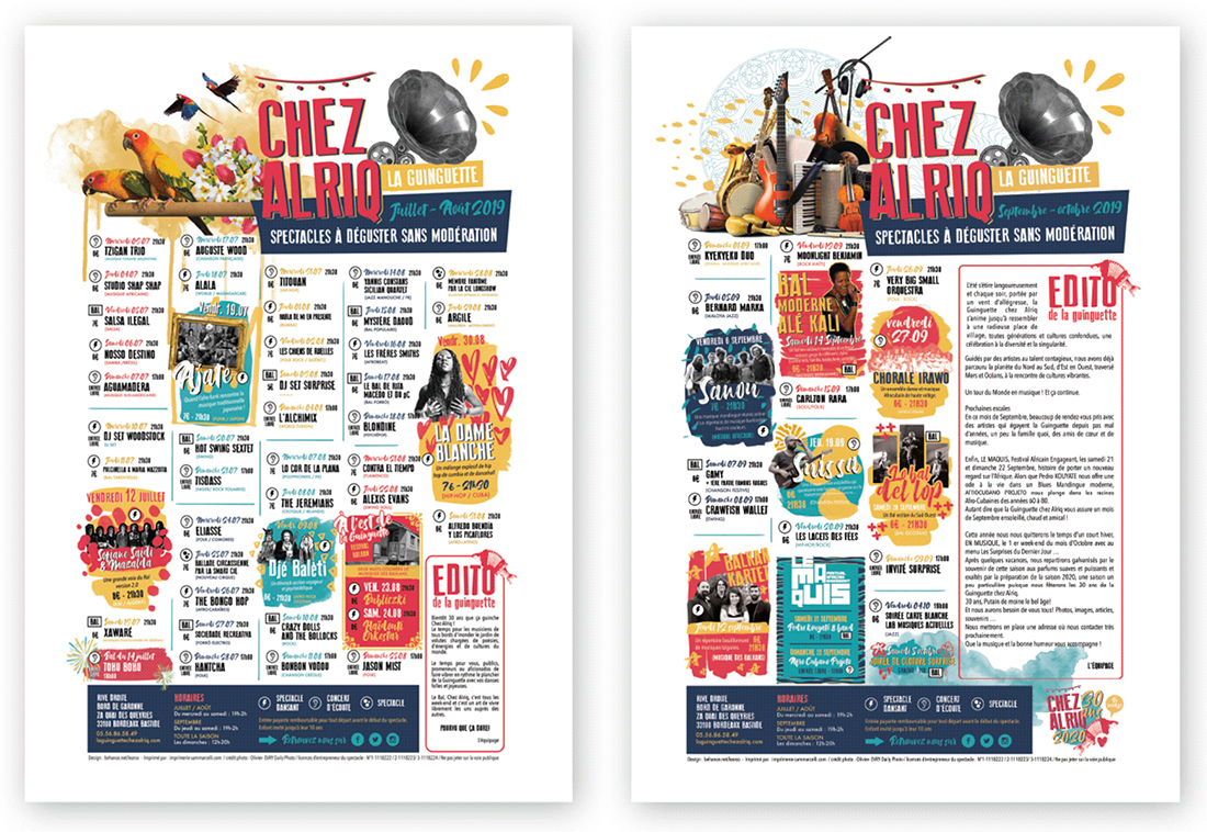
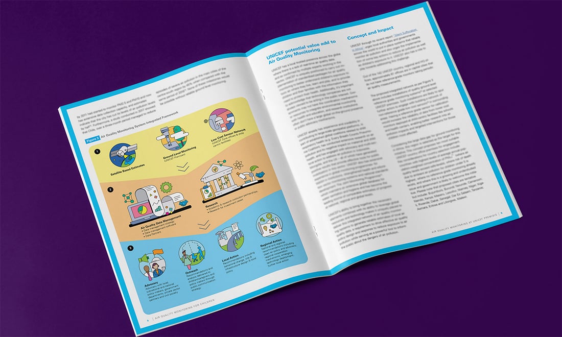
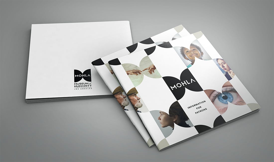
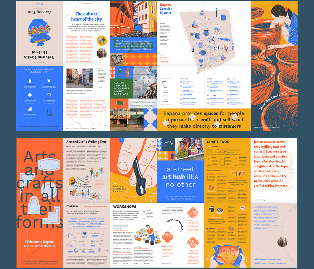
Infographics are a great brochure option because they can help explain what your messaging is about. Infographics are also highly visual and engaging.
There are two routes to take:
- Detail, in-depth graphics, like the first two examples above)
- Simple, graphics and images to convey meaning, such as the third example above
All are equally effective and can provide energy and understanding to content. Brochures can contain infographics that stand on their own or as a part of an overall design scheme.
Highly Visual, Image-Based Designs
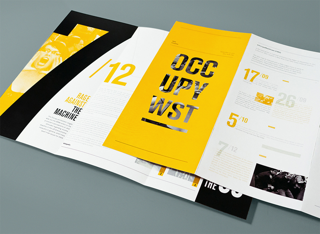
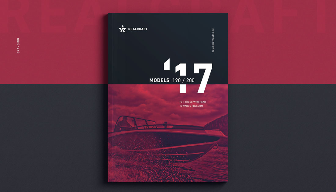
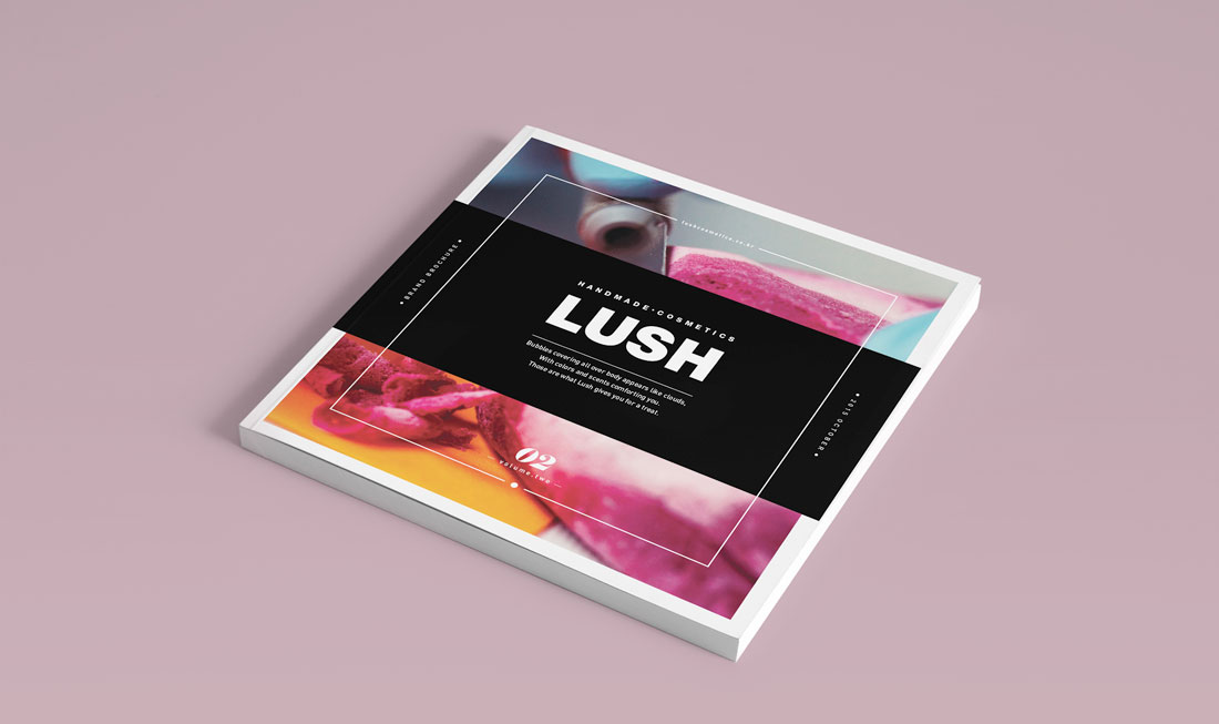
When it comes to creating a brochure design, highly visual elements with images and color are trending. (These styles are especially popular for brochure designs that will only be shared digitally.)
High color, high image designs can work great and be quite impactful in print also. Just make sure to check with your printer to ensure that colors, images, and bleeds will work well with the paper and printing selections you have made and adjust if needed.
When it comes to brochure designs with a lot of color and imagery, look for visual elements that are easy to understand at the size displayed. Images shouldn’t be overly complicated and communicate a single message. (Note the Realcraft example above, which uses a lot of color and imagery, but the image is of a single element.)
Typography-Driven Brochure Design Ideas
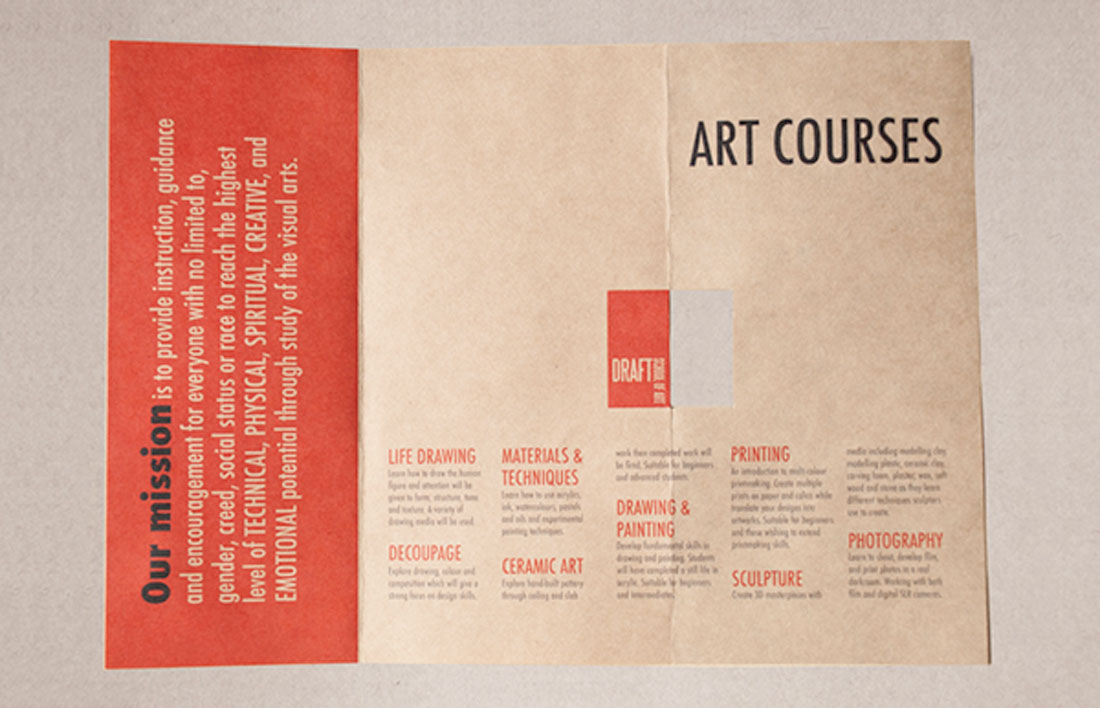
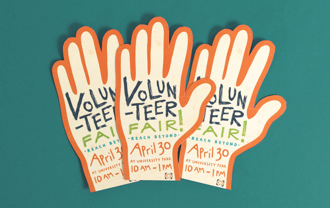
A great way to handle a brochure design without a lot of images or other “designed” art elements is with “big type”. Fun oversized lettering can provide impact, and help users know exactly what the brochure is all about.
Get creative with type choices and the way you create words. Interesting word breaks for long words (such as on syllable per line), titling, color, and different alignments can add a lot of visual draw to lettering.
When choosing to design a brochure featuring only lettering, take care to include plenty of white space and a defined type hierarchy so that the eye travels easily through the content.
Minimal Design is Great for Printing
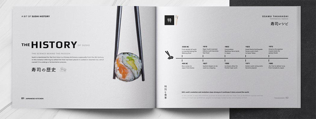
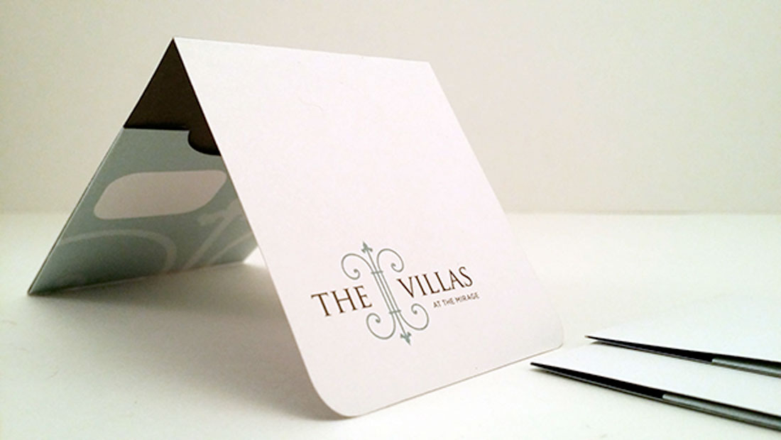
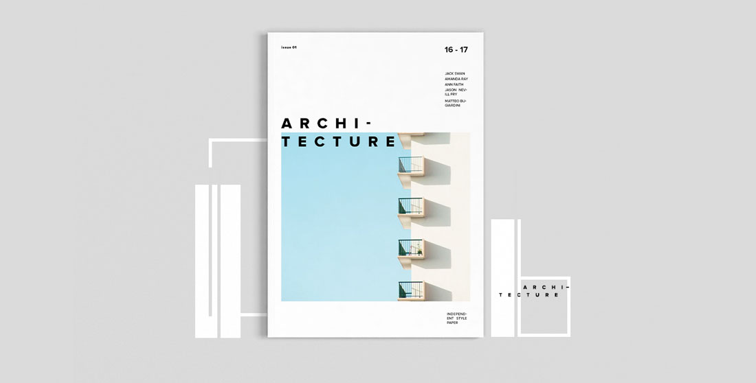
When it comes to printed brochures, less is more.
Minimal design styles are popular with brochures because there’s less to worry about when it comes to printing and quality control. Avoid reverse type and you don’t have to worry about the readability of light text on dark backgrounds. Go for a white background or canvas and there’s less ink to worry about smearing.
Minimal styles give you a little more choice with paper stock as well. You can actually use lighter-weight paper when you don’t have as much happening with the overall print job.
Finally, minimal design styles are classic and modern. They never seem to go out of style.
Conclusion
Ready to get started? We’ve got even more tips to help you create a great brochure design. Or, if you’re short on time, consider starting with a brochure design template!