10+ Best Broken & Cracked Fonts for Eye-Catching Design
Broken and cracked fonts are not just typographic styles; they are artistic expressions that convey a raw, gritty, and sometimes rebellious vibe.
In this post, we explore a selection of the best broken and cracked fonts available, each chosen for its distinctive character, versatility, and ability to make a statement.
These fonts are perfect for projects that require a touch of drama, an element of surprise, or a departure from the pristine and polished. Whether you’re working on a poster for a rock concert, a title for a horror movie, or branding for a bold new venture, these fonts can add an impactful visual element that captures attention and provokes thought.
Have a look and start downloading. There are a few free fonts in there as well.
Crushed – Broken Glass Font
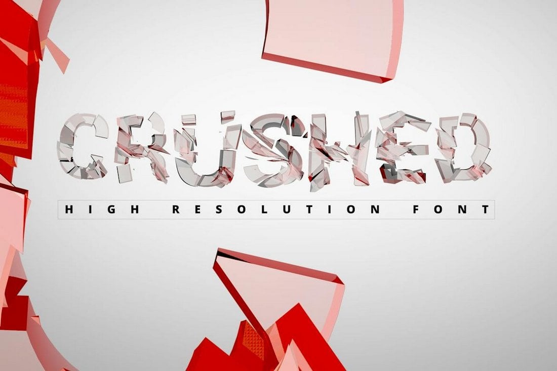
Crushed is a unique typeface that’s technically not a font. It’s actually an alphabet that comes in high-resolution (3000px) PNG files. It includes a set of all-caps letters featuring a realistic broken glass-style design. You can use the PNGs to create cool titles for your posters and banners. And even colorize the letters however you like.
Ember – Stencil Cracked Font
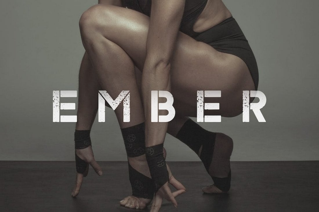
Ember is a bold stencil font that features a rough and cracked letter design. The font comes in two styles featuring a regular stencil font and the post-apocalyptic-style cracked font. Both are perfect for crafting urban-style titles for your design projects.
Broken – Cracked Letters Font

Broken font includes a set of letters that have scratches and cracks, giving them a rough look and feel. This font has all-caps letters with a handwritten style. It’s ideal for crafting big titles for everything from posters to YouTube thumbnails.
Bigger Cracks – Comic Title Font

This is a fun and casual title font with a comic-style letter design. The letters have creative cracked elements that give each letter a different look. The font includes lots of ligatures, alternate characters, and multilingual support as well.
Asphalt Crack – Distressed Cracked Stone Font
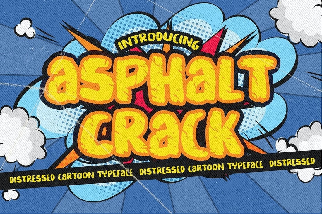
This font also has a creative cracked letter design mixed with a quirky comic book-style vibe. The font has the perfect cartoon look for crafting big titles for children’s branding designs, product packaging designs, banners, posters, and more.
Broken Space – Cracked Letters Font

The casual brush-style letters and its broken cracked letter design make this font a great choice for designing titles for your fun design projects. It will fit in quite well with your YouTube thumbnail designs, video titles, social media posts, and even greeting cards. The font has all-caps letters with a few alternates.
Shatterbox – Free Broken Font
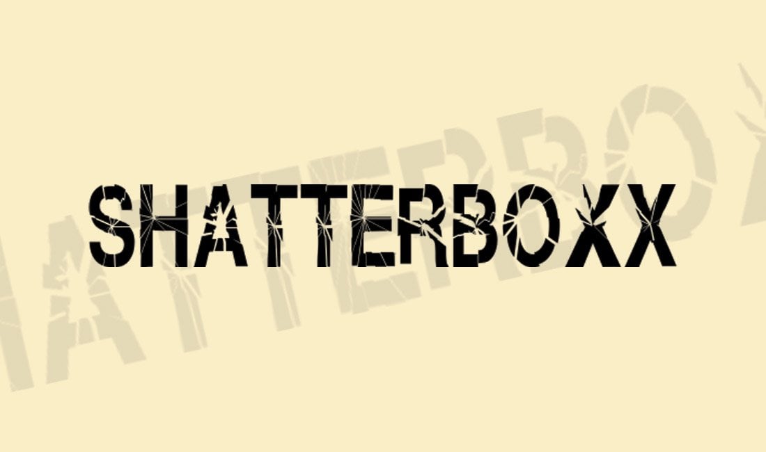
Shatterbox is a bold title font that you can download for free. This font features a shattered broken glass-like letter design that’s perfect for making thrilling titles for movie posters, banners, and various other graphic design projects. The font is free to use with commercial projects.
Broken Glass – Free Font
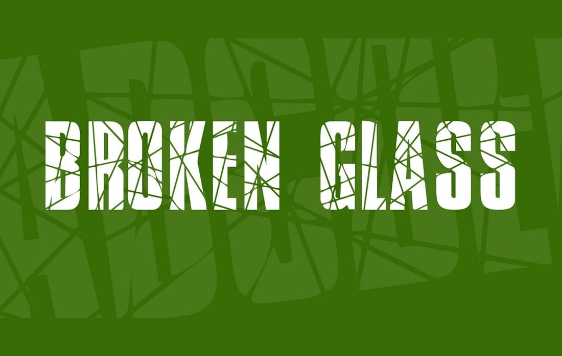
Just as the name suggests, this font also features a creative broken glass effect with tall and narrow letters. It’s best for flyers, posters, and social media posts to make your titles and headlines more attention-grabbing. It’s free to download and use with your commercial projects.
Glaz Krak – Free Cracked Font
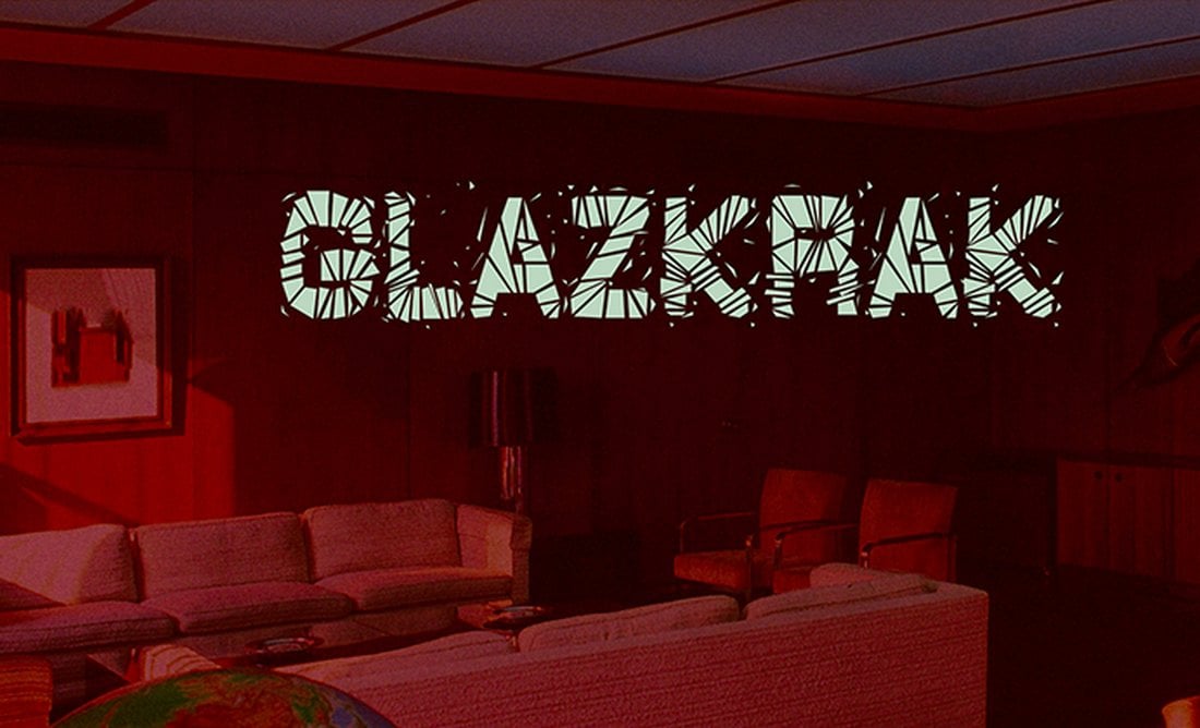
This free font has a very unique letter design that makes each letter seem like they were made up of broken pieces of glass. It’s a bold font to use with your creative projects, especially for custom prints such as T-shirts and mugs. The font is free to use with commercial projects.
Opium – Free Broken Font

Opium is another cool font with broken letters. This font, however, features a more casual and simple letter design that will fit in nicely with your friendly and quirky designs. It’s great for everything from posters to packaging designs. The font is free for personal use only.
Gipsiero – Free Cracked Font

If you want to craft big titles with an old west-themed look, this free font is perfect for your project. It features chunky serif letters with cracked textured elements. The font comes in 3 different styles, including one with broken letters. This font is free to use in commercial projects.
Breakaway – Free Broken Font
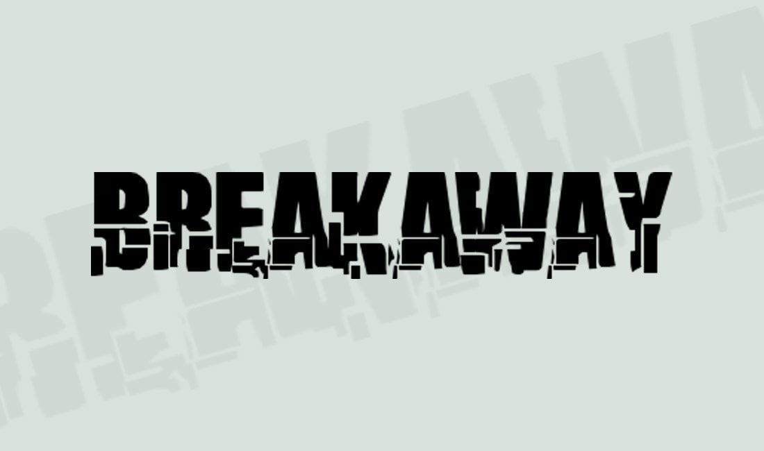
Breakaway is a free broken font featuring a unique design. It features a cool futuristic-style broken design that will remind you own cyberpunk-themed designs. You can use this font for free with commercial projects.
10 Tips For Choosing the Right Font for Title Designs
Follow these quick tips to find the best font for your design projects.
- Reflect the Tone: Ensure the font matches the tone and theme of your content. A serious documentary might need a stark, clean font, while a children’s show could use something more playful.
- Legibility is Key: For titles, clarity trumps style. Choose fonts that are easy to read at a glance, especially important for viewers on smaller screens.
- Size Matters: Consider how your font looks in large sizes. Titles are often scaled up, and some fonts might lose their appeal when enlarged.
- Contrast with Background: Ensure your font color contrasts well with the background for readability. Avoid colors that blend in too much.
- Avoid Overused Fonts: Steer clear of clichéd fonts like Comic Sans or Papyrus. They can make your design feel unoriginal.
- Pairing Fonts: If using multiple fonts, ensure they complement each other. Avoid clashing styles that can make the design look chaotic.
- Consider the Era: If your content is period-specific, choose a font that aligns with that era’s typography style for authenticity.
- Weight and Style: Experiment with different weights (bold, regular, light) and styles (italic, underline) to see what emphasizes your title best.
- Cultural Sensitivity: Be mindful of cultural contexts; some fonts may carry specific connotations or associations in different cultures.
- Test on Multiple Devices: Ensure your title design looks good not just on a computer but also on mobile and tablet screens for a consistent viewing experience.