Christmas Graphic Design: 5 Tips for Classy Festive Design
From holiday cards to party invitations, to sales promotions, to baubles on a website design. It’s time to start thinking about ways to spruce up your graphic designs for the Christmas season!
The trick is creating something that looks classy and festive, not gaudy and overdone.
You want Christmas to be threaded through your design, not being garishly overwhelming!
Here are five tips to get you on your way with ideas to get you thinking about Christmas graphic design projects with some downloadable elements you can make your own.
1. Go Metallic
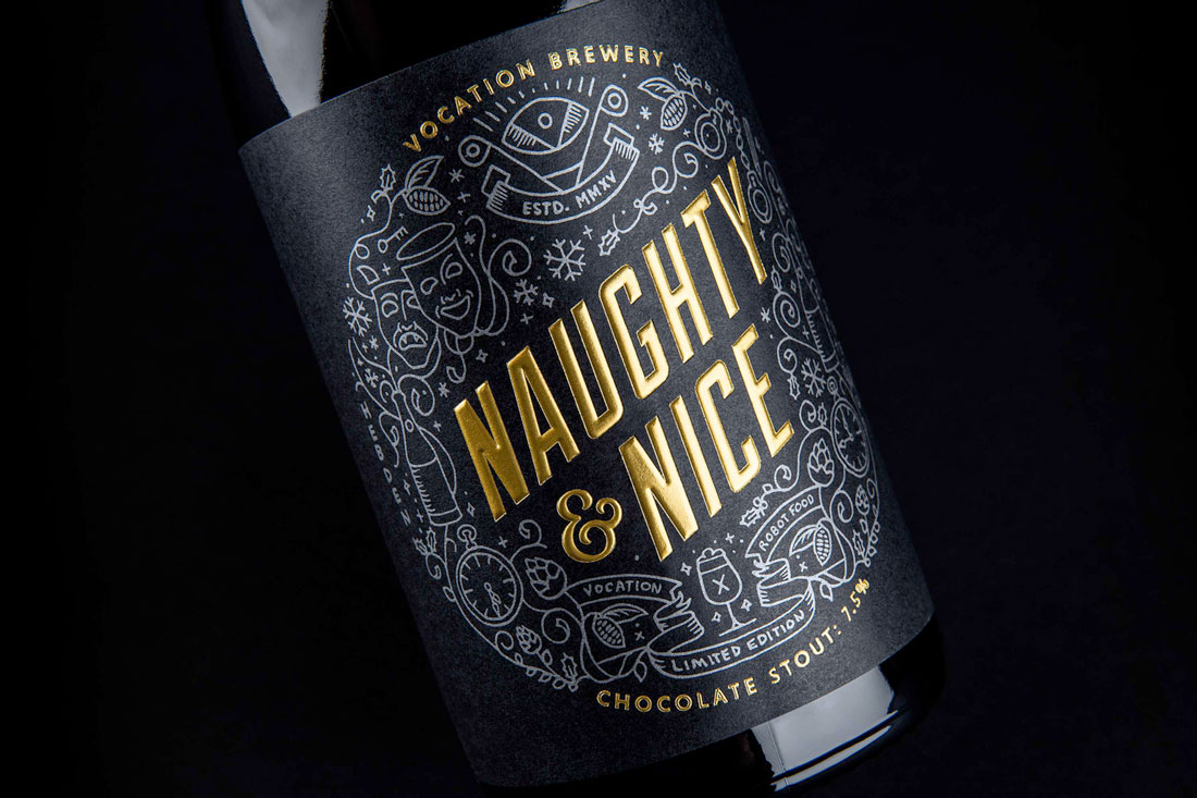
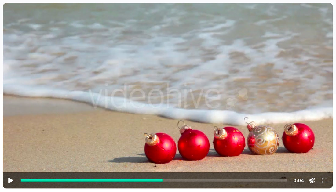
Nothing makes you smile and feel festive like a little sparkle and shine. Add a metallic element or opt for special print effects when you can.
Foil print effects can be one of the classiest and most impressive print effects at your disposal. And they are perfect for Christmas graphic design projects. Add a silver or gold foil technique to cards, invitations or even packaging, like the example above. Even without a lot of other holiday language or wording, you can create a festive feel with this technique.
For digital elements or website design, use video or animation to really show that something is metallic or sparkling. The video b-roll clip, above, is a great way to add a touch of the holidays into a website design – including that metallic shine – without overwhelming users with too many effects. Think about simple elements to convey holiday messages and don’t feel a need to go overboard.
2. Don’t Pick Just One Holiday
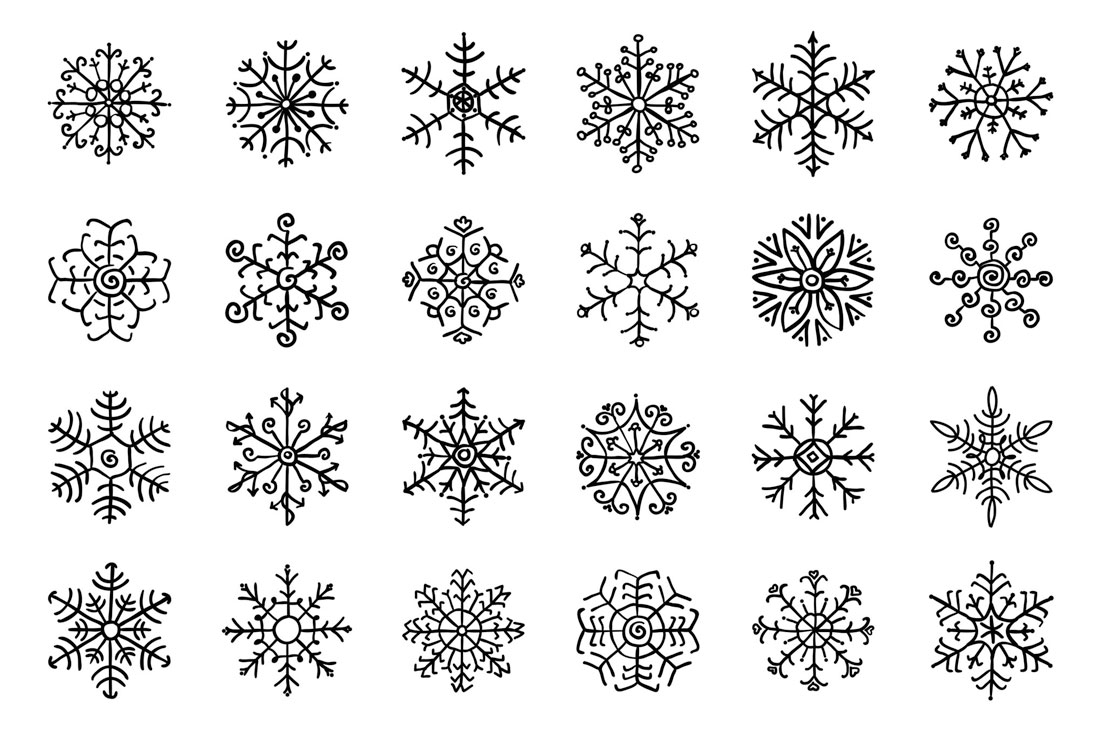

Depending on your audience, it might not be appropriate to go all out with a Christmas theme during the holiday season. But chances are that you want to do something.
Use winter scenes, colors and imagery to create a holiday connection for users to whatever winter holiday they celebrate. Just setting the scene for a certain time of year can resonate with users.
This can be a superb option for websites that feature products for sale – and you don’t want to worry about offending users – and holiday cards that are sent to colleagues or business peers. This non-secular approach to holiday graphic design can be a little more appropriate when you are working with a wide or unknown audience. And the designs can look just as good.
3. Use Type to Your Advantage

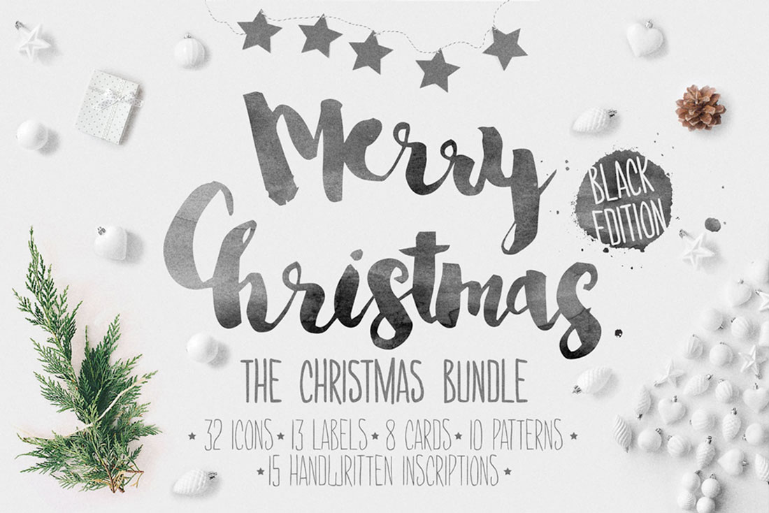
Christmas graphic design projects present a special opportunity to do things with typography that you might not try any other time of year. Think of the places where it’s actually acceptable to use flowy scripts or childlike handwriting styles.
With the simple messaging of the holidays – Merry Christmas, Happy Holidays, etc. – the words are well-known. This provides an opportunity to experiment with a typeface that’s a little more difficult to read but emotionally correct for holiday usage.
Here’s how it works from the examples above.
- In the top example, the script typeface is rather easy to ready with the simple message but there is a design trick: The letters are used to fill in Santa’s face. This is a common holiday technique with messaging in the shape of Christmas trees, ornaments and other themed-images.
- In the second example, the typeface is more difficult to read, but thanks to common phrasing and associated imagery, the eyes have no trouble discerning the letters.
4. Don’t Get Stuck on Red and Green

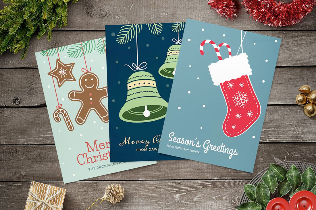
While red and green might be the colors fist associated with the Christmas holiday, don’t get stuck using a color palette that doesn’t work with your design.
Start with a palette that features cool colors – back to that winter theme. This includes purples, blues and greens.
A cool palette can also complement metallic effects if you are looking to use that technique.
Also, don’t feel like you are forced into picking an all-new color palette. Mix your brand colors into holiday design pieces. Anything you create should be a reflection of your design style.
5. Light Up Designs with Animation

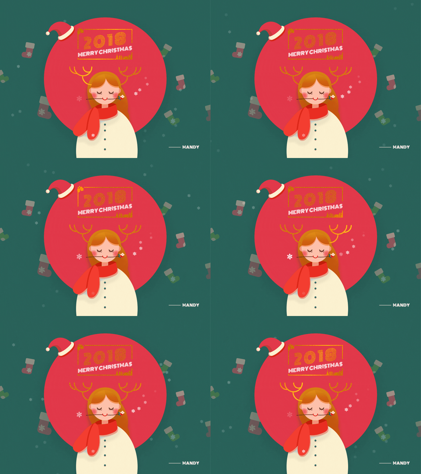
Add a festive touch to digital and website projects with a cheerful animation. Whether you use this design as a full background image or a small delightful object somewhere within the design, an animation can bring attention to the object to highlight that holiday feel.
While the examples above are of custom-made animations (go check them out on Dribbble), something as simple as animated lights around lettering or an image or a new hover state can do the trick.
You don’t have to completely overhaul an existing design to add a holiday touch. Sometimes the smallest design elements can be the most appreciated. Loyal users will know that you’ve added these festive elements and take care with keeping the right feel for the season on your website.
Conclusion
While the holidays are the one time that I might recommend decorating your graphic designs, a simple plan is best. A good Christmas graphic design adds a touch of the holidays but doesn’t lose your style or branding.
Even with a holly jolly feel, a Christmas graphic design should maintain the integrity of who you are. Happy holidays!