Mastering Responsive Web Design: Techniques and Best Practices for Cross-Device Compatibility

Need to create a website, landing page, or blog that can deliver a pristine customer experience across a range of devices?
Look no further than responsive web design, a strategy that focuses on creating a fluid layout to create congruent interfaces for desktop and mobile users.
In this article, we’ll take a closer look at what responsive design really means, three ways to create it, and two examples of optimal websites with flexible designs. We’ve also included a bonus checklist for you to help you refine your layout before going live.
Ready to learn more?
Let’s get started.
What is responsive website design?
Coined by Ethan Marcotte, otherwise known as “The Godfather of RWD”, responsive web or website design means creating a website that looks clean, intuitive, and functions well, regardless of the device type it’s viewed on.
According to Ethan, having a “device-agnostic layout” is key. This can be accomplished using flexible images, media queries, and fluid grids — the three pillars of a responsive design.
In his original article on the subject, Ethan referenced the following quote which perfectly depicts the power of responsive web design (RWD).
“The control which designers know in the print medium, and often desire in the web medium, is simply a function of the limitation of the printed page. We should embrace the fact that the web doesn’t have the same constraints and design for this flexibility. But first, we must accept the ebb and flow of things.” — John Allsopp, A Dao of Web Design
2 examples of optimal websites with cross-device compatibility
In today’s digital era, a website’s cross-device compatibility has become paramount for delivering a seamless and engaging user experience.
Ensuring that blog posts, landing pages, and other content have comprehensive navigation and are visually appealing across a variety of devices is crucial for capturing and retaining user attention.
Two notable examples of well-optimized websites include the Hers blog and Clean Origin’s diamond stud-earring collection page.
Let’s explore how these exemplify the significance of cross-device compatibility.
The Hers blog
For Hers, a well-optimized blog means that users can easily access insightful information about topics like the effects of Adderall on mental health and other wellness resources from any device.
Whether on a computer, tablet, or mobile phone, Hers’ content retains a responsive layout without sacrificing design quality. Here’s the desktop version:
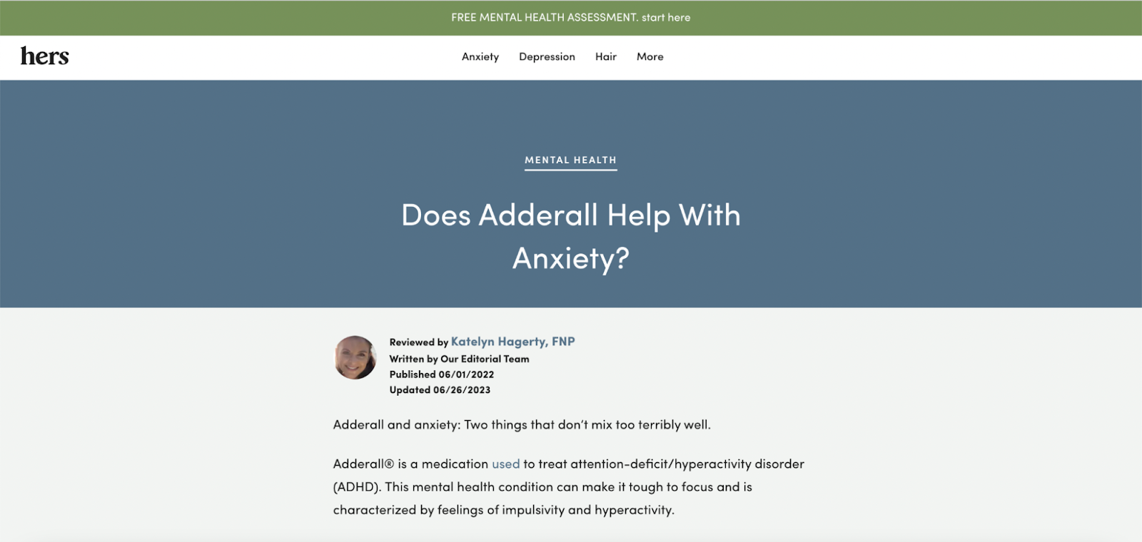
(Image Source)
And here’s the mobile version:

(Image Source)
This cross-device compatibility empowers users to educate themselves and make informed decisions regardless of their location or preferred viewing device. What’s more, the smooth user experience provided by the responsive design can help enhance user satisfaction and foster trust in the brand’s expertise and credibility.
Clean Origin’s diamond stud-earring collection page
Clean Origin’s well-optimized landing page for its diamond stud-earring collection offers stunning visuals that are equally captivating on both desktop and mobile screens.
Here’s a peek at how it looks on a desktop:

(Image Source)
And this is how it looks on a mobile device:

(Image Source)
This cross-device compatibility ensures that users can enjoy browsing through the exquisite earring designs and easily select their favorite from any location or device. The seamless transition from one device to another facilitates a seamless shopping experience, maximizing customer engagement and increasing the likelihood of conversions.
But the advantages of cross-device compatibility extend beyond user satisfaction.
Cross-device compatibility can also positively impact search engine rankings, as major search engines prioritize mobile-friendly websites, considering them more relevant and user-oriented.
Websites that cater to various devices can receive higher visibility and reach broader audiences, ultimately leading to increased organic traffic and inspiring business growth.
3 ways to create cross-device compatibility
Now that you’re clear on the basics, let’s take a look at three ultra-simple ways you can master responsive web design when working on your next design project.
1. Use a grid system
If you’re a coding enthusiast who loves having control over every stage of development, responsive grid systems, like Flexbox Grid, Zimit Framework, or Bootstrap, might just be your thing.
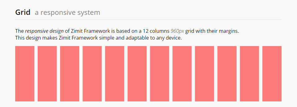
(Image Source)
Grid systems provide all of the necessary building blocks you’ll need to create responsive web design, including containers, columns, rows, and classes for organizing and nesting elements.
With media queries and popular breakpoints, these systems smoothly adapt to different screen sizes.
When it comes to responsive grid systems, there’s a wide variety to choose from. Some are simple and straightforward, while others are more comprehensive and feature-rich. Jot down your top priorities before shopping for grid system software.
2. Use a responsive website builder
If you’re looking for an easy and flexible way to create a responsive website, website builders have got you covered!
Whether you’re a tech guru or a beginner, these user-friendly platforms provide features you can use to build your website without needing to touch a single line of code. Features may include browser-based drag-and-drop editors, advanced customization options, and hundreds of stylish blocks.
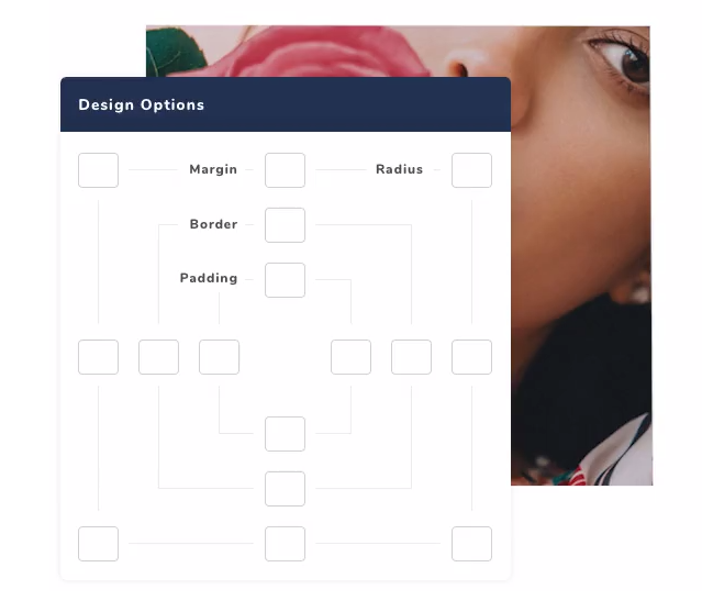
(Image Source)
Some responsive website builders focus on responsive behavior, while others prioritize mobile-friendliness, offering tools to optimize your site for different devices.
Hiring React JS developers with expertise in building responsive web applications can also be a great option to ensure your website meets your specific requirements.
If you’re interested in using a responsive website builder, check out options like SpringBuilder, Designmodo Startup, and Visual Composer.
3. Use a CMS
Another simple way to create cross-device compatibility is by using a Content Management System (CMS) like WordPress or Shopify. Hint: If you need an easy way to create a responsive blog or ecommerce store, this option may be your best bet!
These user-friendly platforms are designed to cater to both tech-savvy individuals and those new to web development.
Although CMS platforms may not initially provide responsive behavior, the good news is that many theme developers have recognized the importance of mobile optimization. With this in mind, they’ve created a plethora of responsive templates that seamlessly adapt to different screen sizes, guaranteeing a smooth browsing experience on mobile and desktop devices.
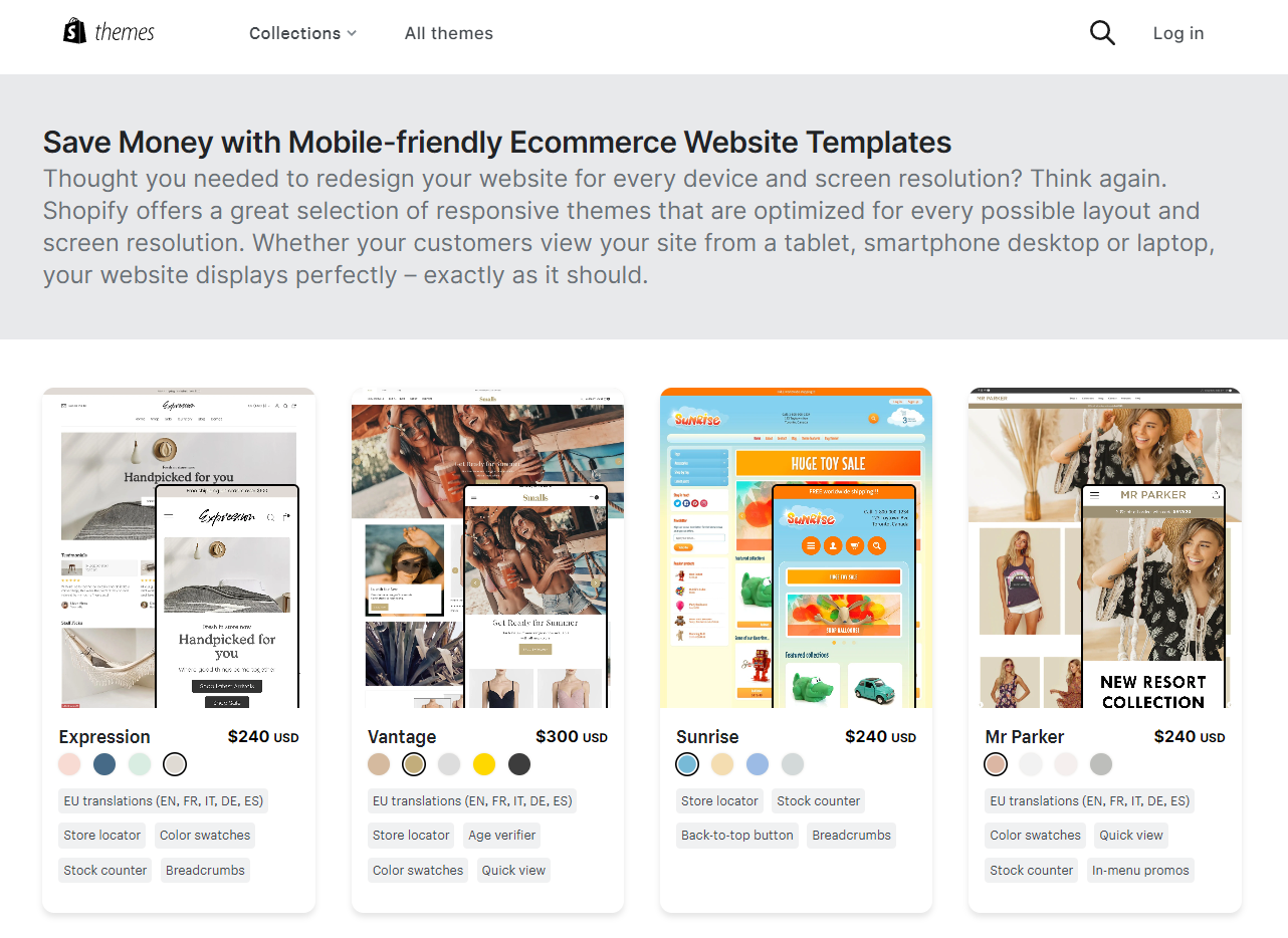
(Image Source)
Whichever method you choose, don’t go live until testing your website on a variety of devices. Head to the checklist in the next section for additional support.
Cross-device compatibility checklist
Here’s the bonus checklist we promised you. ??
Before going live, make sure your new web page can pass the following cross-device compatibility checklist:
Does my website, landing page, or blog:
Feel and look intuitive on larger screens and smaller screens?
Have plenty of white space to decrease overwhelm and promote readability?
Look beautiful and professional on mobile and desktop browsers?
Function correctly across desktop and mobile versions?
Have responsive images and correct image sizes?
Wrap up
And there you have it.
Today we discussed what responsive web design is, some simple techniques to help you master it, and two examples of optimal websites with cross-device compatibility.
If you’re ready to get started on your next project, don’t forget to bookmark this article and share it with your web development team.
And if you’re looking for even more insightful advice you can apply to your business, check out our online magazine for additional guides and resources.
Here’s to your success!
Featured image by Domenico Loia on Unsplash