How to Choose the Perfect Font for Titles & Headlines
The right font choice for titles and headlines can significantly impact the visual appeal and effectiveness of your design work.
A well-chosen title font can capture your audience’s attention, establish hierarchy, and convey the intended message with clarity.
In this article, we will explore what a headline or title font is, tips for choosing a good headline or title font, examples of famous headlines and the fonts used in them, and advice on creating design work where the headline stands out and captures attention.
What is a Headline or Title Font?
A headline or title font is a typeface specifically chosen for use in large, prominent text elements in a design, such as titles, headlines, and headers. These fonts are designed to be eye-catching and easy to read, even at a glance.
They often have distinct characteristics, such as bold weights, strong contrasts, or unique letterforms, which help them stand out and convey the desired message effectively.
Tips for Choosing a Good Headline or Title Font
1. Legibility and Readability
The primary purpose of a headline or title is to capture the viewer’s attention and quickly convey the main message. Therefore, it is crucial to choose a font that is easy to read, even at a distance or smaller sizes. Look for fonts with clear letterforms, ample spacing, and good contrast between the strokes.
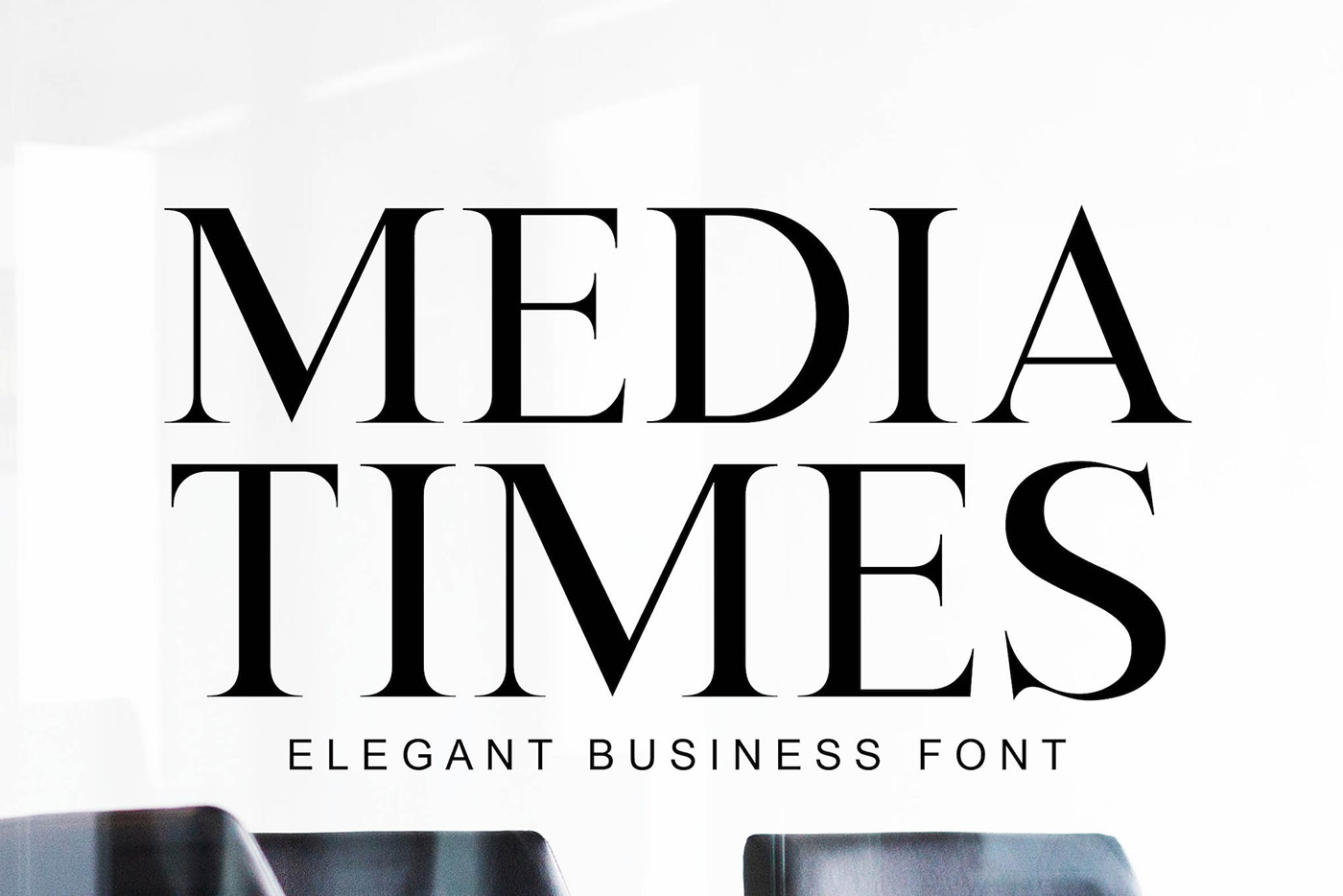
2. Visual Hierarchy
To create a visual hierarchy, consider using a different font or font weight for your headlines and body text. This distinction will help guide the viewer’s eye to the most critical information first. A bolder, more eye-catching font for headlines will effectively differentiate them from the rest of the content.
3. Mood and Tone
Choose a font that reflects the mood and tone of your content or design. For example, a formal document may require a more classic serif font, while a playful or casual design might call for a quirky, decorative typeface. Consider the intended audience and the message you want to convey when selecting a font.
4. Versatility
Select a font that offers various weights and styles, such as bold, italic, and condensed versions. Having multiple options within the same font family can provide flexibility in your design work and help maintain consistency throughout different elements.
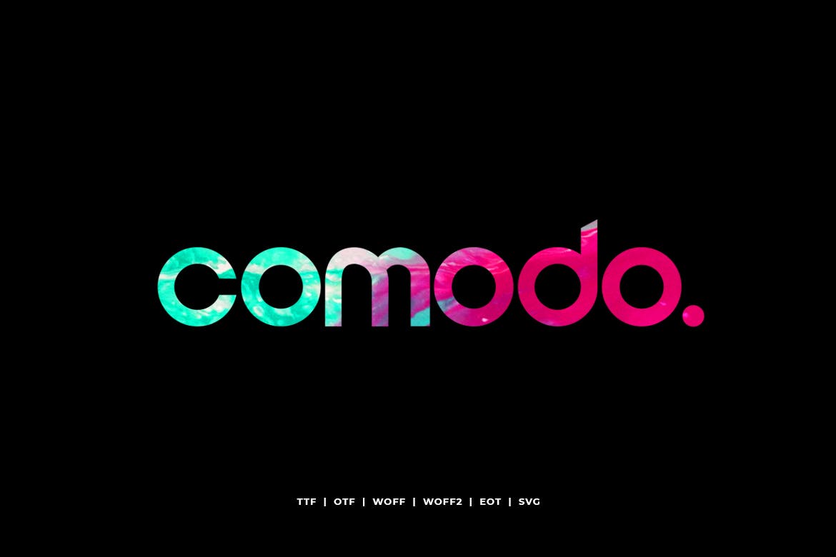
5. Pairing with Other Fonts
When combining fonts in a design, consider how the headline font will work alongside the chosen body text font. Aim for a harmonious balance between the two, ensuring they complement each other without being overly similar or conflicting.
Famous Headlines and Fonts
The New York Times
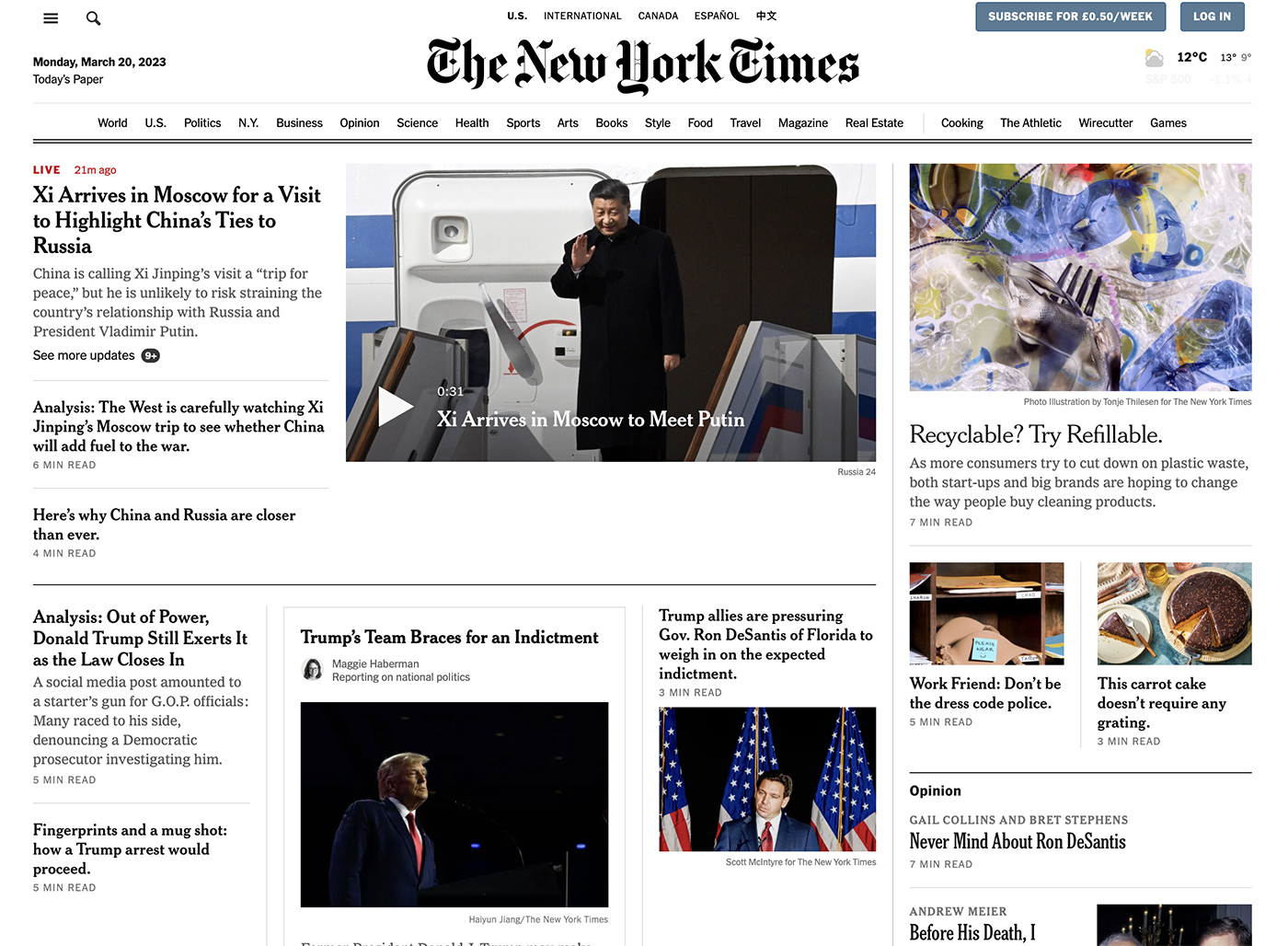
The New York Times uses the custom typeface NYT Cheltenham for its headlines. This elegant serif font, designed by Matthew Carter, conveys a sense of authority and tradition while remaining highly legible and versatile.
The Guardian
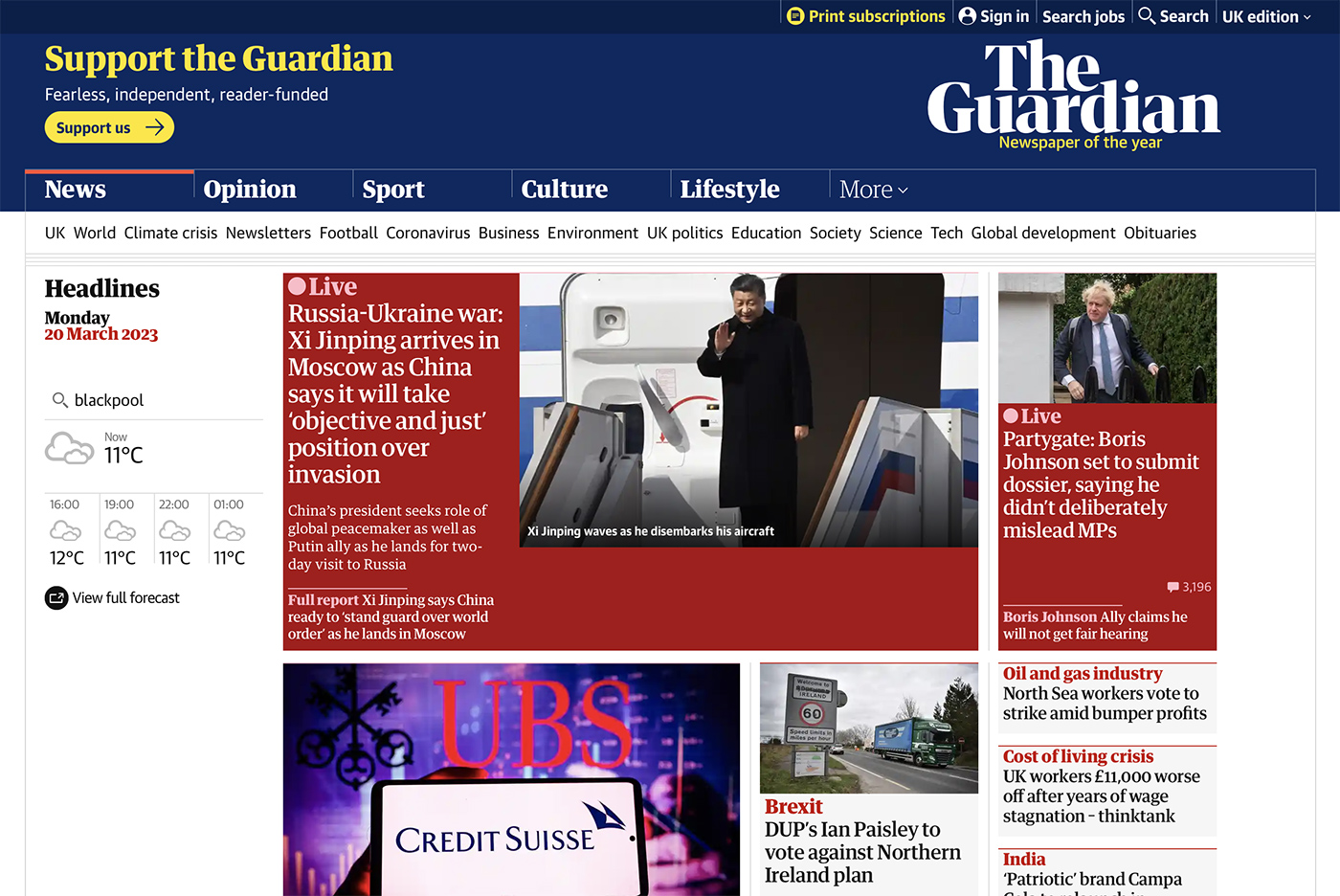
The Guardian newspaper uses the custom typeface Guardian Egyptian for its headlines. Designed by Paul Barnes and Christian Schwartz, this font is characterized by its strong, bold letterforms and high contrast, making it an excellent choice for capturing attention and conveying a modern, progressive feel.
Vogue Magazine
Vogue magazine is known for its iconic use of the Didot typeface in its logo and headlines. This classic, high-contrast serif font, designed by Firmin Didot, embodies elegance, sophistication, and refinement, making it a perfect choice for a fashion-focused publication.

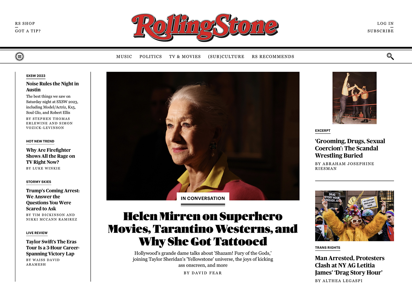
Rolling Stone
Rolling Stone magazine uses the custom typeface Rolling Stone Display for its headlines. Designed by Tobias Frere-Jones, this bold, condensed sans-serif font reflects the magazine’s edgy, contemporary, and rock-and-roll-inspired aesthetic.
Apple Inc.
Apple Inc. has frequently used the Myriad Pro typeface for headlines and marketing materials. This clean, modern sans-serif font, designed by Robert Slimbach and Carol Twombly, embodies Apple’s minimalist, user-friendly design philosophy.
How to Make Your Headline Stand Out
Contrast and Color
Utilize contrast and color to make your headlines stand out from the background and surrounding elements. Choose a color that complements your design while ensuring the text remains legible and easy to read.
Appropriate Font Size
Select a font size that is large enough to grab attention but not overwhelming. Consider the viewing distance and context of your design when determining the ideal size for your headlines.
Use of White Space
Incorporate ample white space around your headlines to help them stand out and make them easier to read. White space can also create a sense of balance and harmony within your design, guiding the viewer’s eye to the most important information.
Consistency
Maintain consistency in your font choices, colors, and formatting throughout your design work. This consistency will help establish a clear visual hierarchy, making it easier for viewers to understand and process the information presented.
Keep it Simple
Avoid overloading your headlines with too many design elements, such as excessive decoration, drop shadows, or gradients. Instead, focus on using a strong, eye-catching font and clear, concise wording to convey your message effectively.
Conclusion
Selecting the perfect font for titles and headlines is an essential aspect of effective design work. By considering factors such as legibility, visual hierarchy, mood, versatility, and font pairing, you can create designs that capture attention and effectively convey your intended message.
Furthermore, by examining examples of famous headlines and fonts, you can gain inspiration and understanding of how to create impactful design work where the headline stands out and captures attention.