Fonts similar to Century Gothic that work great
Century Gothic is a remarkable sans serif designed in 1947 by Sol Hess. Its enlarged X-height makes it a very popular choice for web designs. To make matters even better, Century Gothic also has 14 different weights and works on any headline.
It is also used for display work where designers apply it in small quantities. If this doesn’t ring a bell, think of TV shows and movie posters – Century Gothic was applied to the best ones among them. This font is also a smart choice wherever readability is a concern.
Yet, functionality is not everything Century Gothic has to offer. There is also its modern appearance and gorgeous geometric structure to convince you. The only downside is that there is no web version you can download for free.
We have some good news for you, though. Designers did some pretty good work recreating this font for private users. Some of the best fonts similar to Century Gothic won’t cost you a dime, and you can find them on the following list:
Fonts similar to century gothic
Muli
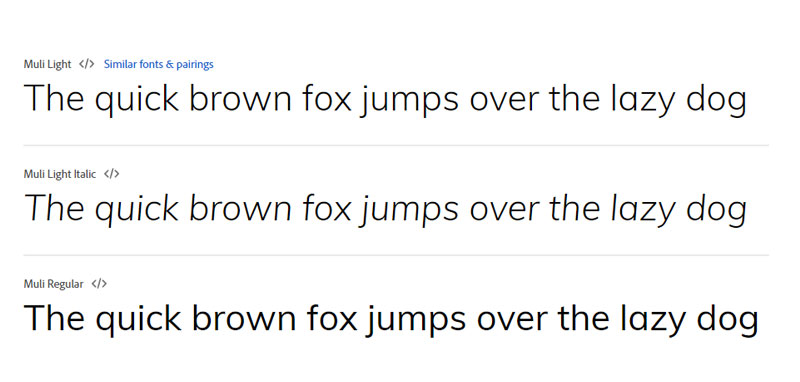
Muli is our top pick on the list. It matches even 95% of the letters found in Century Gothic. You can spot the difference mostly on the lowercase letters, such as ‘t’, ‘g’, and ‘y’. Muli uses subtle curves on the tail, which also makes it the ‘warmer’ font of the two.
Didact Gothic
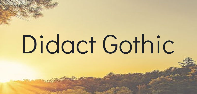
The character kit of Didact Gothic is very condensed, but it can still compete with Century Gothic. It is even simpler and more readable, and you can get it on Google Web Fonts for free. Try it out on your next project!
Palas
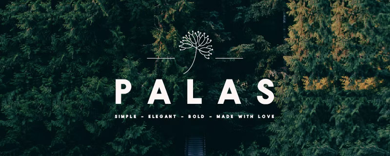
Palas is one of the most impressive fonts similar to Century Gothic. Its bold appearance makes it perfect for posters and headlines, and no viewer is indifferent to it. There are four different weights, just as in the Century Gothic case. Check it out for your next project – it may be exactly what you are looking for!
Questrial
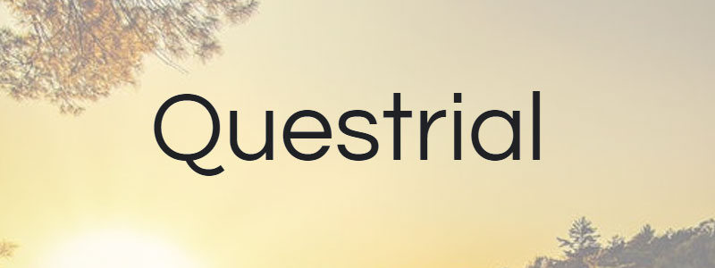
Questrial works just as well for headlines as it does for body text. The sans serif is very modern, but it will still remind you of the glorious lettering of the past. Designers choose it because it is very readable and because it blends seamlessly with any other font. Not even to mention how cute its full-circle curves look!
You will notice right away that Questrial is a Swiss font. At times, its grotesque appearance may even remind you of Helvetica. Instead of numbers, Questrial uses tabular figures, a very catchy feature. At the same time, there is support for all European languages, African Latin, and Vietnamese. We recommend it for business advertising.
Clarity Nuvo
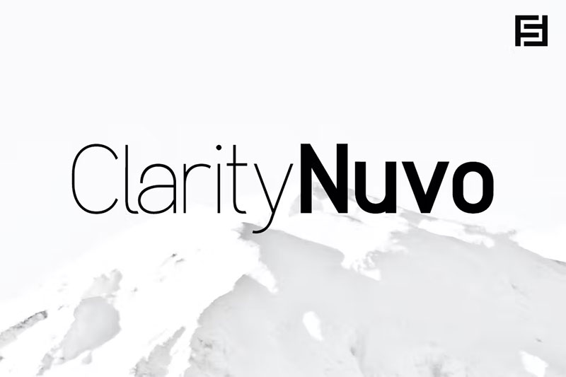
Inspired by the Century Gothic typeface, Clarity Nuvo impresses with cleanness and simplicity. There are even ten fonts you can spread among five weights – heavy, bold, regular, light, and thin. Each weight even has its italic version.
We recommend Clarity Nuvo as one of the best Century Gothic alternatives for web and print design.
Spartan
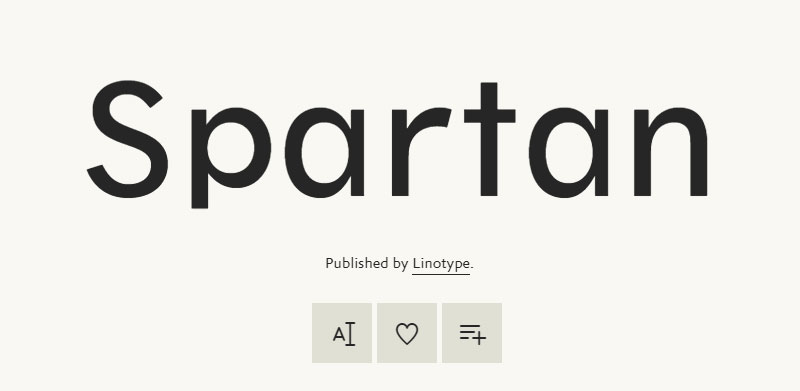
The Spartan typeface set is the American version of Futura. It was released in 1936 but didn’t take long to catch connoisseurs’ attention. There is almost no type of project where you can’t use it. It works on headlines, packaging designs, short text blocks, and many others.
In the beginning, Spartan was only used for 5.5 points classified advertising. This means it could be the perfect match for designers working with small sizes and large x-heights.
Equinox
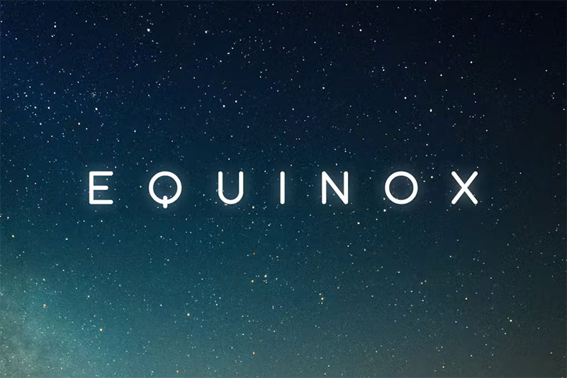
Equinox is so similar to Century Gothic that you almost can’t tell the difference. The font is modern and minimalist and thus very legible. Yet, it only features uppercase characters.
Make sure you also check the new features. There is a multilingual character set, numbers, alternate letters, and punctuation.
Futura PT
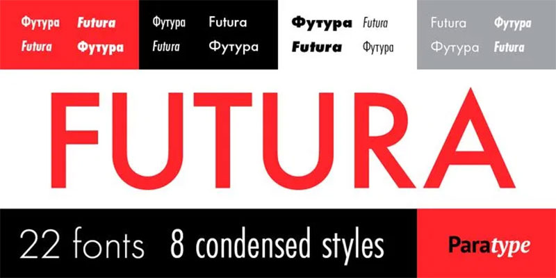
Futura PT is neither identical to Century Gothic nor free to use, but it is still an excellent choice. You are looking at an expressively geometric and aesthetically pleasing sans serif. It may remind you of fonts released by the Bauhaus foundry in the 1920s.
The font is indeed worth what you pay for it. There is a wide selection of widths and weights, and you can use it on any screen or text setting. Better yet, you get 8 condensed types and corresponding obliques that work seamlessly with each other. It is time to get creative!
Axon
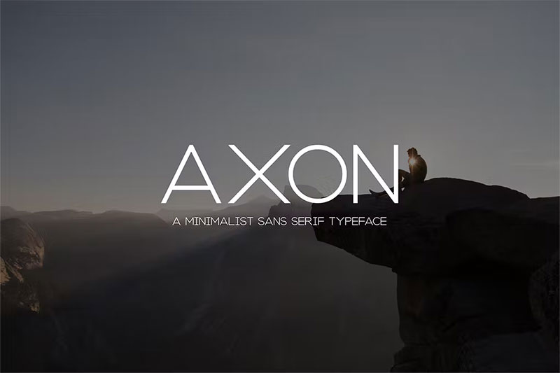
Axon transfers with ease the minimalist, yet elegant spirit of Century Gothic. You can find it on many popular magazine layouts, invitations, large-scale artwork, and much more.
ITC Avant Garde Gothic
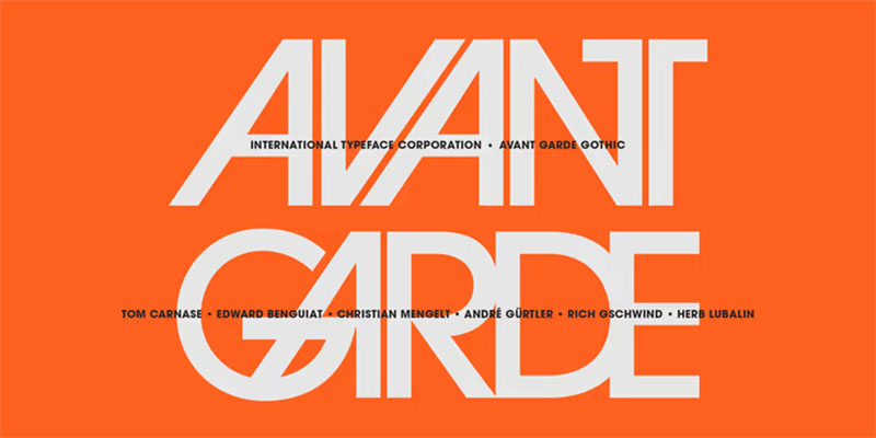
If you want to know how ITC Avant Garde Gothic looks, think of the evergreen Avant Garde magazine logo. Designer Herb Lubalin intended to create the perfect, clean headline typeface, but that was just the beginning.
Designers Tom Carnase, Ed Benguiat, Andre Gürtler, Christian Mengelt and Erich Gschwind also did their share. They created condensed versions and added obliques. It resulted in Avantgarde Gothic being a full-fledged do-it-all font.
If you like the original version better, keep in mind that there are no ligatures or alternate characters. Not bad after all – you still get to choose the ideal of the five available weights and widths.
Bergen Grotesk Font
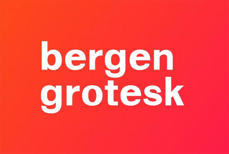
Bergen Grotesk is another great font that deserves attention. The style is foremost neutral, but the results always look beautiful. Designers think of it as the do-it-all typeface, used for both body text and headlines. You won’t be expected to pay, and you will still have access to ligatures, arrows, and fractions. Great deal, don’t you think?
Galano Grotesque
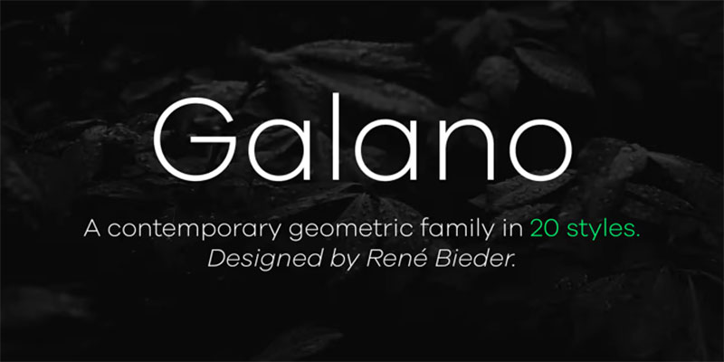
Galano Grotesque is very similar to Avant-Garde and Futura, probably due to its strict geometric form. The widths are well harmonized, and the font is therefore modern and legible at the same time.
The font also works as a ‘universal weapon’ for designers. It is simple and comes up with excellent results on headlines, short, and large text. Each of the ten weights and widths has a neutral appearance, which means there is little chance you can go wrong.
Let us reveal another secret: Galano has the most powerful set of OpenType features you can find for free. There are ligatures, glyphs, fractions, and even multilingual support. It is a must-have item for any designer!
Sheylla Sans Serif Typeface
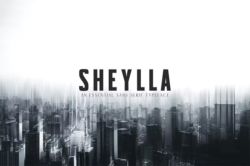
If you find Century Gothic a bit boring or overused, check Sheylla Sans. The similarities are there, but you will find the latter much more condensed and stylish. It is often chosen for print layouts, business flyers, or magazines.
Remember – if you are looking to save some space, this is the font you need.
Grafic
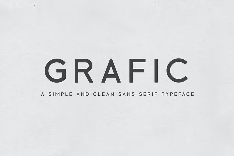
Grafic is also a valuable Century Gothic alternative, as it is clean and simple. It works great on its own, but we still recommend you pair it with a more decorative script to make the most of it. That way, your poster or album cover can become way more cheerful.
Dr
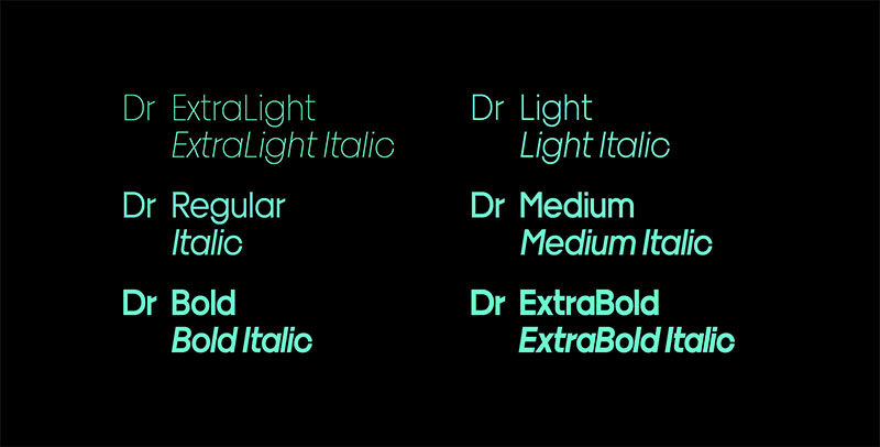
Dr is an intriguing sans serif, to say at least. The proportions are notably distorted in comparison to Century Gothic. Yet, the letterforms underwent just a minimal optical correction. Put together, these features seem weirdly off.
So why should you even consider Dr? The counter forms and narrow apertures make this font medically precise. The weights are so diverse, that you can’t tell two styles to belong to the same family. The distance between the ‘I’ and its dot is notably large. As a result, you get a punchy, one-of-a-kind design no one can copy. Works amazing for playful designs.
Chronograph
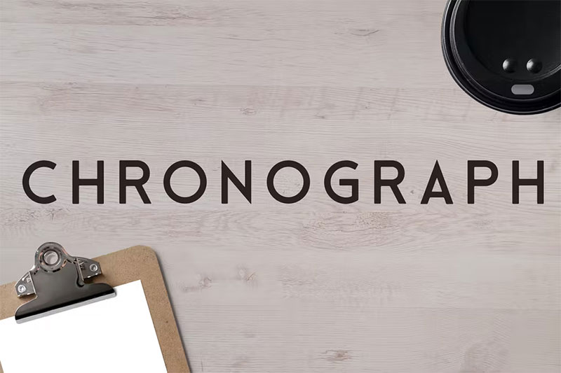
The Chronograph typeface will certainly capture the eye of Century Gothic fans, as it gives them enough styles to let them be flexible. It works for terrific and clean headlines that command attention. At the same time, it is one of the most legible sans serifs out there.
Another thing Chronograph can do is to bring a vintage vibe to your designs. It will look perfect on logos, posters, and headlines. There are four styles to choose from: Light, Regular, Semi-bold, and Bold.
Linotype Aroma No. 2
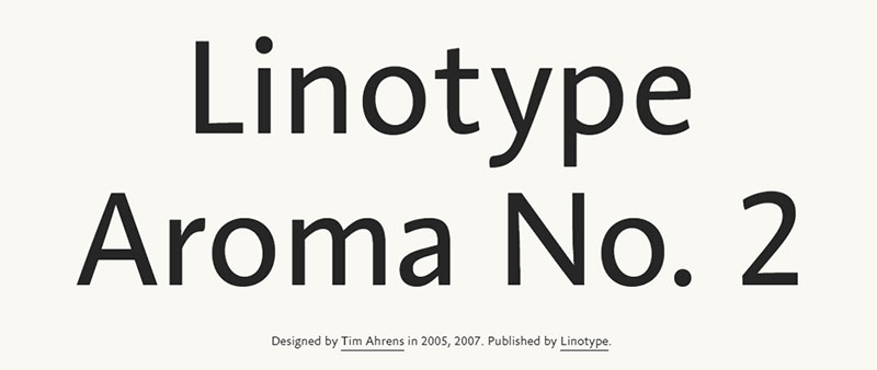
Aroma is special because of its parabolic contours, as seen on its lowercase ‘r’. Simple in form but grateful in function, Aroma also works with convex end strokes for a more organic and natural look. The sans serif can bring any design to life and grant it a memorable personality. Designers prefer to use it on large texts to convey the exact message they had in mind.
As expected, a font as modern as Linotype Aroma is fully equipped with OpenType features. The letterforms look new and refined and offer more consistency throughout versions. Some characters were added to make the suite more playful, such as the new weights and the small caps. Indeed – Aroma 2 has it all!
Adriell Sans Serif Fonts Family
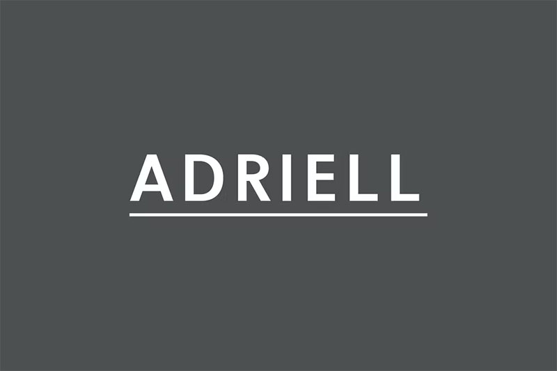
Adriell is available in five weights: black, bold, medium, outline, and regular. You can use it for literally any project: quotes, magazine titles, headlines, banners, logotypes, templates, etc.
The set even contains non-English characters, and it is offered for free. Check it out!
We hope this list helped you find the best fonts similar to Century Gothic. Try them out and let us know which one works out best for your project.
If you enjoyed reading this article on Fonts similar to Century Gothic, you should check out this one about fonts similar to Impact.
We also wrote about a few related subjects like fonts similar to Futura, fonts similar to Avenir, fonts similar to Calibri, fonts similar to Gotham, and fonts similar to Montserrat.