Gorgeous Hair Salon Websites to use as Inspiration
Creating an attractive and efficient hair salon website can be a difficult process, especially if you are unfamiliar with web design. Fortunately, there are numerous beautiful hair salon websites available that can serve as fantastic sources of inspiration.
In this article, we’ll look at some of the most stunning hair salon websites, emphasizing their distinct features and benefits. These sites demonstrate the best in hair salon website design, ranging from slick and sophisticated to comfortable and friendly. This post will provide you with wonderful examples to utilize as inspiration, whether you’re a new salon owner trying to construct a website for your business or an experienced business looking to improve your online presence.
Stunning hair salon websites
Fringe NY
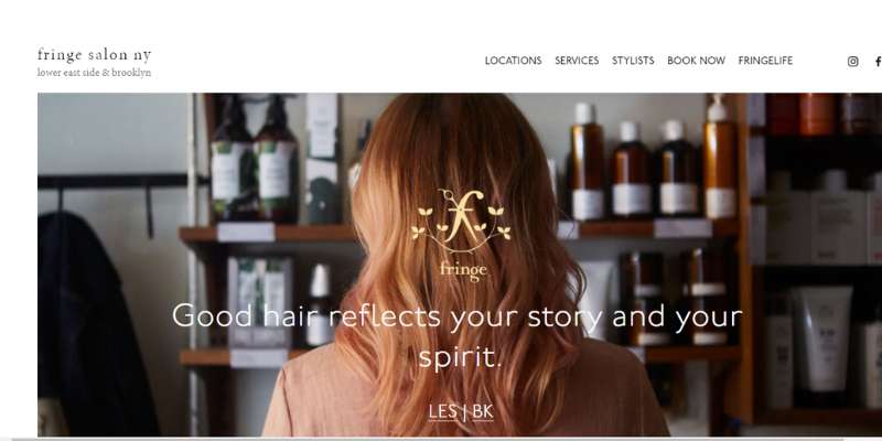
One of Fringe Salon’s website’s most defining and distinctive features is arguably its easy navigation, which is made possible by the home page’s clever and intuitive design. The brand’s logo has a gold tint, which gives it a regal appearance. With a quick scroll, the address and contact information are easily apparent.
New York Hair
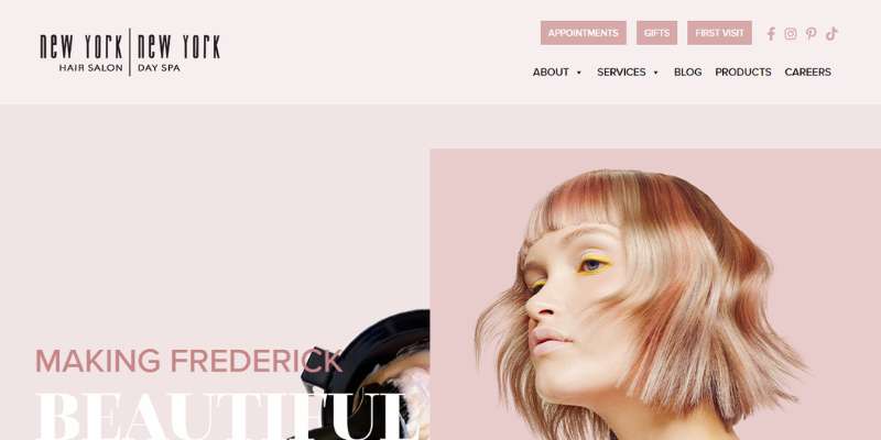
To keep website visitors interested, New York Hair makes extensive use of contemporary features including moving images and interactive screen components.
The muted mauve and soft pink color scheme utilized for the hair salon website design is not just distinctive, but it also works well with the images and other design elements. Social media, particularly Instagram, is extremely nicely interwoven.
Soho Hair Salon
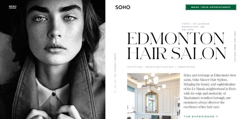
The right half of the page glides down to display additional text while the left side remains static for a time. Then, as you approach the book’s conclusion, both sides are open to exposing further text.
The whole hair salon website is black and white with sporadic splashes of natural color, which gives it a special touch.
Pastels Salon
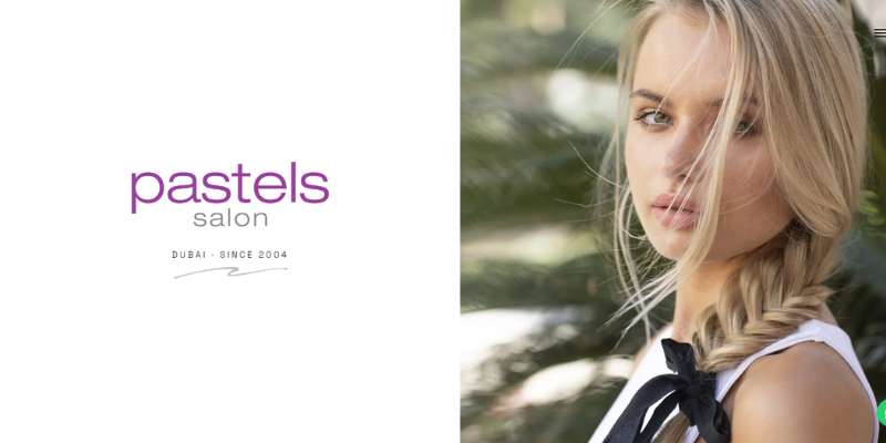
This hair salon website design resembles a gallery screen in every way. The multipage technology doesn’t even alter the screen, so you may read more of the website without having to scroll down.
The screen then switches to a full image with text as an alternative. Even this hair salon website’s sliding method isn’t as straightforward as it seems since one side of the screen slides up while the other slides down.
On the right side of the screen, there is a hamburger menu that may be accessed to display more choices.
Platinum Hair Studio
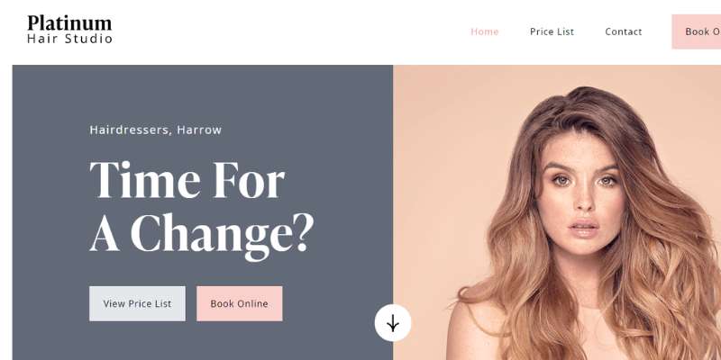
The color palette used on this hair salon website is amazing, and the website’s layout is also a bit unusual. By clicking on the images, you can quickly examine every service the hair salon provides and the pricing list for that specific treatment.
The hair salon website’s backdrop gradually changes from white to pale pink once you reach the covid safety section before returning to white once you leave it.
Jet Rhys Hair Salon
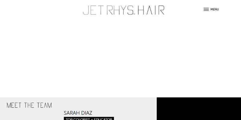
The hair salon website is even more enticing since it contains a full-screen backdrop picture of the hair salon artists at work.
You can find all the information, including how to schedule an appointment, by selecting “Menu” in the top-right corner of the hair salon website. The hair salon’s hours of operation and a newsletter sign-up option are included at the bottom of the page.
Luis Neto Hair Design
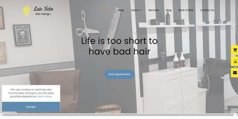
This hair salon website design has a homepage in the form of a gallery, however, the text scrolls across the gallery rather than together with the images.
The website’s other elements shine out because of the pastel tone. Everything is properly put out on the hair salon website, making it quite simple to navigate.
Marco Ambrosi Hair Salon’s website
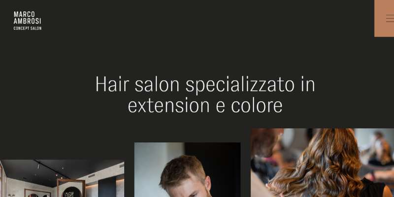
This hair salon website is not only wonderfully made, but it is also quite dynamic since the images, text, and other components are always moving and interacting with one another.
At the very bottom of the webpage, there is a gallery of haircuts. Another element that is lacking from most websites is an entirely black backdrop.
23rd Street Hair Salon
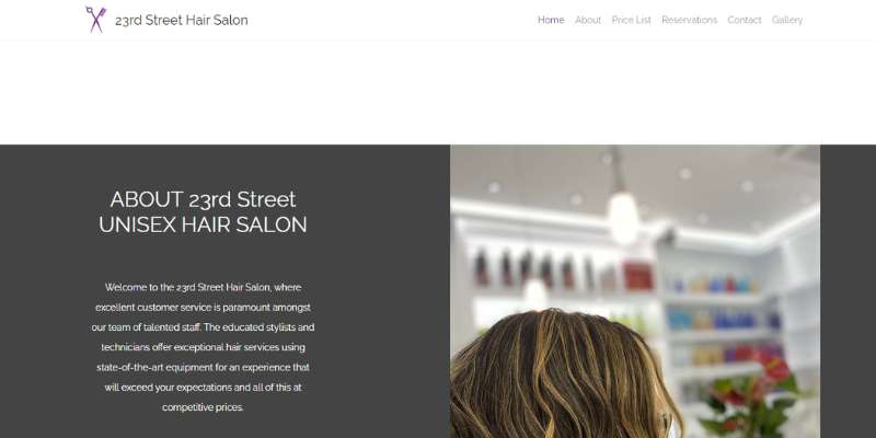
The homepage of the hair salon website is designed like a gallery. The only thing left after scrolling past the picture gallery is a list of several services and their associated costs, with a photo gallery at the bottom of the page.
Larry King’s Hair
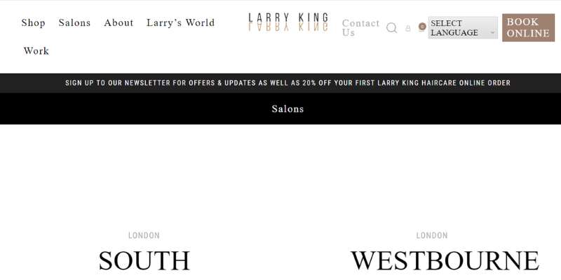
With a webpage that jumps right into the address information, this hair business keeps things straightforward. Also full of information that is simple to grasp is the footer.
Camerino Alzira
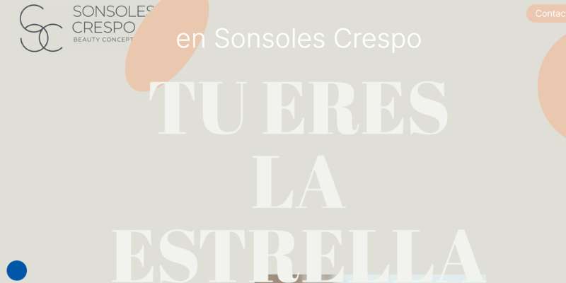
A lot of imaginative visuals and moving elements are used on this other extremely interactive hair shop website to keep visitors interested.
The website has a lot of personality because of the neutral color scheme, which also helps the text and photographs stand out. However, even though the website has splashes of orange throughout, it doesn’t seem too out of place.
As all the information is on the homepage, the website’s absence of a navigation bar makes it simple to browse.
Suki
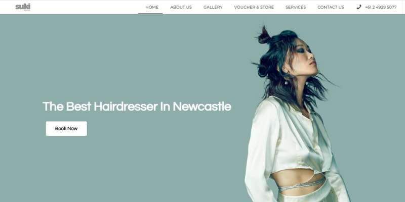
The excellent color grading of the website is one feature of this hair shop that immediately stands out. The pictures’ blue hue blends well with the rest of the website’s color scheme.
Glasshouse Hair Salon
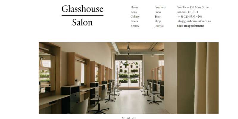
This hair salon website has a fantastic visual appeal because of its eye-catching design, color scheme, font, and picture presentation. a clean, uncluttered website design.
Parfois Hair Salon
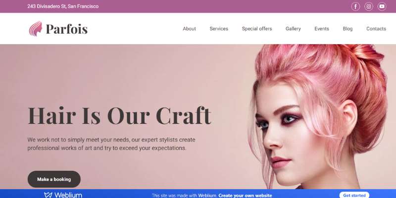
The Parfois hair salon website stands out for its structure, order, and clean aesthetic. The website’s color scheme’s rose and powdered accents take on the role of a unifying theme, acting as a tool to help the website develop into a unified whole.
Hairsoda Salon
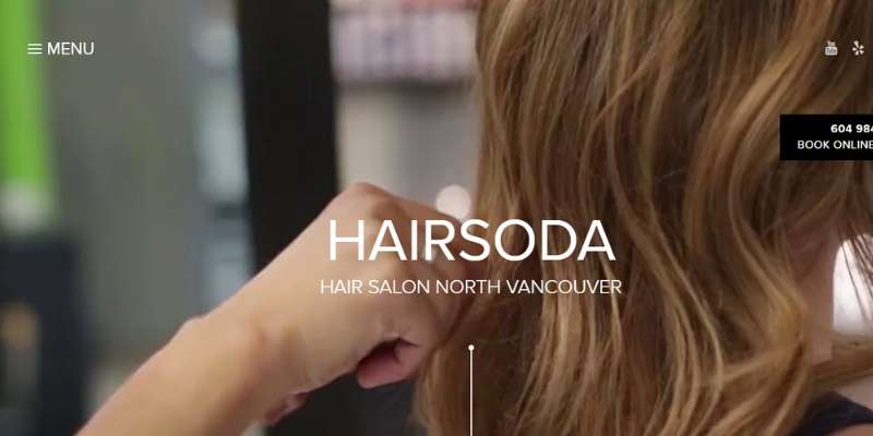
The site has a top-notch, completely saturated video that demonstrates how various hairstylists trim and color hair.
On the webpage, there is a brief information section where you can quickly find out about hair services and salon hours. Salon clients may check the stylist’s prior work in the portfolio area before making any appointment requests.
The whole hair salon website is contained on a single page, making navigation exceedingly simple.
Hair and Co
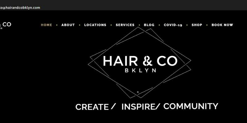
Beautiful full-width banner video on Hair & Co. To locate what you need, the drop-down menu is well-organized. The front page has profiles of the stylists and helpful embedded YouTube videos. Another exciting addition is the quiz to “meet your stylist”!
Spa and Hair
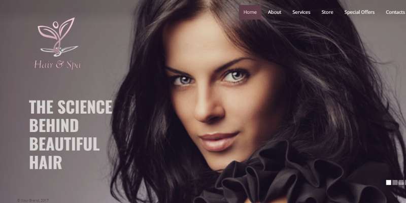
Another intriguing hair salon website design is the one of Hair and Spa, which just has a gallery part on the homepage with a ton of text and images. The remaining details are available by visiting other pages through the menu bar.
Stag Hair Parlor
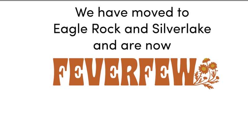
Everything a consumer would require is available on the website’s navigation bar, which has a straightforward design and features anything from items and contact information to appointment scheduling.
The Salon Charlee
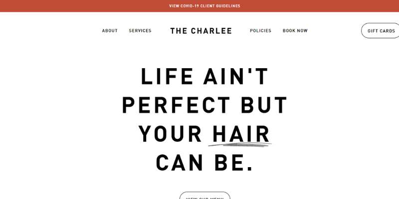
The website’s initial structure is extremely straightforward since it just employs the standard navigation bar, text, and photo components that many top hair salon websites have. But, it also includes a collage of various hairstyles that serves as the website’s main focus point.
Kimble Hair Studio
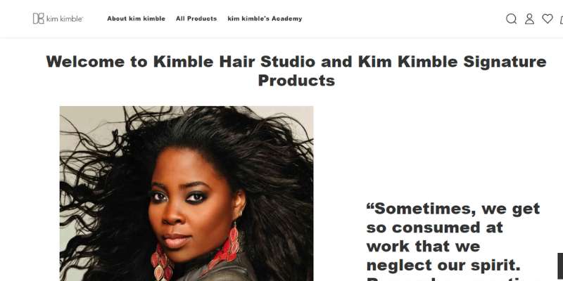
The focal point of the website is the design of the horizontally extended banner picture. This website’s design, which was created using Shopify, is excellent for people who want to emphasize their brand. The store, hair salon, and contact information are all included in the clear, well-defined menu bar.
Leo’s Hair
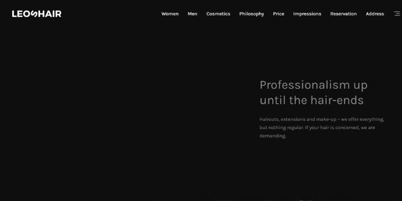
The homepage of the website is made up entirely of a series of alternating boxes with text and images. The website once again has a black backdrop, which makes the colorful accents stand out even more.
Fabio Doti Salon
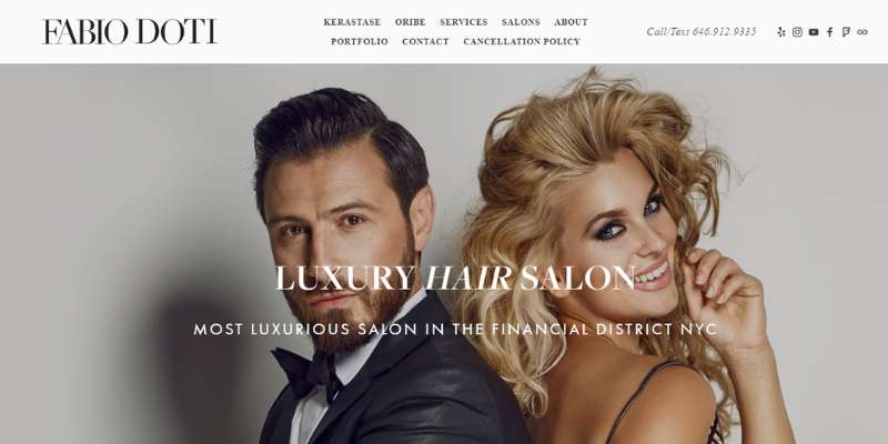
The Fabio Doti website has a warm, friendly feel about it. The website’s design incorporates opulent language and imagery. But, two things—well-integrated social media and a thorough and appealing staff page—make the salon personable and pleasant for customers.
Adam Reed London
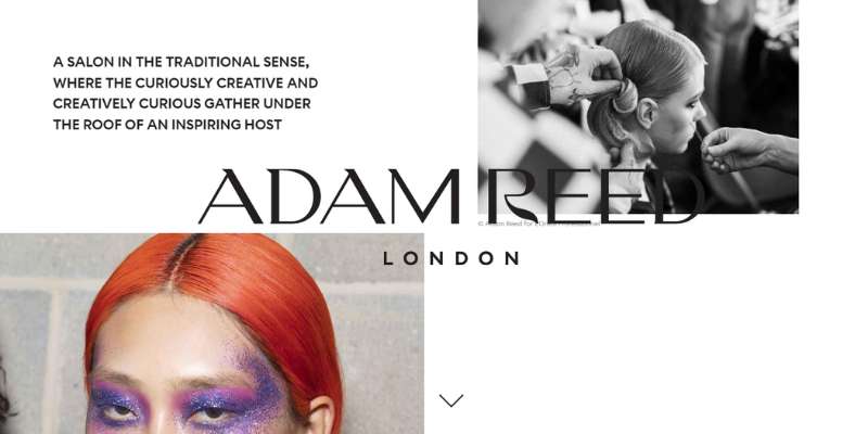
One of the top hair salon websites for hair salons is this one. When you first visit the website, it genuinely engages you because of the layout’s use of visual design and little content.
George Northwood
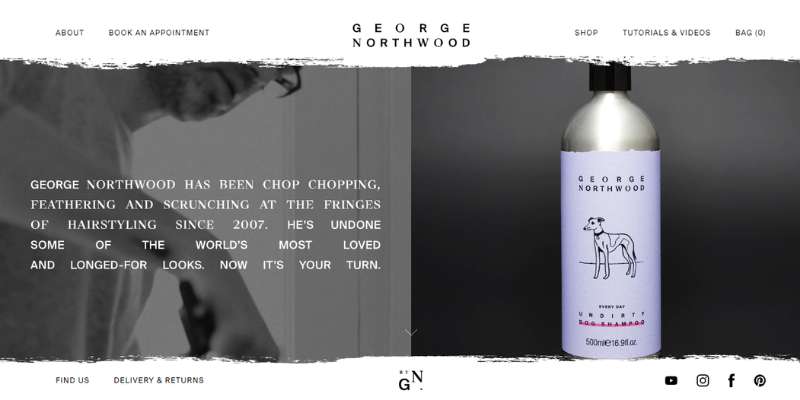
The navigation bar on the website for the George Northwood hair salons is oddly positioned in the upper left corner of the page. To schedule an immediate appointment, you may also use the online booking option. a website design that is easy to use.
Bleach London
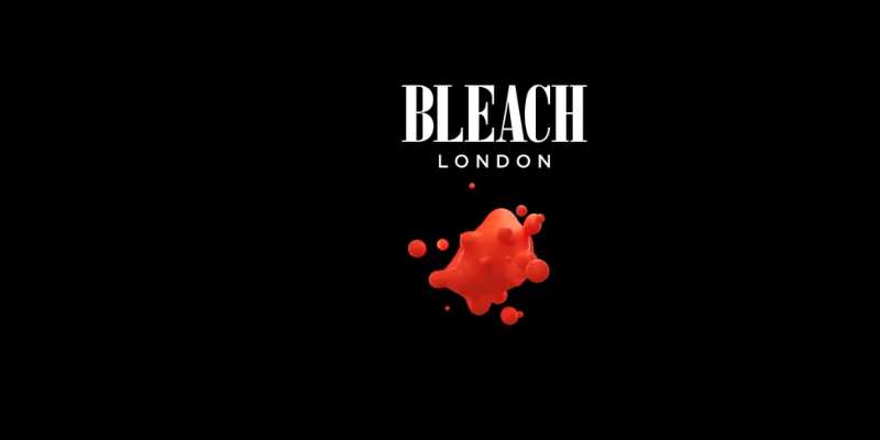
This website has bold colors and prominent banners with deals and important information. Astonishing video picture utilization is also used.
Blue Tit London
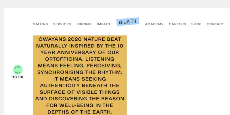
As a result of the captivating visuals and straightforward language, the design is stunning, lively, and colorful. An online booking option is also visible on the right of the page, which is a useful addition.
Mop Hair Salon
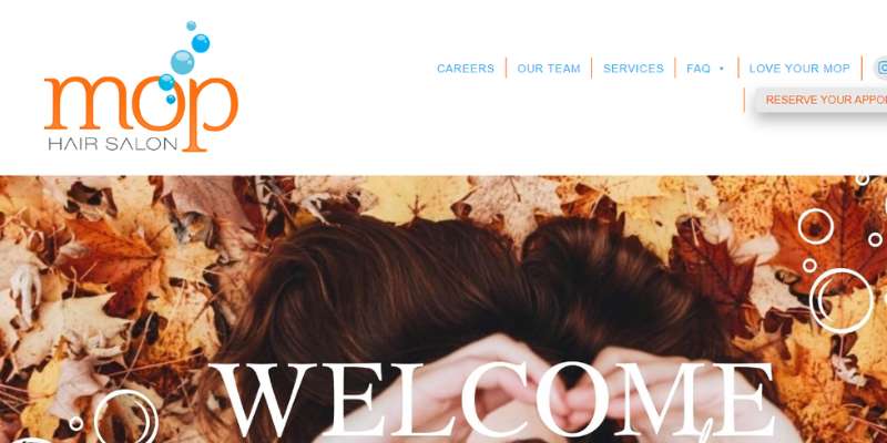
The pattern is vibrant and lively. A simple navigation that guides you throughout the website is located beside some attractive images. There is a large, noticeable orange button that reads “schedule appointment.” You get more eager to visit the location as you continue to browse the website.
Nook Stockholm
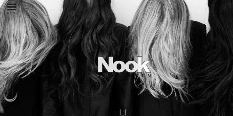
This website for a minimalist hair salon, which is mostly black and white, is excellent.
Voodoo Hair Salon
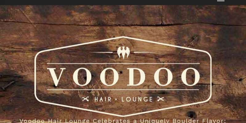
This website’s amazing design has all the elements website visitors need to remain on the page. The old-fashioned images and backdrop hue of brown wood provide professionalism while also adding mystery.
Parlour Hair Salon
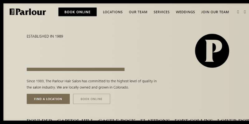
This website has a large opening menu, an attractive dark design, educational courses, job opportunities, a team portfolio, and a separate wedding hairstyle website in addition to many more services.
Percy & Reed Salon
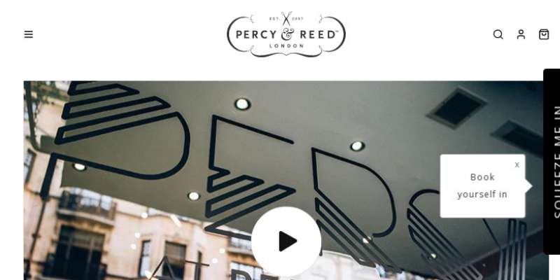
The Percy & Reed website is a good example of how to use color, typeface, and pictures in a pleasing and appealing way. It conveys a rather vivid feeling. The menu bar is located at the top of the webpage and contains all the necessary information.
Blackstones
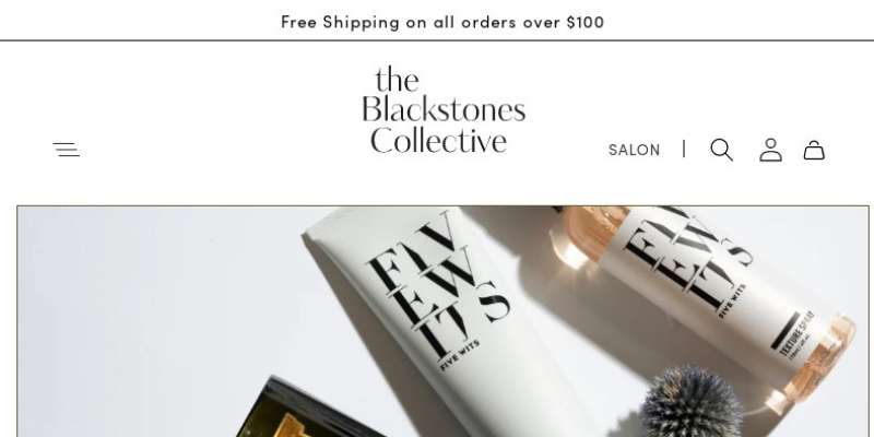
Customers are instantly drawn in by the full-width photos, straightforward pricing, and precise salon locations information. Another excellent addition is the grid of creative employee pictures.
Hairzoo
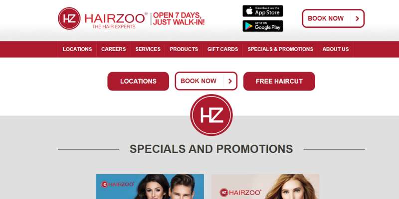
This website contains a large banner with several brief videos of the stylists at work. As you scroll down, it also features an intriguing grid of the most recent deals.
CODE Salon
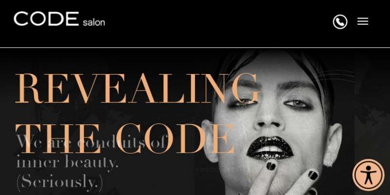
The CODE Salon’s full-width picture carousel is eye-catching, and the grid with vital salon services below it enables customers to navigate straight to the information they need. This website is at the top of its game, as seen by the excellent aesthetics and conveniently placed social media links.
THP Hair
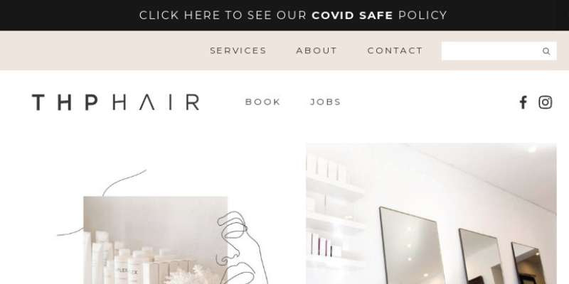
The website and brand are unified and simple to browse because of the use of harmonious colors, images, and graphic components.
FAQ on designing a hair salon website
What kind of color scheme should I use for my hair salon website?
A hair salon website’s color scheme should be consistent with the salon’s logo and portray a feeling of style and refinement.
Consider using complementary hues to create a visually pleasing look. Basic tones such as black, white, and grey are commonly used in hair salon websites, but brighter colors such as pink, blue, or green can also be utilized to add flair.
How can I make my website look professional and stylish to potential customers?
Use high-quality photographs and material, make your website easy to navigate, and offer clear information about your salon’s services and prices to make your website look professional and fashionable.
Consider employing a professional design that includes a custom logo, uniform font, and a simple layout. Provide clear contact information as well as links to social media profiles.
What are some essential features that a hair salon website should have?
A list of services offered, pricing information, location data and hours of operation, contact information, and a photo gallery exhibiting the salon’s work are all required aspects for a hair salon website.
An FAQ area, user reviews, and a blog are all potential valuable elements.
How can I make my website easy to navigate for visitors looking for specific services?
Use clear and simple labels for each page and area, include a search bar, and make sure your menu is easily accessible and arranged to make your website easy to use.
To break up language and make material easier to skim, use headings and subheadings. Consider employing filters and sorting options to assist visitors in finding the services they require.
How can I showcase my salon’s services in a visually appealing and enticing way?
Use high-quality photographs and videos that highlight the subtleties and benefits of each service to visually attractive and enticingly promote your salon’s offerings.
Consider using before-and-after photographs to demonstrate the outcomes of a service, or a 360-degree view to provide visitors with a closer look. You might also use bundle discounts or special offers to get visitors to test several services.
What type of content should I include on my hair salon website to engage visitors?
Provide useful and entertaining content about hair care and beauty to captivate visitors. Consider creating blog posts or articles about hair trends, styling advice, or product reviews. You might also offer useful resources such as tutorials, fashion galleries, or commonly asked questions.
How can I optimize my website for search engines to increase visibility and attract more customers?
Use relevant keywords in your content, including meta tags and descriptions, utilize alt text for photos, and make sure your website is mobile-friendly and loads quickly to optimize it for search engines.
Try obtaining links to your website from other related websites and promoting your content through social media.
Should I include an online booking system on my hair salon website, and if so, how should it be designed?
Customers may plan appointments at your salon more easily if you have an online booking system. Make the booking system user-friendly and simple to use, and just ask for the information needed for the appointment.
Consider offering appointment reminders and confirmations, and include clear information about payment alternatives and cancellation procedures.
How can I make my website mobile-friendly for visitors who access it on their smartphones or tablets?
Choose a responsive design that automatically adjusts to fit the screen size of the device being used to make your website mobile-friendly.
Make sure your website loads swiftly and has readable fonts and photos. Try employing larger buttons and touch-friendly features for a better mobile user experience.
What are some best practices for designing a user-friendly and effective hair salon website?
Using a clean and consistent design, prioritizing ease of use and accessibility, using high-quality photographs and material, and ensuring that the booking process is easy and intuitive are all best practices for developing a user-friendly and effective hair salon website.
It’s also critical to keep your website up to date with new services, content, and special offers, as well as to test its usability and performance on a number of devices and browsers.
Finally, consider incorporating consumer input and making adjustments depending on user behavior to continuously improve the effectiveness of your website.
Conclusion on hair salon websites
When you’re preparing to create a new website, it might be difficult to know where to start. But it’s a great place to start to look at what the best hair salon websites do.
If you enjoyed reading this article about hair salon websites, you should read these as well:
- Top weird websites that you’ll be surprised even exist
- Choosing The Right Colors And Fonts For Your Brand
- mpressive Museum Website Design to Use as Inspiration