An Ultimate Guide On Sizing, Spacing, Grids And Layout In Web And UI/UX Design
A spatial system is a set of design guidelines about spacing, sizing, and dimensions of user interface components. It is a mandatory part of any design system, as it helps to create visual rhythm, creates consistent products, and reduces the amount of decisions designers make every day. A spatial system usually consists of four basics: a base unit, a spatial scale, grids, and sometimes layouts. Why is it so important?
Let’s look at these two layouts in the image below. It’s an example of how proper organization of space can help designers create better layouts:

We can assume that this is most likely an authorization form on a website. The first layout has some inconsistencies with spacing and does not have a clear vertical rhythm. However, when we look at the second layout, everything seems more clear. It's because all the elements are adjusted to the 8pt spatial system, so vertical rhythm becomes predictable and clear. When a design does not have an immediately recognizable spatial pattern, users may find it inconsistent and unreliable.
Now that we have an idea of what we are discussing, let's start with grids since the organization of space usually begins with them.
What Is A Grid?Grids provide a structure for the layout of elements, while a spatial system defines rules for using spacing and sizing. Early print designers used grids to organize text blocks and images into pleasing visual hierarchies for achieving better readability and scannability. The same basic principles can be applied to web and interface design.
The Nielsen Norman Group wrote a good article about using grids in interface design. According to the article, there are three common grid types used in websites and interfaces: column grid, modular grid, and hierarchical. I suggest considering another type that came from graphic design — a baseline grid.
In this article, we will not go deep into the topic of grids but consider them in the context of a spatial system.

A column grid is the most popular grid in web and interface design. It helps to organize content into evenly spaced vertical columns with gutters between them. A modular grid extends the column grid by adding rows to it. It helps us to organize content into a matrix structure, so it is very helpful for e-commerce, galleries or card layouts.
With a baseline grid, things get more complicated. Let's take a closer look at it:

A baseline grid is a dense grid of equally spaced horizontal lines. As I mentioned before, It came to us from graphic design, where all texts flow vertically along the baseline, creating a similar rhythm. In order to align all the elements on this grid, it is necessary that all spacings and dimensions are multiples of the interval value between the lines. In order for us to do this, we need to create a clear spatial system. Let’s start with a base unit.
Base UnitA spatial base unit is a number by which all composite grids, dimensions, margins and frames are divided. Choosing a base unit value is the first and the most important step since the entire spatial system will be based on this value.
Most systems use an 8pt spatial base unit with a 4pt half-step, for example, design systems like Google's Material Design, Atlassian Design System, Adobe's Spectrum Design System, etc. This is because 8 itself is a very convenient number.

Many screen sizes are divisible by 8 (320px, 768px, 1024px, etc.), which makes scaling for a wide variety of screen sizes easy and consistent. Also, we can easily divide it by 2 or 4 to get fractional values. Look at the image below: 4pt is a @0.5 of an 8pt base unit, and 2pt is a @0.25:

Fractional values are very convenient when we work with elements that need a more flexible system, for example, icons, typography, and a baseline grid. Therefore the interval between lines in baseline grids is also half the base unit. Atlassian Design System uses this approach. Look at the image below: they have a great baseline grid and typography system, which is aligned by line height and baseline at the same time, although usually, on the web, we place texts by a line height instead of a baseline, just like in graphic design.

Another nice feature of an 8pt base unit is a perfect balance between the visual distancing and the number of variants. If we take all the linear values in the range from 0pt to 120pt, with an 8pt base unit, we will get 15 different values; with a 10pt base unit, we will get only 12 values; and with a 5pt base unit, we will get all 24 values!
On the other hand, there are some teams that prefer to use a 5pt base unit. For example, Adidas and Upwork websites are built using a 5pt base unit. They don’t have open design guidelines, but If we inspect the code, we can see values that are multiples of 5.

However, keep in mind that choosing an odd value for a base unit can cause some problems. There are some devices that have @1.5 scale ratio to the original size. Odd values will become fractional, and splitted pixels will be blurred and create visual noise.

You can choose any value for a base unit: 4pt, 5pt, 6pt, 8pt, 10pt. Hence your choice should depend on the overall product and brand aesthetic you are going for. When you have chosen a base unit value, the next step is defining a spatial scale. Summing up, choosing a small value for a base unit will create too many variables in your spatial system. It will be hard to notice the difference between adjacent values; for example, a 2pt base unit will create 12pt, 14pt, and 16pt values. Contrariwise choosing a large value for a base unit will create too few variables in your spatial system. The difference between adjacent values will be too large; for example, a 16pt base unit will create 16pt, 32pt, and 48pt values.
Spatial ScaleThe next step is defining a spatial scale. These are the very values or tokens that we use for margins, paddings, and dimensions of UI components. There are several approaches to the formation of a spatial scale. Let’s walk through them.
Some teams use a linear spatial scale where each step is a fixed base unit increment. For example, Wave Design System is based on a linear spatial scale with an 8px base unit (8px, 16px, 24px, 32px, etc.). In my opinion, however, It creates too many options to choose from, especially when it comes to large values. Let’s consider the image below. It’s hard to notice the difference between two adjacent values larger than 72px, isn't it? When do we use 104px and 112px? What is the difference between them?

On the other hand, you can use scales based on Golden Ratio, Geometric Progression, or other mathematical rules. For example, Pega's Bolt Design System uses Geometric Progression with a factor of 2x for their spatial scale.

Hence if at a linear scale, we may have a bunch of unnecessary values, then with the geometric progression, we may lack many useful ones. In this case, some teams just break their systems and use custom values, not from the scale. For example, Pega’s Bolt Design System uses custom values for margins and paddings for their card component. We can find this out by inspecting the CSS styles via the browser. Despite all these advantages, this approach has a drawback, which I think is essential — it is very easy to spoil the consistency of a product. Why make rules if you break them later?

I prefer to use a linear scale, remove all unnecessary values, especially larger than 72px, and add useful ones. The most popular design systems use this approach too, for example Adobe's Spectrum Design System or IBM's Carbon Design System. Remember that all variables should be reasonable and visually distinguishable.

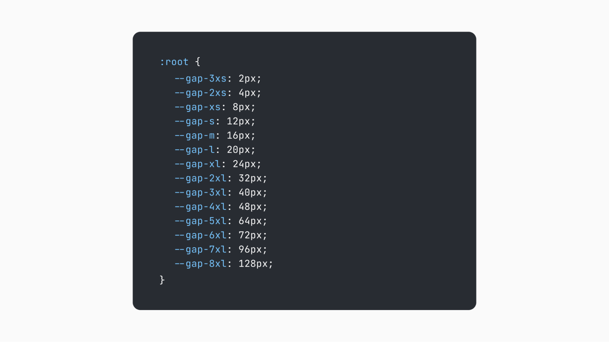
Another thing to consider is naming spatial scale values. Roughly speaking, a spatial scale is a set of constants or tokens, and their names should be the same in both code and design. This will help designers and developers speak the same language and reduce the number of visual bugs. Because there is no universal solution for naming, you can name spatial scale values the way you and your team like the most. For example, IBM's Carbon Design System uses numbers from ‘1’ to ‘13’, Adobe's Spectrum Design System uses numbers from ‘50’ to ‘1000’, Bootstrap uses names from ‘xs’ to ‘xxl’, Salesforce's Lightning Design System uses names from ‘xxx-small’ to ‘xx-large’.

When we have chosen a base unit and defined a spatial scale, we may have a question: how to use it properly? Let’s figure that out.
As we know, spatial scale applies to margins, paddings, and dimensions. For width or height, we just set a value from a spatial scale. It is ok to set only height or only width if we cannot predict the content of the component, so it will hug the content and stretch dynamically. But with margins and paddings, things get more complicated. Look at the image below. As you can see, there are three types of spacing: inner spacing, vertical gaps, and horizontal gaps (or inline spacing).

Vertical and horizontal gaps are white spaces between UI elements, components, and sections. We will assume that in design, these gaps will be transparent rectangles with strict height or width definition, while in web development, they will be in the form of ‘margin’, ‘top’, ‘right’, ‘bottom’, and ‘left’ CSS properties. For their values, we should use spatial scale values, nothing special.
Inner spacing, or paddings, is white space inside the borders of UI components. In design, we can use it as auto layout properties or the same transparent rectangles. In web development, it will be in the form of ‘padding’ CSS property. Sometimes it’s not possible to use spatial scale values both for inner spacing and dimensions of UI components.
Let's look at the following example:

In the above image, we have two buttons. The label’s line height is 20px (@2.5 of the 8px base unit). If we set a strict height of 32px for the first button, it will have 6px top and bottom paddings. The spatial scale includes the 32px value, but it does not include the 6px value. And if we set strict top and bottom paddings of 8px for the second button, it will have a 36px height. The spatial scale includes the 8px value, but it does not include the 36px value. Which one is the right choice?
If we can predict the content or its size, we could set strict size properties. For example, we know that the button can have only 1 line of text inside, so we can set a strict height value from the scale. Therefore, the first button is made correctly. Components, where we can set strict size properties, are the key to creating rhythm in the overall composition.

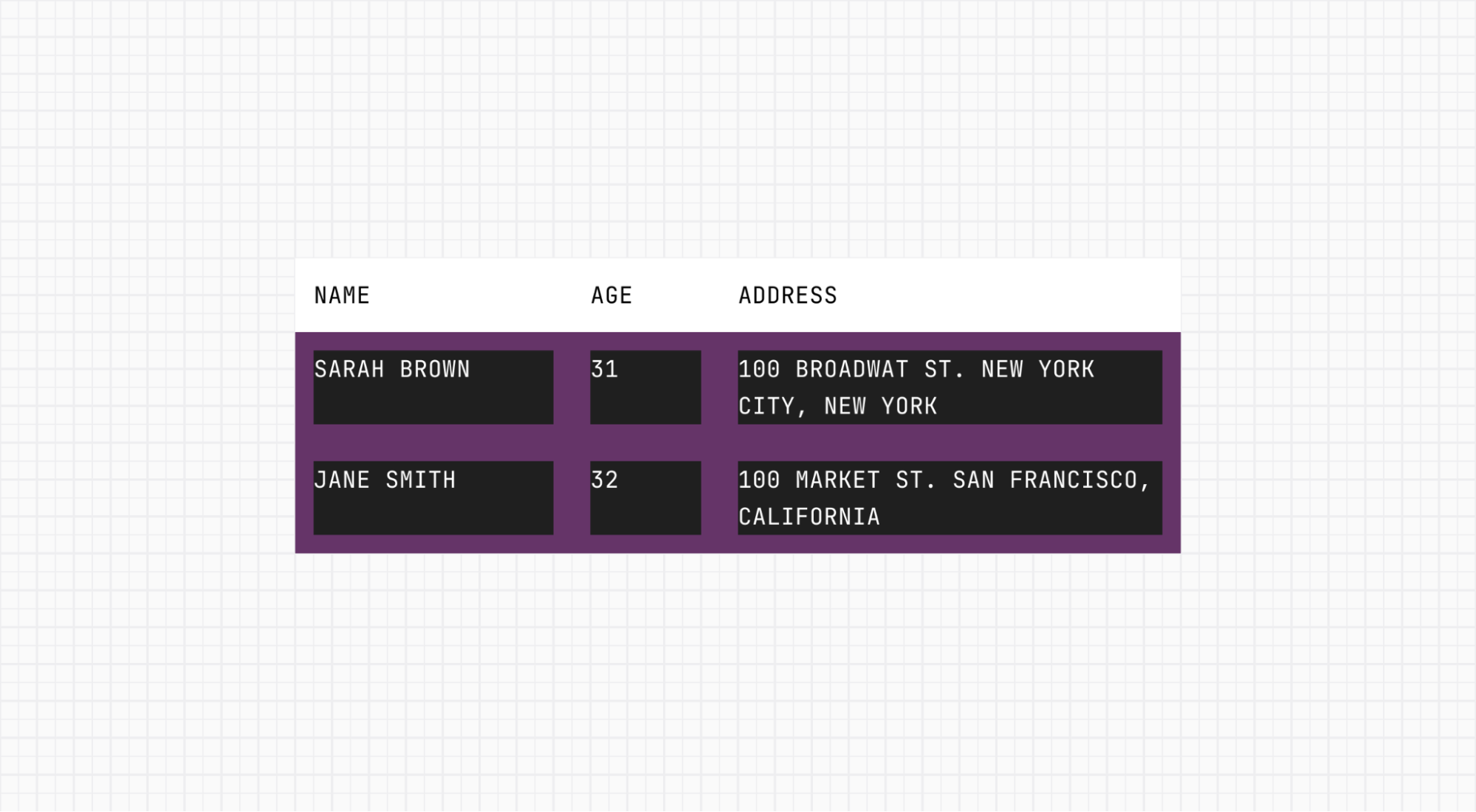
But if the content of the component is less predictable, we could set strict internal paddings. For example, we don’t know what the content of the table row component will be, so we can set strict internal padding from the spatial scale and let the height of the component depend on the content.

Summing up, we saw that space is one of the core elements of design. The spatial system is a mandatory part of any design system, and it helps to achieve consistency, create visual rhythm, limit decision-making, and help different teams stay on the same page.
There are no good or bad spatial systems — every system has its own pros and cons. Create your system based on the needs of your product and the overall brand aesthetics you are going for. Remember that a spatial system is a tool, i.e. it should help you to create better products, and not limit you.