Building A Web Code Editor
An online web code editor is most useful when you do not have the opportunity to use a code editor application, or when you want to quickly try out something on the web with your computer or even your mobile phone. This is also an interesting project to work on because having the knowledge of how to build a code editor will give you ideas on how to approach other projects that require you to integrate a code editor to show some functionality.
Here are a few React concepts you’ll need to know in order to follow along in this article:
- Hooks,
- Component structure,
- Functional components,
- Props.
We will be using a library named CodeMirror to build our editor. CodeMirror is a versatile text editor implemented in JavaScript for the browser. It is especially for editing code and comes with a number of language modes and add-ons for more advanced editing functionality.
A rich programming API and a CSS theming system are available for customizing CodeMirror to fit your application and extending it with new functionality. It gives us the functionality to create a rich code editor that runs on the web and shows us the result of our code in real time.
In the next section, we will set up our new React project and install the libraries we need to build our web app.
Creating A New React ProjectLet’s start by creating a new React project. In your commandline interface, navigate to the directory in which you want to create your project, and let’s create a React application and name it code_editor:
npx create-react-app code_editorHaving created our new React application, let’s navigate to that project’s directory in the commandline interface:
cd code_editorThere are two libraries we need to install here: codemirror and react-codemirror2.
npm install codemirror react-codemirror2Having installed the libraries we need for this project, let’s create our tabs and enable tab switching between the three tabs that will appear in our editor (for HTML, CSS, and JavaScript).
Button Component
Instead of creating individual buttons, let’s make the button a component that is reusable. In our project, the button would have three instances, according to the three tabs we need.
Create a folder named components in the src folder. In this new components folder, create a JSX file named Button.jsx.
Here is all of the code needed in the Button component:
import React from 'react'
const Button = ({title, onClick}) => {
  return (
    <div>
      <button
        style={{
          maxWidth: "140px",
          minWidth: "80px",
          height: "30px",
          marginRight: "5px"
        }}
        onClick={onClick}
      >
        {title}
      </button>
    </div>
  )
}
export default Button
Here is a full explanation of what we did above:
- We created a functional component named
Button, which we then exported. - We destructured
titleandonClickfrom the props coming into the component. Here,titlewould be a string of text, andonClickwould be a function that gets called when a button is clicked. - Next, we used the
buttonelement to declare our button, and used thestyleattributes to style our button to look presentable. - We added the
onClickattribute and passed our destructuredonClickfunction props to it. - The last thing you’ll notice we did in this component is pass in
{title}as the content of thebuttontag. This allows us to display the title dynamically, based on what prop is being passed to the instance of the button component when it is called.
Now that we have created a reusable button component, let’s move on and bring our component into App.js. Go to App.js and import the newly created button component:
import Button from './components/Button';To track which tab or editor is open, we need a declare state to hold the value of the editor that is open. Using the useState React hook, we’ll set up the state that will store the name of the editor tab that is currently open when that tab’s button is clicked.
Here is how we do that:
import React, { useState } from 'react';
import './App.css';
import Button from './components/Button';

function App() {
  const [openedEditor, setOpenedEditor] = useState('html');
  return (
    <div className="App">
    </div>
  );
}
export default App;
Here, we declared our state. It takes the name of the editor that is currently open. Because the value html is passed as the state’s default value, the HTML editor would be the tab open by default.
Let’s move on and write the function that will use setOpenedEditor to change the value of the state when a tab button is clicked.
Note: Two tabs may not be open at the same time, so we’ll have to consider that when writing our function.
Here is what our function, named onTabClick, looks like:
import React, { useState } from 'react';
import './App.css';
import Button from './components/Button';

function App() {
  ...

  const onTabClick = (editorName) => {
    setOpenedEditor(editorName);
  };

  return (
    <div className="App">
    </div>
  );
}
export default App;
Here, we passed a single function argument, which is the name of the tab currently selected. This argument would be supplied anywhere the function is called, and the relevant name of that tab would be passed in.
Let’s create three instances of our Button for the three tabs we need:
<div className="App">
      <p>Welcome to the editor!</p>
      <div className="tab-button-container">
        <Button title="HTML" onClick={() => {
          onTabClick('html')
        }} />
        <Button title="CSS" onClick={() => {
          onTabClick('css')
        }} />
        <Button title="JavaScript" onClick={() => {
          onTabClick('js')
        }} />
      </div>
    </div>
Here is what we did:
- We started by adding a
ptag, basically just to give some context to what our application is about. - We used a
divtag to wrap our tab buttons. Thedivtag carries aclassNamethat we will use to style the buttons into a grid display in the CSS file later in this tutorial. - Next, we declared three instances of the
Buttoncomponent. If you recall, theButtoncomponent takes two props,titleandonClick. In every instance of theButtoncomponent, these two props are provided. - The
titleprop takes the title of the tab. - The
onClickprop takes a function,onTabClick, which we just created and which takes a single argument: the name of the tab selected.
Based on the tab currently selected, we would use the JavaScript ternary operator to display the tab conditionally. This means that if the value of the openedEditor state is set to html (i.e. setOpenedEditor('html')), then the tab for the HTML section would become the currently visible tab. You’ll understand this better as we do it below:
...
return (
    <div className="App">
      ...
      <div className="editor-container">
        {
          openedEditor === 'html' ? (
            <p>The html editor is open</p>
          ) : openedEditor === 'css' ? (
            <p>The CSS editor is open!!!!!!</p>
          ) : (
            <p>the JavaScript editor is open</p>
          )
        }
      </div>
    </div>
  );
...
Let’s go over the code above in plain English. If the value of openedEditor is html, then display the HTML section. Otherwise, if the value of openedEditor is css, then display the CSS section. Otherwise, if the value is neither html nor css, then that means the value must be js, because we have only three possible values for the openedEditor state; so, then we’d display the tab for JavaScript.
We used paragraph tags (p) for the different sections in the ternary operator conditions. As we proceed, we will create the editor components and replace the p tags with the editor components themselves.
We have come so far already! When a button is clicked, it fires up the action that sets the tab it represents to true, making that tab visible. Here’s what our app currently looks like:
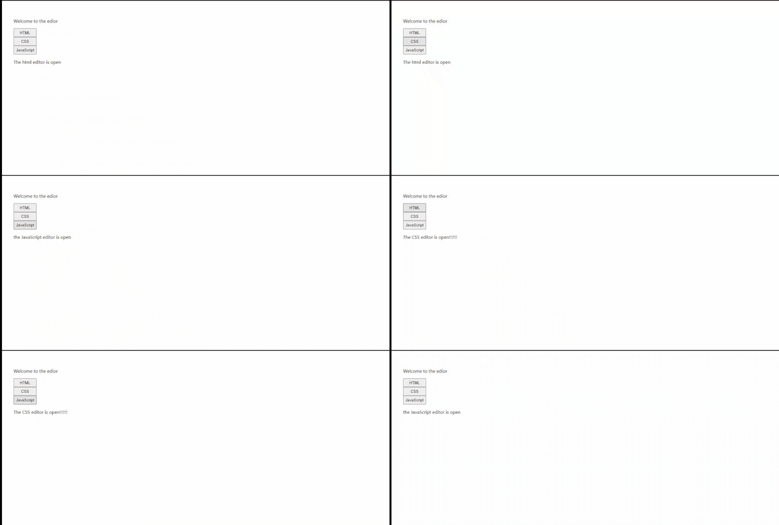 A GIF showing the tab toggle we currently have. (Large preview)
Let’s add a little CSS to the div container holding the buttons. We want the buttons to be displayed in a grid, instead of stacked vertically like in the image above. Go to your App.css file and add the following code:
.tab-button-container{
  display: flex;
}
Recall that we added className="tab-button-container" as an attribute in the div tag holding the three-tab buttons. Here, we styled that container, using CSS to set its display to flex. This is the result:
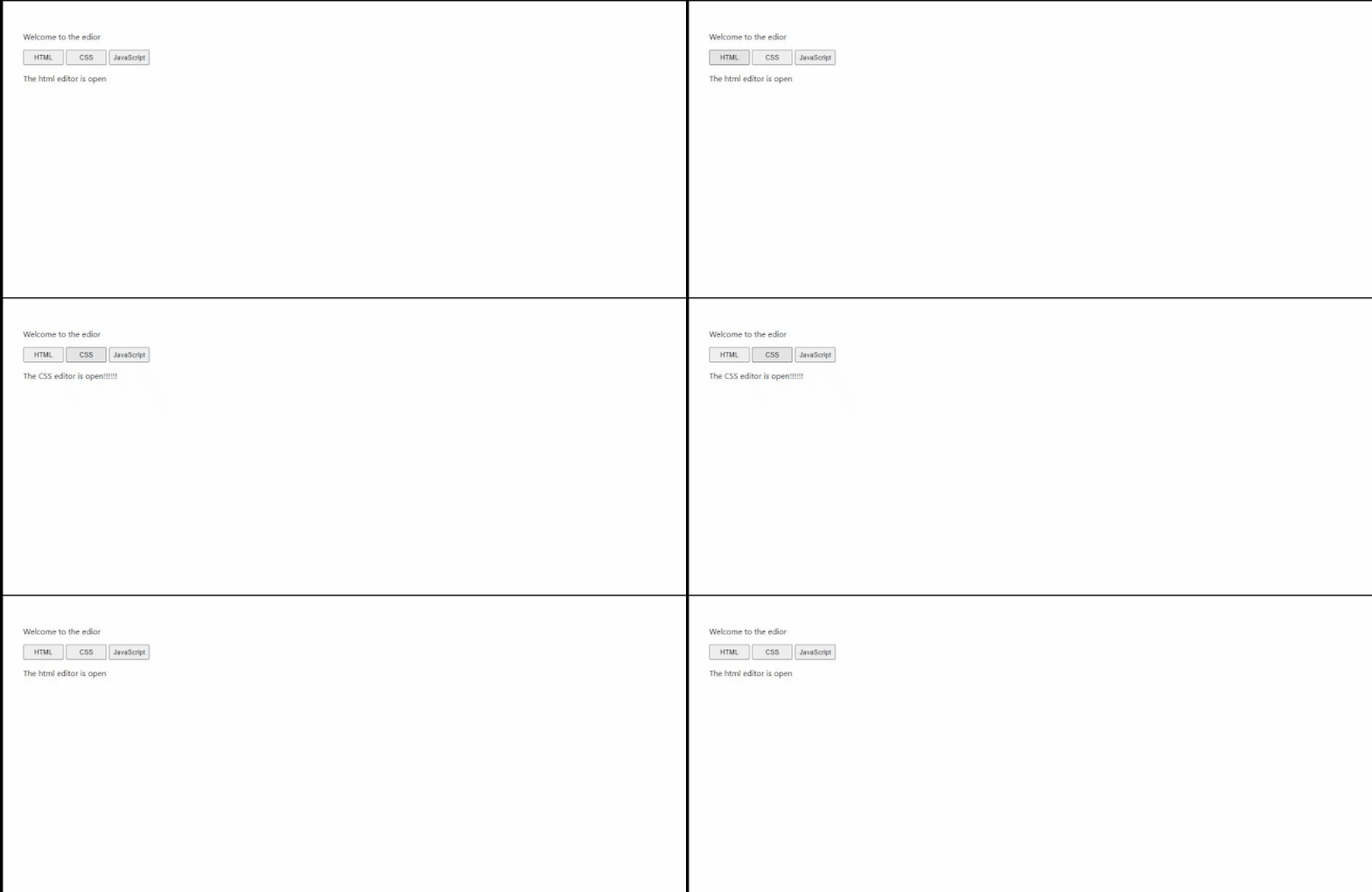 (Large preview)
Be proud of how much you’ve done to get to this point. In the next section, we will create our editors, replacing the p tags with them.
Because we have already installed the libraries we are going to be working on within our CodeMirror editor, let’s go ahead and create our Editor.jsx file in the components folder.
components > Editor.jsx
Having created our new file, let’s write some initial code in it:
import React, { useState } from 'react';
import 'codemirror/lib/codemirror.css';
import { Controlled as ControlledEditorComponent } from 'react-codemirror2';


const Editor = ({ language, value, setEditorState }) => {
  return (
    <div className="editor-container">
    </div>
  )
}
export default Editor
Here's what we did:
- We imported React alongside the
useStatehook because we are going to need it. - We imported the CodeMirror CSS file (which comes from the CodeMirror library that we installed, so you don’t have to install it in any special way).
- We imported
Controlledfromreact-codemirror2, renaming it toControlledEditorComponentto make it clearer. We will be using this shortly. - Then, we declared our
Editorfunctional component, and we have a return statement with an emptydiv, with aclassNamein the return statement for now.
In our functional component, we destructured some values from the props, including language, value, and setEditorState. These three props would be supplied in any instance of the editor when it is called in App.js.
Let’s use ControlledEditorComponent to write the code for our editor. Here’s what we’ll do:
import React, { useState } from 'react';
import 'codemirror/lib/codemirror.css';
import 'codemirror/mode/xml/xml';
import 'codemirror/mode/javascript/javascript';
import 'codemirror/mode/css/css';
import { Controlled as ControlledEditorComponent } from 'react-codemirror2';


const Editor = ({ language, value, setEditorState }) => {
  return (
    <div className="editor-container">
      <ControlledEditorComponent
        onBeforeChange={handleChange}
        value= {value}
        className="code-mirror-wrapper"
        options={{
          lineWrapping: true,
          lint: true,
          mode: language,
          lineNumbers: true,
        }}
      />
    </div>
  )
}
export default Editor
Let’s walk through what we did here, explaining some CodeMirror terms.
The CodeMirror modes specify which language an editor is meant for. We imported three modes because we have three editors for this project:
- XML: This mode is for HTML. It uses the term XML.
- JavaScript: This (
codemirror/mode/javascript/javascript) brings in JavaScript mode. - CSS: This (
codemirror/mode/css/css) brings in CSS mode.
Note: Because the editor is built as a component that is reusable, we cannot put a direct mode in the editor. So, we supply the mode through the language prop that we destructured. But this doesn’t change the fact that the modes need to be imported in order to work.
Next, let’s discuss the things in ControlledEditorComponent:
onBeforeChange
This is called anytime you write to or remove from the editor. Think of this like theonChangehandler you would normally have in an input field to track changes. Using this, we will be able to get the value of our editor anytime there's a new change and save it to our editor’s state. We will write the{handleChange}function as we proceed.value = {value}
This is just the content of the editor at any given time. We passed a destructured prop namedvalueto this attribute. Thevalueprops is the state holding the value of that editor. This would be supplied from the editor’s instance.className="code-mirror-wrapper"
This class name is not a style we make ourselves. It is supplied from CodeMirror’s CSS file, which we imported above.options
This is an object that takes the different functionality we want our editor to have. There are many amazing options in CodeMirror. Let’s look at the ones we used here:lineWrapping: true
This means that code should wrap to the next line when the line is full.lint: true
This allows linting.mode: language
This mode, as discussed above, takes the language that the editor is going to be used for. The language has already been imported above, but the editor is going to apply a language based on thelanguagevalue supplied to the editor via the prop.lineNumbers: true
This specifies that the editor should have line numbers for each line.
Next, we can write the handleChange function for the onBeforeChange handler:
const handleChange = (editor, data, value) => {
    setEditorState(value);
}
The onBeforeChange handler gives us access to three things: editor, data, value.
We only need the value because it is what we want to pass in our setEditorState prop. The setEditorState prop represents the set value for each state that we declared in App.js, holding the value for each editor. As we move on, we will look at how to pass this as a prop to the Editor component.
Next, we’ll add a dropdown that allows us to select different themes for the editor. So, let’s look at themes in CodeMirror.
CodeMirror Themes
CodeMirror has multiple themes we can select from. Visit the official website to see demos of the different themes available. Let’s make a dropdown with different themes that the user can choose from in our editor. For this tutorial, we’ll be adding five themes, but you can add as many as you like.
First, let’s import our themes in the Editor.js component:
import 'codemirror/theme/dracula.css';
import 'codemirror/theme/material.css';
import 'codemirror/theme/mdn-like.css';
import 'codemirror/theme/the-matrix.css';
import 'codemirror/theme/night.css';
Next, create an array of all of the themes we have imported:
const themeArray = ['dracula', 'material', 'mdn-like', 'the-matrix', 'night']Let’s declare a useState hook to hold the value of the selected theme, and set the default theme as dracula:
const [theme, setTheme] = useState("dracula")Let’s create the dropdown:
...
return (
    <div className="editor-container">

      <div style={{marginBottom: "10px"}}>
        <label for="cars">Choose a theme: </label>
        <select name="theme" onChange={(el) => {
          setTheme(el.target.value)
        }}>
          {
            themeArray.map( theme => (
              <option value={theme}>{theme}</option>
            ))
          }
        </select>
      </div>
    // the rest of the code comes below...
    </div>
  )
...
In the code above, we used the label HTML tag to add a label to our dropdown, and then added the select HTML tag to create our dropdown. The option tag in the select element defines the options available in the dropdown.
Because we needed to fill the dropdown with the theme names in the themeArray that we created, we used the .map array method to map themeArray and display the names individually using the option tag.
Hold on — we’re not done explaining the code above. In the opening select tag, we passed the onChange attribute to track and update the theme state whenever a new value is selected in the dropdown. Whenever a new option is selected in the dropdown, the value is gotten from the object returned to us. Next, we use the setTheme from our state hook to set the new value to be the value that the state holds.
At this point, we have created our dropdown, set up our theme’s state, and written our function to set the state with the new value. The final thing we need to do to make CodeMirror use our theme is pass the theme to the options object in ControlledEditorComponent. In the options object, let’s add a value named theme, and set its value to the state’s value for the selected theme, also named theme.
Here’s what ControlledEditorComponent would look like now:
<ControlledEditorComponent
  onBeforeChange={handleChange}
  value= {value}
  className="code-mirror-wrapper"
  options={{
    lineWrapping: true,
    lint: true,
    mode: language,
    lineNumbers: true,
    theme: theme,
  }}
/>
Now, we have made a dropdown of different themes that can be selected from in the editor.
Here’s what the full code in Editor.js looks like at the moment:
import React, { useState } from 'react';
import 'codemirror/lib/codemirror.css';
import 'codemirror/theme/dracula.css';
import 'codemirror/theme/material.css';
import 'codemirror/theme/mdn-like.css';
import 'codemirror/theme/the-matrix.css';
import 'codemirror/theme/night.css';
import 'codemirror/mode/xml/xml';
import 'codemirror/mode/javascript/javascript';
import 'codemirror/mode/css/css';
import { Controlled as ControlledEditorComponent } from 'react-codemirror2';


const Editor = ({ language, value, setEditorState }) => {
  const [theme, setTheme] = useState("dracula")
  const handleChange = (editor, data, value) => {
    setEditorState(value);
  }
  const themeArray = ['dracula', 'material', 'mdn-like', 'the-matrix', 'night']
  return (
    <div className="editor-container">
      <div style={{marginBottom: "10px"}}>
        <label for="themes">Choose a theme: </label>
        <select name="theme" onChange={(el) => {
          setTheme(el.target.value)
        }}>
          {
            themeArray.map( theme => (
              <option value={theme}>{theme}</option>
            ))
          }
        </select>
      </div>
      <ControlledEditorComponent
        onBeforeChange={handleChange}
        value= {value}
        className="code-mirror-wrapper"
        options={{
          lineWrapping: true,
          lint: true,
          mode: language,
          lineNumbers: true,
          theme: theme,
        }}
      />
    </div>
  )
}
export default Editor
There’s only one className that we need to style. Go to App.css and add the following style:
.editor-container{
  padding-top: 0.4%;
}
Now that our editors are ready, let’s go back to App.js and use them there.
src > App.js
The first thing we need to do is import the Editor.js component in here:
import Editor from './components/Editor';In App.js, let’s declare the states that will hold the contents of the HTML, CSS, and JavaScript editors, respectively.
const [html, setHtml] = useState('');
const [css, setCss] = useState('');
const [js, setJs] = useState('');
If you recall, we will need to use these states to hold and supply the contents of our editors.
Next, let’s replace the paragraph (p) tags that we used for the HTML, CSS, and JavaScript in the conditional renderings with the editor components we have just created, and we’ll also pass in the appropriate prop to each instance of the editor component:
function App() {
  ...
  return (
    <div className="App">
      <p>Welcome to the edior</p>

      // This is where the tab buttons container is...

      <div className="editor-container">
        {
          htmlEditorIsOpen ? (
            <Editor
              language="xml"
              value={html}
              setEditorState={setHtml}
            />
          ) : cssEditorIsOpen ? (
            <Editor
              language="css"
              value={css}
              setEditorState={setCss}
            />
          ) : (
            <Editor
              language="javascript"
              value={js}
              setEditorState={setJs}
            />
          )
        }
      </div>
    </div>
  );
}
export default App;
If you’ve been following along until now, you’ll understand what we did in the code block above.
Here it is in plain English: We replaced the p tags (which were there as placeholders) with instances of the editor components. Then, we supplied their language, value, and setEditorState props, respectively, to match their corresponding states.
We've come so far! Here is what our app looks like now:
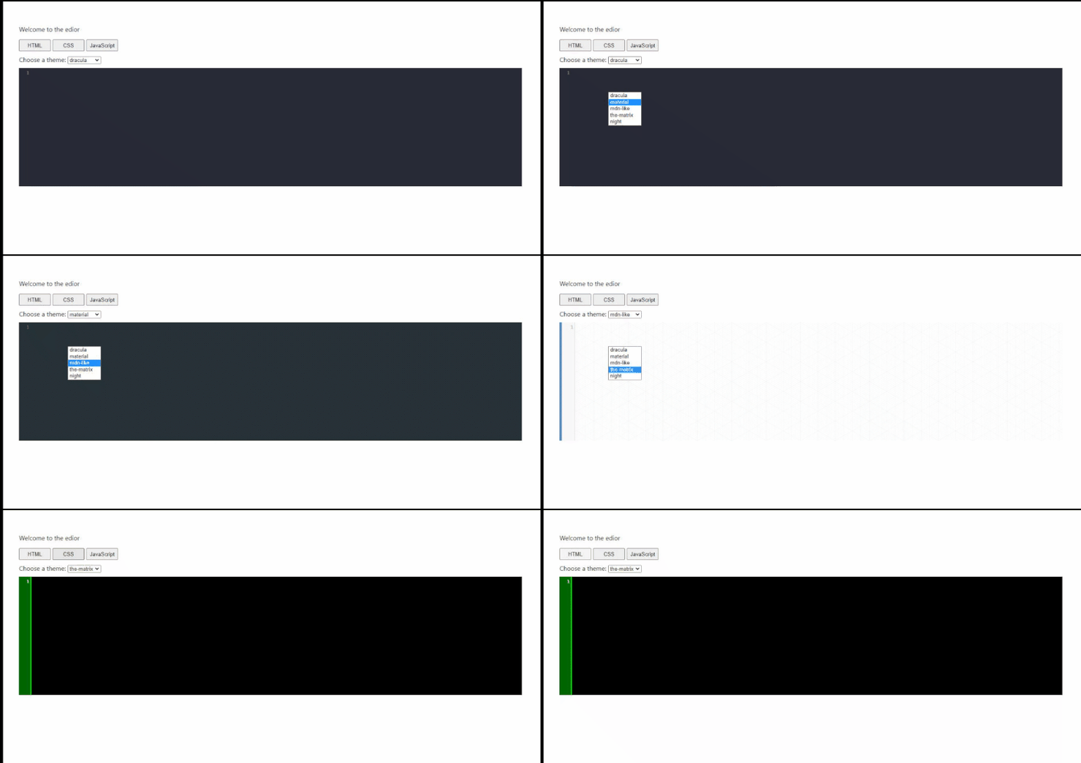 (Large preview)
Introduction to Iframes
We’ll be making use of inline frames (iframes) to display the result of the code entered in the editor.
According to MDN:
The HTML Inline Frame element (
<iframe>) represents a nested browsing context, embedding another HTML page into the current one.
How Iframes Work in React
Iframes are normally used with plain HTML. Using Iframes with React doesn’t require many changes, the major one being to convert attribute names to camelcase. An example of this is that srcdoc would become srcDoc.
The Future of Iframes on the Web
Iframes continue to be really useful in web development. Something you might want to check out is Portals. As Daniel Brain explains:
“Portals introduce a powerful new set of capabilities into this mix. Now it’s possible to build something that feels like an iframe, that can seamlessly animate and morph and take over the full browser window.”
One of the things Portals tries to solve is the URL bar problem. When using iframe, components rendered in the iframe don’t carry a unique URL in the address bar; as such, this might not be great for the user experience, depending on the use case. Portals is worth checking out, and I’d suggest you do that, but because it is not the focus of our article, this is all I’ll say about it here.
Creating the Iframe to House Our ResultLet’s move ahead with our tutorial by creating an iframe to house the result of our editors.
return (
    <div className="App">
      // ...
      <div>
        <iframe
          srcDoc={srcDoc}
          title="output"
          sandbox="allow-scripts"
          frameBorder="1"
          width="100%"
          height="100%"
        />
      </div>
    </div>
  );
Here, we created the iframe and housed it in a div container tag. In the iframe, we passed some attributes that we need:
srcDoc
ThesrcDocattribute is written in camelcase because this is how to write iframe attributes in React. When using an iframe, we can either embed an external web page on the page or render specified HTML content. To load and embed an external page, we would use thesrcproperty instead. In our case, we are not loading an external page; rather, we want to create a new internal HTML document that houses our result; for this, we need thesrcDocattribute. This attribute takes the HTML document that we want to embed (we have not created that yet, but we will soon).title
The title attribute is used to describe the contents of the inline frame.sandbox
This property has many purposes. In our case, we are using it to allow scripts to run in our iframe with theallow-scriptsvalue. Because we are working with a JavaScript editor, this would come in handy quickly.frameBorder
This merely defines the border thickness of the iframe.widthandheight
This defines the width and height of the iframe.
These terms should now make more sense to you. Let’s move on and declare the state that will hold the HTML template document for srcDoc. If you look closely at the code block above, you’ll see that we passed a value to the srcDoc attribute: srcDoc={srcDoc}. Let’s use our useState() React hook to declare the srcDoc state. To do this, in the App.js file, go to where we defined the other states and add this one:
const [srcDoc, setSrcDoc] = useState(` `);Now that we have created the state, the next thing to do is display the result in the state whenever we type in the code editor. But what we don’t want is to re-render the component on every single key press. With that in mind, let’s proceed.
Configuring the Iframe to Display the Result
Every time there's a change in any of the editors for the HTML, CSS, and JavaScript, respectively, we want useEffect() to be triggered, and that will render the updated result in the iframe. Let’s write useEffect() to do this in the App.js file:
First, import the useEffect() hook:
import React, { useState, useEffect } from 'react';Let’s write useEffect() like so:
useEffect(() => {
    const timeOut = setTimeout(() => {
      setSrcDoc(
        `
          <html>
            <body>${html}</body>
            <style>${css}</style>
            <script>${js}</script>
          </html>
        `
      )
    }, 250);
    return () => clearTimeout(timeOut)
  }, [html, css, js])
Here, we wrote a useEffect() hook that will always run whenever the value states that we declared for the HTML, CSS, and JavaScript editors are changed or updated.
Why did we need to use setTimeout()? Well, if we wrote this without it, then every time a single key press is made in an editor, our iframe would be updated, and that isn’t great for performance generally. So we use setTimeout() to delay the update for 250 milliseconds, giving us enough time to know whether the user is still typing. That is, every time the user presses a key, it restarts the count, so the iframe would only be updated when the user has been idle (not typing) for 250 milliseconds. This is a cool way to avoid having to update the iframe every time a key is pressed.
The next thing we did above was to update srcDoc with the new changes. The srcDoc component, as we explained above, renders specified HTML content in the iframe. In our code, we passed an HTML template, taking the html state that contains the code that the user has typed into the HTML editor and placing it between the body tags of our template. We also took the css state that contains the styles that the user has typed in the CSS editor, and we passed that between the style tags. Finally, we took the js state that contains the JavaScript code that the user has typed in the JavaScript editor, and we passed it between the script tags.
Notice that in setting setSrcDoc, we used backticks (` `) instead of normal quotes (' '). This is because backticks allow us to pass in corresponding state values, as we did in the code above.
The return statement in the useEffect() hook is a cleanup function that clears setTimeout() when it is complete, to avoid memory leakage. The documentation has more about useEffect.
Here’s what our project looks like at the moment:
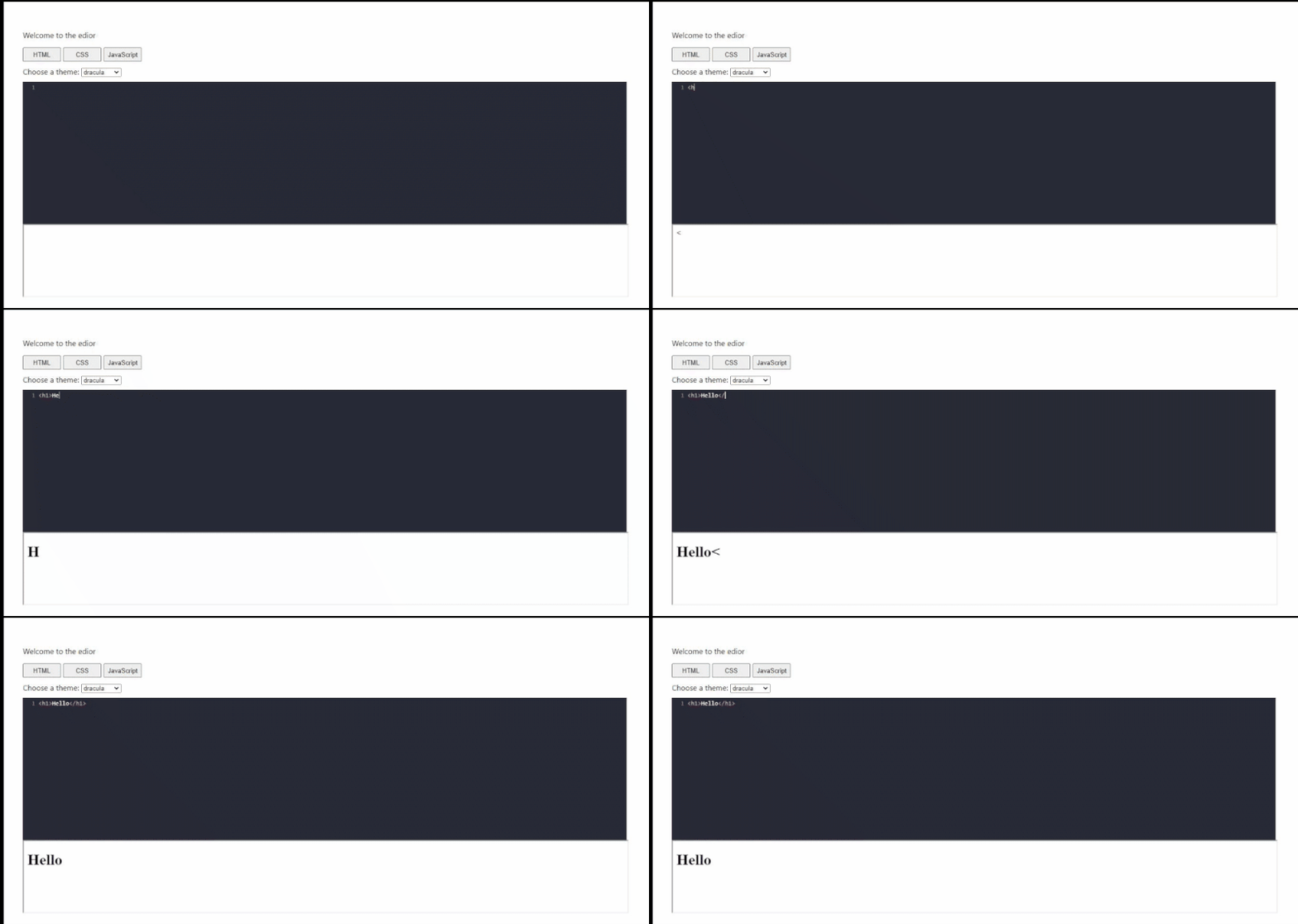 (Large preview)
CodeMirror Addons
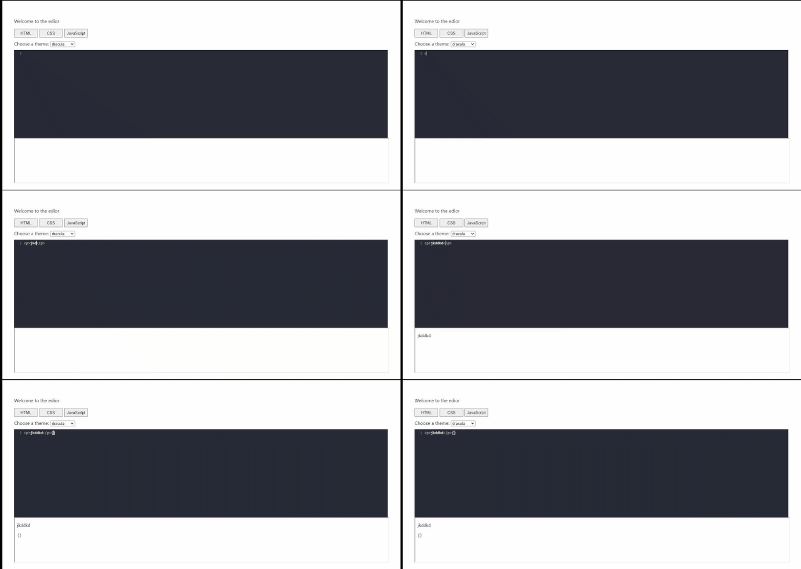
With CodeMirror addons, we can enhance our editor with more of the kind of functionality we would find in other code editors. Let’s walk through an example of closing tags being added automatically when an opening tag is typed, and another example of a bracket automatically closing when the opening bracket is inputted:
The first thing to do is import the addon for this into our App.js file:
import 'codemirror/addon/edit/closetag';
import 'codemirror/addon/edit/closebrackets';
Let’s pass it in the ControlledEditorComponent options:
<ControlledEditorComponent
        ...
        options={{
          ...
          autoCloseTags: true,
          autoCloseBrackets: true,
        }}
      />
Now here’s what we have:
 (Large preview)
You could add a ton of these addons to your editor to give it richer features. We couldn’t possibly go through all of them here.
Now that we are done with this, let’s briefly discuss things we could do to improve our app’s accessibility and performance.
Performance and Accessibility of the SolutionLooking at our web code editor, some things could definitely be improved upon.
Because we’ve paid attention primarily to functionality, we might have neglected design a little bit. For better accessibility, here are some things you could do to improve this solution:
- You could set an
activeclass on the button for the currently open editor. Highlighting the button would improve accessibility by giving users a clear indication of which editor they’re currently working on. - You might want the editor to occupy more screen space than what we have here. Another thing you could try is making the iframe pop up with the click of a button that is docked somewhere to the side. Doing so would give the editor more screen space.
- This sort of editor would be useful for people who want to run a quick exercise on their mobile device, so fully adapting it to mobile would be necessary (not to mention both of the points about mobile above).
- Currently, we are able to switch the theme of the editor component from among the multiple themes we’ve loaded in, but the general theme of the page remains the same. You could enable the user to switch between a dark and light theme for the entire layout. This would be good for accessibility, relieving the strain on people’s eyes from looking at a bright screen for too long.
- We didn’t look at security issues with our iframe, mainly because we were loading an internal HTML document in the iframe, rather than an external document. So we don’t need to consider this too carefully because iframes are a good fit for our use case.
- With iframes, another consideration would be page-loading time, because the content being loaded in the iframe would normally be out of your control. In our app, this isn’t an issue because our iframe content isn’t external.
Performance and accessibility are worth a lot of consideration when you’re building any application because they will determine how useful and usable your application is to its users.
Shedrack has done a good job of explaining methods for improving and optimizing performance in React apps. It’s worth checking out!
ConclusionWorking through different projects helps us to learn about a wide range of subjects. Now that you’ve gone through this article, feel free to expand upon your experience by experimenting with more add-ons to make the code editor richer, revamping the UI, and fixing the accessibility and performance concerns outlined above.
- The entire code base for this project is available on GitHub.
Here’s the demo on Codesandbox:
Links and Material
- “Google Chrome’s Portals: Like Iframes, But Better, and Worse”, Daniel Brain
- “Optimizing Performance”, React documentation
- “User Manual and Reference Guide”, CodeMirror documentation