Great looking fonts similar to Bodoni to try
Bodoni is the masterpiece of designer Giambattista Bodoni (1740-1813) or as he was better known – the King of Printers. Bodoni employed his unique cutting techniques to create the iconic typeface in 1798. His style reminds strongly of the works of Pierre Simon Fournier (1712-1768), as well as those of the Didot family (1689-1836).
The Bodoni font is impactful and embodies only strong characters. It is an honorary representative of its age – the Enlightenment and its rational reasoning. Bodoni himself is responsible for both transitional and modern versions of this typeface. He envisioned the font as a display face rather than a text face and therefore gave it a recognizable contrast between thin and thick strokes.
When using this and fonts similar to Bodoni, keep in mind that the marked contrasts between thick and fine lines can damage its legibility. In the best case, use Bodoni only for larger prints where spacing is not an issue.
If you are not convinced, search through our list of fonts similar to Bodoni. Your ideal font may hide there!
Fonts similar to Bodoni
Didot
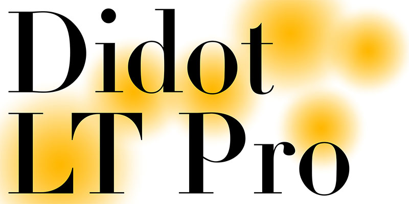
Didot fonts are both the predecessors and the biggest competitors of the Bodoni fonts. They were named after the French family that created them during the 18th and the 19th century.
At the same time, Didot fonts might be the most interpreted and updated fonts of all time. The awoke the interest of the world’s best font designers, such as Jonatan Hoefler and Adrian Frutiger.
Their fine and varying strokes may be perfect for printworks but transferring Didot to the web world proved out to be a real challenge.
Bodoni Moda
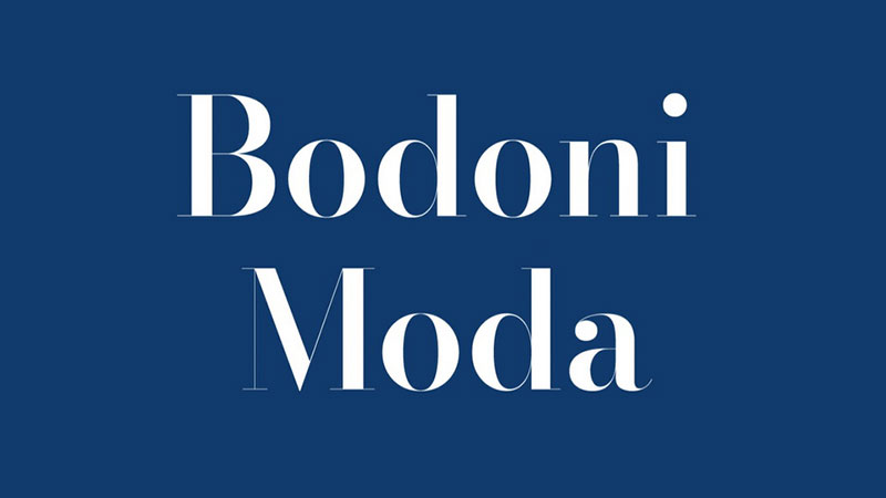
Bodoni Moda is almost identical to Bodoni. The font was created with digital use in mind and is, therefore, a bit wider than its predecessor. The font is just perfect for titles and headlines and can be downloaded from Google for free.
Ambroise
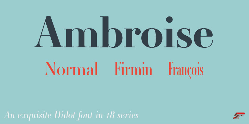
Compared to the Bodoni family, 201 French typeface Ambroise looks very modern. Its designer Jean François Porchez based his work on classic 19th-century typefaces. And yet, he came up with a contemporary tool for headlines and titles.
We are especially fond of the letters g and y, both with unusual geometric shapes and curved tails. We also like the variety of this typeface. It offers even five weights (black, bold, demi, regular, and light) and two widths (the regular Firmin and the condensed Francois) for each of them. Note, yet, that Ambroise has no italics.
FF Acanthus
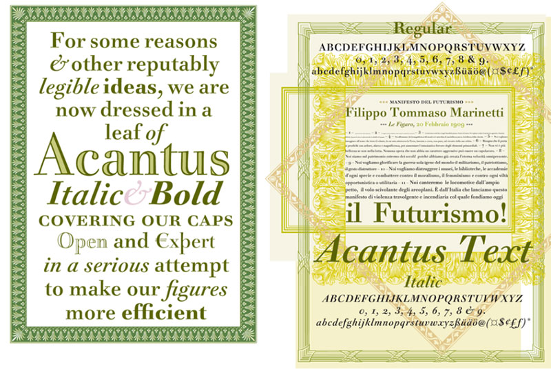
FF Acanthus is another font similar to Bodoni and Didot, but with a slightly weaker appearance.
More than anything else, this neoclassical Roman font is decorative. To begin with, its emphasized and crisp serifs make it more readable than Bodoni, be that at small or at large sizes.
Furthermore, FF Acanthus is packed with matching borders and ornaments. It will work great on every decorative project.
Modern 216
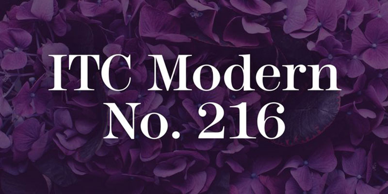
ITC released Edward Benguat’s pioneer font Modern 216 in 1982. The neat serif typeface works with the same high contrasts as Bodoni. It comes in five different weights, each with a corresponding italic version.
ITC Golden Cockerel
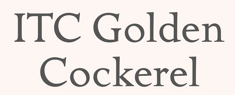
ITC Golden Cockerel font is a meticulously crafted and elegant typeface. It followed up on Gill’s 1929 deliveries for the Gold Cockerel Press and it adopted his skilled engraving, calligraphy, and carving. The available styles are Italic, Roman, Initials, Titling, and Ornaments.
Questa
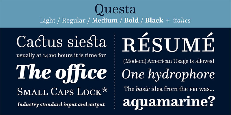
The Questa superfamily has been on the market since 2014. Next to the modern serif, we are discussing, you can check Questa Grande and Questa Sans. They have all been delivered by Dutch designers Martin Majoor and Jos Buivenga.
Compared to Didot or Bodoni, these typefaces have unusually large x-heights, and their contrasts are toned down.
Onyx
Onyx is signed by no other than the famous typographer Gerry Powell. Powell was also an American Type Founder’s director and industrial designer who is known for many famous advertising fonts. True to its age, Onyx font resembles closely the Bodoni fonts. Yet, its proportions are much better, which means it is readable even when space is very limited.
Arapey
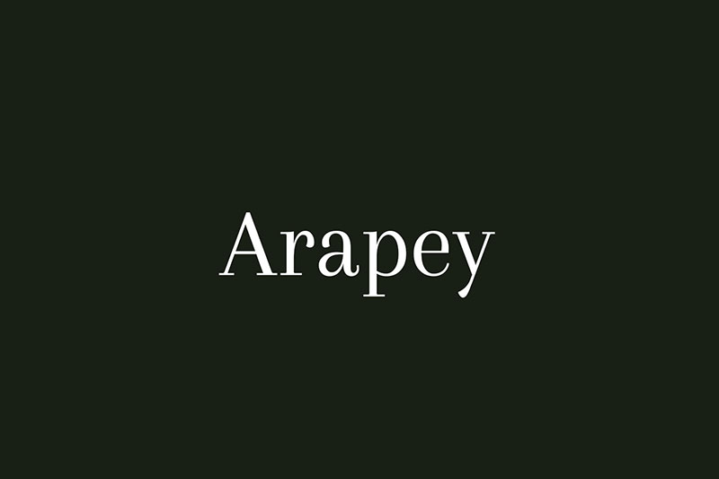
Arapey adopted the looks of Bodoni fonts, but only some of their features. For instance, the serif features subtle finishes and soft lines which make it more distinguished than Bodoni. If you compare the two closely, you will also discover a tiny difference in the upper and lowercase ‘Q’.
Filosofia
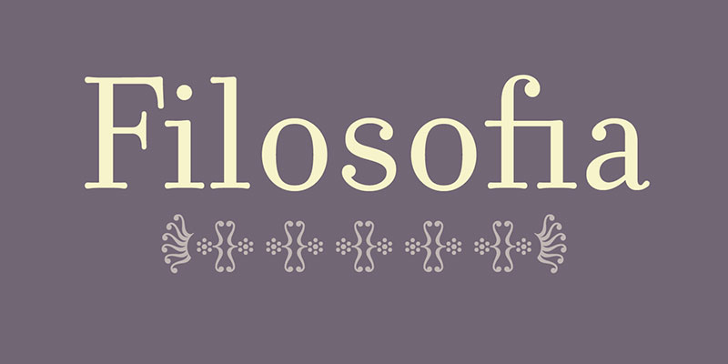
The most interesting thing about Filosofia designer Zuzana Licko is how keen she was on Bodoni’s looks. She chose to reinvent this font despite its poor, limited legibility.
1996 Filosofia was her attempt to interpret Bodoni as a contemporary serif, making sure it can be used also in smaller sizes. The geometric skeleton of the two typefaces is almost the same. Yet, an expert eye won’t miss Licko’s contributions, such as the beautiful ball terminals.
Whittingham
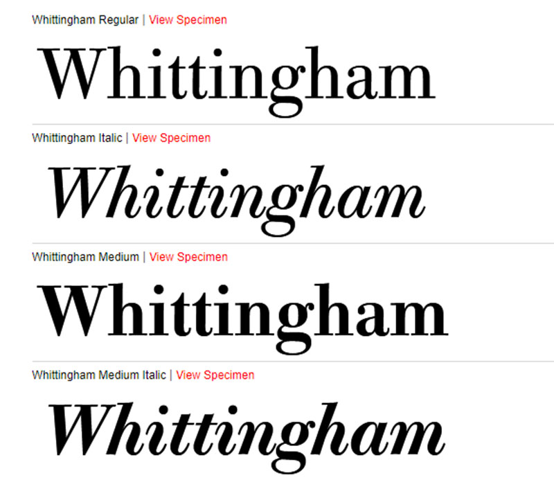
Whittingham was created in 2000 by a renowned group of Berthold master designers. The team was led by Günter Gerhard Lang and Dieter Hofrichter.
The designers combined the most distinguishing characteristics of each period. As a result, we now have a very modern and finely tuned serif that can be used for any design project.
Prata
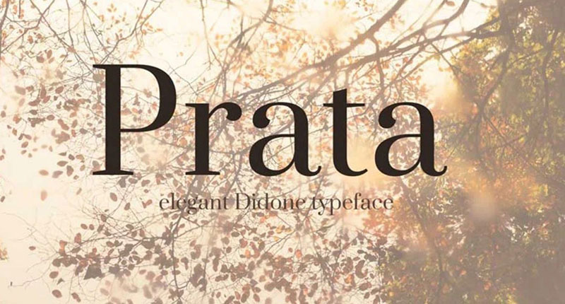
Prata and Bodoni have many similarities, perhaps to the extent where an inexperienced user could not differentiate between them. An experienced eye, on the other hand, would quickly catch up on the minor differences in the lowercase ‘g’ and ‘y’.
If this is not an issue, you have just found the best on-budget Bodoni alternative.
Centennial
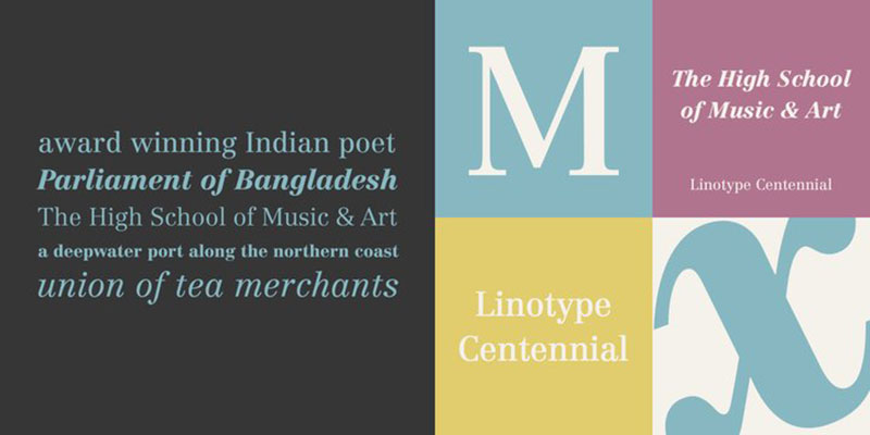
Centennial was promoted in 1986 to celebrate 100 years of Linotype’s existence. For this purpose, it was decorated with light roman cuts and subtle looks which make it cool and reserved. American Type Founders have changed it many times since, so make sure you give all variants a look.
Gill Sans
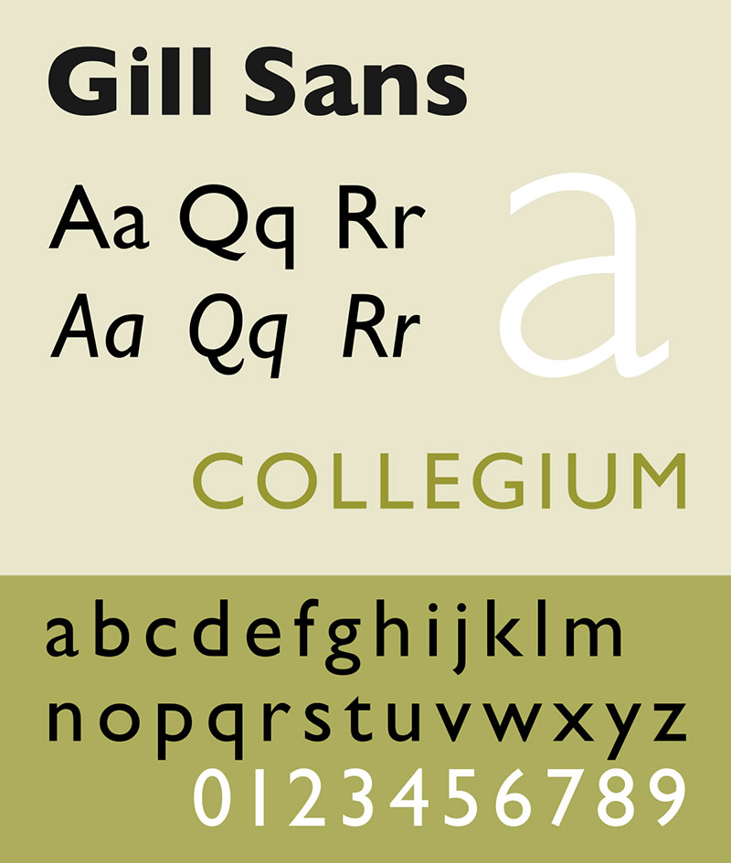
Here comes another masterwork of English designer Eric Gill. Gill created the humanist serif has a memorable geometric structure similar to the works of Edward Johnston. For many connoisseurs, this font is a British as it gets – cheerfully idiosyncratic, legible, and very bold. It comes with lighter weights compared to the ones of Bodoni, but its typography is still very compelling.
Leitura Display
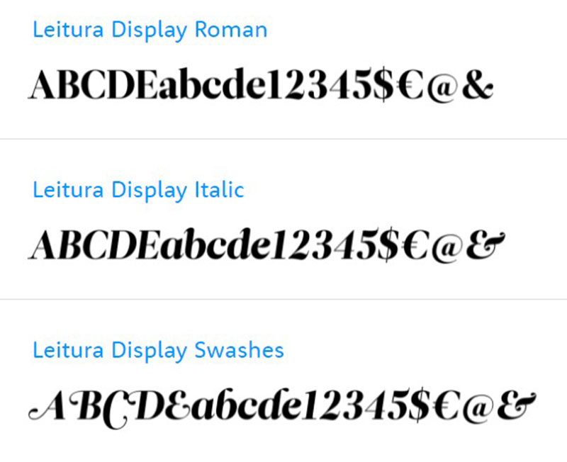
Leitura Display is all about contrasts and large display sizes, which forms its main connection to Bodoni. Other than that, Dino dos Santos’s creation offers decorative and intricate letter shapes. It is also worth mentioning how it transmits very warm feelings to the readers.
Tiempos
Tiempos is a compact collection of modern serifs and tools for editorial typography. Tiempos Text, for example, offers the functionality of contemporary fonts such as Times or Plantin. Tiempos Headline, on the other hand, balances between elegance and functionality. Last but not least, Tiempos Fine offers a variety of sharp details and warm curves. Both variants preserve the practical proportions typical for the entire family.
Freight Display
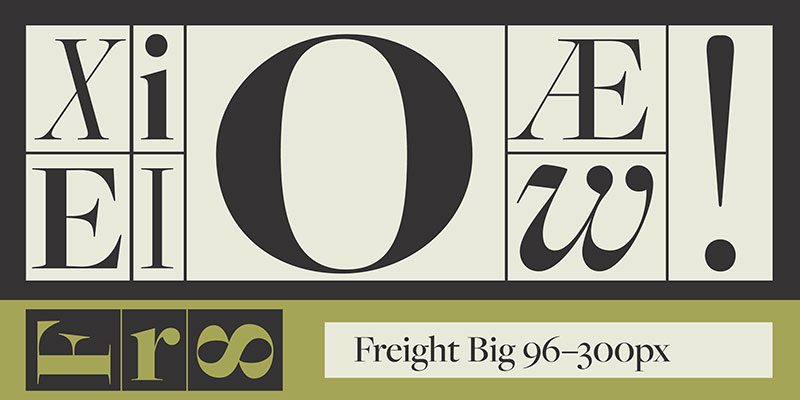
Remember Freight Text? Designers also came up with a display version of it to make it usable for headlines and at large sizes. It is similar to Bodoni because of its high-contrast letterforms and variety of weights, such as light, book, medium, semibold, bold, or black. Corresponding italics are also available.
Basilia
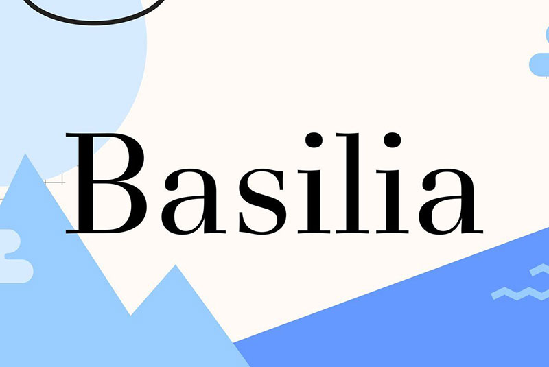
Basilia is the newest Bodoni alternative on the market which pays extreme attention to detail. You will adore its open and subtle appearance, as this font cuts the cords with all its traditional predecessors. It replaces Bodoni’s narrow and angular spacing with a subtler stroke on the curves. Its strokes are also more transparent and way lighter.
Iridium
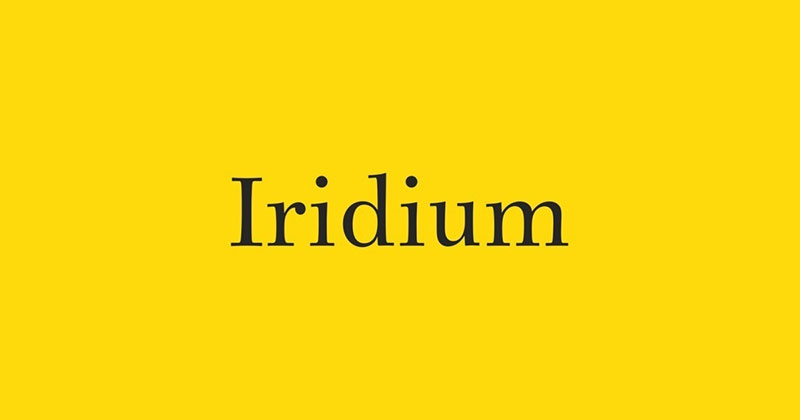
Iridium is the so-called modern Bodoni. Despite its high contrast, Iridium distributes weight gracefully and symmetrically. The naming was an unlucky coincidence, as this typeface has little to do with the sturdiness and rigidness of the so-called metal. As may better be that designer Adrian Frutiger thought of the Greek meaning of this word, namely rainbow.
With this in mind, Iridium is the strongest and most impactful serif of its kind. If you are not convinced, check its beautiful round characters and curved ovals.
If you enjoyed reading this article on fonts similar to Bodoni, you should check out this one about fonts similar to Avenir.
We also wrote about a few related subjects like the Roblox font and what font does Roblox use, the best 72 free fonts for logos to create modern and creative designs, fonts similar to Futura, fonts similar to Impact, fonts similar to Calibri, fonts similar to Gotham, and fonts similar to Montserrat.