How Do You Turn a Digital Design Into Print? 7 Useful Tips
It’s probably happened more times than you’d like to think about: You finish a presentation or website design and the client asks you to make it into a brochure or poster.
Wait… what?
Turning a digital design into something for print can be a challenge for sure. But there are a few things you can do to tweak your workflows to account for this “unexpected request” and make it a little more seamless.
1. Start with Vector Everything
The easiest way to ensure you have everything you need for the digital project and anything that comes down the line is to start with vector parts and pieces.
- Original logo in .ai or .eps format; you may convert it to .png or .svg for the web
- Draw or download icons from vector sets
- Keep track of CSS for user interface element shapes; you can recreate the look of them for print, if necessary
- Use scalable elements for backgrounds, patterns, or textures
Using vector shapes and elements for everything you can ensure that you have a scalable version that can be used without losing quality for a printed counterpart design.
If you don’t have vector elements, is there a close replacement? You can recreate the look of a CSS gradient background in Illustrator as long as you know the colors. (It doesn’t have to be a perfect match as long as you can get it close.)
The biggest challenge when it comes to vectors is typically logos. It’s difficult to get a good render of a logo without an original copy unless the design is super simple and you can redraw it with ease.
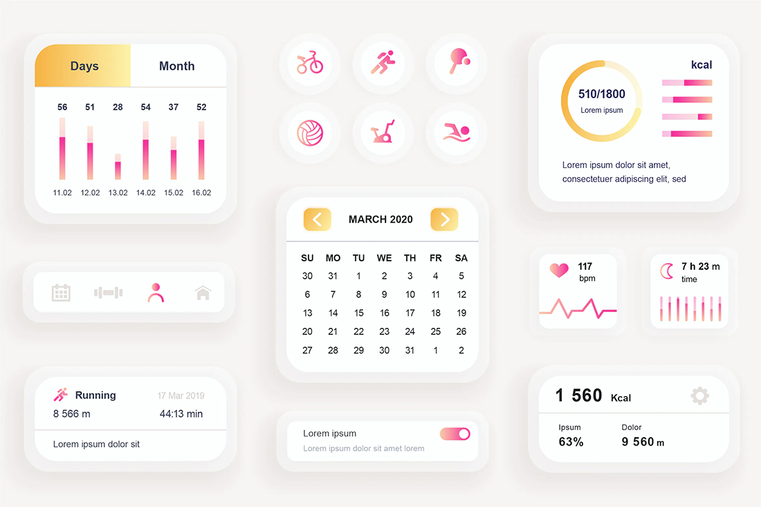
2. Think in Modular Shapes
Think about how you may convert a digital design to print in the same way you might think of converting a desktop design to mobile.
Working with a series of modular parts that stack and shift can make turning any design into another shape that much easier.
Then look at the components. What can you reuse from the digital interface to print?
The good news with many of these projects is that the “design” is usually often a duplication or similar replica of something you’ve already created. Just pick the elements you need and arrange them accordingly.
3. Write Down Color Palettes in HEX and CMYK
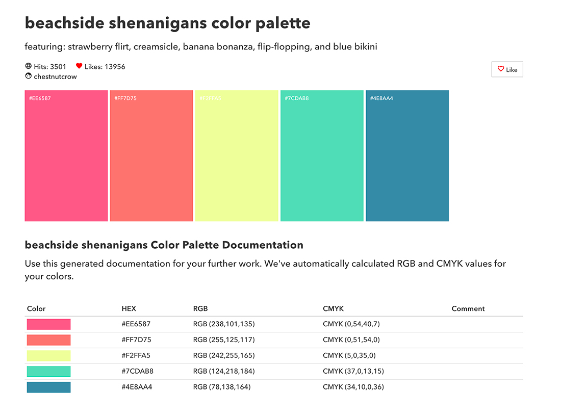
This might be the biggest time-saving tip here: Write down every color you use in the digital design (and usage from primary to accent) with color codes for digital and print design side-by-side.
You will save a ton of time here because you won’t have to recreate the color scheme for print.
There are a couple of exceptions to consider when moving a design from digital to print.
- Convert super dark or rich black into pure black (C 0, M 0, Y 0, K 100). You’ll get a sharper print run, particularly if you use lightweight paper that may soak up inks or have small text elements.
- Convert super light elements into white (C 0, M 0, Y 0, K 0). In the same way that pure black will appear cleaner in print, moving from a 5% black background to white will also ensure a cleaner print job. There’s another bonus as well: White areas on printed items are often easy to use as a writing space. Just think of how many people jot an extra contact phone number or email on a business card.
4. Use Standard Fonts
You are probably doing this if you are start projects digitally and moving to print, but it is worth a reminder. Standard fonts make life a lot easier – or less expensive anyway.
Reminder No. 2 about fonts: Be cautious about fonts that you buy and download with web-only licenses. Are they high enough quality to stand up to printing on a sign or billboard? Do they even have a desktop license?
You can use a close alternate typeface between digital and print design. (Digital designers have been doing this forever with fonts used in print elements that don’t have an identical web version.)
Just don’t try to “sneak” this by a client. Always be upfront about it or when you might need to use a replacement typeface. Provide some alternatives and options if this situation pops up.
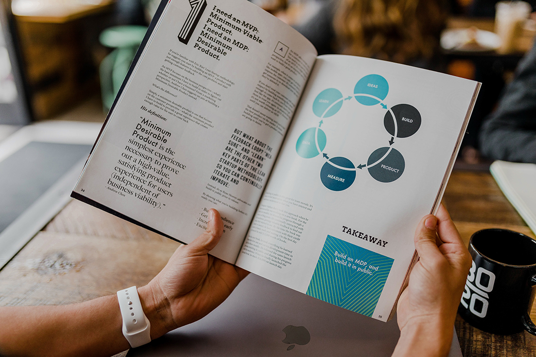
5. Don’t Compress Original Files

When it comes to digital, we are always trying to make files and elements as small and lightweight as possible. (Nothing beats a zippy website or app.)
Just don’t edit and compress your originals.
When it comes to print, you want the opposite in file size and quality. You want large, high-quality, high-pixel-count, images.
You need every pixel, for example, to see the shooting star in the image above in print.
If you permanently crop your headshot to a 300-pixel square, it’s going to be tiny on your business card or printed resume. Always make separate copies before cropping or compression for digital projects and maintain a file of all original images, video, and other design elements.
6. Mimic the Digital Design
If a client is asking you for printed design and you did the digital elements first, chances are they loved the look and feel of that work.
Mimic the design elements and style for the printed elements. You don’t need to reinvent the wheel and come up with an entirely new aesthetic – unless the client asked for it.
A couple of pointers for more successful printing:
- If there are light and dark mode color palettes digitally, the light mode is often the preferred choice for better printing. This is especially true in smaller sizes or with lower paper quality.
- Consider space. The nice thing about a digital canvas is that you don’t have the same space restrictions as print. You will have to pick and choose elements and information to maintain ease of readability on printed materials.
- Familiarize yourself with the printed medium you’ll be working with. Designing for a brochure is different than a t-shirt or packaging due to shape, size, color, inking, and the material on which everything is printed. When in doubt, ask the printer for help. (It can save you from making an expensive mistake.)
7. Get a Physical Proof
The biggest challenge for digital designers converting something to print is knowing what it will actually look like.
Visualizing the size or scale of something from the screen to real-life can be a little worrisome. Ensuring that elements have the right quality and color is vital.
Don’t skip on asking for a physical proof. Yes, some printers charge for this (generally a nominal amount).
But here’s what you get: Peace of mind and the knowledge that before you spend real money on a print run, the final result will look like what you expect. It’s the perfect insurance policy.
Conclusion
Turning a digital design or elements from a digital project into print is an important skill, and offering that can provide extra value to your clients.
Most of the legwork includes best practices to implement before you start the design process. (Hopefully, you are doing many of these things already.)