How to Increase Website User Engagement: Best Practices
Your website is the gateway to your business. And you only have seven seconds to make an excellent first impression.
Users expect visually appealing websites that are responsive and easy to navigate without wasting their precious time.
A strong website can help you make a good impression on potential customers, nurture leads and score more conversions.
In this article, we’ll review ten best practices for improving website user engagement and how to measure the results of your efforts.
Let’s dive in.
Best practices for increasing website user engagement
Here are ten simple ways to increase website user engagement and make the most out of your online presence.
1. Create relevant content
Your content is the meat and potatoes of your website. But it’s also the most challenging and time-consuming to perfect.
Thankfully, an AI writing tool can help you produce high-quality content for your site in the blink of an eye.
It’s hard enough to establish a consistent content schedule (quantity) that’ll attract users, but you also need to write it in a way that keeps them engaged and coming back for more (quality). The writing style you choose has a direct impact on your website engagement.
If your content isn’t resonating with your audience, the tone or style might be missing the mark. Try testing a different approach to your writing by tweaking some of your content or even rewording it with a sentence rewriter tool. Rinse and repeat until you find something that sticks.
Now that you have built up a library of great content don’t let it go to waste.
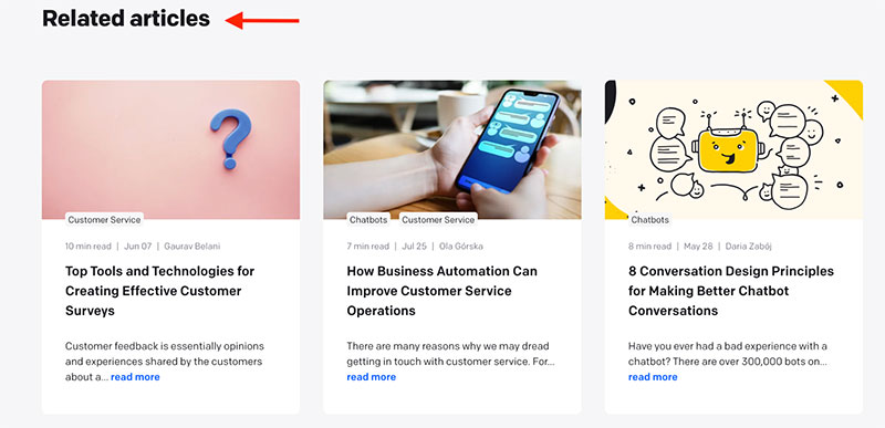
Add related articles to the bottom of your blog posts to give readers another reason to stay on your website. It’ll also help them feel like they’re getting more value from your site – a win-win situation.
(Image source)
2. Simplify navigation
Simple website navigation is the recipe for success.
Start by organizing your content into sections to help users understand the structure of your site.
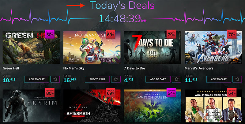
Take YUPLAY as an example. They have a specific page for limited-time offers that shows users a wide variety of video games and downloadable content currently on sale.
The user doesn’t spend ten minutes searching the site for sales on downloadable content like the Batman glider or the PC Marvel’s Avengers game. Instead, the user already knows what items are on sale that day.
(Image source)
Having everything available at the user’s fingertips prevents them from bouncing and reduces frustration.
You can also use navigation bars, toolbars, and other elements to help users find their way around your website.
Be sure these elements are visible on the page — not just when someone hovers over them — and make sure they’re big enough to use easily with a mouse or finger (for an app or mobile site).
It’s also important not to clutter your navigation bar area with too many items — keep it simple by limiting yourself to main pages or categories.
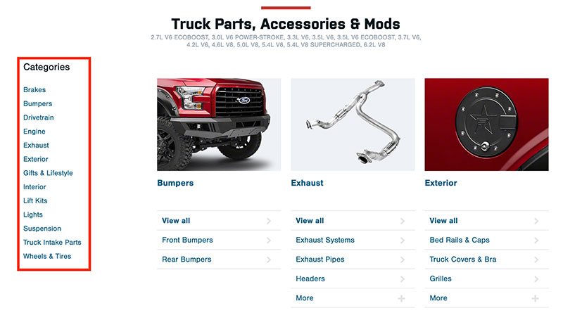
American Trucks does an excellent job with their navigation bar. Suppose one of their users is interested in different types of truck accessories.
In that case, they can leverage the navigation panel on the left side of the screen to find detailed information about every kind of accessory they offer (brakes, bumpers, exhaust, etc.).
(Image source)
Planning your website navigation is like laying the groundwork for your house. If you don’t plan things out properly, they could fall apart, no matter how nice it looks.
3. Make your website easy to find
A domain name is the first thing users see when visiting your website.
That’s why choosing a domain name that represents your brand and that users can easily remember is essential for the success of your website.
Your domain name is more important than you think. It helps:
- Make your website easy to find and navigate
- Add credibility to your business
- Improve mobility of your web presence
- Drive traffic to your website
- Increase brand awareness
Let’s take a look at an example where a website domain makes a significant difference.
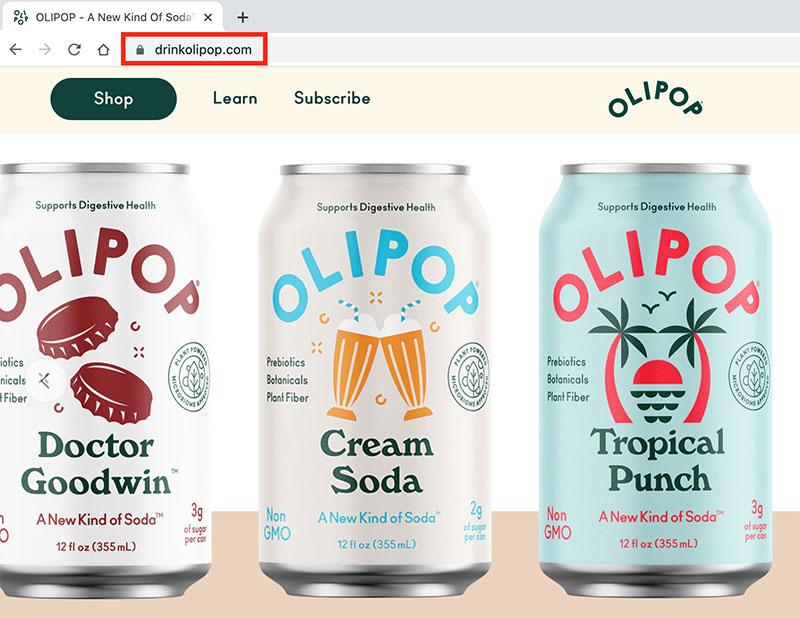
Olipop, a healthy soda alternative, uses the domain name “drinkolipop.com” instead of “olipop.com.” Adding the word drink to the front of the domain name helps consumers understand that the product is a drink and not a candy. Or TradeZella, an all-in-one trading journal platform, where the first word added is trade, making a point of the purpose of their site.
(Image source)
The one-word addition to the domain is the difference between a high and low bounce rate.
4. Reduce page load time
The speed at which your website loads is critical to its user experience. The faster the page loads, the more likely users will stay on your site and engage with your content.
When it comes to online shopping, slow-loading pages can cause visitors to abandon their carts in frustration.
In fact, Google gives a slight ranking boost to sites with quick loading times — a small benefit that could significantly impact businesses trying to attract traffic from search engines.
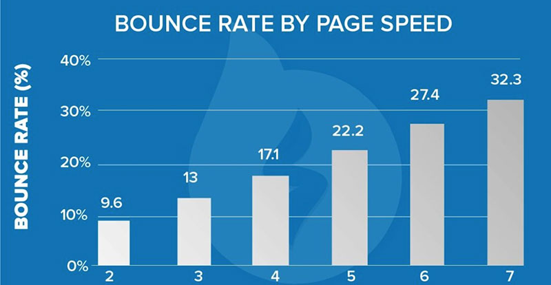
Slow-loading pages can also hurt conversions. Studies show that the slower the page speed, the higher the bounce rate.
(Image source)
The goal is to make your website as fast as possible. The good news is that there are several ways you can increase the speed of your site without having to invest in expensive hardware or software upgrades.
- Optimize images: The more pictures you have on your site, the longer they’ll take to load. Use Quicktools by Picsart to convert and compress your image files to reduce bandwidth and improve loading time.
- Reduce the number of plugins and widgets: If you have too many plugins installed, they can slow down your site due to all the additional code and memory requirements.
- Use a content delivery network (CDN): Reduce the time it takes for your site to load by distributing content across servers that are geographically close to your users.
5. Use images to draw people in
An attractive website is an engaging website. So get creative, and don’t be afraid to decorate your webpage with free vector graphics, beautiful fonts, and on-brand colors.
People are 94% more likely to view content with relevant images than without. Don’t sleep on the power of images.
To people, images generate sensations, whether good or bad. There’s a reason the first impression is what counts.

(Image source)
Having the right pictures on your site is essential to keep your users engaged. If you provide services, appealing to emotions is a clever way to increase user engagement.
For example, on their satellite TV packages page, Infinity Dish uses an image of a father and son in a fort eating popcorn and watching a movie. It’s adorable, and your eyes can’t look away.
The image pulls at your heartstrings and draws in potential customers itching to learn more. How can they create this memory with their children?
Use images and other visuals to help make your site stand out from competitors’ pages and become more visually appealing overall.
6. Make your website mobile-friendly
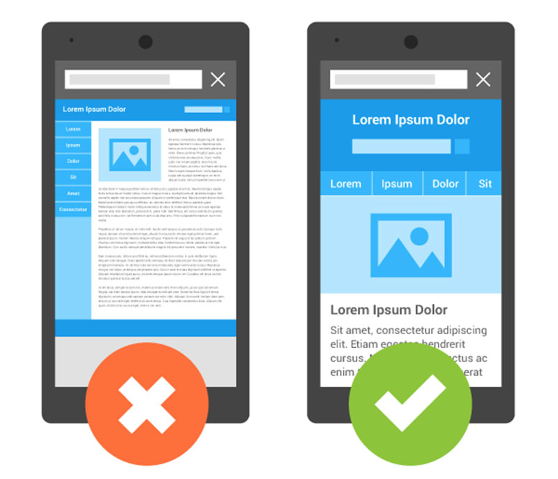
Optimizing your website for mobile is crucial to keep users engaged, with over half of global internet traffic stemming from mobile devices. If you don’t have a mobile-friendly website, you’re missing out on a significant chunk of your audience.
If a user can’t find the information they need from your website because it isn’t appropriately organized or doesn’t load quickly enough on their smartphone, they’ll move on to the next site in the search results — and may never return.
You can check whether your website is accessible for mobile visitors by entering your URL into Google’s Mobile-Friendly Test.
(Image source)
A mobile-friendly website design helps visitors find what they’re looking for on the go, get in touch with you, and stay on your site longer.
7. Add compelling calls-to-action
A call-to-action (CTA) is any element that encourages a visitor to act, whether filling out a form or clicking a button.
Your call-to-action should be visible and simple enough for anyone to understand what they’re supposed to do if they want to take advantage of whatever offer you’re presenting.
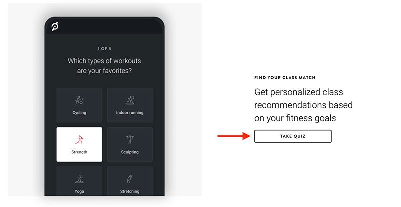
Peloton does an excellent job adding a variety of CTAs across its website. Here the user is encouraged to take a quiz to help them find the perfect fitness class based on their current fitness goals.
Not only does this CTA offer a personalized result, but it’s also promoting Peloton’s product in the process and keeping the user engaged on their website.
(Image source)
Test out different CTAs based on what content you’re promoting or what you want them to do next. For example, if you’re selling products on an ecommerce site, maybe one call-to-action will say “Buy Now” while another says “Add to Cart.”
Color is a powerful marketing tool. Warm colors like red, orange and yellow encourage users to act. These colors represent energy and excitement, and they’re perfect for when you want to get people excited about your offer. Leverage the psychology of color to help make your CTA stand out.
Finally, play around with the different offers on your website to determine what attracts the most engagement. It can be anything from a discount, newsletter, calculator, or a download of your latest case study.
8. Focus on internal linking structure
Don’t underestimate the importance of internal linking. It holds two essential roles.
Internal links help search engines determine the architecture of your site, connect related content, and distribute pagerank.
Also, internal links help users find related, relevant content on your site without having to search all over your site.
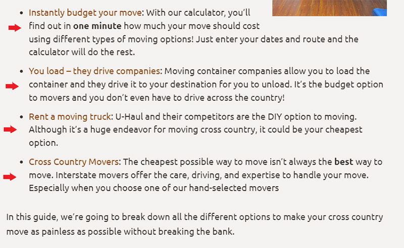
This article on budgeting for a long-distance move includes plenty of internal links with relevant content about moving expenses and resources for the best moving companies.
Users are lazy and want everything available at their fingertips. This strategy of including helpful internal links to other blog posts increases the chances of users clicking through to those links and staying on your site for longer.
(Image source)
External links to other websites let you share authority and establish the relevance of your content, while internal links within your website let you distribute that authority and make it easier for users to navigate your site.
9. Include customer reviews
When you add customer reviews to your product pages, people will spend more time clicking through and reading the reviews to help make informed buying decisions.
Social proof is also a great way to build trust and credibility for your product or service. Your customers will feel more confident in their purchase if they know that other people have bought it before them.
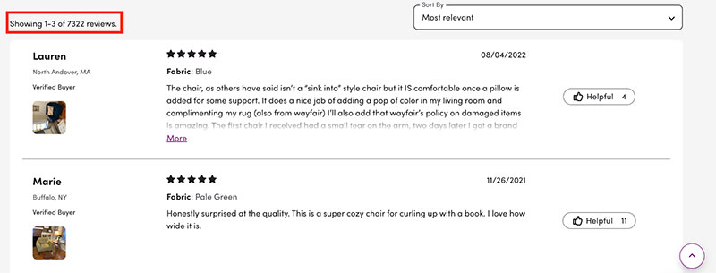
For example, an accent chair from Wayfair has 7,322 reviews with an almost five-star rating (instant credibility boost). However, potential buyers are still interested in learning what other people say about the chair.
(Image source)
How is the quality? Is the chair comfortable? Did the chair arrive in good condition? Does it align with the product pictures?
Buyers will click through as many reviews as they need to help answer these questions before pulling the trigger on the final purchase.
10. Add a chatbot for 24/7 assistance
A chatbot is an automated, friendly interface that lets customers ask questions and get answers without waiting, filling out forms, or talking to a human.
It’s like a customer service agent — but better. Chatbots are available 24/7 and never get tired or forgetful, so they’re always ready to help.
They can also learn from their users and adapt in real-time as they interact with more people, making them a great way to improve your site’s user engagement.
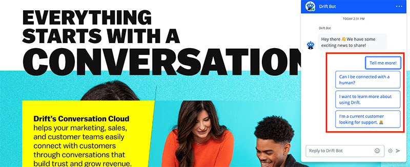
Drift has one of the best chatbots on the internet. Drift Bot runs on artificial intelligence and is ready to help you at all hours of the day.
If you want to learn more about using Drift or connect with customer support, you can use the Drift Bot. When you land on Drift’s homepage, Drift Bot instantly greet you. The Drift Bot then provides a few CTAs for ease of use.
(Image source)
With chatbots, everything is tied up in one nice, neat bow. And consumers respond positively to chatbots, with 68% enjoying chatbots because they provide quick answers.
On the other hand, if you haven’t installed a chatbot on your website and a question comes up at 2am, the odds are your user will bounce and go to another source to find the answer.
How to measure website user engagement
With these best practices in mind, how can you ensure they are working as expected?
Here are some standard metrics to help you track your website user engagement.
Time on page
Time on page is the amount of time a user spends on a page.
It’s measured by tracking how long a user stays on a page before clicking away or navigating to another part of your site, and it’s an excellent indicator of how engaging your content is.
As you might expect, the more time people spend reading your articles and interacting with your content, the more likely they’ll stay engaged with your brand.
Bounce rate
The bounce rate is the percentage of visitors that only visit one page before leaving your site altogether.
If someone lands on your site and immediately leaves it for good, that means they didn’t find what they were looking for or didn’t feel compelled enough by what they saw to stick around.
Bounce rates vary across industries and websites, but you generally want to keep this number as low as possible.
Conversion rate
Conversion rate is a metric that measures the percentage of your site visitors who act, such as purchasing a product or signing up for a newsletter.
If you have 10,000 visitors per month and 100 sign up for a newsletter, you have a 10% conversion rate. You can calculate the conversion rate in Google Analytics by adding custom goals to your report and tracking them in real-time.
A high conversion rate indicates that your website is working well for its purpose; however, it doesn’t tell you why.
Are people doing what they should because of a clear call-to-action? Or is something turning them away?
By analyzing each step of the user journey through analytics tools like Google Analytics or a heat map tool, you can track where users are losing interest — and fix it.
Wrapping up
User engagement is vital to the success of your website and inbound marketing strategy.
And while increasing user engagement may seem like a daunting task, there are several strategies you can employ — as well as key metrics you can track — to increase the level of engagement with your website.
Creating relevant content, improving your site’s navigation, and optimizing your website for mobile devices is a good start.
But remember that every website is unique, and not all these tips will apply to your site. Keep an eye on the specific data for your site to see what best practices work for you.
About the author
 Kelly Moser is the co-founder and editor at Home & Jet, a digital magazine for the modern era. She’s also an expert in freelance writing and content marketing for SaaS, Fintech, and ecommerce startups.