What Is the Best Font for a Flyer?
Helvetica, Nevis, Cooper Black, Mono Alphabet — these names will be extremely familiar to those who have ever tried to create a stunning flyer, brochure, leaflet, and so on. Such design projects are extremely demanding in what elements will be used, what messages they are going to convey, and how. There is a vast number of free fonts for flyers, but the risk of delivering too plain and boring senses is high.
Standing out among so many competitors isn’t a breeze, but it can become one for sure. All that you need is to find the best project preparation strategy and the right design software and just create flyers with exclusive and custom brochure fonts online.
How to Choose the Right Font for Your Needs
In the majority of cases, masters usually consider typefaces they like and implement them in the structure of their marketing campaign. However, this strategy makes your vision rather limited — instead of hitting the jackpot with a font that represents your brand and target idea, you just rely on your own taste and hope it will help.
To let things work as they should, you have to analyze their project peculiarities to select perfect-match fonts for flyers and brochures:
- The effectiveness of your communications will be greatly influenced by the promotional font, even though your photos and prose will do most of the heavy lifting. Pick a good typeface that suitably matches the rest of the layout in regards to the emotional pattern, unless contrast is what you aim at. It is crucial to select fonts that the typefaces you select contribute to the mood other visual content components are trying to convey.
- Think about how brand-appropriate a chosen font is. A nice font for business needs has to be clear and not confuse target audiences, as it might happen with giants like Apple that pick up non-typical cosmic-like fonts without any related meaning and message. For instance, BBQ isn’t associated with curvy and flower-rich lines.
- Without a doubt, general readability is a must-have component, and it should be straightforward and immediate. Otherwise, the mission to create a multifunctional flyer with gorgeous fonts for brands will be an epic failure. If you don’t want to experience this embarrassing disappointment, don’t hesitate to print out a few samples with different font designs and check how test-group viewers will react. The same is valid for digital layouts too — please take into account various UI/UX settings.
- Another crucial component that sets the right mood on the flyer stage is its images. If text and pictures don’t work well together, the game is over. Avoiding such scenarios is what differentiates amateur fonts from professional templates.
How to Work with Font Designs
Making a statement with different combinations of signs and letters requires more personalization and content analysis. You don’t have to select new typefaces for repeated newsletters and promotions — several design elements can be similar. That’s why it is so essential to get software with tools to organize your workflow fluently, regardless of the project scope.
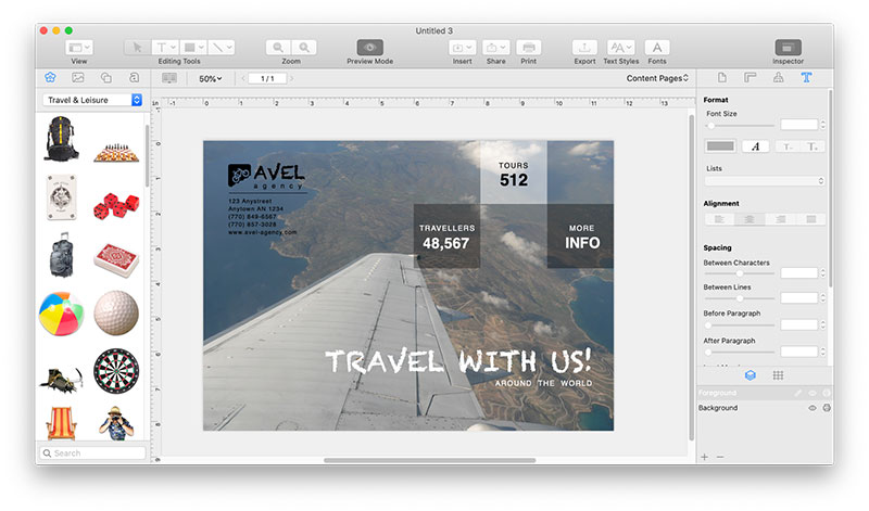
If you desire to find this font free version or more advanced solutions, Swift Publisher is a suitable answer. This software guarantees its convenient and multioperational interface will guide you through the flyer creation process and help you select the best niche possible.
Here are a few professional tips to style your flyers as gourmet products:
- Creativity means a lot. You will enjoy numerous attention-grabbing combinations that will fuel your team with stunning professional vibes on what to do and avoid. In addition, checking the lists of trendy fonts will also come in handy.
- There are typefaces that suit main body text, headings, and subheadings more than alternative areas. Switching them up won’t be efficient since you spoil their visual richness and contribute to the hierarchical confusion based on improperly selected patterns.
The Takeaway: Time-Tested Font Styling Approach
Visual beauty, harmony, and eye-catchiness of flyers do highlight their meaning and aid in achieving the final goal of their creators. If you fail to deliver the message brightly and precisely, even the most fantastic idea or benefit for end users might be missed. For those parties who are interested in well-rounded campaigns to maintain their marketing and business development strategy, it is especially crucial to stand out and overcome this challenge.
With the help of professional and all-inclusive interfaces like Swift Publisher, you get it all set. Aside from a high variety of fonts and customized flyer templates, customers access a wide range of handful tools to increase the value of their advertising projects significantly. For more details, just give a test drive to this software and practice its advantages on your own — its free trial is awaiting on the official domain.