Simplify Your Color Palette With CSS Color-Mix()
There’s a reason for all the new, experimental color features CSS is introducing. And there’s a reason for all the excitement they’re stirring up.
Colors are hard. Defining a base color palette can be time-consuming and involve quite a few stakeholders. And that’s not even considering contextual colors, like hover, active and inactive states. Defining these values requires even more time and more attention to accessibility. This can result in a bloated palette and an even more bloated set of design tokens.
It can be a lot to juggle. 🤹
While the CSS color-mix() function may only blend two colors together, could it be used to simplify color palettes and streamline contextual values across themes?
The CSS color-mix() function is an experimental feature that is currently a part of the Color Module 5. True to its name, the function will accept any two colors, mix them together and return a little color Frankenstein.

For the sake of this article, let’s define how these arguments will be called while using this example.
- Color Space would refer to
HSL; - Base Color would refer to
red; - Base Percent would refer to
50%; - Blend Color would refer to
white; - Blend Percent, not shown in this example, will refer to a value covered later.
There are quite a few moving pieces here, so let’s have a quick interactive visual to simulate the base color, base percent, and blend color.
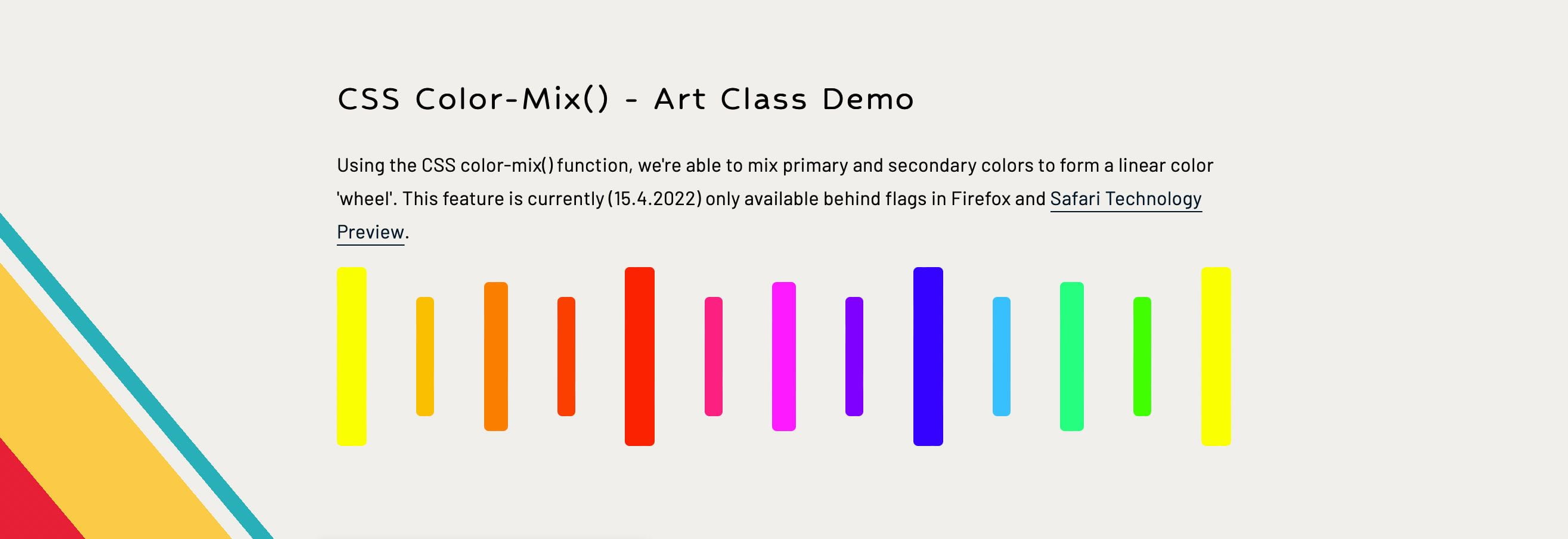
Building the linear color wheel was a lot of fun and a great dive into using color-mix(). It often helps when experimenting with a new feature to already know what the visual outcome should be.
So how does this work?
First: Define the base primary colors.
--primary-1: #ff0;
--primary-2: #f00;
--primary-3: #00f;
Next: Mix the primary colors to create the secondary colors.
--secondary-1: color-mix(in srgb, var(--primary-1) 50%, var(--primary-2));
--secondary-2: color-mix(in srgb, var(--primary-2) 50%, var(--primary-3));
--secondary-3: color-mix(in srgb, var(--primary-3) 50%, var(--primary-1));
Last: Mix the primary and secondary colors to create the tertiary colors.
--tertiary-1: color-mix(in srgb, var(--primary-1) 50%, var(--secondary-1));
--tertiary-2: color-mix(in srgb, var(--secondary-1) 50%, var(--primary-2));
--tertiary-3: color-mix(in srgb, var(--primary-2) 50%, var(--secondary-2));
--tertiary-4: color-mix(in srgb, var(--secondary-2) 50%, var(--primary-3));
--tertiary-5: color-mix(in srgb, var(--primary-3) 50%, var(--secondary-3));
--tertiary-6: color-mix(in srgb, var(--secondary-3) 50%, var(--primary-1));
Of course, when I was in art class, there was only one set of paints. So if you wanted yellow, there was only one yellow. Red? There was only one red. Blue? Well, you get the idea.
But the web and CSS offer a much wider selection of colors in the way of ‘color spaces.’ Some of these color spaces may already be familiar, but there were quite a few I hadn’t used before, including four new CSS color features which are gradually gaining support.
Color spaces can calculate their colors differently from one another. Newer color spaces provide wider palettes with more vivid shades to maximize the latest screen technologies — like ultra-high-definition retina displays. It means that a single color may appear differently across each color space.
Knowing the CSS color-mix() function supports using different color spaces, let’s experiment with color spaces by replacing the use of srgb from the previous example with a custom property to see how the color wheel changes.

While the W3 docs explain the calculations behind this functionality quite well, the math is a tad beyond my abilities to explain clearly — this is art class, after all. But, as best as I can put it:
--math-bg: color-mix(in srgb, red 20%, white 60%);
In this example, the base percentage is 20 while the blend percent is 60 creating a total of 80. This gives us, what’s called, an alpha multiplier of 0.8 where 1 = 100 and 0.8 = 80%.
To fill in the gaps, the function will multiply the base and blend percentages by this alpha multiplier to scale them up to 100% while remaining relative to their original weights.
20% * 100/80 = 25%
60% * 100/80 = 75%

--math-bg: color-mix(in srgb, red 25%, white 75%);
If the base and blend percentages total more than 100, the inverse of this approach would be taken to round down to 100. Again, the math behind the scaling of these values, along with the general mixing calculations, is beyond my depth. For those interested in digging deeper into the technicalities of color-mix(), I would point to the W3 docs.
However, that mathematical understanding isn’t required for the below demo, where both the base and blend percentages can be adjusted to view the result.

Because the --background-color property is technically defined, the fallback won’t trigger.
However, that’s not to say color-mix() can’t be used progressively, though. It can be paired with the @supports() function, but be mindful if you decide to do so. As exciting as it may be, with such limited support and potential for syntax and/or functionality changes, it may be best to hold off on mixing this little gem into an entire codebase.
@supports (background: color-mix(in srgb, red 50%, blue)) {
  --background-color: color-mix(in srgb, red 50%, blue);
}
CurrentColor Is Not Supported
A powerful little piece of CSS is being able to use currentColor as a value, keeping styles relative to their element. Unfortunately, this relative variable cannot be used with color-mix().
button {
  background: color-mix(in srgb, currentColor 50%, white);
}
The hope was to have ever greater control over relative colors, but unfortunately, using currentColor in this way will not work. While color-mix() can’t achieve relative colors to this degree, the new relative color syntax is also coming to CSS. Read about CSS relative color syntax with Stefan Judis.
While color-mix() may not be as powerful as something like color-contrast(), there is definitely a place for it in a CSS tool belt — or kitchen cabinet. Wherever.
The use cases for contextual colors are intriguing, while the integration into design systems and themes (to potentially simplify color palettes while retaining great flexibility) is where I want the most to experiment with in the feature. However, those experiments are likely still a ways off due to the current browser support.
Personally, combining color-mix() with color-contrast() is an area that seems particularly exciting, but without proper browser support, it will still be difficult to fully explore.
Where would you first implement color-mix()? 🤔
Maybe it could be used as a mixin to roughly replicate the lighten() and darken() SCSS functions. Could there be greater potential in the realm of user-generated themes? Or even web-based graphic editors and tools? Maybe it could be used as a simple color format converter based on device capabilities.
Nevertheless, CSS is providing the web with plenty of new and exciting ingredients. It’s only a matter of time before we start mixing up some incredible recipes.
Further Reading On Smashing Magazine
- “Manage Accessible Design System Themes With CSS Color-Contrast(),” Daniel Yuschick
- “A Recipe For A Good Design System,” Átila Fassina
- “A Guide To Modern CSS Colors With RGB, HSL, HWB, LAB And LCH,” Michelle Barker
- “Color Tools And Resources,” Cosima Mielke