5+ Tips for Using QR Codes on Your Business Cards
One of the hottest trends for business cards is adding QR codes to the design.
A QR code can provide an extra way to contact to access your contact information, website, or even a landing page or sales information. QR codes have re-emerged as a popular element to help drive online traffic from physical sources.
Here, we’ll look at five tips to help you make the most of using QR codes for business card design.
Bonus: Every example here includes a template from Envato Elements that you can download and use for your business card designs. Not sure where to generate your QR code? You can start with a free tool such as QR Code Generator.
Use a Code to Handle Links and Contact Information

The first tip for using a QR code with a business card design is to have a purpose. What information should be contained in the code?
Use it to handle information that you want someone to take away from your card before they throw it away. This might include your contact information, website link, product link, or even link to download an app.
Start with that goal in mind before you get too far down the path of using a QR code. For it to be effective, it must have a purpose.
Then you want to make sure that the purpose is clear. In most instances, the information on the card itself is the information that you’ll find when scanning the QR code.
Make a QR Code Part of the Design

QR codes have a distinctive and understandable look and feel. You will definitely know a QR code when you see it. But you can incorporate this element into the design in a way that looks intentional, rather than as an afterthought.
There are plenty of ways to accomplish this with a QR code, but what’s important from a design perspective is to create a visual that doesn’t look like you just plopped the code on the card.
Play with layering, location, and color options so that the code is easy to see, but isn’t the total focal point of the card design.
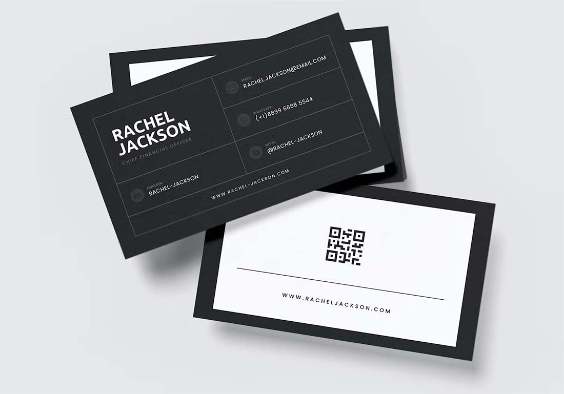
Add a Large QR Code on the Card Back

Use both sides of your business card to make the most using a QR code by putting the scannable design element on the back of the card.
With this design option, you can give the QR code plenty of space and size so that it is easy to see, scan, and understand. This placement can also eliminate bothersome issues such as competing elements – the QR code and your logo – or making the space next to your contact information feel too cramped.
By opting for QR code placement on the back of the card, you can give it plenty of room and almost treat it as a design element. So have fun with your code generation and even play with color or other treatments with this option.
Use a QR Code in a White Box

If your business card design has a lot of colors or dark background, consider a QR code that’s inside of a white box or frame. To ensure that phone cameras and scanners read the QR code with ease, there needs to be a lot of contrast between the code and the background.
Keeping the QR code in a white box here can do the trick if your design is not on a white or light background.
To ensure that the QR code doesn’t look out of place, this technique works best when you have other white or light elements in the design as well. That probably won’t be too much of a challenge because dark backgrounds often require white or light text for readability.
The goal is to give the code plenty of visibility and comprehension as well as enough room to be scanned quickly.
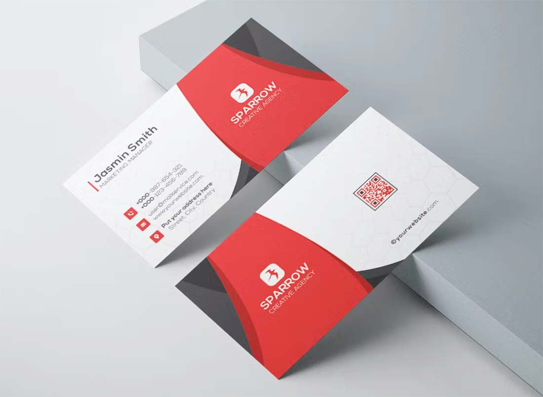
Try a Colorful Business Card QR Code

There’s no rule that says a QR code has to be black and white. You just need enough contrast to differentiate between the code and background so that it scans well.
Consider using a code with a color – or even colors – that match the rest of your business card design. Some QR code generators and tools will even let you add icons or other image elements inside the code for an even more unique element.
The goal of any QR code styling should be to make it feel like it belongs with the business card design. It should not compete with or work against it.
When thinking about colorful QR codes, you probably want to avoid pastels, light grays or beiges, or any similar color that might not have the contrast value you need. Bright, bold colors on a light background are generally the best option.
Keep It Simple

It’s the most timeless piece of design advice and it works here, too. Keep it simple.
When you are designing with a QR code on a business card, you are adding another element to a small canvas. A simple, elegant design will take you far every time.
Focus on clean lines, hints of color, simple typography, and a QR code with a placement that doesn’t compete with your logo or other design elements. White space can be your strongest design element here as you think about ways that scale and simplicity can benefit the overall aesthetic.
Conclusion
A QR code on a business card can provide an extra, and easy, way for new contacts to save your information quickly and easily. Make sure to include relevant information in the QR code and don’t forget to save your code link somewhere with easy access so you can update it if you need to. (There’s nothing worse than scanning a code that doesn’t work.)
Finally, remember to make the code big enough to scan with ease on the card. This can’t be emphasized enough. You want to make it as easy for others as possible to get your information without frustration; a too-small code can be difficult to scan.