Full Guide On How To Design A Perfect App Icon
In the first quarter of 2021, Google Play had almost 3.5 million apps, and App Store – more than 2,2 million. It means that while users don’t have to limit their demand, developers struggle to keep up with the competitive edge. The way to the client’s heart is long and tedious: you should perfect everything about your app, and the icon isn’t an exception. That’s what we are going to discuss in the article – how to make an ideal icon?
What Is an App Icon?
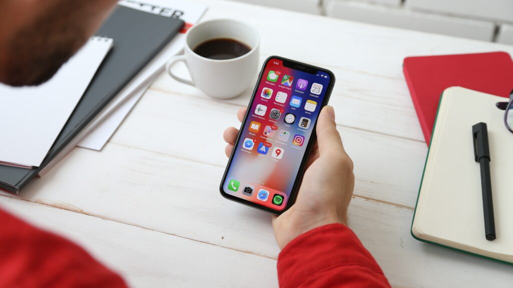
Let’s start from the very beginning – an app icon definition. It’s a small, usually square image on your home screen, by tapping on which you call out an app. It’s extremely important as it should be eye-catching to grab the users’ attention and tune your brand identity at the same time.
Sometimes, an app icon is mistakenly perceived as a brand logo. While this can be true, both are actually very much different in terms of approach to work, design process and tools, metrics.
Why Should You Bother About an App Icon?
That’s probably one of the most popular questions since an app icon seems to be too small to be significant – it’s just a tiny image, after all. In reality, the user’s brain will process this image much faster than the name of your app. It means that if the icon fails to attract attention, the chance of user acquisition drops.
We are sure that icons are of utmost importance when it comes to App Store Optimization (ASO) because it helps to build a rapport between a user and an application. No one has ever suffered from an appealing wrapping as books are judged by their covers. Only a few focus on app mechanics and features, neglecting its design.
So, we can say that an app icon contributes to establishing an emotional connection with the target audience, which in turn leads to an increased number of downloads. Besides this, with a beautiful wrap, you can count on a competitive advantage in the App Stores due to a positive first impression.
4 Steps on the Way to a Stellar App Icon
Although you should pay specific attention to an app icon design, the whole process isn’t rocket science. You should proceed with four steps only.
1. Identify a Design Idea
You can’t just implement the first icon idea that came to your mind. You need to embed the tiny image into your brand concept. Here are three golden rules that will guide you:
- Be customer-oriented. The colors and patterns should reflect your target audience if you wish to use an icon as a powerful marketing tool.
- Be true to yourself. Don’t confuse users by copying someone else. You may provoke negative associations and alienate users in the end.
- Be eloquent. Speak with the icon. Let it tell users more about you, your app, and your offer. Descriptive keywords that you will present in the form of symbols are one way to do this.
2. Study the Platforms Requirements
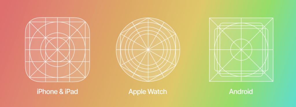
Besides attractiveness and brand identity, your app icon should meet the app stores standards in terms of patterns, resolutions, styles, layouts, etc. All the guidelines are present on “ Design for Android” and “iOS Human Interface Guidelines”. While they are pretty different, there is no need to create two designs. You can merely adapt one according to the technical requirements.
| Google Play Store (Android) | App Store (iOS) | |
| Dimensions | 512px × 512px | iPhone: 180px × 180px (60pt × 60pt @3x), 120px × 120px (60pt × 60pt @2x) iPad Pro: 167px × 167px (83,5pt × 83,5pt @2x) iPad, iPad mini: 152px × 152px (76pt × 76pt @2x) App Store: 1024px × 1024px (1024pt × 1024pt @1x) |
| Format | 32-bit PNG | PNG |
| Color mode | sRGB | sRGB or P3 |
| Shape | Square – Google Play automatically rounds off corners (20% of icon size) and add shadows | Square without shadows or rounded corners |
3. Create, Create, and Create
Now that you have everything ready, it’s time to let your creative spirit out. The design stage is one of the key steps as your job is to express beauty in a tiny image. Otherwise, according to Comscore, 20 percent of millennials will delete your app.
To facilitate the task for you, we have prepared six design tips:
3.1. Don’t forget about scalability
The icon is like the face of your app: it will represent the app everywhere and anywhere. However, the icon size varies from store to store. That’s why you need to ensure it is optimized so that the image quality isn’t lost. You can test different sizes with the Appsparky tool.
3.2. Don’t overdo
You may be tempted to make your icon sophisticated, but it’s not a winning strategy. Too many details on a small image diffuse the focus. That’s why you should adhere to a minimalistic approach and reduce the number of symbols as much as possible.
Such an approach allows you to be clear with your audience about what you want to express. Our advice is to choose one symbol and stick to it. This way, your icon will be easy to comprehend.
3.3. Don’t stay under the radar
Here we are speaking about uniqueness. Users should recognize your icon, ideally as easily as they do with McDonald’s or Facebook. In such a case, your brand has managed to build an emotional connection, which is a driver of improved brand awareness and customer loyalty.
What is more, if your icon is unique, you are ahead of your competitors. Those who try to imitate them, however, risk unintentionally promoting rival applications and lose the connection with the target audience.
3.4. Don’t ignore colors
One thing that interacts directly with the user’s subconsciousness is colors. These three pieces of advice are for you to consider when thinking about which shades to use:
- Be bold. Catch the attention with the right color. For instance, you can follow the successful examples and use blue with red and white. But don’t overdo with contrasting colors: two are more than enough.
- Be branded. You need to tell a cohesive story, and colors play a major role here. Use branded shades only.
- Be aesthetic. A beautiful icon is a sure way to success. That’s why you need to find those colors that appeal to your audience and look good on different backgrounds.
3.5. Don’t use a lot of text
A lot of words won’t do you any good because the app icon is too small for users to read it. Instead, it’s better to speak with symbols. You can leave only very short texts or letters. Look how Skype features “S” and Facebook “F”: their icons are branded, recognizable, and easy to comprehend.
3.6. Don’t neglect your essence
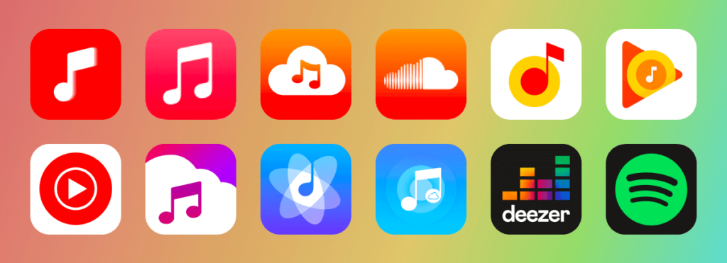
A good icon is one that isn’t only beautiful but also informative. It should describe what your app is about. That’s why e-commerce apps feature a shopping cart, reading apps – books, music apps – a music note, etc.
While it may seem too primitive for you, users are likely to easily grasp the idea of the app. Remember: simplicity is key as it allows your audience to quickly comprehend and process the image.
To make sure that you have designed a brilliant icon, you need to test it. Typically, you will have several options to try. You can assess the success by:
- Setting up a focus group. Use an A/B testing approach: show two different designs to two separate focus groups made up of your target audience. Ask the people if the icon matches your app’s concept and if it’s beautiful or not. You may also present several icons, competitors’ ones included, and let the users choose the best one. You can turn for feedback to Google Experiments’ (Android solutions) or Facebook’s communities. If you are on a budget, conduct the research among your friends, employees, and family.
- Conducting a technical test. Besides assessing attractiveness for users, you also need to check if the icon is optimized for different mobile devices and if the image is good regardless of its size.
Tools to Create an App Icon
Here are the tools for you to use to design your ideal app icon:
- Graphic Editors like Adobe Photoshop or Adobe Illustrator – offer extensive functionality to implement even the wildest ideas.
- Design Apps like Adobe XD, Sketch, Figma – similar to the previous ones in terms of functionality but also mostly preferred by UI/UX designers.
- Online graphic designers like Canva, Appicon, Font Awesome, Logaster, Iconsflow – beginner-friendly, offering simple navigation and templates.
Speak With Your Icon
In the era of brands, when consumers seek authenticity, a brand icon is more than just an image to click on to run an app. It’s the embodiment of your application, its nature, and its essence. It’s a powerful tool that helps you to build the very first connection with a user who can potentially become your brand ambassador. Therefore, never save neither your time nor your money when it comes to an app icon.