11 Tips To Trigger Emotions Through Design
Business operations are highly dependent upon their customer’s nature. Therefore, the psychology behind a brand’s strategy and its customer’s mindset are the two fundamental elements of every design. Any design for marketing, advertising, and business operations should contain all the necessary factors to increase engagement and provoke action. The industry is always changing, and so is the audience. Designers have to keep up with the latest market trends and latest consumer behaviors to create a design that can go a long way for sustainable growth. It is a very tricky process, and you have to keep all the necessary key points in mind while creating your unique design. There are many ways to inculcate emotions in the design that can increase engagement and give instant actions as a result. And to help you with that, we will discuss the 11 most essential tips to trigger emotions through your designs for the intended results.
1. Understand Your Audience:

Before deciding on designing aspects, you must research and collect all the available information about your respective audience. Age group, geographic factors, demographic factors, personal preferences, buying behavior, psychological factors, etc., are known as the essential elements for consumer behavior patterns. And gathering all the vital information regarding your audience can really help you while deciding on an outline of your design. By this, you can decide which emotion you want to trigger and how you can do that easily. This step can work as a foundation for your design hierarchy. Because in the end, you want your audience to find your design appealing and convincing enough to take action or take participation. So everything about your design must be according to their preferences and psychology.
2. End Motive of Your Design:
After understanding your audience, you need to understand the end purpose of your design. An emotionally triggering design needs to understand the brand’s motive behind this particular design. It can be anything from the point of view of sales, marketing, or general strategy. Any strong call to action for the lead or just engagement is the center stage of your design. So while designing, the audience and your motive are the two base theories you are using as a primary component. There are many emotional triggers possible in the design, from positive to negative, and it is up to you how you want to fulfill the end motive and by which emotion. You can generate a positive outcome from negative emotion and a negative outcome from positive emotion; it is totally up to your creativity and idea.
3. Colors Play the Major role:
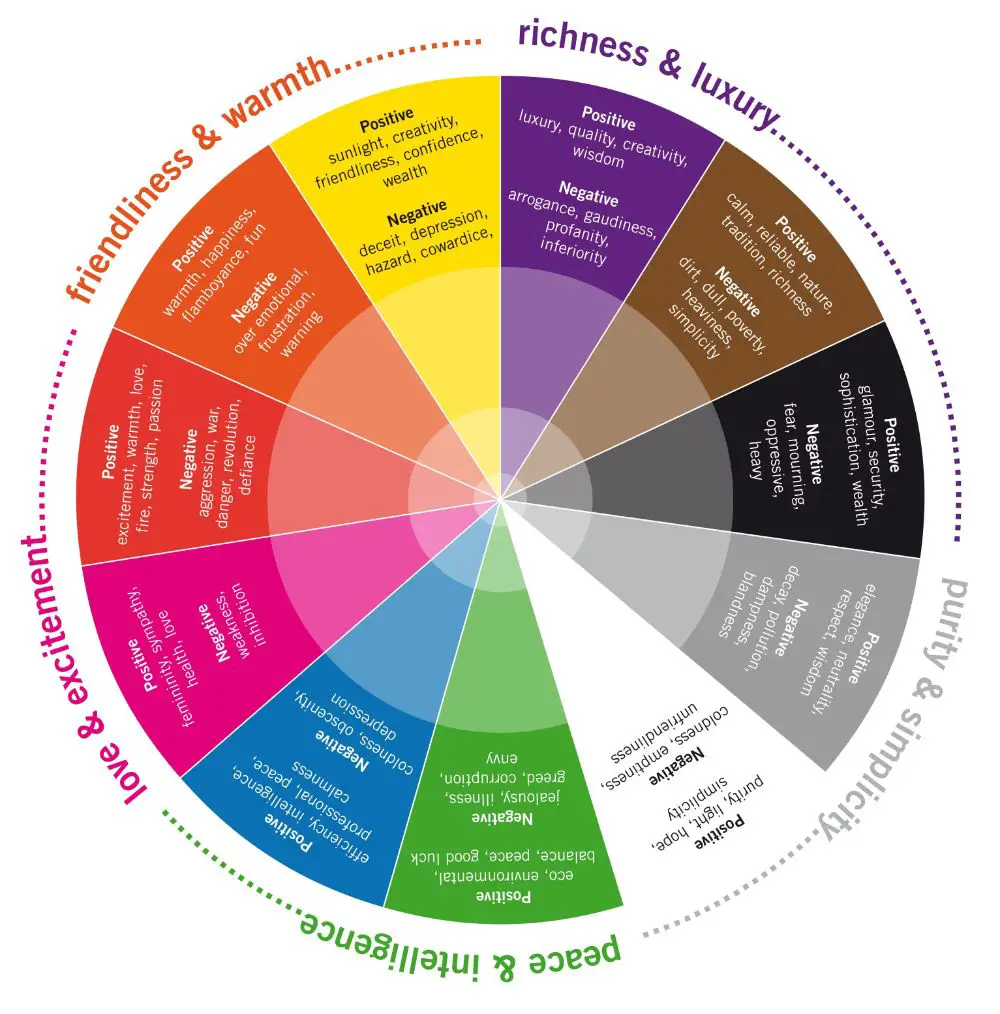
One of the essential things in designing you need to focus on is your design’s color pallet because colors can speak louder than the text. The first thing in any design anyone can notice is the colors of that design. Every color has its own story and owns meaning that you must study thoroughly before selecting as a designer. A detailed study of What each color represents and the use of complementary, analogous, achromatic, etc., kind of color combinations is beneficial. From vibrant to monochrome and from saturated to greyscale colors, you can choose any color combinations as per the design and the emotion you want to trigger. Colors are highly impactful for the triggering of emotions as they can easily touch instant feelings. That is why it is very essential to pick the appropriate color pallet to trigger the right emotion through your designs.
4. Include Real Images:

Sometimes, whole design with infographics and texts may find difficulties in triggering the emotions. It is not a rule or some guideline, but some real images are highly advisable to stimulate emotions more effectively and quickly. It is a psychological trick that can actually influence the design to create an emotional connection with audiences more quickly. If your audience is notifying real images of their kind of people, emotion, desire, places, society, and environment, they are more likely to associate with the design. Whatever message you convey through your design, real live images can help you deliver the message more efficiently. You can creatively use the combination of text and photos, infographics and photos, or only photos as well to make your design more connective.
5. Never Underestimate Typography:
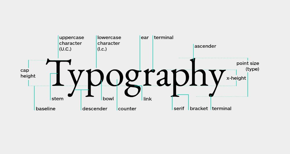
Typography includes texts, style of that texts, sizes of the fonts, and placing of fonts. Many other things are also there, but to create an excellent design, you must understand all these typography things. Bold and big letters encourage dominance, anger, and motivation; small and curvy letters are for positive, kind, and happy emotions, and just like that, whatever typography method you are using on your design, it indeed reflects your design’s emotion. The alignment of texts and the margin of the texts decides the position of your content. Whatever content you are using, no matter how great it is, it can lose all of the impacts if it’s not written well on the design. The colors of the design, message of the design, style of the fonts, size of the fonts, and the fonts’ placing must complement each other to deliver the quality design. The emotion you are triggering through your design should reflect in your Soft fonts, italic fonts, bold fonts, uppercase letters, and calligraphy of the texts.
6. Define Structure and Layout:
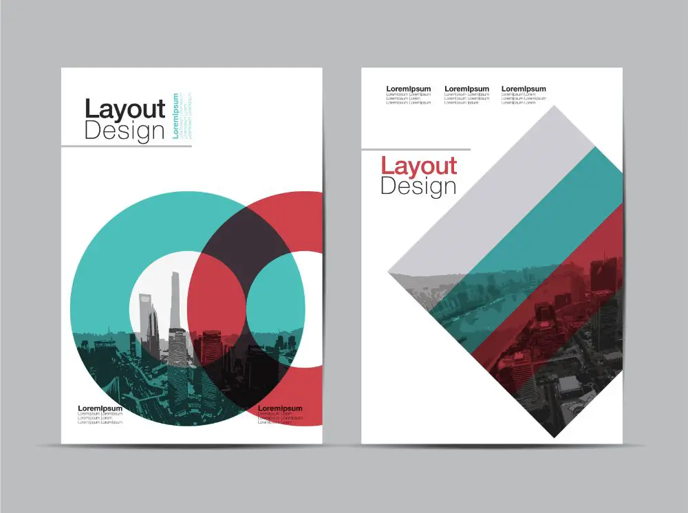
Structure and layout do play some role in creating emotion through the design. After deciding all the design elements, you need to place them in a well-structured layout. And for that critical question is what to place and where to place? Some strokes, frames, and geometrical shapes can help you to define your layout easily. Your graphics, texts, images, and background should dissolve with each other in such a way that the end design can trigger the intended emotion. If you are not placing all the elements correctly, then the whole design can become a waste. It is better to decide the layout first and then the elements. Structure and layout can give you the blueprint of your design and help you to create everything accordingly. Placement of Overlapping, shadows, frames, lighting everything matters when deciding the final structure of your design. Abrupt placement in layout can make the design offbeat, and that is something you should take care of in the designing process.
7. Take Storytelling Path:
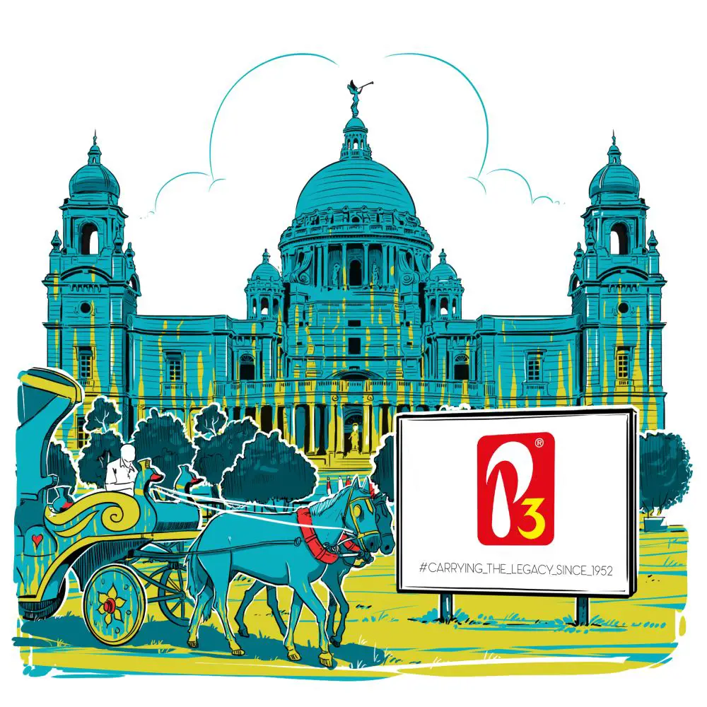
If you want to influence your audience’s emotions through some simple technique, then taking a storytelling format is one of the best choices. As per the audience and your message, you can implement some storytelling content or graphics. A design with some exciting story can engage customers more easily and quickly. It can create curiosity and hold them to notice everything about your design. Motivating, positive, and impactful small story through the design can deliver the message creatively and make your audience remember your design for a long time.
Moreover, this format can enhance your creativity with time. Emotions with the story can feed your audience’s interest, and they can pay more attention to your designs and brand. You can create grids or a series of designs as well to make it more interesting.
8. Focus on Environment and Lighting:

The general environment and lighting in your design matter a lot to create your design’s vibes and energy. Positive emotions require brightness, warm colors, and a pleasant environment in designs. Negative emotions require dullness, dark and cool colors, and a dangerous or sincere environment in designs. As per your audience and the required emotion, you need to create a design with respective vibes and energy. Your design’s feeling can ultimately trigger the required emotion in the audience’s mind, and for that, you should plant the required lighting and environment in your design nicely. It should go with the end message and emotion; then, only you can create an impactful design. A good design, perfect content, and right colors can even fail the creativity if they are not balanced with the end motive’s lighting and environment. So understand these things and work accordingly on your design can save your efforts and time.
9. Give Touch and Texture:
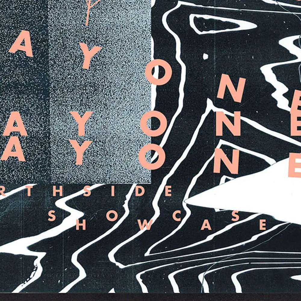
Through various methods, tools, and images, you can create some texture of your design. It is not necessary for every design or message, but it can be little addition to your design. You can make your design 3D, smooth, shiny, or rough in multiple ways. How is it beneficial to trigger emotions? It can make your design more real to your audience. If you are going for an image, then an image with a textured surface can help you a lot with your design. With all the other elements, this can work as an extra compliment on your design. Many textured elements like Flakes, grains, creases, furs, and creative 3D objects can make your design more impactful and help your design to encourage the desired emotion.
10. A Little Humor Can Never Go Wrong:

Happy emotions are always welcoming for the designs. If you can make your audience laugh or smile for a bit through your designs, they are more likely to engage with your design. The humor element can create magic even if the designs are not up to the mark. But this is very much depending on the audience and the end motive of your design. If your design is about some serious and sad emotion, then maybe humor can make things ugly. If you are presenting some social topic and it’s quite sensitive, you should not consider adding humor. But apart from that, almost every emotion can go very well with humor. So if you want to trigger any emotion in your audience, try adding some humor in your design; it can impact positivity.
11. Justify the Overall Theme:
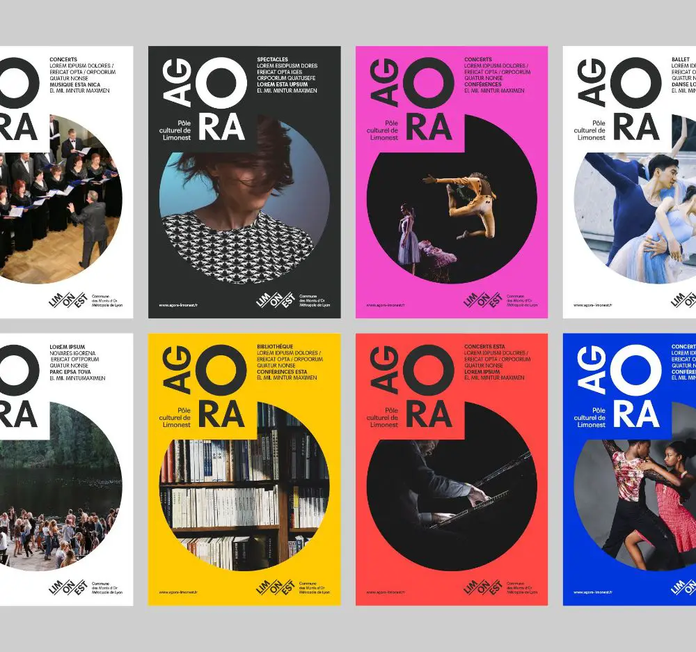
The theme of your design is something you plan before deciding on all the other elements. The theme is what keeps your design tied up in a particular way or format. You can create any design with a predetermined theme; this can save a lot of time and energy because it helps you go in a well-estimated design direction. Every design that you see around you has some theme or maybe a combination of themes. Your end design must justify your theme because a perfect design can only fulfill the purpose if it has all the elements well executed. By the end, if your design is going off track with the theme, then it can look horrible and cause serious issues. So throughout the process, you must design everything by keeping the theme in mind and justifying that theme with maximum creativity.
Elements, content, style, and most importantly, your design’s purpose decide how your customers are going to perceive the message. You can play with psychology but not without precise knowledge and research. If one of your design elements fails, then the whole design can turn out as a failure, and it may harm the brand image. For any reason, if viewers do not understand the message and confuse it with something else, the business may have to face some severe issues. So, a designer must understand how sensitive it is and the consequences of his design. Emotions have a direct connection with the brain because they work as a stimulator for any decision. So, to use them wisely, take inspiration from the tips mentioned above, and be creative in your way to trigger the emotions through your designs.