Fonts similar to Eurostile: The best alternatives out there
If you like functional and appealing sans serif typefaces, Eurostile needs no introduction. Aldo Novarese created this font in 1962 for the popular Turin foundry Nebiolo. This typeface replaced Novarese’s Microgramma but offered only uppercase letters.
What makes Eurostile so special is that it simply looks great on any project. It is popular and yet not overused, modern and practical at the same time, and easy to apply on any sign or heading. Its shapes are squarish but have rounded corners. These features caused this and fonts similar to Eurostile to appear often on TV screens during the 1960s.
The subtle looks of this typeface are not that easy to replace. Yet, there is a number of beautiful fonts similar to Eurostile that you should definitely consider.
Michroma
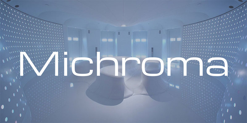
Michroma reminds us of how designers felt about the future during the 60s. It belongs to the popular sans genre of rounded-square fonts, such as the works of Aldo Novarese and Alessandro Buttin. The font is 10 years younger than Eurostile, but its character widths and stem weights make it much more traditional.
Not that long ago, Vernon Adams came up with a slightly different design process and optimized Michroma for use on digital screens. Ever since Michroma produces amazing screen results without manual manipulation.
Refrigerator Deluxe
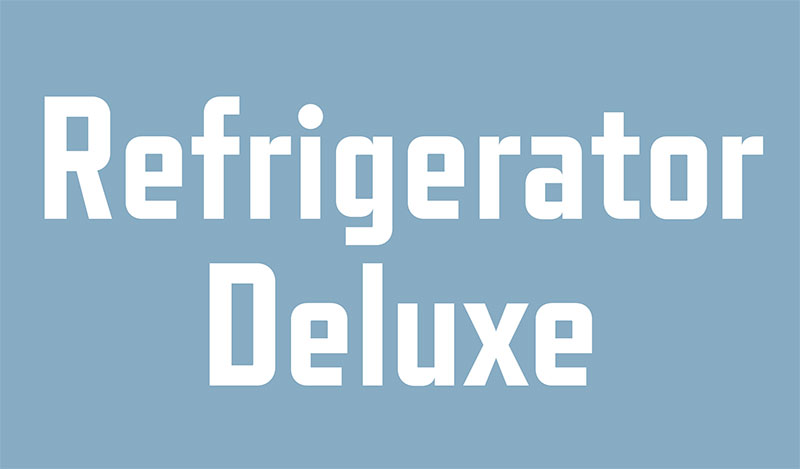
This condensed sans serif font is signed by Mark Simonson. It has been around for more than two decades, all along gradually improved and updated with weights and deluxe editions. You can get a light, normal, bold, or heavy-weight version. Matching italic styles are not available.
FF Max
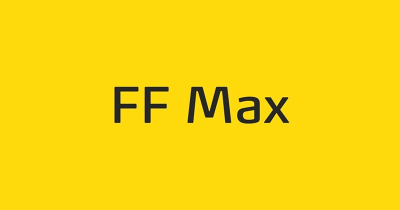
FF Max was delivered by Novarese’s Danish fan club. It is very similar to Eurostile, but its forms are rounder and friendlier, as its designers strived towards a more human touch. It is mostly used for newspapers and magazines.
Jura
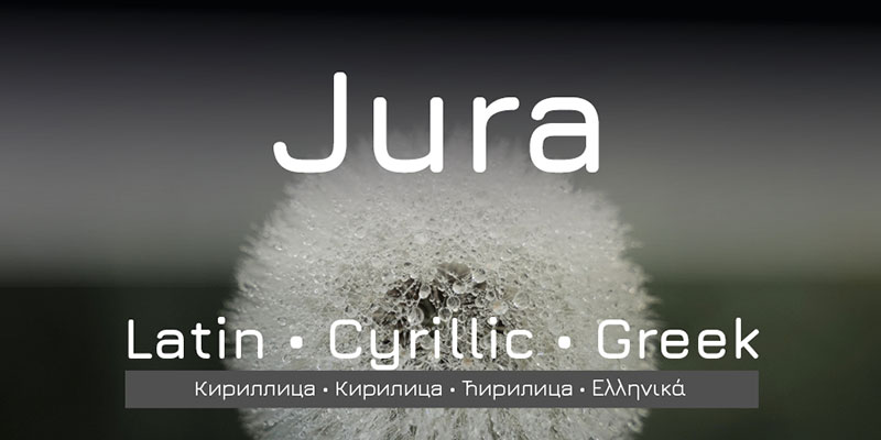
Jura is the umbrella term for a family of typefaces inspired by both Eurostile and the FreeFont project. These typefaces come with the exact same range of curves and strokes as Kayah Li Glyphs. The advantage is that they are also suitable for Greek and Cyrillic alphabet users.
Neographik
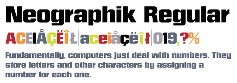
Fans of Monotype typefaces should definitely check Neographik. Despite being offered in only one bold weight, this font has tight apertures and beautiful rectangular letterforms.
Tactic Sans
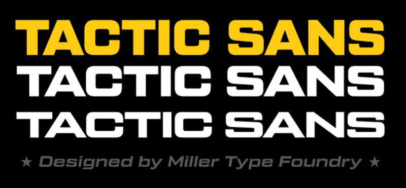
What designers love the most about Tactic Sanis its versatility. It is offered in three widths, seven weights, and matching italics for all of them. Put together, the set provides you a total of forty-two options to include this font into your design.
Tactic Sans works really well on sports posters, email blasts, or in military environments. The accessories are pretty much unique. Thanks to it, you get to use alternate characters, fractions, ligatures, tabular lining figures, Numerators ($¢£€¥ƒ#%), and much more! Best of all: it also works with Cyrillic alphabets!
Geogrotesque
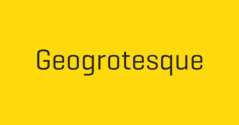
Geogrotesque can be recognized by its rounded letters and subtle appearance. Its characters use the identical formal principle of their matching optical adjustments. As a result, the typeface is easily adaptable to any project. The construction is purely technological, but the geometric forms are rounded. Be as it is, Geogrotesque invokes only warm feelings and is, therefore, a highly preferred tool of publications with longer texts.
There are only two weights available: thin and ultralight.
Gruppo
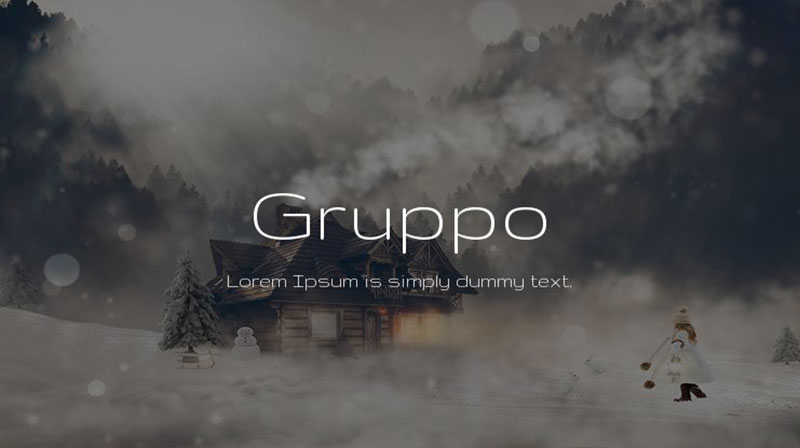
Gruppo follows the ‘little is more’ principle typical for laid-back and stylish branding campaigns. As Jasper Morrison once said, special is generally less useful than normal.
Compacta
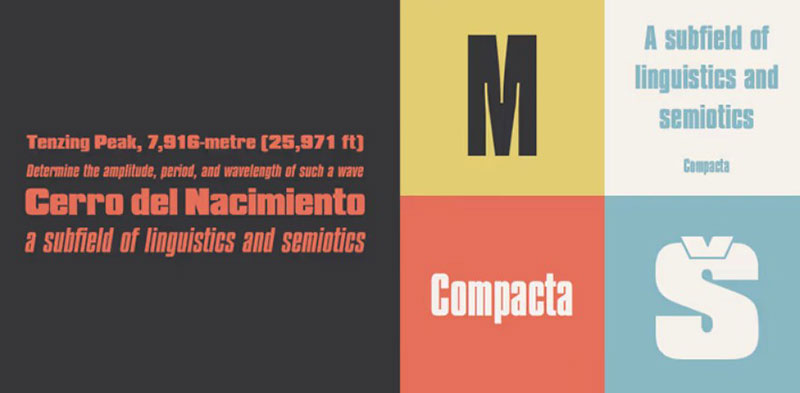
Compacta is perfect for designers concerned about spacing. With its flat-sided letters, you won’t have to compromise on less condensed design, just because you don’t have all the space you want. We especially recommend it for larger headings.
Normalidad
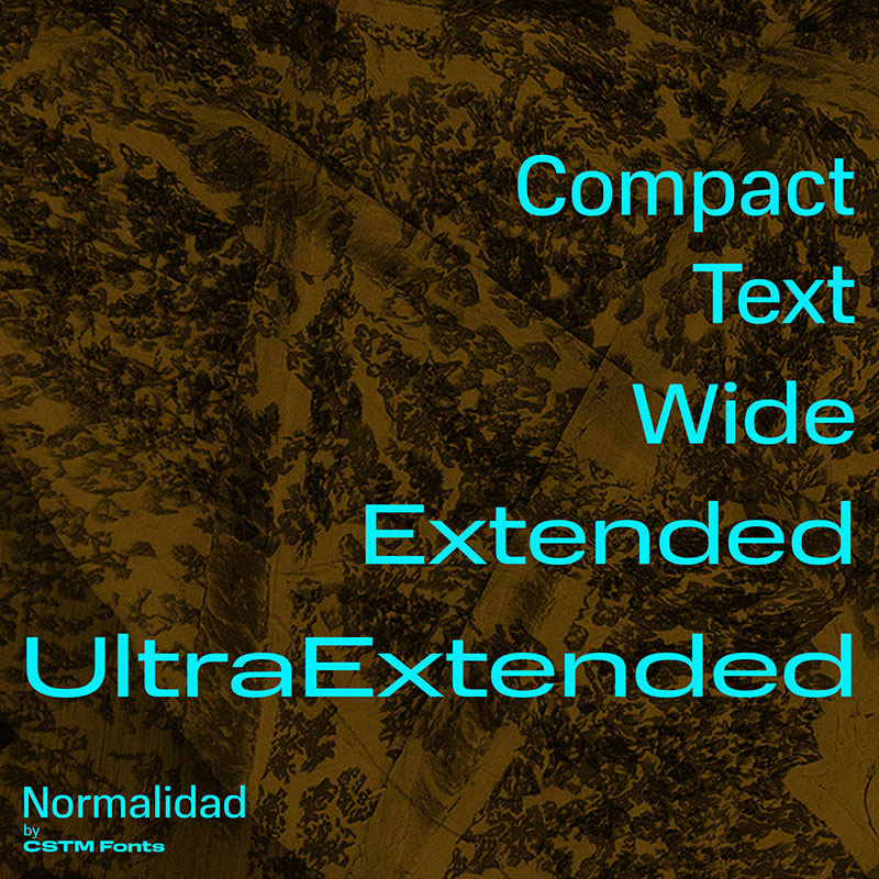
Normalidad is foremost a mechanical sans serif, as it comes with semi-closed apertures It is a rich and diverse tool, both when it comes to weights (Thin to Black) and to widths (Compact to Ultra Extended). It even has a range of text and UI ones and super-display cuts, so there is practically no case where you can’t use it.
It was designed in 2019 for the needs of Russian mobile operator MTS, but it is constantly improved with new styles and codes.
Forza
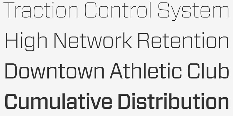
In 2010, Hoefler& Co. Designers (H&FJ decided to create a more squarish sans serif to pair with their Vitesse slab serif typeface. Despite only being offered in six weights, Forza is a very impressive alternative to Eurostile.
Eurostile Next
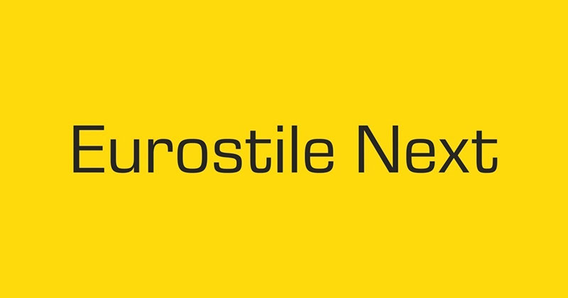
Looking at the name, we are instantly drawn to imagine a futuristic font similar to Eurostile. And we are right!
Novarese’s original design with mid-century appearance and standard metal types is now expanded and redone. The new product uses foremost squarish characters and subtle curves, which makes it perfect for digital content. You get to choose between five distinctive weights: bold, semibold, regular, light, and ultralight. You get to choose between five distinctive weights: bold, semibold, regular, light, and ultralight.
Industry
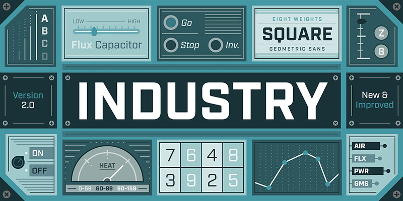
Industry was released in 2014 by Fort Foundry. Designer Mattox Shuler was obviously inspired by vintage posters. As a matter of fact, he composed a pretty nifty set of flat-sided and geometric letterforms. Industry features eight different weights, all of them with matching italics.
Exo
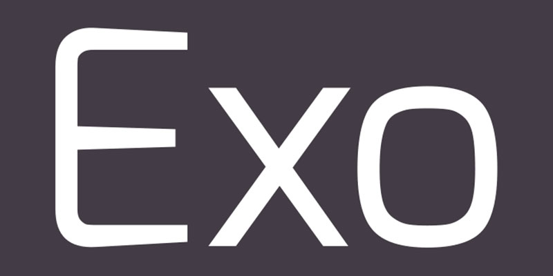
Exo is a very elegant typeface, but it still manages to capture the eye of technology fans and futurists. Its designers opted for universal application and gave it a total of nine weights with adapted italic versions. You will find it, especially appealing on small size texts and displays.
Stratum 2
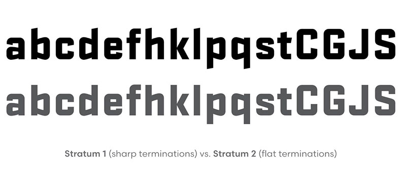
Eric Olson’s typeface Stratum 2 was released by Process Type Foundry in 2004. True to its age, Stratum works only with lowercase letters. True to its purpose, it still matches and possesses the legibility provided by uppercase letters. There are a total of six weights with no matching italics, but who would expect to see those on this geometric masterpiece?
Eurostile Candy
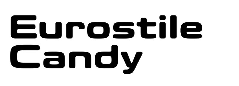
Eurostile Candy is another fun member of the Eurostile Next family. It was Akira Kobayashi’s attempt to completely revolutionize this typeface and to give it a softer and friendlier appeal. For instance, he changed many of the essential characters, removed excess strokes (as on the ‘a’, ‘s’, and the ‘t’), and added square shapes (as on the ‘n’ and the ‘r’). Thanks to his stylish alterations, Eurostile Candy can be used for any project.
Titillium
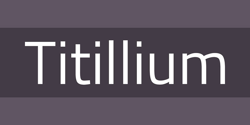
Even the visual design master CampiCisivi tried to redo Eurostile. The result was Titillum – an everchanging typeface master with a breathtaking appearance.
Each year, dozens of design students of the Academia di Belle Arti di Urbino work to solve the problems of this geometrical typeface. Consequently, Titillium is constantly amended and enriched with great additions. Make sure you put it on your list!
Exo 2
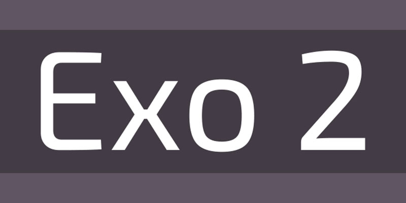
Compared to the elegant Exo typeface, Exo 2 is a completely reinvented organic-looking typeface. Thanks to its versatility, Exo 2 blends much easier within long texts with small text sizes. At the same time, it looks adorably futuristic.
Saira
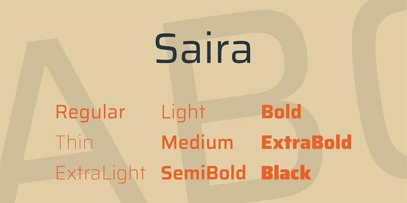
Saira is Hector Gatti’s system of sans serif fonts, rather than font itself. It offers the most diverse package of widths and weights, which means it can respond to any typographic challenge you are facing. Designers call Saira the ‘super family’, and it is mostly because of the condensed, semi condensed, and extra-condensed styles. Each of them is available in even nine weights.
FFCubea
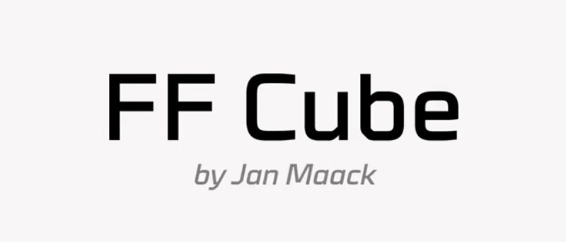
FF Cubea doesn’t resemble Eurostile all that much, that be so if we exclude their matching industrial look. This typeface is more compact than Eurostile, as it comes with unusually large x-heights. If you give the lowercase letters a look, you will spot a horizontal movement among the strokes. They lean and neet the stem at exactly 45 degrees. This perk does not only make FF Cubea so ‘cubby’, but it also makes the text more powerful and easy to read. The easiest way to describe the feeling it invokes is ‘stable’. And as if this was not enough, you can choose among light, regular and bold weights, condensed and normal weights, and a matching italic for each of them!
If you enjoyed reading this article on fonts similar to Eurostile, you should check out this one about fonts similar to Impact.
We also wrote about a few related subjects like fonts similar to Futura, fonts similar to Avenir, fonts similar to Calibri, fonts similar to Gotham, and fonts similar to Montserrat.