7 Ways to Design for the Unexpected
What just happened? Why doesn’t that work? Does this look funny to you?
These are all questions you don’t want users to ask when interacting with your website design. But inevitably, they will. The unexpected happens all the time online. From users changing settings on their devices to slow browsing speeds, your role is to expect these unexpected challenges and offer a design solution… before they happen!
From dark mode to people taking an unexpected path through your website or app, we’re exploring lots of unexpected scenarios so you can plan for them in advance!
Unexpected: Dark Mode

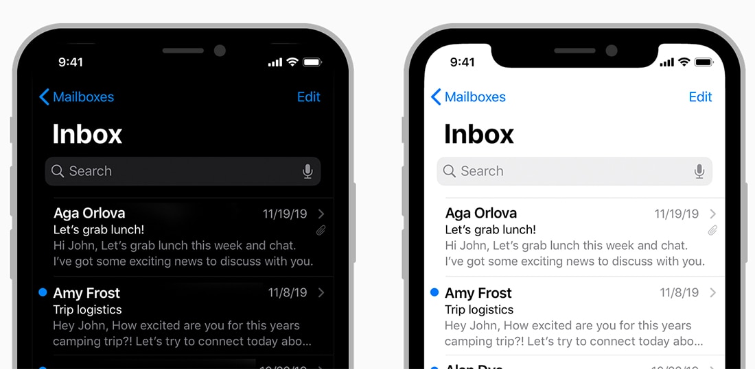
The number of users switching to dark mode for browsing and emails is growing all the time. Android users are most likely to make the switch – as many as 81% of users prefer it – and Apple users are growing in usage with 37% of people adopting it for browsing.
In short, it’s becoming more important all the time to account for dark mode in your designs. You can design the control with a toggle switch and present color palettes for light and dark modes. Or you can use CSS and JavaScript to accommodate users who prefer dark mode.
If you opt for the latter, it is important to have styles in place to account for this change. Remember, dark mode isn’t always as simple as a flip from a light background with dark text to a dark background with light text. You may need to use a secondary color palette or make other changes to the design to adjust most accurately. Interested in digging a little deeper? Learn more about designing for dark mode.
Unexpected: Out-of-Date Browsers

While you might not know anyone who still – somehow – has Internet Explorer installed and uses it, there are those people out there.
From outdated browsers to odd screen resolutions, compatibility is a sneaky issue that can make a beautiful website look pretty horrible.
While you can’t account for everything every time, there are a few things you can do to mitigate the risk:
- Keep your code simple
- Use CSS resets
- Include DOCTYPE in coding
- Validate your code
- Test for compatibility
Unexpected: Bad Backlinks
A dark and dirty practice is linking poor quality or spam sites to a website. Hopefully, you don’t run into this issue but if you do, it is important to remove poor backlinks – spam, illegal activities, porn, link farm links, links from unrelated websites, penalized domains, foreign language sites.
If you see odd spikes in web traffic or odd referral sources in your analytics, that can be a sign that something is off.
To combat this issue, run a link checking tool on your website periodically. Request removal of links that you deem inappropriate, and create and submit a disavow request to Google to ignore those links.
Unexpected: Translation Issues
Some website owners rely on translation plugins or tools to ensure that audiences in different locations can access and understand the website equally well. If you don’t speak the language, it is important to use a quality translation tool so that you don’t say something that doesn’t make sense or create an unexpected issue of your own.
You can create different versions of the website design and copy that someone manually translates and direct users based on geolocation information with an extension at the end of the URL such as /en or /fr.
You can use a plugin or tool that allows users to toggle to the appropriate language. Remember to do users a favor and only allows the menu to show languages that are relevant to your audience for more ease of use.
Remember to always offer users a way to switch languages if they get to the site and can’t understand.
Unexpected: Super Slow Internet

It’s happened to everyone at some point. You open the browser on your desktop or phone and nothing loads. The internet speed is dragging – big time.
While internet speeds are getting faster all the time and more people have access to faster internet, you still want to do what you can to mitigate potential issues.
- Compress and minify where you can.
- Include alt text for images and video that explain what’s there if it doesn’t load.
- Use caching or hosting that has performance optimization built in.
- Reduce the number of redirects to pages that are necessary.
- Use asynchronous and defer loading for CSS and JavaScript.
- Delete plugins and tools that you aren’t using.
Unexpected: Location Confusion

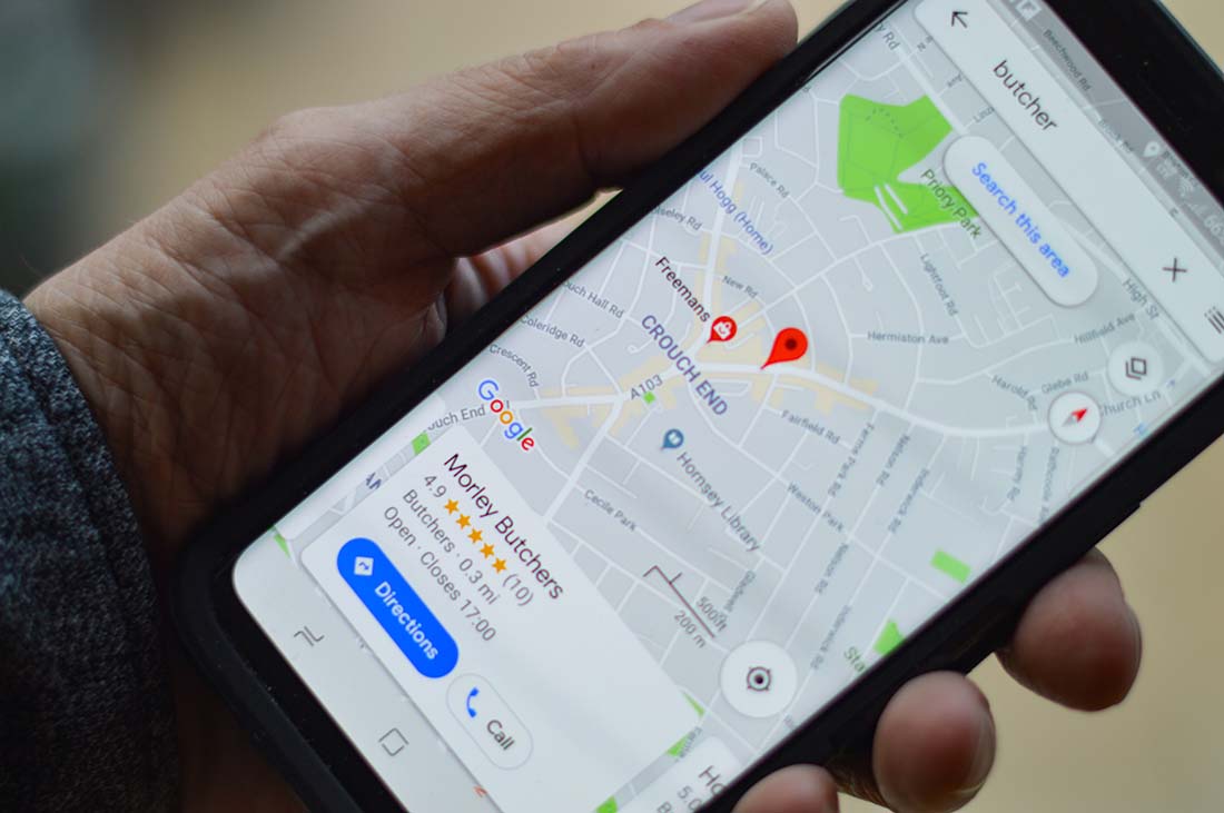
Does your website use location information to display content? Location confusion can happen for a number of reasons from the user disabling location settings to redirected IP addresses.
The fix here is rather simple. Always ask the user for their location and tell them what it impacts with the design. Give them a reason to enable location settings to provide a better user experience.
Users like to have control over the data and information they share and how that interaction works. Provide that option.
Unexpected: User Paths or Journeys
When website visitors aren’t doing what you expect them to do, it’s time to make adjustments to their journey so that the right conversion happens.
Unless that unexpected usage is a happy surprise.
This is another issue that you’ll likely notice by looking at analytics and designing calls to action differently, swapping directional dues to be more direct, and helping visually lead users through the website in the way you want them to navigate are potential solutions.
It is your responsibility to help ensure that visitors do what you need them to do when they interact with the design.
Conclusion
A little timeless design advice can help you mitigate many of these challenges: Test everything and pay close attention to analytics to help see issues before they become big problems.
Think about how you use, how your parents use, how the youngest person you know uses, and how the older person you know uses the websites. Then figure out a way to design something that all of them can enjoy.
Remember to keep the user experience simple and consistent and always offer a way for users to get back where they came from. A design that’s free of visual clutter, has clear navigation, and provides feedback when errors happen is a lot easier to use and more likely to keep users if something unexpected does happen.