Features that a photography website should not miss
Do you run a photography studio? Are you considering starting a photography website? Even if you are not a web designer, you can build a wonderful platform for potential customers to view your greatest work. Many professional photographers have excellent websites that help them get notoriety and additional revenue.
If you want your website to help you reach your photographic aims and earn business, it must be carefully built. Your website is the pivot around which all of your marketing revolves.
You’ll need a fantastic website if you want to exhibit your amazing photos online, advertise your photography business, and expand its customer base. Photographers’ websites are gateways to new clients and additional employment. If your website isn’t up to pace, you might be losing revenue, not to mention missing out on possibilities for personal branding and putting your name out there.
The finest photography websites are more than online portfolios; they highlight a photographer’s finest works, exhibit their ability, and set them apart from the rest. It’s not like every photography website will need the same set of features. Of course, your website will require an incredible method to exhibit your beautiful photographs, but it will also require a strategy to develop your business.
Your website should persuade potential consumers to cooperate with you. There are several important pieces of information that should be included on your business site. When we start putting things together, we occasionally overlook to include certain important pieces. To construct a website, you must first establish a checklist of a few key elements that your website must contain.
Use a right hosting platform

When selecting a web hosting platform, it is critical to choose a business that provides quick speed, strong security, and accessible customer support. Make sure to investigate all of your alternatives, as well as the benefits and drawbacks of each, so that you can make the best decision for your photography website.
WordPress is one of the most user-friendly systems for optimizing SEO, with dozens of themes to pick from. You may, however, choose a less technical way. As an example, consider Photoshelter.
A single-specialty gallery

A gallery is likely to be the most essential feature of a photography website. Less is more when it comes to your photography portfolio website. Create galleries centered on a specific speciality. Find a technique to categorize your work into unique themes if you mainly photograph in one certain field. A gallery will also assist you in making your website more visually appealing.
If you offer photographic services to a variety of industries, you should further categorize your work as Wedding, Business, Food Menu, and so on. This not only makes your photograph albums simpler to consume, but it also aids in navigation. Some of your viewers may already know what they want, so let them go directly there.
Write a blog to reach out to followers

A blog may assist any photography website to exchange some fantastic stories with its readers. A photographic blog that is linked to your website may be incredibly useful. You gain authority in your niche, receive more visibility on search engines, and so on.
This can include industry news, customer reviews, and lessons, which can help you build your expertise and reputation, as well as some passive money if you utilize affiliate links.
Blogging aids in the creation of an asset that attracts an increasing number of individuals to your work over time.
A blog is an excellent method to develop your followers and tell them about your services, demonstrate what a photo session looks like, give image galleries for certain photo shoots, inform them about you and your specializations, and create shareable material that keeps them coming back for more.
You would have to provide information on new cameras, new styles, lenses, and other helpful hints too. Offering useful information will help you appear to be a real professional while also engaging your target market in terms of possible clients and collaborators.
An eye-catching & informative header and subheader

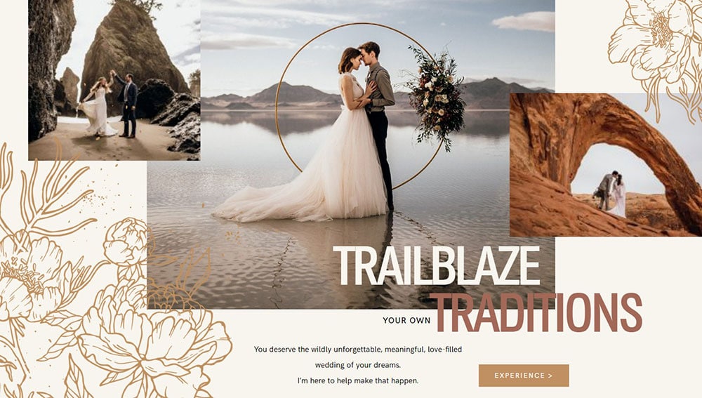
A properly designed header may feature an example photo as well as a title that describes who you are and what you’re doing. Following to website structure norms such as headers, navigation menus, and footers may not sound like the most creative approach to showcase your photographic work, but it is likely that this is what your future clients will find most natural.
Customers can see if you’re the photographer they’re seeking at a glance. This is accomplished by the use of images and words, such as a brief headline over a great shot of the type of photography you do.
Show your human side with about page

About pages are frequently among the most popular on a website. Create a bio for your about page to sell yourself, establish trust, and demonstrate your personality. It informs clients about who you are and your narrative, as well as your vision, location, experience, credentials, and approach to photography. People want to identify with you, so also provide a photo of yourself that is nice.
Keep your about page brief, concise, and straightforward; no one wants to read a stranger’s autobiography. However, in the few paragraphs you have available, attempt to convey your human side.
Testimonials

Testimonials serve as social confirmation of your worth and abilities. Your potential clients, like any other business, need to see reasons to work with you. Your portfolio and body of work should demonstrate your technical competence and outcomes, but positive customer testimonials from past clients will offer your visitors an idea of what it’s like to deal with you.
Once your website has a large number of good evaluations, you have a better chance of closing more transactions and increasing your income.
Include all contact info

Keep it as simple as possible for your website visitors to contact you if they so choose. Sometimes even the thrill of establishing a website causes you to overlook something as important as a contact page. This part must be simple to use, transparent, and functional. To check that this area is functioning properly, send yourself a test at least once a month.
A contact form is arguably the most important component for increasing sales and conversions. A contact section or contact page should have an easy-to-use contact form, business name, studio address, phone number, email, contact form, response time frame so they know when to expect to hear from you, the location you service, and a map.
Use social media buttons

Because people are more active on social media, you should engage with your audience through social channels as a professional photographer. If you have Twitter, Instagram, Pinterest, or Facebook accounts, include links to them. Social media buttons and embedded social media feeds allow clients to follow and get to know you in a variety of ways.
This also allows you to keep in touch, and they will remember you when they or their friends want the services of a photographer. Directing website visitors to your social sites establishes trust, displays your enthusiasm and diligence (if you update from time to time), and encourages people to follow you there.
It is advised that you create accounts on all of the main social networks and include buttons for them on your website. This will assist your visitors in connecting with and engaging with you.
Look into SEO
Believe it or not, there are lots of photographers that ignore SEO completely. And that is quite silly since there are lots of your potential clients that just go online and search for “photographer in [insert city]”.
There are various guides online on how to do on-page and off-page SEO. Check those out and see how you can improve your website’s presence in search engines.
It’s better to have more possible clients contacting you than you can work with than to have just a few once in a while.
Update your portfolio on a regular basis
Creating your portfolio and forgetting about it is not the way to go. What do you think will happen when a prospect ends up on your website only to find an outdated portfolio with pictures from a few years ago? You might make him or her think that you haven’t worked in a while.
Do you think they’ll all contact you so they can see if you’re still around? Most likely, a good chunk of your visitors will just bounce and contact another photographer that seems to be active in this business.
Ending thoughts on creating a photography website
Make your website a vital instrument for increasing company and sales. Websites are the ideal venue for showcasing your work because social media algorithms are always changing. You can’t enhance what you can’t measure, so monitoring your website’s traffic, bounce rates, and clicks is critical for fine-tuning.
Every photography website must focus on communicating clearly what you do, who you do it for, what they can anticipate, and how much it costs. A well-designed website may significantly increase your photography company. All you have to do is guarantee that your website contains all of the above-mentioned features.