Using Surrealism in Graphic Design: Tips and Tricks
Behind every creative effort is the desire to expand the audience’s perception, to see the world in a different or surprising way.
Graphic designers can use surrealism to convey a message by taking multiple disparate images and giving them a relationship that evokes a new way of understanding a subject.
For example, using the image of a human figure and replacing the head with a lit lightbulb can signify the spark of an idea. In this way, you can present a storyline with novelty and movement toward a conclusion without writing a single word.
It doesn’t have to explain anything about the subject having an idea or how that comes about.
The two images recombine to tell the story.
What is Surrealism?
Surrealism is an art movement that began in the early 20th century, just after WWI. Author Guillaume Apollinaire coined the term in 1917 to describe what he called “truth beyond realism.”
A few years before, the watershed 1913 Armory Art Show in New York City saw the birth of modern art with its introduction of abstract expressionism to the masses. An explosion of artistic experimentation in the art world followed, and Surrealism was one of those movements riding in its wake.
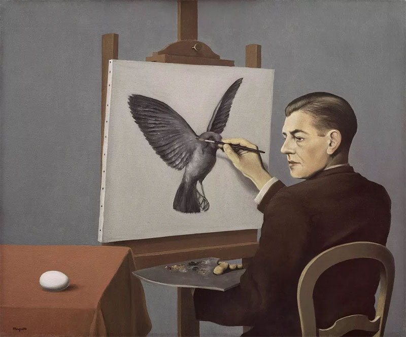
René Magritte
Clairvoyance (La Clairvoyance), 1936
Art Institute of Chicago
Partly inspired by the writings of authors like Andre Breton and the theories of Sigmund Freud (who pioneered the idea of the importance of dreams and the unconscious mind’s influence on the human condition), surrealists like Max Ernst and Juan Miro began to create the impossible imagery of the unconscious mind overlaid onto images from the material world.
Arguably, the most renowned surrealist painter, Salvador Dali, rose to prominence in the 1930s with his groundbreaking painting, The Persistence Of Memory, in 1931.
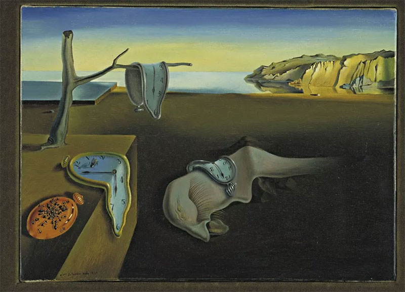
Salvador Dalí
The Persistence of Memory, 1931
The Museum of Modern Art
Surrealism continued to gather widespread popularity and acclaim throughout the 20th century and is still today one of the most popular art movements.
Famous illustrators and artists like Julie Curtiss, Chen Zhou, and Inka Essenhigh continue pushing the artform through the 21st century.
Tips & Techniques for Incorporating Surrealism Into Your Work
Understanding the fundamental elements of Surrealism will help you reach your design goals and find success. Due to its wide-open possibilities and intrinsic creative freedom, Surrealism is a graphic design trend that is ubiquitous today and will continue to be so for a long while.
Look at the following guidelines for what makes a design surrealist, and use them as a guide to creating engaging graphic design.
Unusual Combinations
A foundational block of surrealist art is combining unrelated or oppositional images into an organic composition. Think in terms of a subject and motivation. Find images that speak to both of those and then combine them in a way that makes them interact.
Methods for achieving this include collage, super-imposition, and automatism.
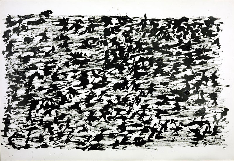
Henri Michaux
Untitled Chinese Ink Drawing 1961
Tate
© ADAGP, Paris and DACS, London 2021
For example, super-imposing a team of horses onto a line of train cars or using explosions and letters collaged together on top of a newspaper’s front page. You can create a new reality that will make a statement beyond its individual parts by taking images with different declarations and putting them together.
Make it Dreamy
Sigmund Freud’s theories on dreams and the unconscious mind and how they relate to the conscious world were paramount to the Surrealist movement.
Therefore, it’s no wonder that so much surrealist art has a dream-like quality. Finding a way to reach into that layer of the mind is a powerful tool in surrealist design.
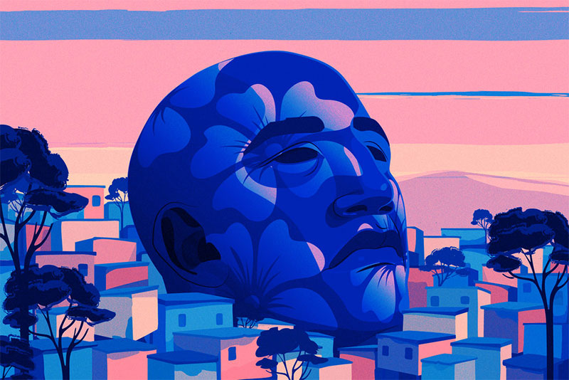
Illustration by Marly Callardo for The New York Times
Surrealism is, at its core, about bringing impossible scenes into reality.
Automatism is a surrealist method that aims to use the subconscious mind to guide the artistic process. Tapping into the subconscious can be done by keeping a dream journal, practicing attentive meditation, or engaging in free association writing and drawing exercises.
Soft Colors
Surrealism strives to blur the boundaries between the conscious world and the landscapes of dreams and the subconscious. In an effort to merge the two worlds into one cohesive context, surrealists incorporate these dreamy images into the real world.
The use of soft pastel colors helps to set a dreamlike atmosphere. Dreams and subconscious thought are by nature unrefined and resist rigidity, and soft colors suggest a blurred sense of definition and have a more open and undefined nature.
Image Source: CATHARSIS via Dribbble
While bright colors and saturated tones encourage boundaries and emphasize line and definition, a soft color palette lends itself to blending and incorporating elements, which is what surrealism aims for.
Dark and Ethereal
Think of the phrase “from the shadowy, dark corners of the subconscious.”
This intones that the realm of dreams and the subconscious are dark and mysterious by nature. Understanding these mind-states from the vantage of the conscious world is murky because viewing them in our waking state necessitates recalling a moment that resides in a different aspect of our consciousness.
Mountain music album cover design by Mitsuo
Surrealism necessarily reflects this relationship between the various levels of the mind, as it is how the artist can tap into those deeper realms.
This is why Surrealism often incorporates shadow, darkness, and an ethereal nature to its aesthetic.
Anything is Possible
There are no limits to the ideas that can be conveyed using surrealism.
Being such a prevalent type of art form, artists are free to communicate any possibility that they are capable of dreaming up, with their only limits being their own creativity.
When to Use Surrealism?
Surrealism attempts to build a bridge between our conscious understanding of the world and our subconscious desires.
So when is this useful in graphic design?
One reason to use Surrealism for a project would be to give the viewer an explanation for why they feel a certain way about something and to reinforce or negate it.
For instance, someone may love jelly beans, and so reinforcing that fondness by having a rainbow gushing out from a line of jelly beans that arcs over an idyllic landscape might be a way of supporting that positive association.
Another way that Surrealism is useful is as a shortcut to getting a complex message across.
Take an example of a promotional piece for train travel.
How can you explain that train travel is more than just A-to-B?
Incorporate images of a modern train that morphs into a majestic team of horses rising from a bed of steam for the engine car. It evokes a feeling of power and grace and a romantic tie to the past.
Examples of Surrealism in Graphic Design and Illustration
Now that we’ve covered the basics of Surrealism, we can take a look at its effective use in graphic design. Surrealism is a movement that translates into all realms of design and media, and its wide-open nature makes it a bounty for creative thought and expression.
One of the most compelling reasons to use Surrealism is that, when executed well, it is at once surprising and familiar. It hits the viewer on several levels of consciousness to create an immersive reaction.
Logo
A great example of Surrealism in a brand logo is the Dreamworks film production company. Their logo depicts a boy with a fishing pole sitting on the edge of a crescent moon.
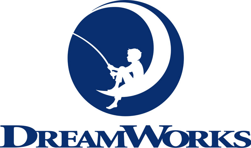
Image Source: DreamWorks
So what makes this an example of Surrealism?
The design takes two unrelated images, a boy fishing, and a moon, and puts them into context with one another. It evokes feelings of nostalgia and beauty.
It’s dreamy and soft in its palette. It succeeds in making two different ideas work together to create a new experience for the audience. It attains an understanding without explaining.
Illustration
Here is a very straightforward example of using two unrelated objects to create a new visual message. It uses similarities in the two objects’ shape and layout to play upon one another, and the end result is an image that does not exist in reality.
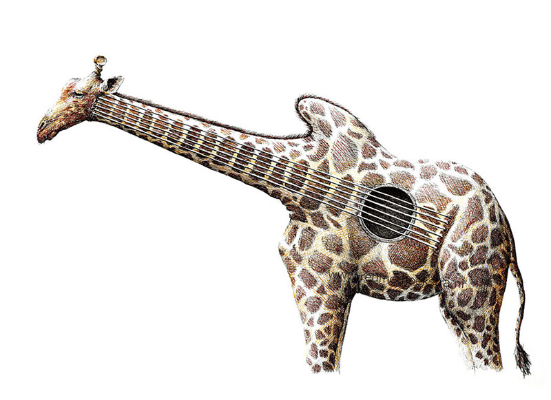
Image Source: Demilked
It’s a clear use of super-imposition and finds a way to make two seemingly unrelated objects relate to one another in a novel way.
What’s the message? Consider the feelings it evokes in you and go from there.
Branding
Using Surrealist techniques to convey a brand’s message can effectively tell a story without overt messaging.
This brand has imparted a sophisticated, urban sensibility by incorporating its product image into a nighttime cityscape. Making the bottles into a part of this landscape conveys its desired message without spelling it out to the audience.
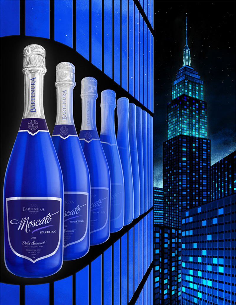
Image Source: Behance
The seamless blending of one image into another provides the subconscious link that their Muscato is for a hip, urban consumer who enjoys the big city nightlife.
Also, note that the artist uses a dark, subdued atmosphere, and even the sharp lines of the buildings and windows are muted rather than pronounced.
Web Design
Here’s an example of a company that designs websites with a surreal bent. Although they have not used Surrealism for all of their clients’ web designs, it is a common theme throughout much of their work, and examples of the surrealist style abound.
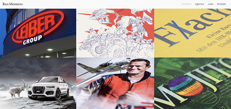
Image Source: Red Monkeys
The gallery of designs shows collage, super-imposition, and dream-like environments to reinforce the surrealist attitude.
They have found myriad ways to bring disparate images together to create a cohesive narrative embedded in a self-made reality custom-tailored to their client’s message.
Ads
This advertisement is a really clear example of classic surrealism at work in an illustration. It uses juxtaposed imagery of flying blenders and floating cupcakes to give the piece a dreamy quality.
It plays on the classic work of Salvador Dali, with the dripping chocolate reminiscent of his famous melting clocks.
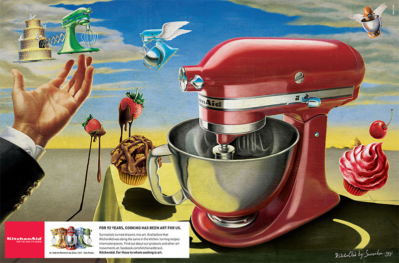
Image Source: Kitchen Aid
It’s also worth noting that the artist uses muted tones for the subject matter and a warm, almost Art Nouveau feel to the background. These are both ways to give a dream-like quality to the illustration that reinforces its surreal attitude.
Other Resources
Understanding the Surrealism art movement will help you create memorable projects that are evocative and compelling for your audience. Delving into a thorough history of Surrealism can shine a light on the motivations and meanings of the movement’s founders and vanguards.
This will ground your work in the principles and techniques discussed in this article and provide a framework for creating compelling graphic designs for your audience.
Surrealism’s foundation is connecting the subconscious and conscious mind to bring impossible reality into the real world.
Advances in graphic design technology over the past 30 years have pushed outward the boundaries of what can be done with visual media. The possibilities are limited only by one’s imagination.