Design Trend: Abstract Art Compositions
When you don’t know what to use to illustrate a design, the answer might be abstract art.
It’s a growing design trend that – when done well – uses interesting shapes, colors, and combinations to create something that means almost nothing but is visually interesting.
There’s no wonder that designers are using this concept.
For startup websites without photography to designs for companies that aren’t sure how to represent an almost-post-COVID world visually and everything in between, abstract can be a workable choice.
What is Abstract Art?
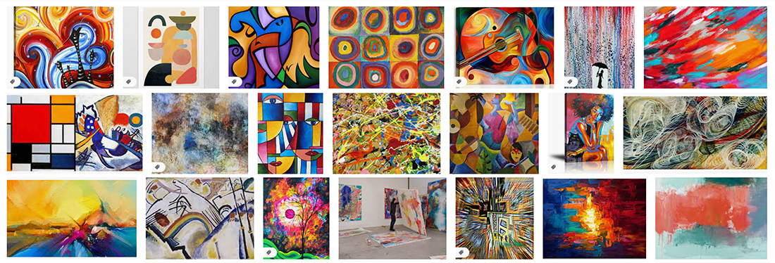
Abstract art is a creative discipline where shapes, lines, colors, and other forms are combined to create a visual element. The practice became popular at the end of the 19th century and mirrored world cultural changes in technology, science, and philosophy.
The style is characterized by a move away from reality in the design. The overall composition may be interesting but nonsensical.
Modern abstraction may mix some elements that are identifiable with others that are not. There are varying levels of abstract use, as the examples here can show.
When it comes to thinking about what abstract art is, it comes down to six key design elements. You may find some or all of them in abstract works.
- Lines: Often with a distinct character for each project, such as thin and light or thick and aggressive
- Shapes: Geometry is an important element in almost any shape form
- Color: Palettes are often packed with color choices and swing far from the minimal spectrum
- Form: The shapes and illusions created in these designs can have distinct or multiple meanings based on the experiences of the viewer
- Textures: Even for digital projects, abstract art mixes in an almost three-dimensional type of layering
- Value: Abstract works can be light or dark and often have a theme when it comes to the overall theme and design
Ways to Use This Trend
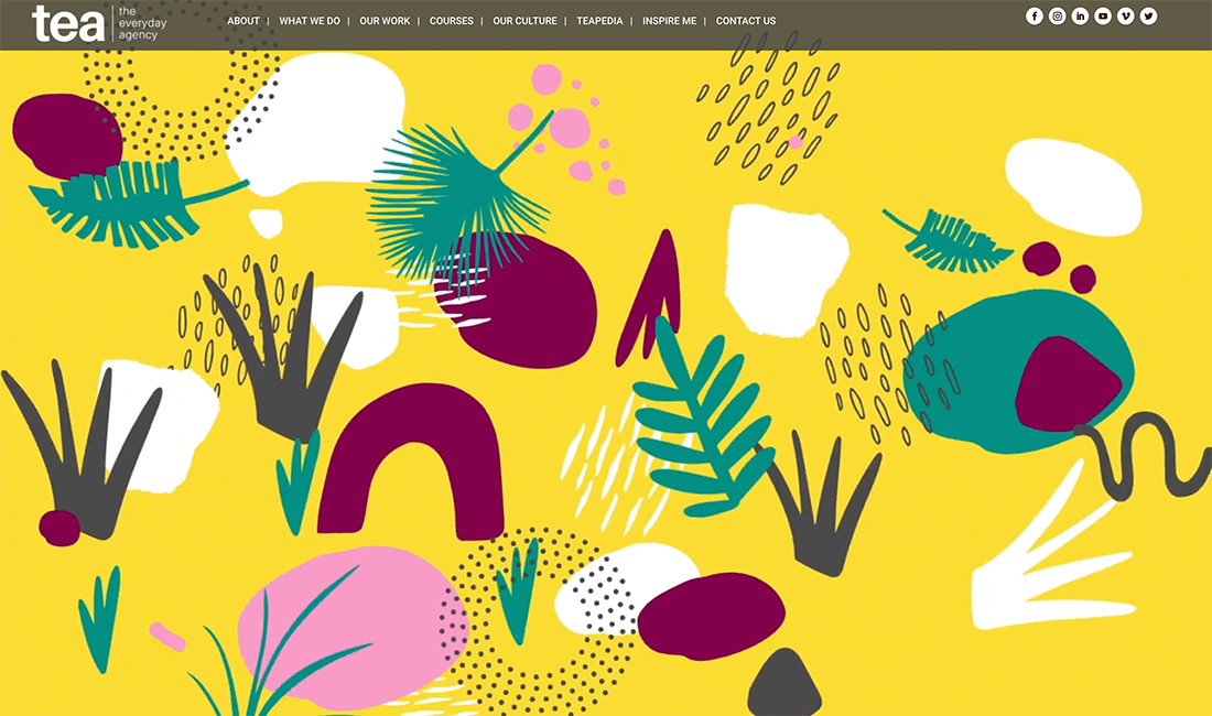

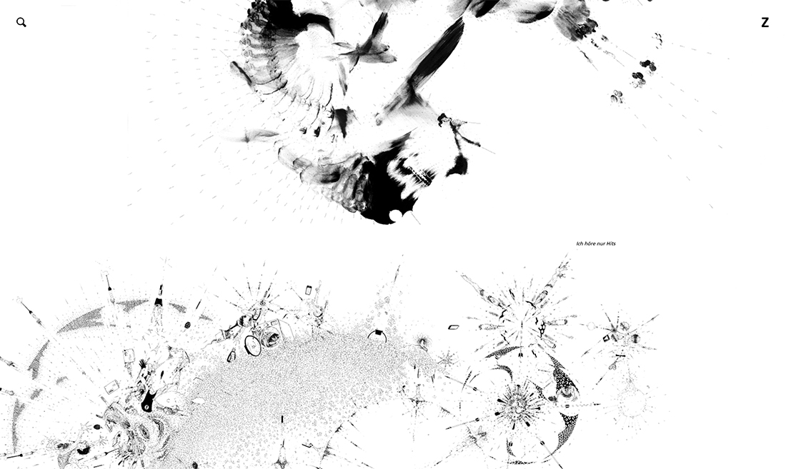
For designers, abstract art can be fun for a variety of applications and may be created as a loose or rigid adaptation of the style. The common theme is that this style needs plenty of room to be looked at because it can take a little time to really dive into.
Don’t clutter abstract elements too much or the overall design might end up looking way too busy.
The most popular way to use this design trend is as a background element. That makes a lot of sense when you think about how the visual composition works in an abstract manner.
Additionally, this trend is taking on extra life digitally with animated abstract elements. These are a lot of fun and are common if you click through most of the examples.
Each of the three examples above uses abstract art elements in different ways to show the breadth of this trend.
Tea uses oversized animation and motion with bright colors and elements that are somewhat identifiable.
7 Designs uses geometric shapes within a geometric shape as a large design element that’s in between the background and text layer.
Ralf Ziervogel uses black and white abstractions that look like inkblots as a stark background that makes you think hard about how to interact with the design.
5 Examples We Love
If you are ready to jump into the world of abstract art in design, these examples can provide inspiration with different visual concepts.
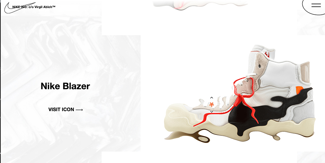
The design concept by Offten showing a Nike shoe exemplifies how to use abstraction with a low value in the background. As a bonus, the shoe also animated to an abstract form (and back) as well.
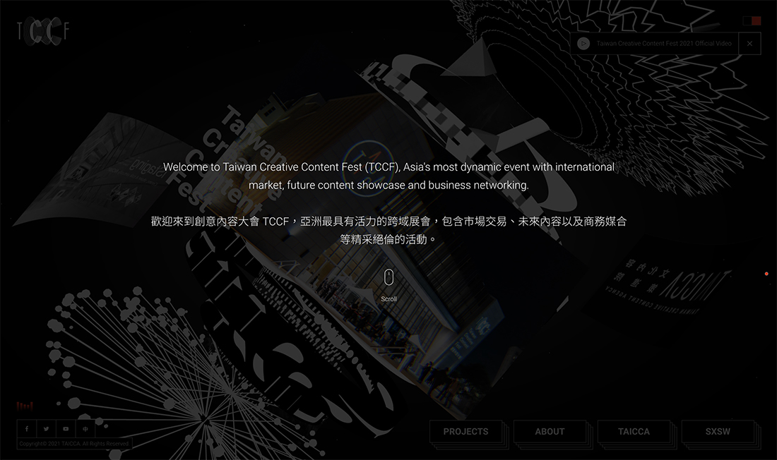
Taicca models a classic abstract pattern with a lot of shapes, lines, and forms with no discernable elements, objects, or purpose. It’s there solely as a visual element. With the extra animation, it comes to life in a fun way.
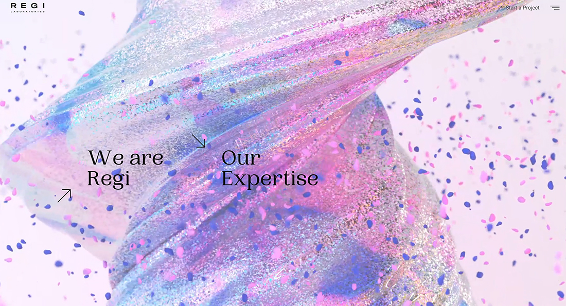
Regi uses another type of animated abstract element to make you look. The video-style animated loop includes blobs, bubbles, and maybe a glitter bomb in action. Nothing here is really anything, but you can’t stop looking at it.
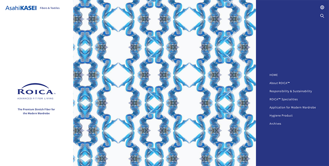
The example above from AsahiKasei is interesting because it uses a real thing to create an abstract dominant art element. The pattern in the center of the screen is actually a microscopic view of stretch fibers. (What a cool concept!)
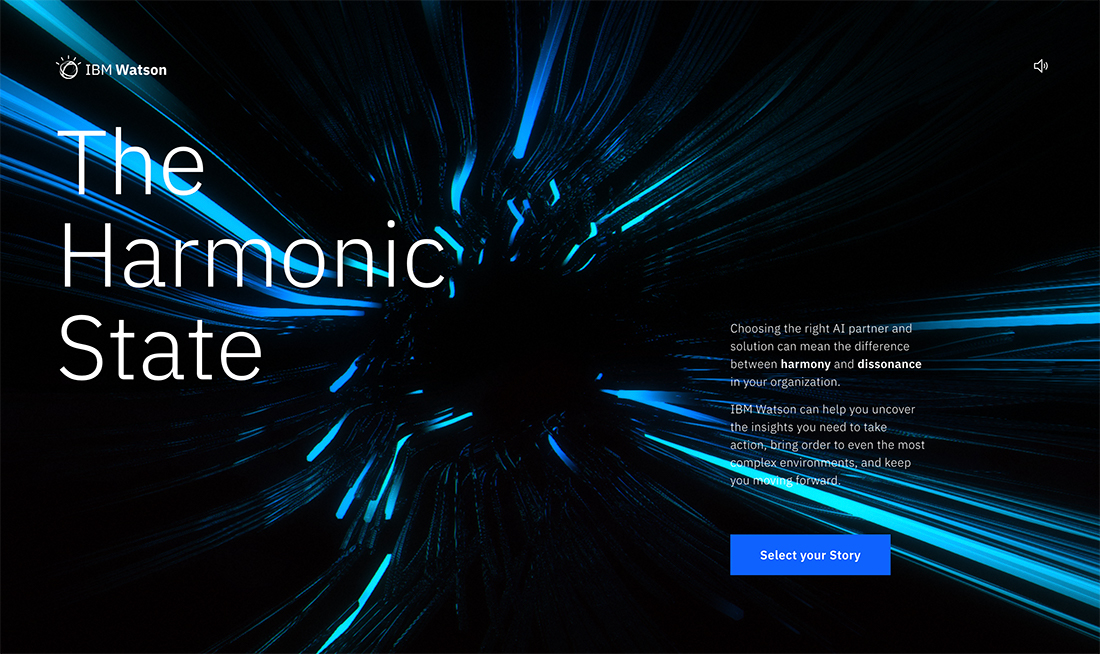
IBM Watson uses the style of abstract art we are most familiar with when it comes to websites – plenty of moving lines and shapes without a lot of meaning. It’s designed purely as a visual display.
5 Design Elements to Get Started
If you don’t consider yourself an artist, a template or background starter can help you get abstract art design projects off the ground. Each of these examples is available to download from Envato Elements.
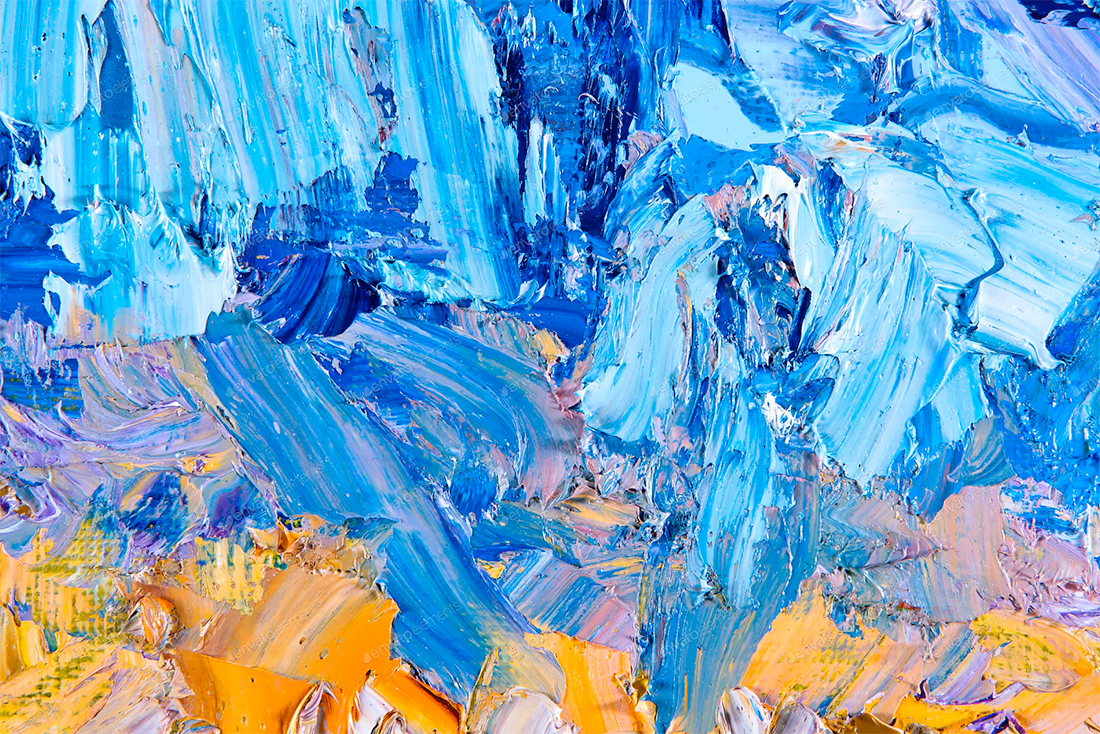
This stock photo of paint on a canvas is a great starting point for a background design element.
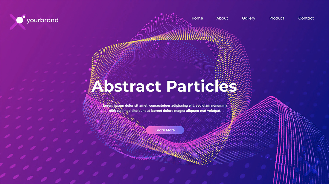
Abstract Particles is a collection of landing page elements for a website design project in this trend. The pack is vector-based and can be customized.
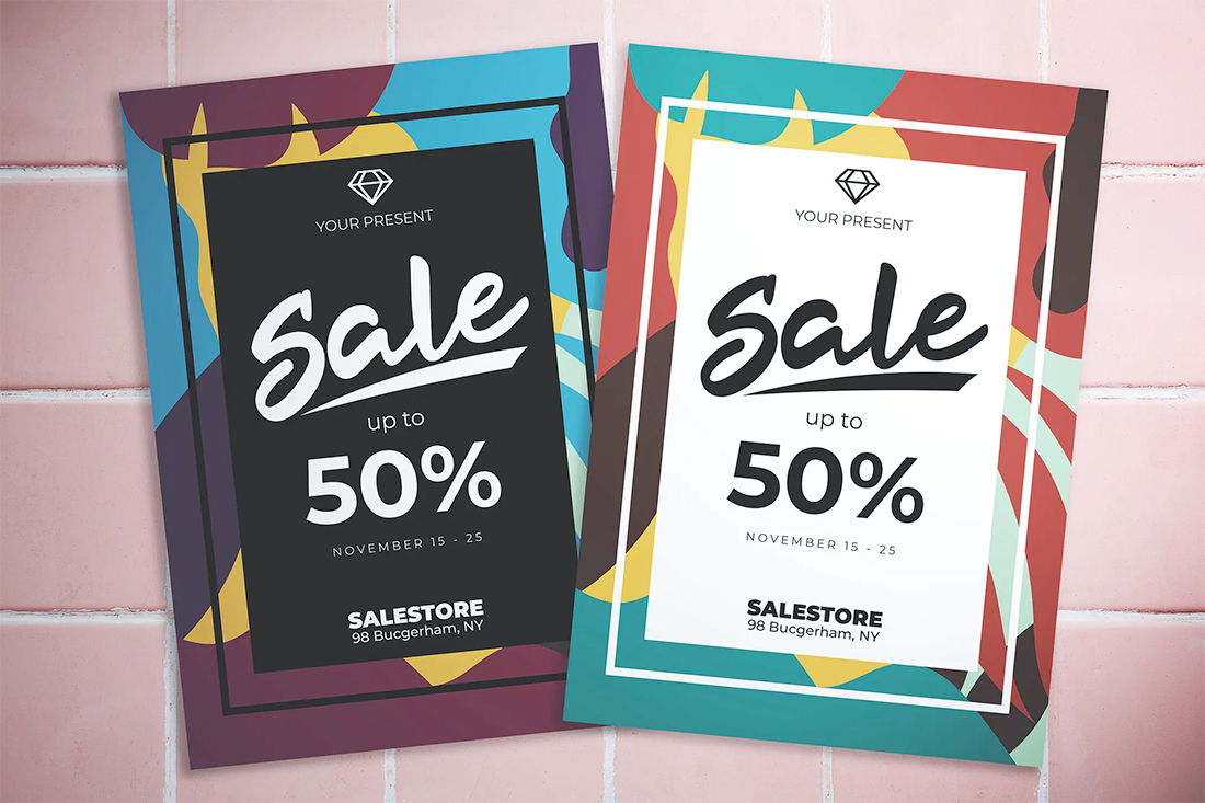
Abstract elements aren’t limited to websites. You can use them for cool backgrounds for printed design projects as well, such as this poster/flyer template.
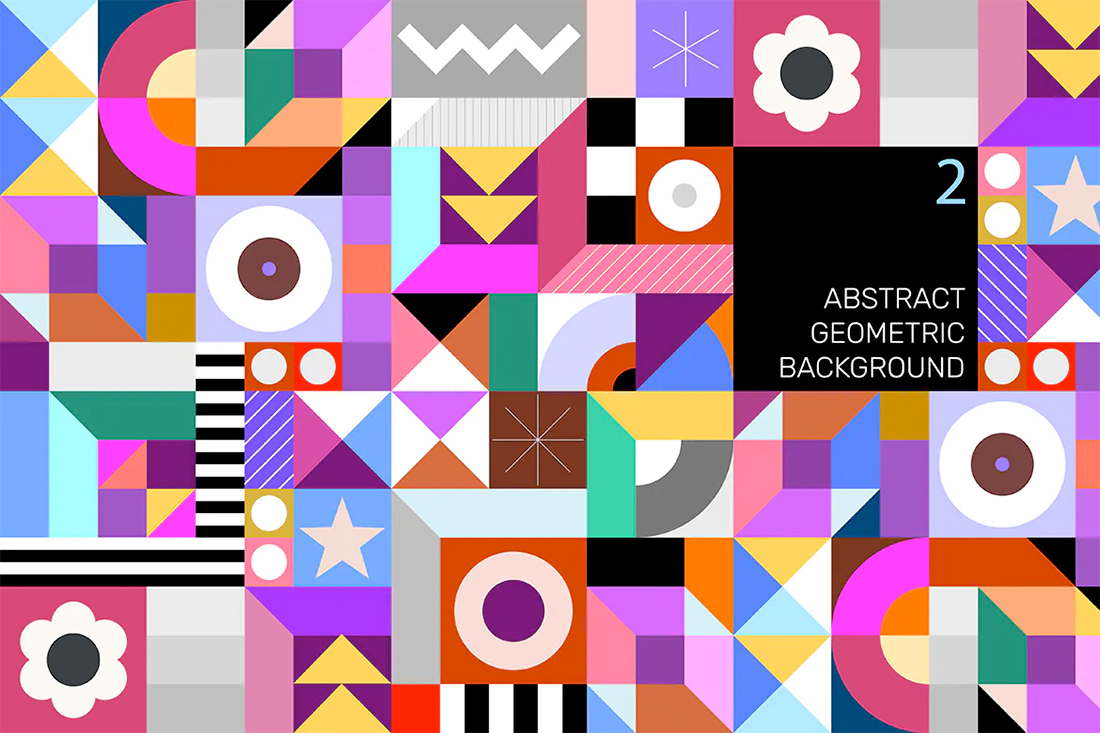
If a bold abstract theme is more of your design style this tileable background packed with shapes, lines, and color perfectly exemplifies abstract art. Use it for print or digital elements.
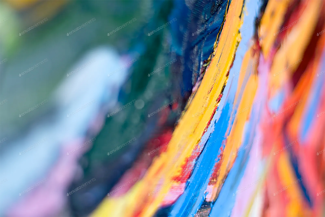
A close-up view of an oil painting has no meaning alone but could serve as a beautiful background element in an abstract style.
Conclusion
Abstract art is a fun trending design style that has a lot of practicality. The challenge is that with so much going on (for the most part) in these backgrounds and elements, you have to take special care with the rest of the design so it doesn’t get visually overwhelming.
Abstract art continues to grow in use and it’ll be interesting to see how this design trend – particularly with animations – continues to grow and expand.