Exploring the Use of Sticky Vertical Navigation in Web Design
Navigation in website design typically only includes the same basic menu items, modestly sit in the header, and always greets the viewer from the outset. Since the popularization of the hamburger button, nothing earth-shattering has happened in navigation design.
But some web designers have dared to change that by using the unconventional yet elegant sticky vertical menu. They tend to be more compact, minimal, and beautifully make use of vertical lettering.
There are several reasons why some websites will choose to use vertical navigation:
- First, they are compact, making them ideal for those who need or want to use up the entire hero section of a website.
- Second, their sizes are typically suited for use on both desktops and mobile devices alike.
- Third, thanks to their stickiness, they are perfect guides and anchor points, making the user experience much more comfortable.
- And finally, continually displaying the logo or name of the website is an easy way to enhance brand identity.
To experience the vertical navigation for yourself, take a look at the inspiring examples we have collected for you below. You will love the results!


Austin McKinney
Our first stop is to the personal portfolio of Austin McKinney. Here, the vertical navbar includes only the essentials: a hamburger button, links to social media profiles, the logo, and the designer’s occupation. As well as a beautifully designed vertical navbar, this website is also the perfect blend of ultra-minimalism and ultra-narrow design.

Editorial New
The creators of Editorial New show us that vertical navigation works regardless of color, stylistic options, or interactive details. Their navbar includes just one element – the hamburger button. It opens a lovely slide-out menu with a table of contents. Since the navigation has been stuck to the left side of the screen, users always have quick access to the menu wherever they are on the site.

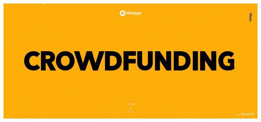
The Crowdfunding Formula
The vertical navbar of Crowdfunding Formula is located on the right side of the page. Although we are not accustomed to seeing it there, it nevertheless works perfectly well. What’s more, thanks to the contrasting orange color of the menu button, it naturally catches an eye.
NSDI
The team behind NSDI uses a vertical navbar for displaying not just the hamburger button, but also the pagination of a full-screen slider. Another distinctive feature is that all of the elements move with the user. Here, they have an ultra-narrow vertical navbar and corner navigation that co-work together in order to create a comfortable user experience.

Villa Covri
The official website of Villa Corvi has not one but two ultra-narrow vertical navigation bars. The first is used for displaying their social media links, whereas the second houses the button for activating the inner menu. Along with the upper header, these two strengthen the subtle boxy feel of the website. Note that only the right panel sticks to the screen and moves along with the user.

TedCo
Much like Editorial New above, TedCo’s vertical navbar is a part of the corner navigation, looking elegant and informative, and completes the sophisticated design of the UI. The vertical navbar stays where it is, giving users the always useful focal point when navigating a website.

Rogue Studio
The detailed navigation bar of Rogue Studio is an excellent example of a solution where all of the menu items are on full display to the audience. Although the component looks more cluttered than our other examples, it has one significant advantage over them. It gives users everything that they need to navigate the website without having to perform any secondary function.

Making navigation vertical can breathe new life into any website. Even though they are not something new, they feel somewhat bold, refreshing, and worth trying out.