5 ways to get the most out of your website’s homepage
Your website’s homepage is like the virtual storefront of your business — it will provide that all-important first impression, so you need to get it right.
Having a great homepage can help you build trust, give a great first impression, and help you earn more sales. In this article, we’re going to outline how you can get the most out of your homepage to give your business the best possible chance of success.
Let’s dive in!
Target the best keywords (but avoid cannibalization)
If you’re running an eCommerce business, you’ve likely heard of search engine optimization (SEO). This involves creating content and optimizing your website to give your company the best possible chance of ranking highly on relevant search engine results pages (SERPs).
In order to know what kinds of phrases you should be targeting with your content and website copy, it’s important that you conduct some keyword research.
Keyword research is the process of identifying the words and phrases people are currently typing into search engines to learn more about what you do. To start, come up with a list of terms and phrases relevant to your industry. Then, plug them into a keyword research tool like Google Keyword Planner. This will provide you with a list of keywords you should be working into your copy in an effort to rank well for relevant queries.
But you need to be wary of keyword cannibalization. If you optimize multiple articles and web pages for similar keywords, you’ll reduce your own chances of ranking highly on the SERPs, as Google won’t know which of your pages is the most suitable. So, it’s best to assign every keyword to just one page on your site.
Highlight your credentials and accolades
People will only want to spend their money with you if you’re able to earn their trust. One of the ways you can do this is by highlighting your credentials, accolades, media mentions, and reviews on your homepage.
To give you some inspiration, let’s break down a few examples.

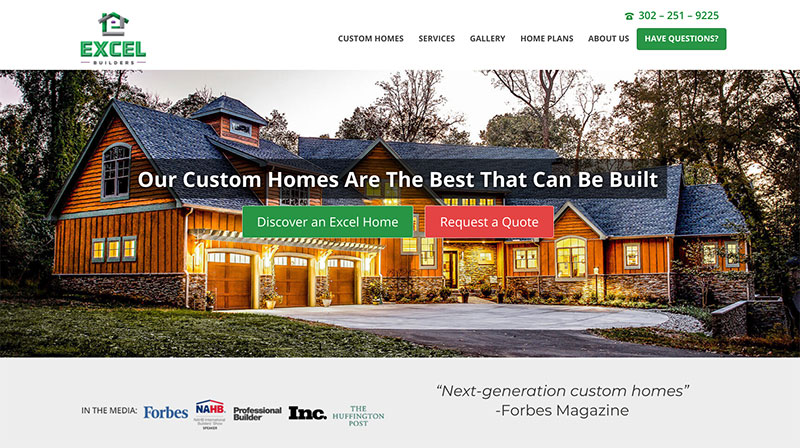
For instance, Excel Builders, a custom home building company, highlights their media mentions on their homepage.
Notice how well-known these particular companies are — by showing that they are trusted by Forbes, The Huffington Post, and more, Excel Builders boosts their authority and shows that they are a trusted leader in homebuilding. This is the type of homepage marketing that will lead to more sales.

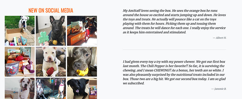
BullyMake, a dog toy subscription service, also highlights its past successes on its homepage using user-generated content. Consider doing the same by collecting social proof through Instagram.
They have a series of reviews and cute images of customers’ dogs using the BullyMake toys. Think about how important this is for a dog toy subscription box — owners want to make sure that these toys are fun, safe, and engaging for their pups. And, by highlighting consumer reviews and accompanying pictures, BullyMake proves just that.
Ensure people know how to take the next step
When people land on your homepage, make sure that it’s as easy as possible for them to take the next step. This will increase your chances of making a sale!
You want to make it as simple as possible for people to find more information or move forward in the buying process by showing off a clear CTA, having a sophisticated search feature, or making it easy for them to get in touch.
Let’s break down a few examples of sites that do this well, so you can get plenty of inspiration.

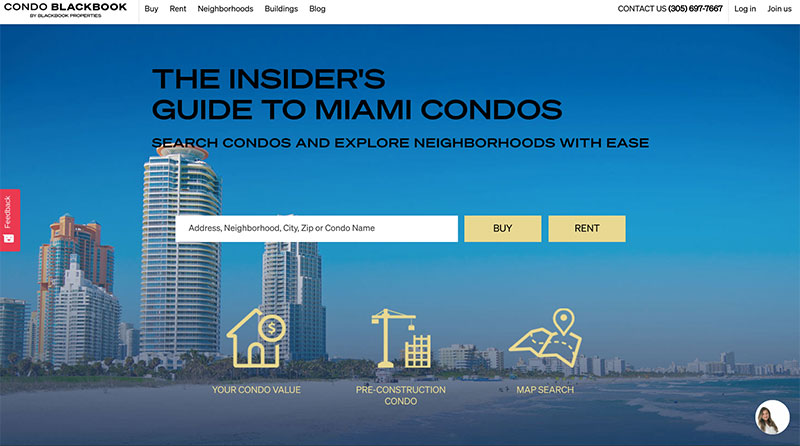
Take a look at how CondoBlackBook, a Florida real estate company, makes it incredibly easy for prospective customers to take the next step from their homepage.
Right off the bat, you can see two straightforward options: buy or rent. Whatever a potential customer is looking for, it’s very clear to them what actions they need to take to achieve their goals. All they have to do is type in the name of a city and confirm exactly what they’re looking for. The fact it’s so easy is likely to lead to a lot of conversions for the company, so consider how you could replicate something similar for your site. Is there a way you could implement an easy-to-use, but incredibly helpful search tool that will help your prospective customers find exactly what they need?

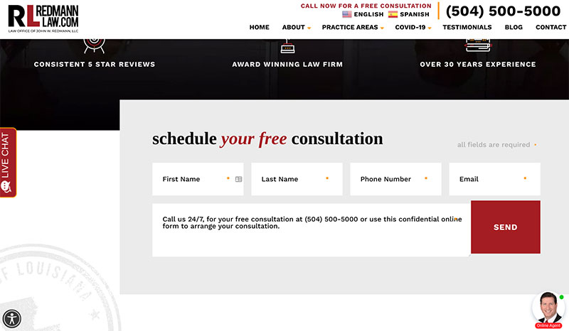
This isn’t the only way you can quickly move people through your sales funnel, either. For instance, the Law Office of John W. Redmann, L.L.C. encourages prospective customers to schedule a free consultation instead. This is likely to be a more suitable approach if you provide a service that requires you to learn more about a client before agreeing to work with them.
But notice that the law firm still makes it incredibly easy for people to agree to the next step — they don’t ask for thorough details about someone’s case right off the bat. Instead, they simply ask for their name and contact details. This is likely to help get a lot more people through the firm’s door, as someone can complete this stage with minimal time and effort. The company’s lawyers will then have the perfect chance to speak to potential clients one-on-one to build a relationship with them.
When it comes to designing your homepage, you need to make things just as easy for your customers — you’ll be rewarded with plenty of sales.
Make sure your homepage copy is engaging
Ensuring your homepage offers an engaging user experience is incredibly important. It can make or break a sale.
To ensure your homepage is populated with engaging copy that will compel people to make a purchase, you should focus on the benefits of your products or services, showcase your company’s personality, and write about the results you’ve gotten for previous customers.
If you haven’t decided on your brand voice yet, you should focus on finding this first. Think about what kinds of values and personality you want to portray, and then put together a list of words that should describe the tone you use to write your website copy. Here are some examples:
- Casual, but not too relaxed
- Passionate, but not aggressive
- Funny, but not informal
Having a conversational tone in your copy is also a great way to make it more engaging. But, there can be levels to using a conversational tone. For example, a law firm might avoid jargon, while writing in a professional but friendly style. Meanwhile, a bakery could write in a more casual way with colloquial language or even informal acronyms. It’s all about writing in a style that’s going to appeal to your target audience.
Use visuals that show what you’re all about
Strong visuals are important for grabbing people’s attention and showing them what your business is all about. You can use imagery to put a face to your business, show people what it’s like to work with you, or show your brand’s personality.
Let’s break down a few examples of businesses that do a great job of using homepage imagery to earn their customers’ trust and show they’re great at what they do.

Take a look at how Guardian Home Care, a nursing agency based out of Toronto, shows who they are using their homepage’s imagery. The image shown here features a cheerful nurse and a smiling, older patient. Healthcare is a difficult subject, and it’s hard to trust a third party with the safety and health of your loved ones. By using comforting imagery of their target customer and their employees, Guardian Home Care shows their compassion and authority.
Similarly, Venngage, an online infographic maker, engages their potential customers with their homepage’s imagery.
Many people don’t know where to start when it comes to creating infographics and incorporating them into their content. By using visuals that showcase what Venngage is all about, the company is able to engage their viewers and show that infographic creation can be easy for everyone. Using visuals to show how simple their tool is can help to engage customers and encourage them to make a purchase. If you want to replicate this, consider using short gifs or videos to show how your products and services work. This will help you to appear helpful, savvy, and creative.
Summary
There are likely to be lots of ways you can improve your website’s homepage and convince people to make a purchase. In this article, we outlined a lot of different ways to make the most of your virtual storefront, including by targeting the right keywords, highlighting your accolades, using imagery to show what you’re all about, and more.
No matter where you are in your eCommerce journey, your website can be improved — better get to it!
Author bio
 Alex Ratynski is a Content Strategist at Loganix, an SEO fulfillment partner that works with agencies and marketers. The company focuses on helping businesses to improve their online visibility, so they can grow and reach their goals. If you enjoyed this article, visit the Loganix blog for more expert advice.