How to Design a Product Page: 6 Pro Design Tips
In this video, Casey from the WebFX Internet marketing team will go over how to design a product page.
https://youtu.be/eJLkJ6hYtiI
Transcript:
Nothing beats the excitement of seeing a package at your door. But let’s rewind.
A lot of factors came into play to get this person from searching for a product to purchasing one.
One very big factor is how you optimize your product pages to make buying something online both tempting and easy.
In this video, I’m going to give you six in-depth tips on how to design a product page, so the next package people receive is something they bought from you.
Let’s jump right in!
Time To Level Up Your Sales
Our long list of services help you make waves in your industry and increase metrics that matter most - like sales.

6 product page design tips
1. Write captivating product descriptions
You can’t stand over someone’s shoulder and tell them how great your product is when they’re shopping from their computer.
Let your product descriptions do that!
Using the manufacturer’s description or copying and pasting between ecommerce product pages is easy, but it’s not always effective.
Think about why people should buy your stuff over someone else’s.

Take this lipstick as an example. You could describe it as a pink, matte liquid lipstick. Or you could say this liquid lipstick is the perfect pop of color that’s sure to stay on from morning to night. Its matte formula is so light you’ll forget you’re even wearing it.
No matter what you sell, think about what makes your product the best product and write it down. Don’t forget to highlight how your product addresses customer pain points.
2. Include important details in your product descriptions
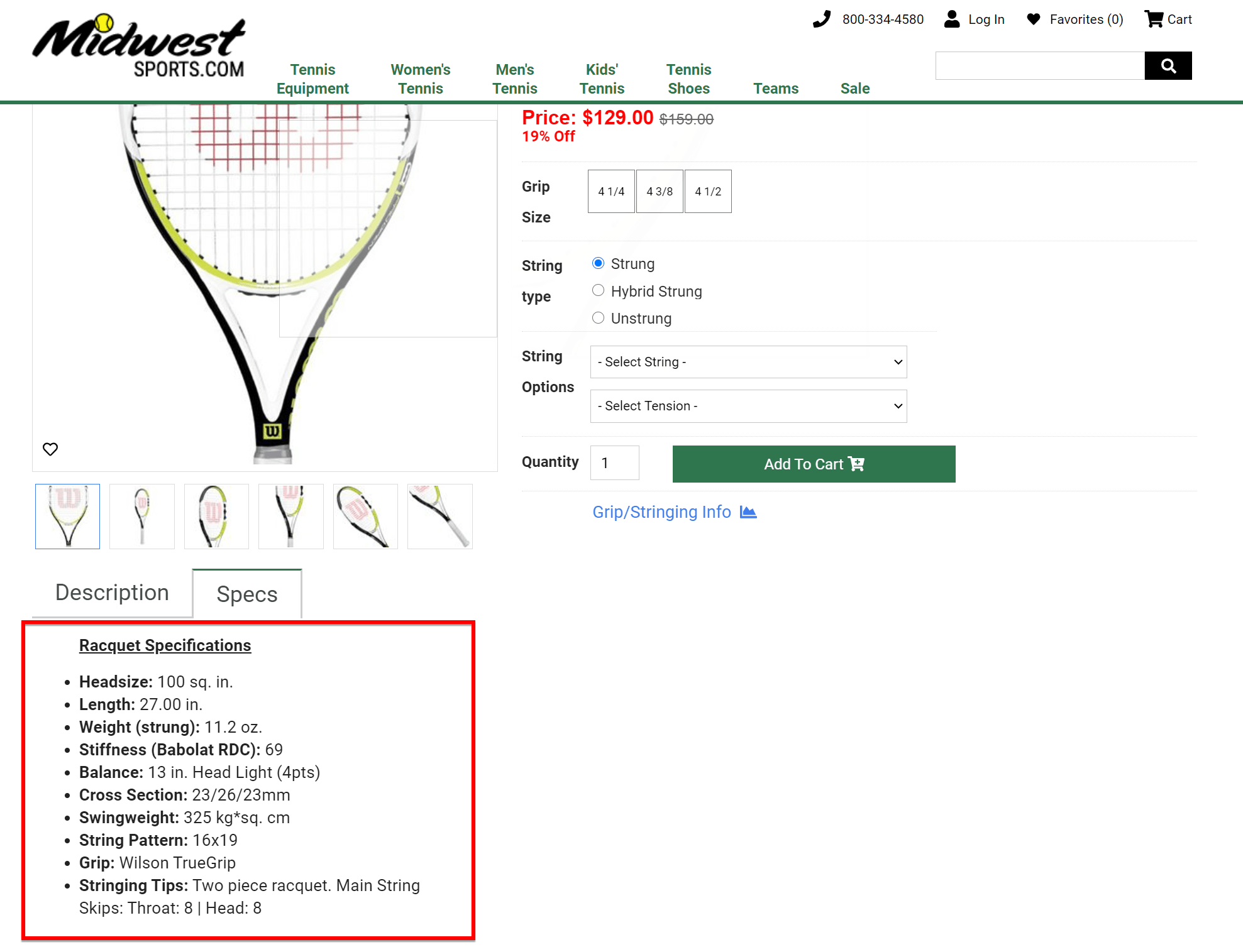
If I’m shopping online for a tennis racquet, I need to know a lot of details to help me determine if it’s the right fit.
In this case, I need to know things like the size, weight, and materials it’s made from.

I can’t physically pick up the racquet and feel if it’s right for me, so I need you, the seller, to give me as many details as possible.
This goes for any product online. It’s super important for you to include detailed specs, so people can judge if what you’re selling is going to meet their needs.
If you sell clothes, be clear about the fabric, colors, sizes, and care instructions.
If you sell auto parts, explain which types of cars they work with, the weight, the dimensions, and anything else people need to know before purchasing.
Be as specific as you can when writing out your product descriptions.
3. Take excellent product photos and videos
Again, people can’t physically get a feel for your products when they’re looking at their phones.
You can use product photography and videography to help give more context to your ecommerce product page.

For those who want to take their own photos, I’ll give you some quick tips for capturing some captivating photos and videos.
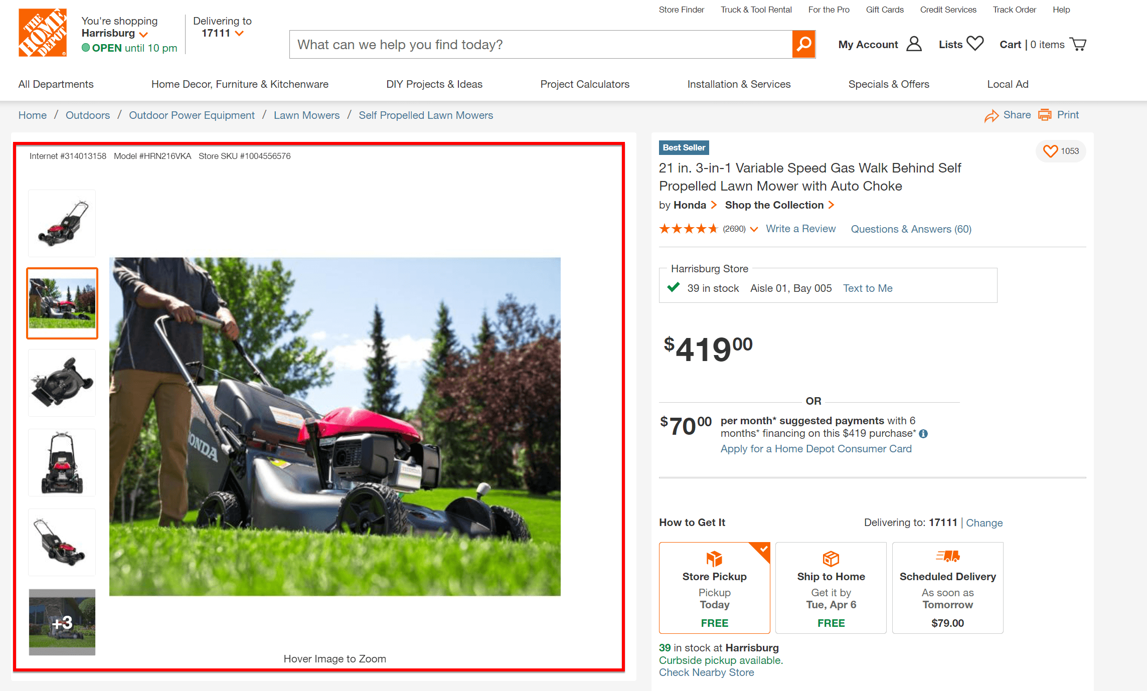
- Capture all angles of your product. Whether you use 360 video or include a gallery of photos, make sure people clearly know what your product looks like inside and out, so they don’t get any surprises when it arrives at their door.
- Show your product in its natural setting or in action. If you’re that auto parts retailer again, your customers may find it helpful to see what a set of rims or a muffler looks like on an actual vehicle. You can also record a demo video explaining how to install your product to cover all your bases.
- Decorate your set. At times, it may benefit you to just shoot your photos and videos on a plain backdrop. But you can communicate your brand’s personality and make your product more enticing by adding some props and decorative accents to your set. So maybe you ship desserts. You can shoot the product on a serving board in some sort of kitchen setting to grab people’s attention.
Using photos, videos, and product descriptions is essential to your website product page design. But there’s still more to learn.
4. Use ecommerce SEO to get your products ranking
Product SEO is essential to bringing in more customers.
If you’re not familiar with SEO, it stands for search engine optimization and is the practice of writing and/or editing your pages, so they can be found in search engines. Now, the key here is to optimize for people first, so you don’t want to make your page great for search engines but unreadable for people. That wouldn’t help your SEO, anyway.
Keywords are a major part of ecommerce SEO. When people search for products with Google, the words they type for their searches are the keywords.
For your product page to show up as a result, you need to use keywords in places like:
- Your title
- Description
- Image alt text
You can either use short-tail or long-tail keywords for your product SEO.
Short-tail keywords are shorter words or phrases with a high search volume, and they’re probably not the best option for your business.
Long-tail keywords are—as they sound—longer. They may not have a high search volume, but they tend to be what people search for when they’re ready to shop.
So if someone searches with the short-tail keyword, “camera,” they could be looking for a variety of results. Maybe they’re interested in learning how to use a camera or just want to look at photos of cameras. Either way, they might not be interested in buying a camera.
If someone searches using the long-tail keyword, “Canon video camcorder XA30,” there’s a higher chance that they are looking to buy that specific product because they’ve done the research to know which model and type of camera they want.
5. Make it easy to browse products
Listen, I know you want people to love all of your products, but it’s not always going to happen. Something may not be the right size or color they’re looking for, and that’s okay. Your product page content won’t work for everyone.
But you can make it easier for people to browse everything you offer if they’re not satisfied with one specific product. Maybe someone is looking for a pair of headphones, but they click on a pair that isn’t exactly right for them.
First, to stop them from leaving your website, you can suggest related products on the same page to help them quickly jump to something that might meet their needs.
Second, you need to give them an easy way to go back to your main product page. In addition to having an organized navigation menu at the top of your page with links to all of your product categories, you need breadcrumb navigation for people to follow.

So to get to a product page for headphones, someone may have clicked a link to your “Electronics,” then “Audio Devices,” then “Headphones,” then “Headphone Model A.”
Breadcrumb navigation lays out that path with clickable links, so people can go back and forth fairly quickly.
Headphone Model A might not work, but Headphone Model B may do just fine.
6. Collect and share reviews on your website
These headphones are super comfortable and lightweight. The sound quality is great for the price, and the Bluetooth feature works impeccably well. Five stars.
My final recommendation when you want to learn how to design a product page is to collect reviews.
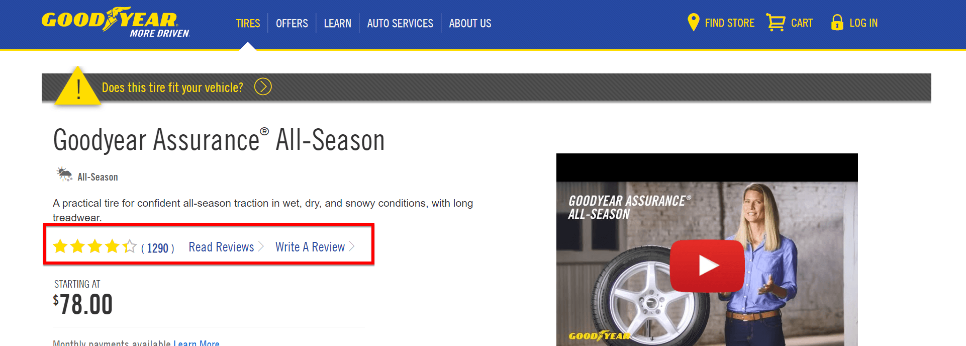
I can’t tell you how many times a set of good reviews has convinced me to actually spend my money. And yes, there have been times when bad reviews have pushed me in another direction.
Reviews can help people understand how your product works in a real environment. They help create trust between you and your customers.

As valuable as a product demo is to your product page, good reviews can build on that value because the people saying nice things aren’t paid to do so.
If you have a great product and an experienced customer relations team, you shouldn’t worry too much over bad reviews. As I said before, you can’t please everyone.
No matter if your review is good or bad, your team should respond to show that you are paying attention to your customers.
If you notice an influx of bad reviews, you may want to dive deeper into the reasons why.
And that’s it for my tips on product page design!
Before you leave to start selling more of your products, take a second to subscribe to our YouTube channel and our email newsletter, Revenue Weekly!
Thanks for watching!