The Biggest Web Design Mistakes to Avoid
Chances are, if you don’t like a company’s website, you’re not going to stay on it for very long. Constant disruptive pop-ups? Annoying. Wonky navigation bar? Forget it. Even the slightest flaw in the design layout can quickly drive users away.
In order to create the most seamless user experience possible, let’s go over the biggest web design mistakes to avoid:
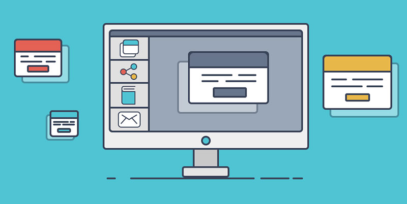
Navigation issues
We now live in a world where everything is available at your fingertips. If a user can’t find something interesting on your site within 15 seconds, it is almost certain that they will abandon it.
Efficient website navigation allows users to move from one page to another with ease. If your website has issues with its navigation, visitors will not be able to find the content they are seeking. A poor navigation experience will almost guarantee no conversions.
How can one avoid making undeniable navigation mistakes? Well, it’s pretty simple – streamline your main navigation bar and get rid of clutter. Using a clear and intuitive approach that follows a structure will more likely lead users to the information they are looking for. For example, use buttons only for Calls-to-Action, and make hypertext on every page stand out.
Content that isn’t skimmable
Your website content has to be skimmable because users simply don’t have the patience to stay on a single page for very long. For instance, when they land on a website with paragraphs and paragraphs of text, they will be diverted from the tedious and intimidating experience. Who likes to read through lines of text to find what they are searching for?
Keep in mind that writing for a website is different from writing for print and other materials, therefore it should be easily skimmable.
What are some solutions to making sure your content is skimmable?
- Utilize links instead of additional text when you want to provide users with more information
- Your content should consist of sub-headings, bulleted lists, succinct paragraphs, and featured keywords
- Take advantage of photos when applicable to get points across
- Adhere to a modern, clean writing style
Persistent pop-ups
Rather than finding pop-ups helpful, many visitors find them annoying because they block their view and interrupt the website experience.
Pop-ups can distract users and steer them away from what they originally intended to do on your website. This results in an overall poor user experience.
Many users also proceed with caution and think of pop-ups as malware or a phishing scam since they are being forced to take action. This will lead to a high bounce rate because users who don’t want to take the risk will leave your site.
How can one avoid making mistakes in the use of pop-ups?
- Setup pop-ups only when you’re sure that they are offering something of value to users. For example: a discount code, email newsletter subscription, or to conduct a feedback survey.
- Design pop-ups that look like they belong on your website
- Make sure the pop-ups you implement are responsive across all devices
- Less is more – don’t ask for every piece of contact information right away
- Be sure to include an easy way for the user to exit out of the pop-up by placing an obvious “X” button in the top-right.
- Timing is everything! If you time your website’s pop-ups well, you will create a smooth on-site experience for your users and increase the chances of them completing a Call-To-Action.
Finally, be strategic about it – don’t set up pop-ups on every page of your website (it’s not necessary). Learn more here.
Weak visual content
It’s not rocket science – if your website looks outdated and unappealing, it will negatively impact your business. In this day and age if your website isn’t updated and visually appealing, you won’t be taken seriously.
Have you ever visited a company’s website that looks like it hasn’t been updated since the early 2000’s? If you have, I’m sure you didn’t stay on it for very long. Chances are you weren’t even sure you could trust the company’s website. Outdated layouts, terrible color choices, and poor quality images or videos are huge red flags to consumers.
Here are a few tips to make sure your website is visually strong:
- Less is more
- Stray away from distracting and unnecessary designs
- Do not use more than 5 colors on a single page
Poor or no search functionality
If you’re like most of the population, you don’t like wasting your time. This is why it’s so important to make sure that your company’s website has a search bar or some kind of search functionality. No one enjoys reading through pages and pages of text to find what they’re looking for.
An effective search bar can generate an increase in conversion and a decrease in a website’s bounce rate. Whereas a poor search experience can negatively impact your business and send your potential customers running for the hills.
Let’s go over a few ways we can implement this:
- Place your search bar in an obvious spot on the homepage
- Prepare for visitors to not type in perfect keywords
- Boost input chances by using predictive search
There are many ways to make this happen – a widget, working with a developer, or adding a custom search to your website (which is what we recommend!).
Non-responsive and non-accessible web design
Whether it be a large desktop monitor, a tablet, laptop, or smartphone screen, responsive design optimizes a website to the user’s screen. This allows for them to have the best quality website experience possible no matter what device they are using. If a company’s website automatically adapts to the user’s device, they will spend more time browsing your site and staying engaged.
However, if a website is non-responsive it will:
- Be difficult to navigate and find Call-To-Actions
- Result in an unattractive website layout leading to low-quality images and poor readability
To take things one step further, it’s important to consider website accessibility as a whole. Too many companies stop at “responsive design” and don’t realize that their site is not accessible for those with disabilities. This means your site won’t work for those with screen-readers, your forms may not be easy to understand, those with motor disorders aren’t taken into consideration, and so much more. This also opens you up to a lawsuit if you’re not complying with ADA regulations. An ADA lawsuit was recently filed against the Golden State Warriors basketball team’s website in January of 2021. But this is not uncommon- in 2020, Total digital accessibility lawsuits exceeded 3,500. According to Neil Dymott attorneys, ADA plaintiffs usually argue they are entitled to $4,000 for each violation.
Consider using an automated accessibility solution such as accessiBe to be sure to result in a positive user experience for all of your website visitors. This solution in particular ensures ADA and Web Content Accessibility Guidelines (WCAG) compliance for your site, and will keep the lawsuits away.