9 Things Not to Do While Using Animation on Your Website
Animation can be used in various places of a website for various reasons, such as educational purposes. People have understood the importance of using animation in their websites. Such animations can make people understand certain features or functions of a product. But, there should be a limit as to how little or much you can use animation on your websites. Animation has been one of the biggest trends in web design. As such, there is a chance that the visitors to your website expect to see some kind of animation when they visit your website.
There are ways as to how you should make use of animation on your website. Using too much animation, or in some cases, no animation, can damage the reputation of your website or hurt your conversion rates. It is best to strike a balance between too much and too little, and use animation only where appropriate. Let us see some of the things you should not do while using animation on your website.
1. Ignoring the basics of animation:
You have to remember that animation comes in different shapes and sizes to suit your requirements. It can range from a tiny animation on a button when you click it or a full range animation in the background. You can use this full ranged animation in the environment as the website background as well. You can use animation to display them as a reaction to your website visitor’s behavior. For instance, you can use animation to reveal particular objects when the visitor of your website is scrolling through your website.
You can choose to apply animation to either the tiniest element of your website or the website background that would occupy the entire screen. It is essential to understand the capability of animation so that you can use it strategically on your website. So, it becomes very important to understand the basics of how the animation should be used. This can be done only when you know the basics of the animation. If you don’t understand how animation works, you wouldn’t be able to use the animation at your disposal, and the animation would stand useless on the site.
2. Moderation is the key:
Moderation is always the key because the excess of everything is poison. It is not advisable to bombard your website with animation at every nook and corner of it. It would be best if you controlled yourself from using animation on every web page of your website. If you use it heavily, the user may find it annoying. And your website can become heavily loaded, which may not render the animation well on low bandwidth. This may impact the performance of the website in so many ways. Moreover, a heavily loaded website can turn off a user, and you may lose your valuable customers and the traffic from your website.
On the other hand, we have been to websites that use zero animation, and we know how dull that website looks. For websites from specific domains, they don’t require animation. In such cases, you can avoid using animation. But when it is about striking a balance between the two, it is always good to use animation in moderation. Light animation here and there on the website does not hurt the performance or distract the user. Moreover, the user’s browsing experience would be seamless and smooth, even if your website employs animation. This makes sure that the website isn’t massive and renders well even on low bandwidth connections.
3. Not justifying the purpose of animation:

It is essential to maintain a healthy understanding of what is the reason behind using the animation on your website. You should be able to justify the usage of animation on your website using strong reasons. The animation should have a specific task to accomplish on your website. For instance, you can use animation to guide the visitors by displaying when the user should click or scroll through the website. Animation can also be used to include storytelling in a very subtle way, or you can use it to uncover certain things on your website using animation.
When you use animation without a specific purpose behind using the animation, you don’t know how to use the animation successfully. And anything without a purpose loses its value, meaning, and importance of itself. It would be best if you understood why you want to use the animation on your website. If you have figured out the reason behind using the animation, it is necessary to implement it in moderation. It would be best if you never forgot the importance of moderation.
4. Animating everything:
It is evident that animating some aspects of the website works well and gives out a good impact. But, individual components don’t give out the effects of animation well. Hence, it would be best if you always focused your attention on the elements that behave well with animation. The animation should be used with the components of the website that trigger a specific behavior. For instance, you can use animation on the navigation button, CTA, and more.
Other elements that explain the direction to the website user can also have animation. For instance, you can choose to animate the background scrolling or arrows that show how and where the user should click next. We all have seen progress bars being animated into various things like a caricature dancing or percentage of the progress bar. You can come up with multiple ideas to introduce animation in the progress bar. Animating the pop-up boxes and message icons is also an excellent way to introduce basic animation on your website.
It would be best if you did not use animation to affect the element’s functionality or harms it somehow. For instance, you cannot choose to add animation to the website’s textual content, which would make the reading difficult for the user. Moreover, it would be best if you always assured that you don’t add animation where you are supposed to get the input from the user. Because using animation in such a place would distract the user mostly.
5. Complicating the content:
One of the best ways to introduce animation on your website is by simplifying the content of the website. For instance, if you have a website that shows how a product is made in the factory, you would typically use textual content for an explanation. This textual content can contain bulleted points, tables, or paragraphs, which would help the user understand the entire process. But sometimes, this way creates a kind of monotonous form of the content.
If you use animation to display the same information, you should show it using various ways to do it. You can animate some elements of the UI and put the information in it. Creating an animation where these elements turn by turn, display the relevant information instead of bland textual content is a good idea. This form of animation is termed as onboarding. It is a designing method that combines the elements of animation and text. This creates an intuitive process that encourages engagement.
6. Ignoring your target audience:
Whatever you choose to put up on your website, it is always essential to understand who is going to read or visit it. These people consist of your target audience. Putting up animation on your website is necessary, but it is more important to see how your target audience is affected by it. More than that, you should understand how the animation can help or benefit your target audience. It would be best if you always analyzed the reasons behind why the users visit your website and their understanding of the technical aspects of your website.
It is always the best thing to analyze what browser version or bandwidth your users are using because you can see if the animation is effective. With a lower browser version, animation becomes useless because it won’t render effectively. Moreover, if the animation doesn’t serve the purpose, it would be useless on the website too.
7. Targeting only one device:
There are so many devices now that users are using to browse your website. And you can change the way you animate elements based on which device the user chooses to browse your website. For instance, you can introduce animation on the mouse-hover action if the user is using a desktop-based computer. And you can animate the mobile screen appearance if the user is browsing the website through mobile. This creates a lot of impact on the user’s mind and gives off the impression that you have paid a lot of attention to different devices.
Moreover, while configuring your website according to changing devices, you can understand the configurations of different devices. This allows you to see which devices are compatible with the kind of animation you are going to use. Hence, knowing configurations lets, you see whether the animation works nicely on that device. It also lets you handle the glitches that show up when you use animations on different devices. So it is best to include all other devices that your users browse your website through.
8. Forcing animation on the users:
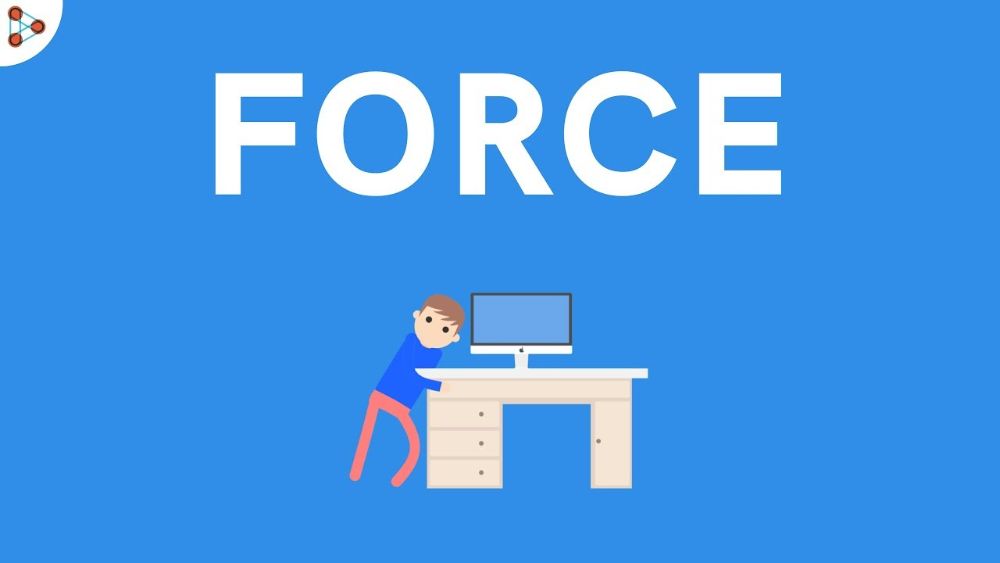
There is no way for your website to be successful if you force something on its visitors. It would be best if you did not force certain things on your website visitors, and it is equally applicable to the animation as well. You might have decorated your website home page with parallax scrolling. But if your user has trouble with motion sickness, then parallax scrolling might not be the correct option for your website. Moreover, when you have animation on your website, you should always provide an opportunity, to the user, for turning the animation off. This way, the user understands that you have considered their need to not look at the animation. And hence, the animation does not look forced.
9. Ignoring the existing mental models:
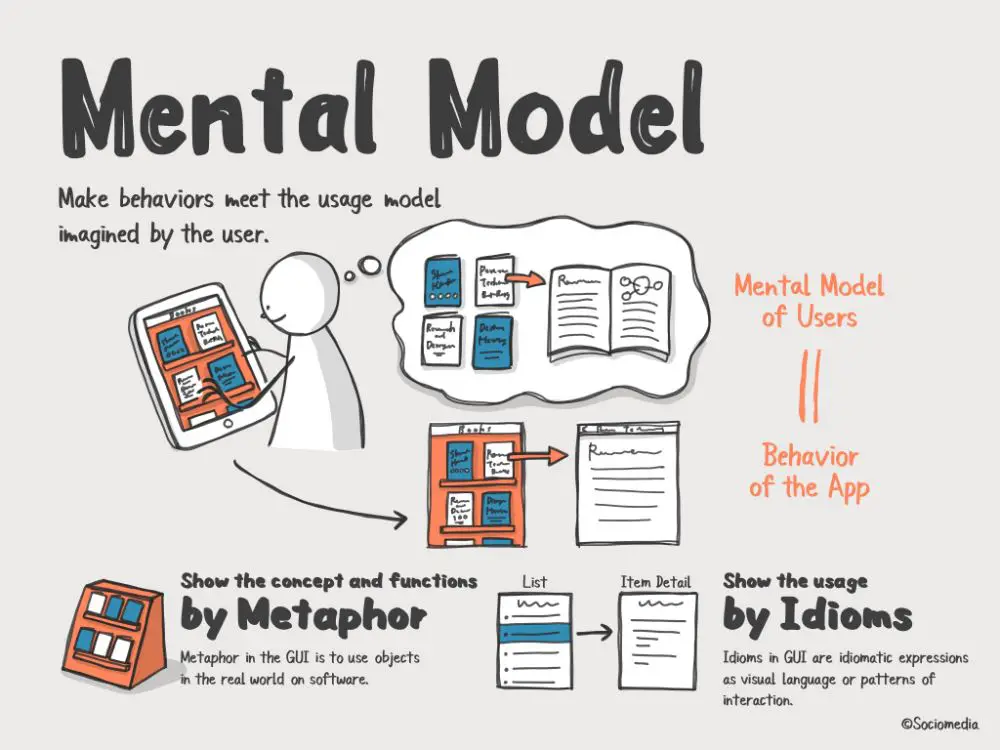
There are so many existing mental models in different fields. And the users expect a specific type of mental models when they are looking at something. So in terms of users, they expect a particular kind of behavior in the animation. For instance, quick movements are enough to attract the attention of the user. But a slow-motion generally goes unnoticed.
To understand the mental models in terms of animation, you should study or go over the 12 principles of animation. You should always make a point to combine animation with the mental model to create a successful animation. When you are including animation on a website, it is imperative to align the animation with the website’s goal. Else the animation stands without a purpose and would look useless that does not resonate with the website’s purpose as well as the user. Moreover, if the animation resonates with the user, then it has the chance of having increased user engagement.
Conclusion:
The animation holds importance only if it is created in moderation and strikes a balance between the animation and the information your website conveys. This blog offers an understanding of the things that you should avoid when you are using animation on your website. Using animation is good, but you should find a finely-tuned point between using too much and too little of the animation. Moreover, the animation should not be a forced thing on the users, and hence your website should allow the user to turn off the animation. Apart from that, it would be best if you used the animation constructively, for example, to offer the information, to the users, in an exciting way. That would increase user engagement and would increase the positive traffic on your website.