7 Characteristics of High-Converting Landing Pages
What good is website traffic if users get to your site and don’t engage with your content and ultimately convert?
Whether the conversion is a purchase, a lead form submission, an email sign up, or some other interaction, you want website visitors to convert.
To make the most of your site traffic, you need to optimize your landing pages for conversions.
In this post, we’ll look at seven characteristics of high-converting landing pages that you can use to convert more visitors.
Keep reading to learn how to optimize your landing pages for conversions, or contact us to speak with a CRO expert!
Check out some of our most amazing case studies that exemplify an amazingly effective marketing campaign.We drive results on a case-by-case basis.
7 elements of landing pages that convert
If you want to create landing pages that convert, here are seven elements you’ll want to consider.
1. A solid website foundation
Before we think about the factors that can increase conversion rate, you need to make sure your site has a solid foundation.
There are a few things that need to be in place before we get into other optimizations:
- SEO-optimized content: If you want to boost conversions, you need SEO-optimized content. Without it, your website won’t rank in search results for your target keywords, and people won’t be able to find your site and convert.
- Quick-loading website: A fast-loading website is an important piece of conversion rate optimization (CRO) because if pages take too long to load, users may bounce or navigate away from your site before they even see your content. You could have the most conversion-optimized pages in the world, but if users bounce before they have the chance to interact with them, you won’t earn any conversions.
- Mobile-responsive website: Similarly, if your site is not optimized for mobile users, visitors will become frustrated with the poor experience and leave your site without converting.
2. Multiple contact methods
Once you have your foundational pieces in place, you can begin to think about the on-page elements that can increase conversion rate.
First, you need to incorporate multiple contact methods, so visitors can contact you, ask questions, and get the information they need to convert.
You can pick and choose which methods of contact are best for your company, but the more methods you have, the better! Some options include:
- Contact form: An optimized contact form should be clearly linked from landing pages
- Phone number: Your phone number should be easy to find and click
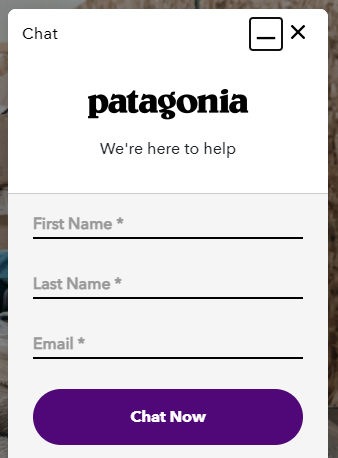
- Online chat: Online chat is especially great for providing quick answers on ecommerce websites

No matter the contact method you choose, you need to make it easy for your audience to convert. That’s why you should include your contact info at the top of landing pages, above the fold, so visitors can take the next step without scrolling or wading through menus.
3. Clear call-to-action (CTA) buttons
The next characteristic of high-converting landing pages is clear call-to-action (CTA) buttons.
Your CTAs will vary depending on your page type and goals, but your CTA buttons should meet the following criteria regardless:
- Above the fold: There should always be a clear CTA button above the fold that users can see without scrolling
- Below the fold: For longer pages, you should also have a CTA button below the fold at the bottom of the page, so users can convert without scrolling back to the top
- Boxed or circled: CTA buttons should be boxed or circled in some way to make them look like clickable buttons
- Accent color: CTA buttons should use an accent color that helps them pop and stand out from surrounding page content
- Directional cues: Incorporate directional cues, like arrows, to point visitors to CTA buttons
- Distraction-free: Make sure your CTA buttons don’t get lost among other content, callouts, and graphics on landing pages

4. Videos
According to Search Engine Watch, 73% of customers are more likely to purchase a product or service if they have seen a video about it first.
Videos are an important part of the conversion funnel since they can be tailored to each step of the funnel.
For top of funnel (TOFU) pages like blog posts or the homepage, videos can provide more general information. For bottom of funnel (BOFU) pages like product pages, videos should be more conversion-focused.

Consider the stage of the conversion funnel of your page, and then add a video that appeals to users in that stage and provide them with the information that they need at that point.
5. Trust signals
If you know anything about E-A-T (expertise, authoritativeness, trustworthiness), you know that trust signals can win over website visitors, gets them to trust your company, and ultimately convert. The more trust signals you have, the better!
Here are a few trust signals to consider adding to your landing pages:
- Ratings and reviews: Star ratings and customer reviews
- Case studies: Any relevant service or customer experience
- Trust seals: Things like a Better Business Bureau (BBB) badge, antivirus badges, secure checkout, etc.
- Media mentions: Any big-name media sites that have mentioned your business
- Real-time stats: Things like the current number of people checking out or updated inventory numbers
- Follower information: List your total number of customers, email subscribers, social followers, etc.
- Celebrity and industry leader endorsements: Any big names that have endorsed your company
- Industry certifications: Industry-specific certifications or awards
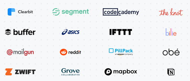
- Customer banner: A banner featuring logos of clients you work with

6. Engaging design elements
High-converting landing pages keep users engaged with custom design elements.
While design elements include graphics and images, they can also include other things like:
- Infographics and micrographics: A visual way to present detailed information
- Icons: Small icons can add visual interest to text-heavy sections
![]()
- Use of color: Make good use of white space, branded colors, and accent colors
- Background: A visually-appealing background can make landing pages more interesting
- Layout: The way you organize site information visually can impact conversion rate
7. Intuitive navigation
The next feature of high-converting landing pages is intuitive navigation.
Users will have an easier time converting on your site if finding the pages and information that they need to convert is straightforward. The information that users are looking for should be easily found within one or two clicks.
While a well-optimized menu or mega menu is a great start, there are other navigational elements to think about:
- Search bar: Allow users to search for exactly what they are looking for
- Breadcrumbs: Always give users a way back to previous pages to avoid them clicking the back button
- Internal links: Present users with other relevant pages in the copy they are reading
- Sidebar: A sidebar with a few relevant links can be a good “map” for users to find important pages
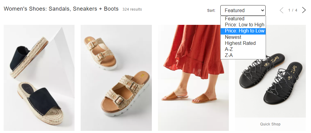
- Sorting and filtering: Especially for ecommerce sites, sorting and filtering functionality helps users narrow in on what they are looking for

Create high-converting landing pages with WebFX!
This is by no means an exhaustive list. There are many more characteristics of high-converting landing pages.
If you’re ready to dive in and get started optimizing your pages, WebFX can help.
At WebFX, we have a world-class Conversion & UX team of CRO experts and specialists who can conduct an in-depth CRO audit on your website to uncover missed opportunities and areas of improvement.
If you are ready to take your pages to the next level, explore our conversion rate optimization plans and contact us to get started!