Design an Ambigram Logo With Your Name
Ambigrams are a particularly complex type of typographical art that can be read identically in different orientations. They typically take the form of a word that reads the same way upside down as it does right side up.
Today we’re going to see what’s involved in creating ambigrams and walk through creating a basic one on our own.
What Is An Ambigram?
In its most basic form, an ambigram can be a simple symbol that looks the same at two or more orientations. More complex forms involve words, groups of words or even entire sentences.
Ambigrams are one of those things that you can go your whole life without noticing and then realize that they’re everywhere once you learn to see them. For instance, ambigrams are a fairly popular logo technique and can be spotted in several famous brands. I’ve always particularly liked the AnchorBlue (the old version, they ruined it now) and Sun logos for this reason.

If you rotate either of these logos 180 degrees, they look exactly the same. It’s a pretty cool and subtle design trick that usually gets noticed mostly by designers, artists and other visually aware folks.
Here are a few logos I pulled from LogoPond that are Ambigrams.

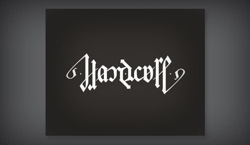
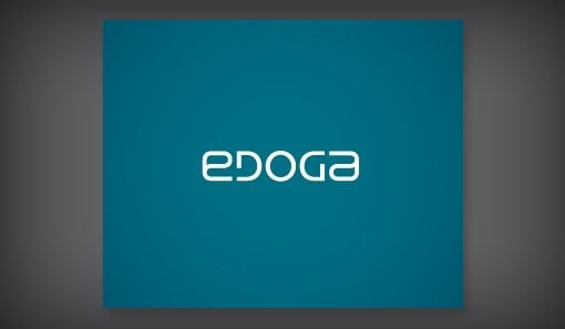
Pop Culture
In recent years Ambigrams have gained popularity largely thanks to the success of Angels & Demons and The Da Vinci Code, two books by Dan Brown that were subsequently turned into Tom Hanks movies.
In this story, the “Illuminati” are a secret satanic cult with an ambigram logo that the author spends far too much time attempting to convince you is impressive.
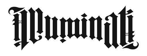
To be fair, it is a pretty cool looking logo. I’m sure all the other secret cults are very jealous. It’s designed by John Langdon, who has an incredible collection of similar work in his portfolio.
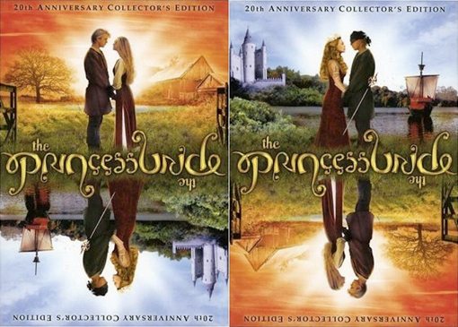
Another sighting of Hollywood Ambigrams is on the 20th Anniversary cover of one of the best, most quotable movies of all time: Princess Bride. The duality here with both the text and the image is really great if you’re familiar with the story (this one’s designed by Cheryl Savala).
Let’s Make an Ambigram
Creating an Ambigram can be a pretty daunting task. It involves a very different kind of thinking and, if you’re designing from scratch, can require a good deal of artistic talent.
This is all well and fine, but I’m all about figuring out quick tricks and shortcuts so today we’re going to bring ambigram creation down to the skill level of mortal man.
Step 1: Plan Out The Letters
Planning out your ambigram involves figuring out your letter pairs. Since the word has to read the same whether it’s upside down or right side up, you maybe be tempted to think your individual letter designs need to be symmetrical, but this is false. Instead, each individual letter needs to serve as two letters.
For instance, if we use my name, “Josh,” then our first letter will have to look like a “J” one way and an “h” the other. To figure out your letter pairings, simply write your word forwards and backwards and see how the letters line up:
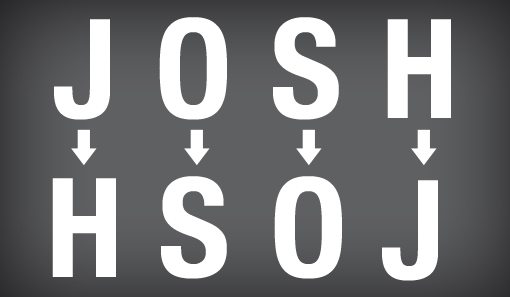
In more complex ambigrams (or those with an odd number of letters), the one-to-one ratio goes out the window. It’s often the case that an object is a single letter one way but two letters when it’s rotated. This is the case in the Illuminati example above. Here are the letter pairings for that ambigram:
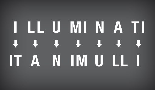
The really nice part about designing your letter pairings is that you only need to create around half as many of them as there are letters because you just reuse them for the other half of the word. We’ll see how this works later.
Step 2: Choose a Font
As I said above, creating an ambigram from scratch can take a lot of work. The big shortcut is that we can just modify existing fonts and save ourselves a lot of trouble.
Since ambigrams letters have to serve multiple purposes, it’s often the case that more ornate letter forms work the best. Ornate fonts tend to have lots of superfluous detail that isn’t true to the way you would actually write the letter, while still having easily identifiable letters. When you’re working with the kind of duality that ambigrams involve, having room to turn leftover pieces into flourishes and swooshes makes your job much easier.
With this in mind, old english or cursive letters make for prime candidates. A quick browse through my fonts folder revealed a number of solid potential starting points.
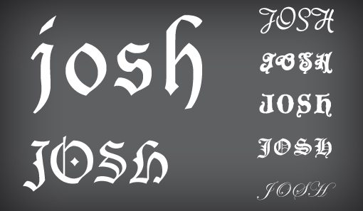
There’s no reason you can’t pick any font that you want, but one trick is to look for similarities in the letter pairings that you require. For instance, if the “O” and “S” have particularly similar shapes in a given font, it might be a perfect candidate for our “Josh” ambigram.
Step 3: Create Your Letter Pairs
From here it’s time to actually start forming your ambigram. To do this, it’s best to open up Adobe Illustrator. Because Illustrator is a vector editing application, it gives you more freedom than Photoshop for playing with your letter forms. Type out your word, convert the text to outlines and start reshaping!
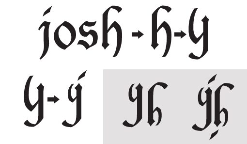
My workflow is pretty simple to follow. First I looked at the “j” and “h” and decided it would be easier to start with the latter. Next, I turned the “h” upside down. From here I already have an upside “h”, which is the goal, I then needed to make it look like a “j” without compromising the integrity of the “h” shape too much.
This takes lots of experimentation. It’s definitely a good idea to keep a couple of different versions just for options. Here you can see the process I went through from beginning to end:
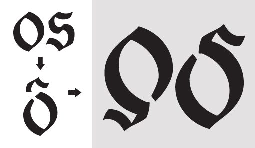
Next, it’s time to tackle the “o” and “s”. To do this, I started with the “o”, cut out a chunk so the loop doesn’t close, and added in the top of the “s” with the following result:
All Done!
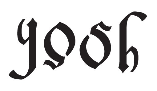
As I mentioned before, since each letter counts for two, we only need to really build two letters, then we can copy and past those two items and rotate them for the second half of our word. So my “j” and “o” rotated become the “s” and “h”.
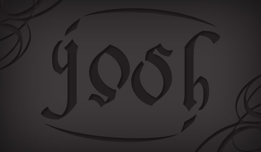
Again, you’ll probably end up with a few different ideas for your finished product, I certainly did. This is great though and gives you options for different uses. For instance, here’s a simple version followed by a fancier version that wraps the whole thing in an oval for a more logo-friendly appearance.
Want to see it in action? Click here for the interactive version.
Ambigram Generators
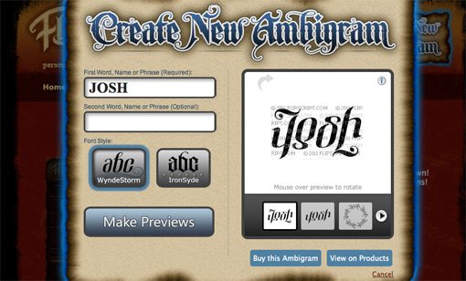
I strongly recommend that you attempt to create one or two ambigrams on your own, but if you want to cheat, there are a few ambigram generators online such as the one at Flipscript.com. Tools like this one can also be a good reference in case you need a hint for how two letter shapes might be paired together.
Conclusion
Ambigrams aren’t going to change the way you design forever, but they are a really fun way to add an unexpected and often hidden twist to a logo. They’re actually a blast to think about and build if you’re a design nerd so you should definitely give it a shot.
Follow the steps above and create your own ambigram, then leave a link below so we can check it out!