12 Things Not To Do To Screw Up Website Usability
When it comes to website performance, you take care of a number of things so that your users see your brand as you see it and take the necessary action. You design a website with high-quality content, strategies, SEO techniques, and technology, and you expect some results out of it. Because a website is a crucial platform where a brand and the users come together to share their business needs, it’s crucial for you to manage your website’s user experience effectively. How the users are using it and how they perceive it decides many things for your business. If your website’s usability does not satisfy your users, you may have to look into a few things and improve the usability design immediately. According to your target audience, you need to design your website in such a way that it helps them to understand and choose it for their purpose. To improve your UX, here we have explained 12 things not to do to screw up your website usability.
1. Do not make your website cluttered:
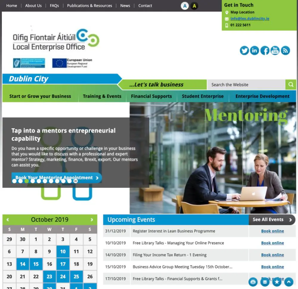
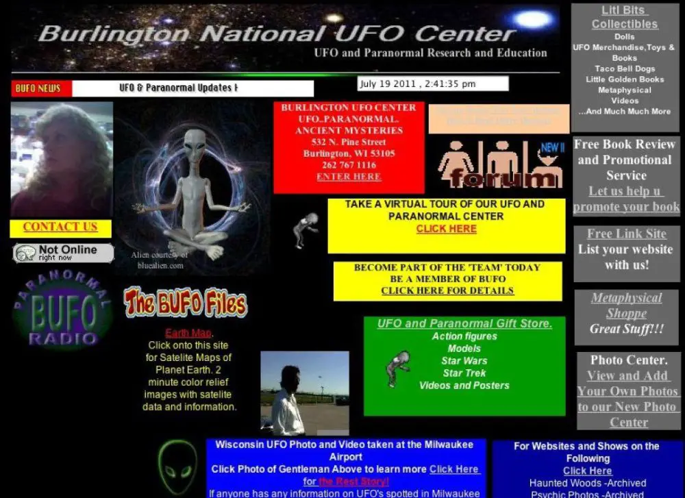
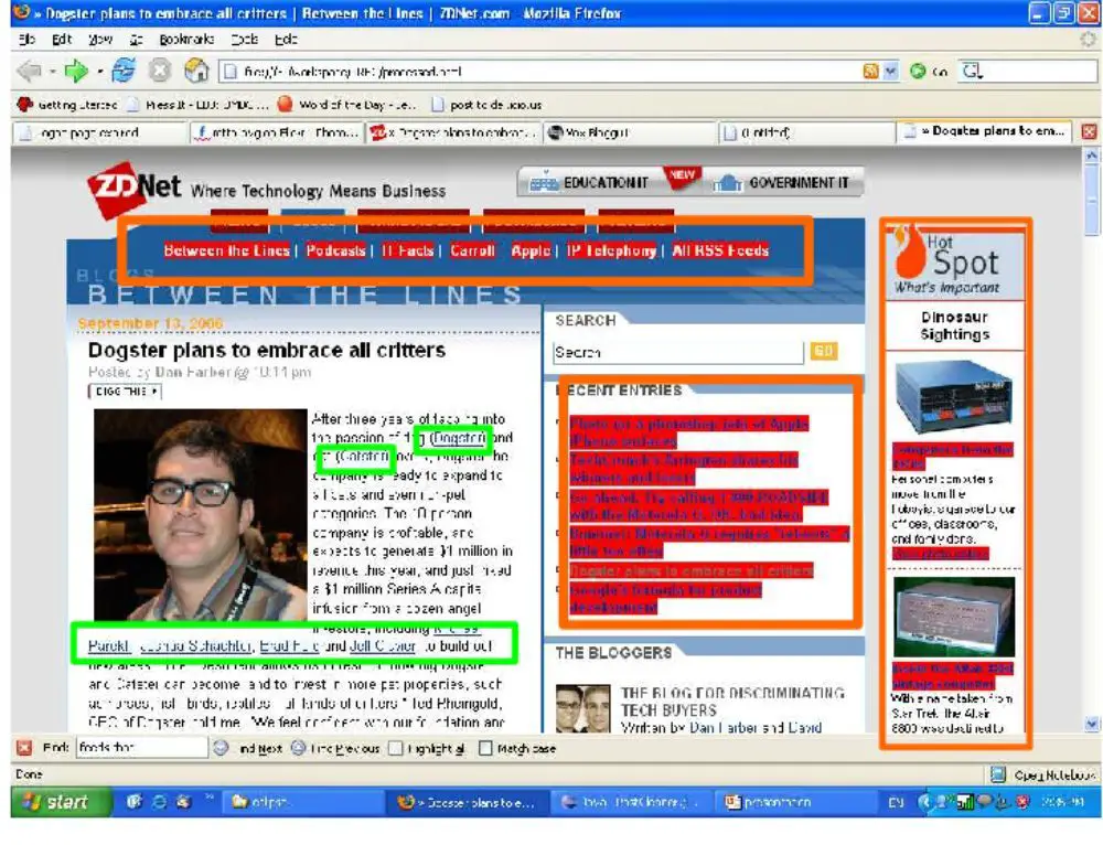
If you think giving all the information on your customer’s faces can help them read and digest easily, then it is the biggest misconception you carry. Whenever your user is coming to your website, and the first page he sees has too many graphics, photos, content, links, videos, and other elements, he might get confused or disappointed. Maybe every element is essential according to you for your user, but he might not accept everything at the same time and lose interest immediately. Instead, keep it simple and subtle. You should keep enough space for your user to take a break from his vision and mind for better understanding. By this, you can enhance your user experience.
2. Don’t mess with visual hierarchy:
Visual hierarchy creates a path for the users to experience smooth vision over the website design. And a good website designer knows the importance of visual hierarchy as it is a concept that almost every designing stream follows. A presentable website with the appropriate color combination, fonts and styles alignment, section, and content structure gives your user a pleasant experience and a better understanding of the brand’s language. Visual hierarchy creates a specific tone and an accent of a brand and helps users follow your message, intentions, and expectations. So if you are messing your visual hierarchy with any haphazard placement, layout, colors, and context, then it can distract your customer and cause discomfort in their mind. A website design must have an excellent visual hierarchy to portray the content effectively to its users.
3. Avoid Complicated forms:
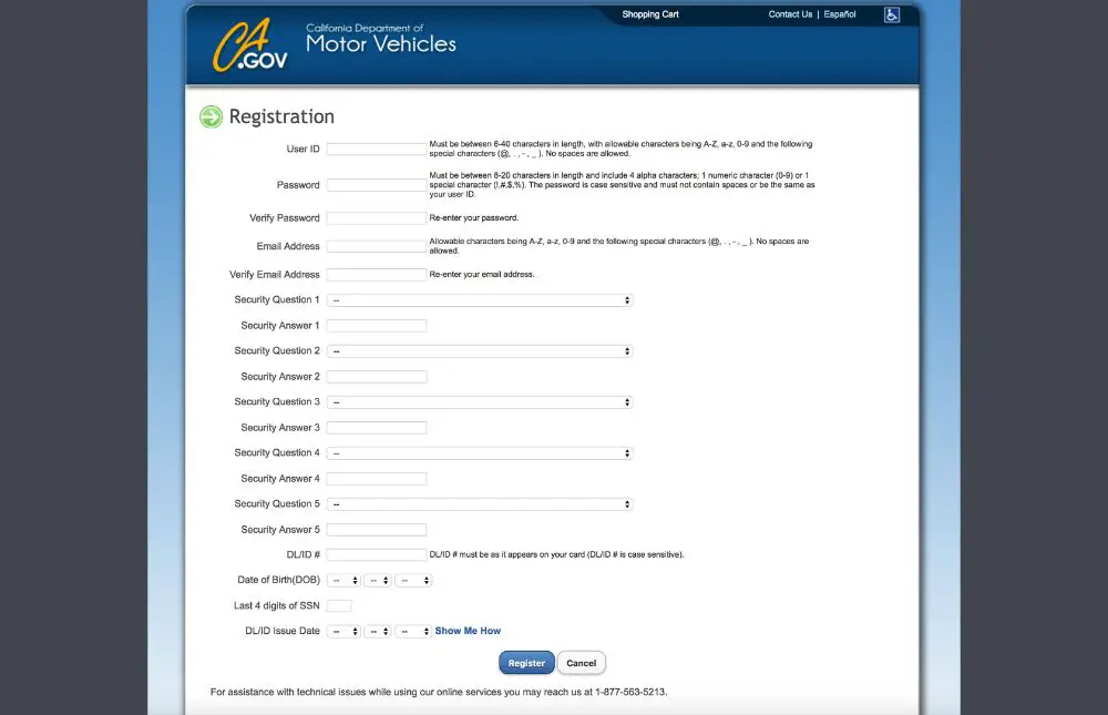
Nowadays, where data is a crucial part of any business, many websites ask their users to fill a form for newsletter, subscriptions, inquiry, or assistance. While designing a form, you must keep few things in mind. If you are keeping the form as a pop-up, then you have to be careful with the frequency number. If you are making this a compulsion, then it can surely give you a highly filtered audience, but at the same time, it can take away your possible audience immediately. Talking about the form elements, please do not make your forms lengthy and complicated with unnecessary or less important subjects. They can quickly get out from the website on an encounter with lengthy or complicated forms. It should be about just the most required information for your business. By this, you can save your users time and interest.
4. Modify large blocks of texts:
Users need help with content to support their understanding and knowledge of your website. A well-balanced website has content, images, and links in the right amount to help users get their required information from the website. But if your website is imbalanced because of the large number of texts, headings, and subtopics, then it can not add anything to the user experience. More than required topics and texts can not attract users, nor can they fulfill their purpose. Nobody wants to invest their time and read every word just to understand something. A mobile screen is even smaller than a desktop screen, so no user would scroll until the end and read the whole page. They might get scared or bored by just looking at these many words and go back to another website. So it would help if you dropped the idea of putting more than required content on website pages.
5. Don’t use the lousy site navigation:
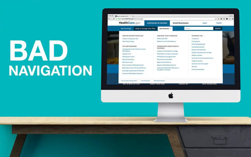
A homepage is your landing page, and from here, your user can go to his required information. It must have a menu bar in the header and sitemap links in the footer so that your customer can walk easily in the right direction. The navigation map should be clear and straightforward. The placement should also be convenient and present on every page. If the site navigation placement is inappropriate and not easy to look at, it can cause confusion and inconvenience to the users. A navigation bar with more than required page links or less than required page links can take your user away from his required information. Instead, please keep all the essential page links in the navigation bar and place the navigation bar by keeping in mind all the devices, all the users, and all the mediums they might use to reach your website.
6. No search option:
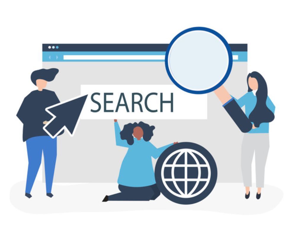
It is a general feedback from users that if a website does not have a search bar, they find it very difficult to use. A search bar option helps you find what you are looking for in just a few seconds, and you don’t have to go through the complete website or site map. If your website is an e-commerce website or some big website with multiple pages, then it must have a search bar. Imagine, without a search bar, how difficult it may be for your user to walk through it and go back and forth with the pages. So it’s always advisable to keep a search bar for every available information and you can keep related search options as well to provide an easier user experience.
7. Don’t forget about the colors, graphics, and pop-ups:
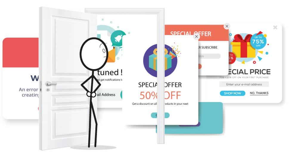
Your website usability relies on many factors, and colors, graphics, and pop-ups are a few of them. When you are selecting colors for your website, you should select based on color psychology. The colors of your website should create the right impact on your audience’s mind. The same applies to graphics; the composition, placement, and message must fit into their interest. Sometimes, too loud colors, flashy graphics, and inappropriate combinations cause visual disturbance and take users out of the website. Pop-ups are another essential thing; if your website has many pop-ups and ads, it can take users’ attention away. And If they are displaying in high frequency, then also users can immediately quit your website.
8. Avoid difficult contact pages:
When someone visits your website, he may want to get connected to you for some reason. The primary purpose of registering your online presence on the search engines is to get maximum users from that platform. So if your website design is not successfully giving easy-to-reach-out features, you are most likely to lose important customers. No matter what industry is and what design you are following, your brand’s contact details must be easily visible to your users. They might not search for a long time, so you need to show them on every page they visit to influence them to contact you. It is vital for your user and your brand as well.
9. Slow-loading website:
Users are very impatient because they can not wait for your website if it is not fully loading within 10 seconds. There are great websites on search engines, and they might switch to another one that is fast loading. Many reasons are possible for slow loading websites, and you can figure them out with the help of many free tools for website testing. Your brand can lose customers and important leads if your website is not opening as fast as it should. If users face delays in downloading or scrolling, they also get disappointed and impatient to stay on your website. It can affect your SEO performance as well. You can lose customers, usability experience, and search engine rank within a short time.
10. Don’t keep things hard to reach:

A website design is to serve the required information and knowledge to your users about your business. If they are not finding what they are looking for quickly and easily, then your user experience ratings can go down. The site map, navigation links, and inter-page links should be easy to follow and clear to understand. There is a rule of 3 clicks. According to this rule, your content, links, and pages should be accessible within three clicks. Three clicks are sufficient for users to get to the required information and to serve a healthy user experience. If they have to click multiple times on your website or pages, they have to invest more time in reading and getting to the desired point. This issue can disappoint them and reduce their interest very quickly.
11. Don’t include unnecessary hyperlinks:
Hyperlinks in the website support better understand and SEO performance as well. But if there is a stuffing of too many hyperlinks in your website, then users can not find your content readable, and it can disturb their experience as well. It is still manageable on the desktop screen, but if they open your website on a mobile screen, they might face more disruption. Unnecessary links and necessary links but on hard-to-click places both can ruin your website’s usability. Make sure you include appropriate links in the content, and they are comfortable to your users. They should be an additive to the user experience from all the technologies, devices, and locations.
12. Do not disable the back button and home button:
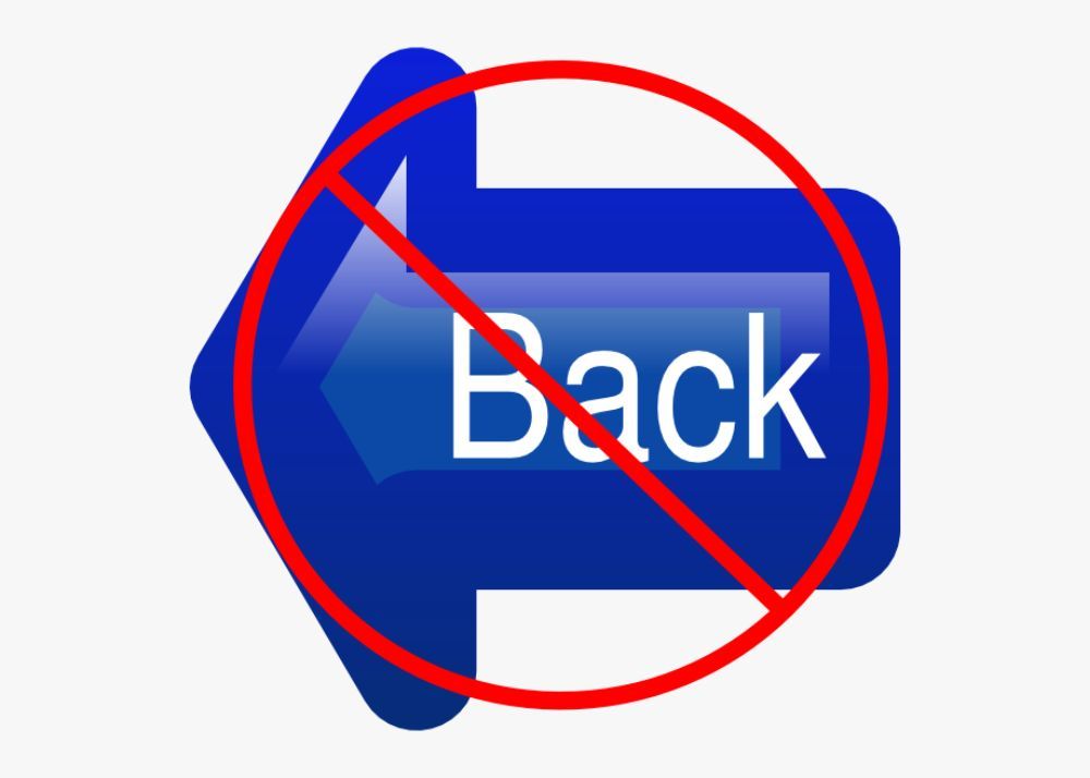
It is a minor mistake that can affect your website’s usability. Some brands do not intentionally keep the back button and home button, which can damage their website usability. If you are including separate tabs function for every click, then it is the right choice. But if your users are going through the pages within the same tab and can’t find the back button easily for the previous page, then they might feel annoyed. If they have to click the home page to go back every time, they can not scroll through your website comfortably. Some websites do not have a home page link on their header and their logo button. This choice can also disappoint users and make them close your website. So, never disable the back button and home button for any reason in order to create an easy-to-access website for your users.
In today’s time, you have access to so many online platforms and tools that help you test your website’s usability. So it’s better that you test your usability in decent time intervals to avoid the loss of your ideal customers and loss of your brand value. Since it directly impacts brand identity and customer flow, you must not stay negligent towards your website’s usability factors and mistakes. Being creative while being kind and thoughtful for your audience is highly advisable to save you from many usability troubles. From the don’ts mentioned above, we have tried to help you with the wrong things you might be doing or might have done on your website to harm the user’s usability experience. So make sure you avoid these things and improve your website’s usability frequently.