How to Make an Org Chart in PowerPoint Quickly and Easily
An organisation chart (org chart), is a useful tool that your business can use to display the company structure. It’s usually shown in the form of a flow diagram, and the chart helps to show the relationships between different departments and employees.
Creating an organizational chart is quick and easy if you have the right tools.
Here, we’re going to walk through some ideas for putting together a stunning org chart in PowerPoint to help you jumpstart projects. Plus, all the examples are from Envato Elements, so you can download templates for even quicker work!
Uses for an Organizational Chart

An organizational chart maps out the hierarchy of a company or other organization in a visual format. It can be a great tool for understanding and mapping out roles and responsibilities for leadership teams and can help all employees understand how a business is constructed.
Organizational charts have a lot of practical uses, including:
- Show internal structure of a company
- Show people who they report to or chains of command
- Make roles and responsibilities clear for employees
- Create efficiency by avoiding duplication of work
- Help manage workloads
- Create decision-making trees
- Help employees see promotion opportunities and how staff and teams are developed
Types of Org Charts

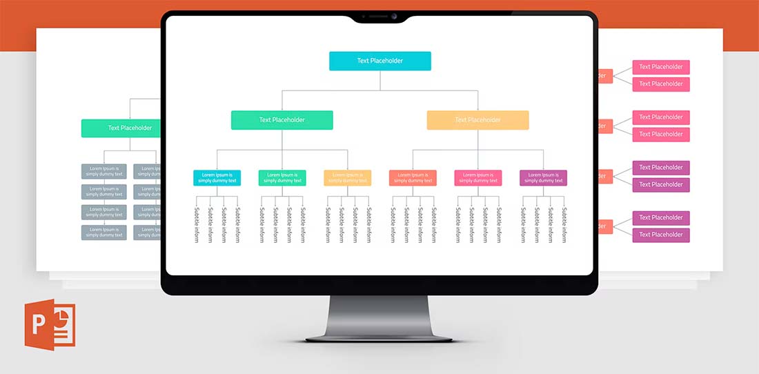
Org charts can be arranged in a number of ways, but most commonly you’ll see them in the form of a flow diagram.
This type of org chart design begins with the fewest blocks at the top (company president or board of directors in this case) and expands on each level with employees. Each level represents which positions report where (the line above) and what positions are managed by others (the line below).
This sense of visual hierarchy helps everyone understand how roles interconnect in an organization. Typically each row in the org chart has an increasing number of employees. The chart is most frequently arranged by job titles, not by individual names of people. Some companies create a second version to fill in with actual names and contact information, to show actual chains of command and contact information.
How to Make an Org Chart in PowerPoint

One of the quickest and easiest ways to make an organization chart is in PowerPoint. The nice thing about using this tool is that you can then use the org chart in presentations or save it as a picture for other uses.
Additionally, there are plenty of great templates available to help you jumpstart building your org chart so that you have some help and guidance on how to create the structure and visual flow.
Here’s how you make the org chart.
Start with a Template
Getting started with a template can make building an org chart a lot easier. A template will give you a visual idea of the type of chart you need, how to arrange elements, and what the design might look like.
Templates allow you to adjust colors, fonts, styles, and branding to suit your organizational needs while providing a ready-made design to jumpstart the project.
Many PowerPoint templates, such as the ones featured here, many include multiple design options in the same downloadable file to help you create different versions of your org chart if you need them.
Often these different design styles are made to account for small versus large organizations or elements such as shape, size, or overall look and feel of the chart. They can also show charts of different types because not every organization wants to start with a typical flow chart style.
Match to Your Brand and Style
Once you pick out a template, you can match everything in it to your brand and style. From colors to fonts to imagery, this is a good way to personalize and own the template.
Reworking the template to your brand helps you create an org chart that will feel like it belongs to your company and will even encourage you to use it more.
Most PowerPoint templates come with a readme file that will help you understand any intricacies of the design as you customize it. But generally, you can do all of this on the master slides.
Fill in Your Information

Once you have the design set to your style, it is time to pick the slide variation you plan to use for your org chart. (Feel free to delete the others.)
Then start filling in your information.
Depending on the template you select, there may be different elements to collect and fill in, including images or contact information.
It can be helpful to actually map out your organizational chart on paper before you start working in PowerPoint to ensure you have all the elements you need before you get started.
Creating an org chart in PowerPoint will go quicker and more smoothly if you have all the resources and information you need at hand when you get started.
Proof and Finish
The final step is to proofread everything. It’s a good idea to have someone else look at the org chart for errors in hierarchy, spelling, and even missing items. (We all know it can be tough to proof your own work.)
If you use images, names, or contact information, make sure to pay special attention to those as well. Nothing is worse than getting someone’s name or likeness incorrect when you publish an org chart.
Once all the proofing is finished, you can prep the PowerPoint org chart for use digitally or in printing. Add this slide to other presentation decks or export the slide as an image file that you can use in other locations.
The availability of export options from PowerPoint is a solid reason to use this tool when creating an organization chart.
Conclusion
Making an org chart in PowerPoint can feel like a daunting task, but with a good plan and tools, it can be a fairly quick and easy project. The keys are to have all of your information ready and start with a solid template that has a design you already like.
Then you can make customizations and be ready to share your chart.